
The Science of Feline Color Perception: Beyond the Human Spectrum
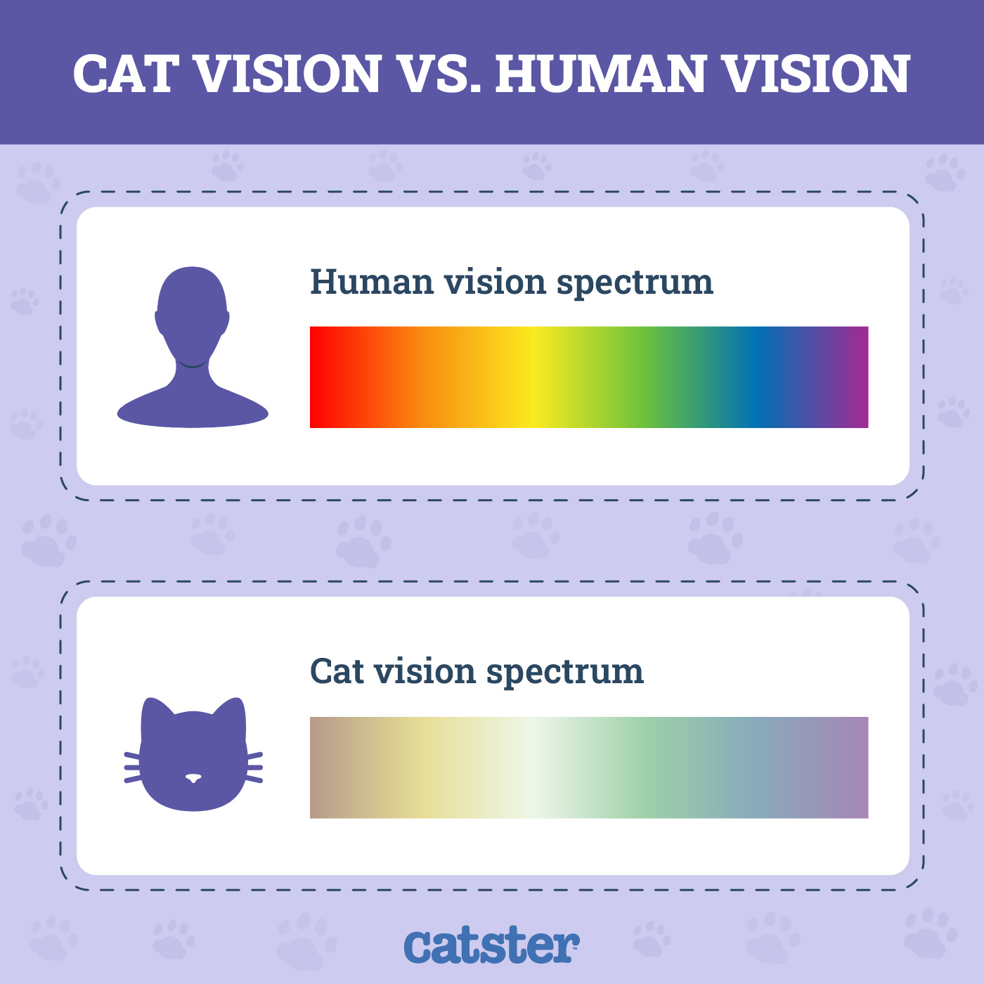
To understand what pink looks like to a cat, we must first dismantle the anthropocentric view that colors exist as objective, universal constants. Human vision relies on a trichromatic system, utilizing three types of cone cells in the retina—sensitive to red, green, and blue wavelengths—to synthesize the vibrant tapestry of the visible spectrum. For cats, however, the world is calibrated differently. Feline biology dictates a dichromatic reality, primarily functioning through blue and yellow sensitivities.
When a human observes a vibrant magenta or a soft pastel pink, their brain is interpreting the simultaneous activation of red and blue cones. Because cats lack the red-sensitive cones entirely, the “pinkness” of an object is effectively filtered out of their optical processing. Instead of seeing a hue that bridges the gap between red and violet, a cat’s visual cortex interprets the light reflected from a pink surface based on the remaining blue and yellow input.

The Dichromatic Limitation
The feline retina is dominated by rods, which provide superior low-light sensitivity and motion detection, but their cone density is significantly lower than that of humans. These cones are tuned to shorter wavelengths. When a cat looks at a pink toy, they are not seeing a void or a black-and-white image. They are seeing a muted, desaturated color that aligns with their blue-yellow axis. To a cat, pink is likely perceived as a dull shade of grayish-blue or a pale, washed-out yellow, depending on the intensity of the light and the specific saturation of the pink object.
The Role of Photoreceptor Density
The evolutionary trade-off for cats is clear: while they sacrifice the rich color depth that primates enjoy, they gain an unparalleled ability to track movement in dim environments. Their visual world is one of high-contrast motion rather than vibrant chromatic saturation. Consequently, the concept of “pink” as a distinct, exciting color does not exist in the feline aesthetic experience.
Why Branding for the Feline Market Often Misses the Mark
The pet industry is a multi-billion-dollar juggernaut, yet it is often governed by human aesthetic preferences rather than animal physiological reality. From a brand strategy perspective, the marketing of feline products frequently employs “human-pleasing” colors, such as bright pinks, purples, and neon reds, intended to catch the eye of the pet owner in a retail environment. However, when we analyze this through the lens of animal-centric design, we realize that these brand choices are entirely performative for the human consumer.
The Disconnect Between Aesthetics and Function
When a brand designs a cat toy in “hot pink” to stand out on a shelf, they are successfully engaging the human buyer’s psychology. Humans associate pink with playfulness, warmth, and vibrancy. Yet, for the cat, the toy is essentially camouflaged against neutral backgrounds. A brand that truly understands its user—the cat—might prioritize high-contrast blue or yellow tones, which are far more perceptible to the feline eye.
Applying Color Theory to Feline Product Design
In the competitive landscape of the pet industry, “User Experience” (UX) should ideally extend to the end user, not just the purchaser. A brand strategy that leverages color theory to improve feline engagement can create a superior product line. By shifting the color palette from human-centric “pink” to cat-centric “blue-violet” or “canary yellow,” manufacturers can enhance the play experience. This shift represents a sophisticated tier of brand strategy: evidence-based design. When a brand demonstrates that they understand the physiological limitations of their target user, they build trust with the consumer who is increasingly educated about animal welfare and science.
The Evolution of Pet Product Marketing
Marketing in the pet sector has undergone a massive shift, moving away from simple commodity sales toward specialized, wellness-oriented, and science-backed branding. As owners become more invested in the mental health and environmental enrichment of their cats, the “pink” question becomes a proxy for broader discussions about product efficacy.
Moving Beyond Human Bias in Design
Corporate identity for modern pet brands is shifting toward transparency. A company that claims to design products “for cats” but persists in using colors that cats cannot effectively distinguish is creating a brand-message dissonance. Consumers are increasingly likely to critique brands that prioritize “cute” design over functional utility. For example, a scratching post covered in dusty rose carpet might look sophisticated in a living room, but the cat may struggle to navigate or engage with it as readily as one featuring high-contrast textures and colors that align with their visual spectrum.
Strategic Color Implementation
To excel in this niche, brands must adopt a dual-layered strategy. First, the packaging must continue to appeal to the human demographic, as they hold the purchasing power. This is where traditional color psychology—the emotional impact of pink, blue, or green—remains relevant. However, the product itself should reflect an understanding of the end user. We are seeing a rise in “neuro-designed” pet products, where the functional components of the toy or furniture are color-coded for feline visual acuity. This creates a powerful brand story: “Designed for their eyes, styled for your home.”
The Future of Feline-Centric Tech and Design
As we move deeper into the age of smart pet technology, the implications of feline vision become even more critical. Interactive laser toys, automated feeders with camera interfaces, and app-controlled stimulation devices all rely on a fundamental understanding of how a cat perceives its environment. If an app interface for a cat-toy controller or a display screen intended for feline entertainment uses colors outside of the cat’s visible spectrum, the tech loses its effectiveness.
Designing for a Non-Human User Interface
In the realm of tech-enabled pet products, UI/UX designers must factor in the dichromatic nature of the cat. If a brand develops a screen-based game for cats—meant to keep them occupied while owners are away—the use of “pink” or deep red elements will result in a flat, unengaging user experience for the cat. Instead, designers should focus on high-motion elements in shades of blue, green, and yellow. This technical precision is what will separate high-end, effective feline tech from the flood of low-utility gadgets currently saturating the market.

Ethical Branding and Scientific Literacy
The most successful brands of the next decade will be those that integrate scientific literacy into their core identity. By acknowledging the limitations of feline vision—and openly discussing why “pink” isn’t a primary color for cats—a brand establishes itself as an authority. This is a powerful form of content marketing and brand positioning. It educates the consumer, builds credibility, and justifies premium pricing based on the inclusion of research-backed design features.
The conversation about “what pink looks like to a cat” is ultimately a conversation about empathy in design. Whether through the color of a grooming brush or the light frequency of an automated laser toy, the shift toward feline-first design is not just a trend—it is the inevitable progression of an industry maturing to meet the specific biological needs of its most beloved consumers. By shedding the human-centric obsession with colors like pink, brands can unlock new potential in product functionality, strengthening the bond between pet and owner through the medium of better-designed tools. The future of the pet industry lies in our ability to see the world not as we wish it to be, but as it truly appears through the eyes of our feline companions.
aViewFromTheCave is a participant in the Amazon Services LLC Associates Program, an affiliate advertising program designed to provide a means for sites to earn advertising fees by advertising and linking to Amazon.com. Amazon, the Amazon logo, AmazonSupply, and the AmazonSupply logo are trademarks of Amazon.com, Inc. or its affiliates. As an Amazon Associate we earn affiliate commissions from qualifying purchases.