
In an increasingly data-driven world, the ability to visualize relationships between variables is paramount. Linear functions, represented by straight lines on a coordinate plane, are fundamental building blocks in mathematics, science, engineering, and data analysis. Understanding how to graph them not only solidifies mathematical comprehension but also empowers individuals to interpret trends, make predictions, and debug complex systems. This comprehensive guide will demystify the process of graphing linear functions, blending foundational mathematical principles with the power of modern technological tools.
A linear function describes a relationship where a change in one variable results in a proportional change in another. Its graphical representation, a straight line, simplifies the identification of patterns and extrapolations. While the core concepts remain timeless, the methods of execution have evolved dramatically. From manual pencil-and-paper techniques to sophisticated graphing software and programming libraries, technology has transformed graphing from a tedious chore into an efficient, insightful, and often interactive process. This article will equip you with both the conceptual understanding and the practical, tech-driven approaches to master the art of graphing linear functions.
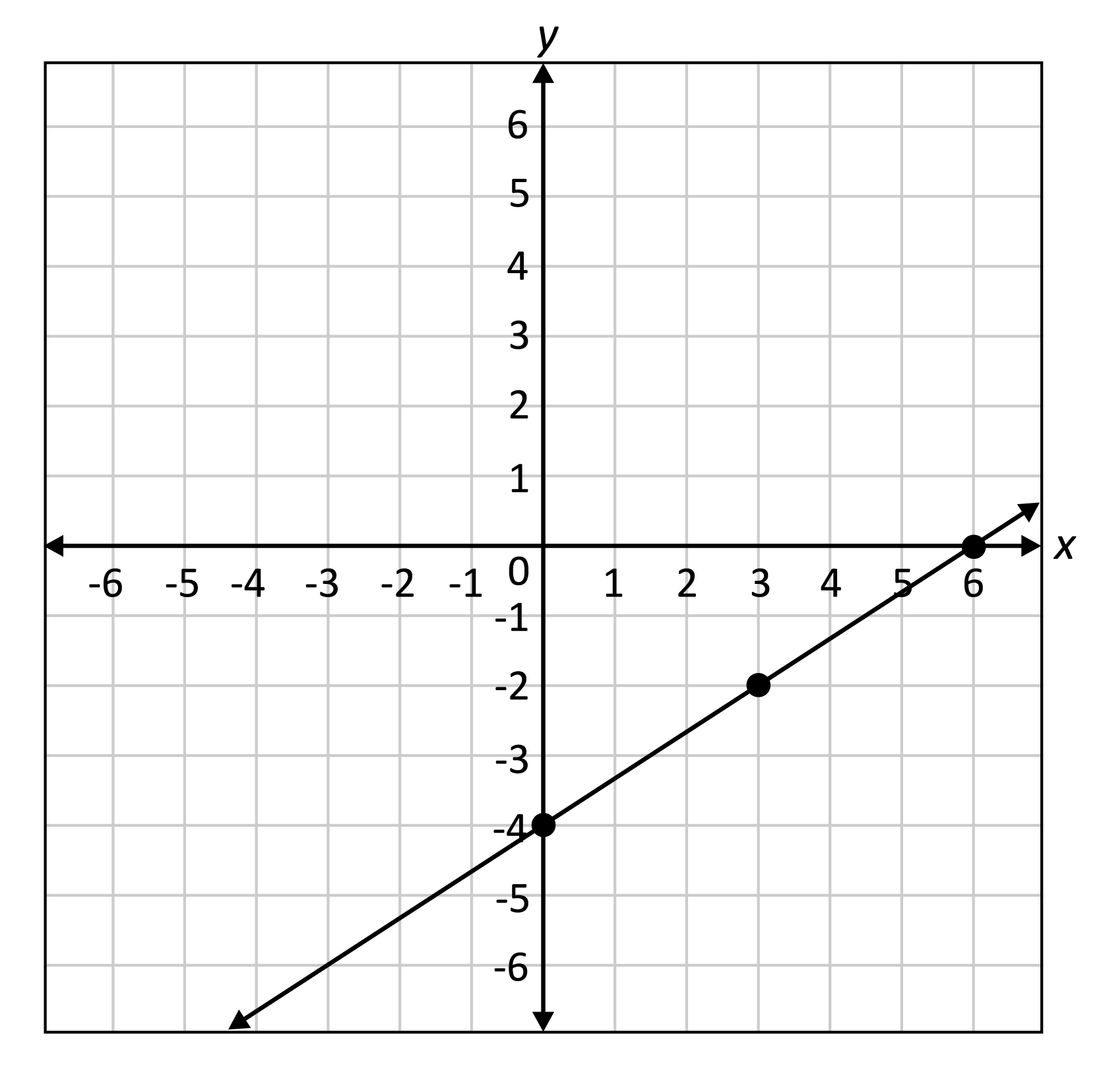
Understanding the Fundamentals of Linear Functions
Before diving into the mechanics of graphing, it’s crucial to grasp the essence of what a linear function represents and the key components that define its unique characteristics. This foundational knowledge is universal, whether you’re plotting manually or instructing a sophisticated algorithm.
What is a Linear Function?
At its core, a linear function is a mathematical relationship between two variables, typically denoted as x and y, that produces a straight line when plotted on a Cartesian coordinate system. The most common and versatile form for representing a linear function is the slope-intercept form:
y = mx + b
Where:
yrepresents the dependent variable (the output).xrepresents the independent variable (the input).mis the slope of the line, indicating its steepness and direction.bis the y-intercept, the point where the line crosses the y-axis (whenx = 0).
Other forms exist, such as the standard form (Ax + By = C) and the point-slope form (y - y1 = m(x - x1)), but the slope-intercept form is often the most intuitive for direct graphing, particularly when utilizing digital tools that frequently prioritize this format. Understanding these components is the first step towards successfully translating an algebraic expression into a visual representation.
The Significance of Slope and Y-intercept
The m and b in y = mx + b are not just arbitrary letters; they are the genetic code of your linear function’s graph.
The slope (m) dictates two critical aspects of the line: its steepness and its direction.
- Steepness: A larger absolute value of
mindicates a steeper line. A slope of2is steeper than a slope of1/2. - Direction:
- A positive
mmeans the line rises from left to right. - A negative
mmeans the line falls from left to right. - A slope of
0results in a horizontal line (y = b). - An undefined slope corresponds to a vertical line (
x = c, which is not a function in the traditional sense but an important linear relation).
Conceptually, the slope is the “rise over run” – the change inydivided by the change inxbetween any two points on the line. Digital tools highlight this by allowing you to easily adjust themvalue and instantly observe the change in the line’s orientation, making the relationship highly interactive and intuitive.
- A positive
The y-intercept (b) is equally crucial. It is the point where the line intersects the y-axis. This always occurs when x = 0. So, if y = 2x + 3, the y-intercept is (0, 3). This point serves as an excellent starting reference for plotting a line, especially when combined with the slope. Modern graphing applications typically mark intercepts explicitly or allow you to query any point on the line, providing precise values that might be difficult to determine by eye on a hand-drawn graph.
The Core Methods of Graphing Linear Functions (Manual & Digital)
While technology streamlines the process, understanding the underlying manual methods provides a deeper conceptual grasp. Here, we’ll explore the primary techniques, emphasizing how digital tools both mimic and enhance these traditional approaches.
Method 1: The Slope-Intercept Form (y = mx + b)
This is arguably the most straightforward method, especially with the aid of digital tools.
Manual Steps:
- Identify
b: Plot the y-intercept(0, b)on the y-axis. This is your starting point. - Identify
m: Express the slopemas a fraction (rise/run). For instance, ifm = 2, write it as2/1. Ifm = -3/4, it’s already a fraction. - Use
mto find a second point: From your y-intercept(0, b), move “up” or “down” by the “rise” value, then “right” or “left” by the “run” value.- If
mis positive, move up (positive rise) and right (positive run). - If
mis negative, move down (negative rise) and right (positive run) OR up (positive rise) and left (negative run). - For
m = 2/1, from(0, b), go up 2 units, then right 1 unit to find your second point.
- If
- Draw the line: Connect the two points with a straight line, extending it with arrows to indicate it continues infinitely in both directions.
Digital Enhancement:
Graphing calculators (like TI-84) and online tools (Desmos, GeoGebra) make this method nearly instantaneous. You simply type the equation y = mx + b into the input field, and the software immediately renders the graph. These tools automatically calculate and display the y-intercept and allow you to trace along the line to see coordinates, effectively performing steps 1-3 without manual plotting. They also handle the ‘drawing’ perfectly straight lines and adding arrows, removing human error and tedium.
Method 2: Plotting Points (Input-Output Table)
This method involves selecting various x values, calculating their corresponding y values, and plotting these (x, y) pairs.
Manual Steps:
- Create a table of values: Choose at least three
xvalues (e.g., -2, 0, 2). More points improve accuracy, especially manually. - Calculate
yfor eachx: Substitute each chosenxvalue into the linear function equation (y = mx + b) to find the correspondingyvalue.- Example: For
y = 2x + 1:- If
x = -2,y = 2(-2) + 1 = -3=>(-2, -3) - If
x = 0,y = 2(0) + 1 = 1=>(0, 1) - If
x = 2,y = 2(2) + 1 = 5=>(2, 5)
- If
- Example: For
- Plot the points: Locate each
(x, y)pair on the coordinate plane. - Draw the line: Connect the plotted points with a straight line.
Digital Enhancement:
This method is where technology truly shines. Spreadsheets (like Microsoft Excel or Google Sheets) or dedicated graphing software can generate tables of values instantly. You define your x range and the function, and the software populates y values. Many graphing applications have a “table” feature that automatically computes points for you. For data analysis scenarios, where you might have discrete (x, y) pairs from observations, these tools can plot the scatter points and even fit a best-fit linear regression line, providing the equation and visual representation simultaneously.
Method 3: Using X- and Y-Intercepts
This method is particularly efficient because it uses two key points that are often easy to calculate.
Manual Steps:
- Find the y-intercept: Set
x = 0in the equation and solve fory. This gives you the point(0, b). - Find the x-intercept: Set
y = 0in the equation and solve forx. This gives you the point(x, 0). - Plot the intercepts: Mark both the x-intercept and the y-intercept on the coordinate plane.
- Draw the line: Connect these two points with a straight line.
Digital Enhancement:
Graphing calculators and online tools automatically identify and often label both the x- and y-intercepts when displaying a graph. Some advanced tools even allow you to explicitly query for intercepts or use features like “zero” or “intersect” on a calculator to pinpoint these coordinates precisely. This eliminates potential algebraic errors in manual calculation, ensuring accuracy and speeding up the process, especially with more complex linear equations.
Leveraging Technology for Efficient Graphing
While understanding manual techniques is foundational, the real efficiency and insight in modern contexts come from leveraging digital tools. These platforms not only graph functions but also offer interactive features that deepen comprehension and facilitate analysis.
Graphing Calculators: Your Pocket Powerhouse
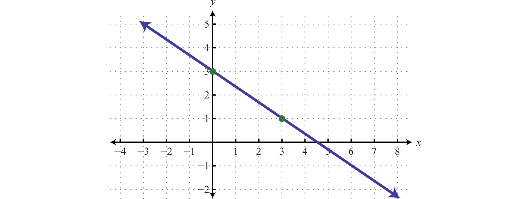
Graphing calculators, such as the TI-84 Plus CE or Casio fx-CG50, have been indispensable tools for students and professionals for decades. They bridge the gap between abstract algebra and visual representation.
Benefits & Features:
- Portability: Handheld and usable in environments where computers are not allowed (e.g., standardized tests).
- Dedicated Functionality: Optimized for mathematical operations, including plotting multiple functions simultaneously, finding intersections, determining roots (x-intercepts), and analyzing functions.
- Parameter Manipulation: Many allow you to define sliders for
mandb, enabling real-time observation of how changes in these parameters affect the graph. - Numerical Tables: Automatically generate tables of
(x, y)values for any entered function.
Mastering a graphing calculator is a skill unto itself, unlocking quick visualization and analysis capabilities that are crucial for problem-solving in STEM fields.
Online Graphing Tools and Software
The rise of the internet has given us powerful, often free, web-based graphing utilities that surpass the capabilities of many handheld calculators.
- Desmos Graphing Calculator: An industry leader known for its intuitive interface, rich feature set, and dynamic interactivity. Users can type equations, create sliders, animate graphs, and even share interactive graphs easily. Desmos is excellent for both learning and teaching due to its visual clarity and responsiveness. It excels at displaying transformations and exploring families of functions.
- GeoGebra: A more comprehensive suite that combines graphing with geometry, algebra, spreadsheets, and calculus. It’s powerful for complex mathematical explorations and constructive geometry. GeoGebra is widely used in educational settings for its versatility and collaborative features.
- Wolfram Alpha: While not primarily a graphing calculator, Wolfram Alpha can plot functions and provide detailed mathematical analysis, including intercepts, derivatives, and integrals. It’s a computational knowledge engine that offers deep insights beyond just the graph.
- Spreadsheet Software (Excel, Google Sheets): While not dedicated graphing calculators, spreadsheets are invaluable for plotting linear functions, especially when dealing with data points. You can input
xandyvalues, and then create scatter plots or line charts. This is particularly useful for linear regression analysis, where you fit a line to empirical data.
These tools eliminate the tediousness of manual plotting, ensure perfect accuracy, and offer dynamic interaction that fosters a deeper understanding of mathematical concepts.
Programming Libraries for Dynamic Visualization
For those with programming skills, libraries offer the ultimate flexibility and power in graphing and data visualization. This approach is common in data science, engineering, and research.
-
Python with Matplotlib/Seaborn: Python, combined with libraries like Matplotlib, provides granular control over every aspect of a graph. You can programmatically define functions, generate points, customize colors, labels, legends, and even create interactive plots. Seaborn builds on Matplotlib to provide higher-level interfaces for drawing attractive and informative statistical graphics. This approach is ideal for integrating graphing into larger data analysis workflows or creating custom, publication-quality visualizations.
import matplotlib.pyplot as plt import numpy as np # Define the linear function def linear_function(x, m, b): return m*x + b # Parameters m_val = 2 b_val = 3 # Generate x values x_values = np.linspace(-5, 5, 100) # 100 points between -5 and 5 # Generate y values y_values = linear_function(x_values, m_val, b_val) # Plot the function plt.figure(figsize=(8, 6)) plt.plot(x_values, y_values, label=f'y = {m_val}x + {b_val}', color='blue') plt.title('Graph of a Linear Function') plt.xlabel('x-axis') plt.ylabel('y-axis') plt.grid(True) plt.axhline(0, color='black',linewidth=0.5) plt.axvline(0, color='black',linewidth=0.5) plt.legend() plt.show() -
JavaScript with D3.js/Chart.js: For web-based interactive graphing, JavaScript libraries like D3.js (Data-Driven Documents) or Chart.js are excellent choices. D3.js offers unparalleled control over SVG graphics and animations, enabling highly customized and dynamic visualizations for web applications. Chart.js is simpler to use for standard charts, including line graphs, and is ideal for embedding interactive plots into websites with less code.
These programming approaches represent the pinnacle of technological integration for graphing, offering powerful capabilities for data exploration, scientific visualization, and web development.
Common Pitfalls and Troubleshooting
Even with the assistance of technology, certain issues can arise when graphing linear functions. Awareness of these common pitfalls can save time and prevent misinterpretations.
Misinterpreting Slope and Intercepts
One of the most frequent errors is misinterpreting the direction or steepness implied by the slope or incorrectly identifying the y-intercept.
- Slope sign error: A positive slope
mmust rise from left to right. A negativemmust fall. If your graph doesn’t match this, double-check the sign ofmin your equation or your interpretation. - Y-intercept confusion: The y-intercept is always
(0, b), not(b, 0). Ensure you’re plotting it on the y-axis.
Tech Solution: Digital tools provide immediate visual feedback. If your equation y = -2x + 5 produces a line that rises from left to right, you’ve likely made an input error or misread the graph. Interactive sliders in Desmos or GeoGebra are invaluable for understanding how m and b directly influence the graph’s appearance.
Scaling Issues in Manual and Digital Graphs
Improper scaling can distort the appearance of a linear function, making it seem steeper or flatter than it actually is.
- Manual Graphs: Unequal scales on the x and y axes can visually distort the slope. Always use consistent spacing for units on both axes if you want an accurate visual representation of steepness.
- Digital Graphs: While software handles perfect spacing, default zoom levels or aspect ratios can sometimes make a slope appear different. For instance, a very steep line might look almost vertical if the x-axis range is much wider than the y-axis range.
Tech Solution: Most graphing software allows you to adjust the window settings (x-min, x-max, y-min, y-max) or offers an “auto-zoom” feature. Desmos and GeoGebra allow you to easily drag and zoom the viewport. When comparing slopes, ensure your x and y axes have comparable visual scales (e.g., using a square grid).
Data Entry Errors in Software
The most powerful tools are only as good as the input they receive. Typos in equations are a common source of incorrect graphs.
- Missing operators: Forgetting
*in2xmight be interpreted as a variable2xinstead of2 * xin some strict parsers. - Incorrect signs:
y = -2x + 5is very different fromy = 2x + 5. - Parentheses errors: Misplaced parentheses can alter the order of operations, leading to an entirely different function.
Tech Solution: Modern graphing tools often have syntax highlighting and error messages to help identify invalid input. Double-check your equation against the original problem. For complex equations, break them down into smaller, verifiable parts if possible. Some tools also offer autocomplete or equation builders to reduce typing errors.

Conclusion
The ability to graph a linear function is more than just a mathematical exercise; it’s a fundamental skill that underpins data literacy and analytical thinking in countless fields. From plotting simple trends in a business report to visualizing complex relationships in scientific data, linear functions provide clarity and insight.
While traditional paper-and-pencil methods build a strong conceptual foundation, the modern landscape demands proficiency with digital tools. Graphing calculators, online platforms like Desmos and GeoGebra, and advanced programming libraries such as Matplotlib have revolutionized how we interact with and interpret linear functions. These technologies not only accelerate the graphing process but also offer dynamic, interactive environments that deepen understanding and minimize errors.
By embracing both the timeless principles of mathematics and the powerful capabilities of contemporary technology, you can master the art of graphing linear functions, transforming abstract equations into tangible, interpretable visual stories. Whether you’re a student, an educator, a data analyst, or simply someone looking to enhance their quantitative skills, the synergistic blend of mathematical knowledge and technological prowess will be your guide in navigating the linear landscapes of our data-rich world.
aViewFromTheCave is a participant in the Amazon Services LLC Associates Program, an affiliate advertising program designed to provide a means for sites to earn advertising fees by advertising and linking to Amazon.com. Amazon, the Amazon logo, AmazonSupply, and the AmazonSupply logo are trademarks of Amazon.com, Inc. or its affiliates. As an Amazon Associate we earn affiliate commissions from qualifying purchases.