In the pantheon of global retail giants, few names are as distinctive or as phonetically rhythmic as Lululemon. When Chip Wilson founded the company in Vancouver in 1998, he wasn’t just launching a yoga apparel line; he was architecting a brand identity that would eventually redefine the entire “athleisure” category. However, the origin of the name “Lululemon” is far more complex than a simple creative whim. It is a case study in brand strategy, phonetic psychology, and, at times, calculated controversy. To understand why Lululemon is called Lululemon is to understand the deliberate—and often provocative—decisions that go into building a multi-billion-dollar corporate identity.

The Strategic Origin: The Phonetic Experiment of Chip Wilson
The creation of a brand name is rarely an accident in the world of high-stakes retail. For Lululemon, the name was born out of a specific observation regarding international marketing and the perceived “cool factor” of Western brands in the global East.
The Power of the Letter “L”
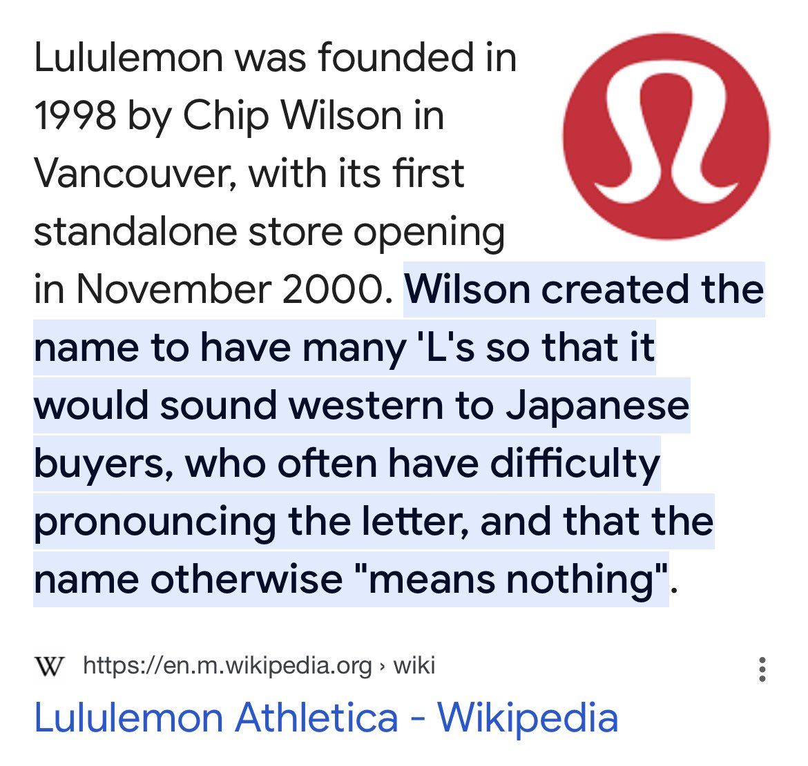
Founder Chip Wilson had previously owned a skateboard brand called “Homless.” He noticed that Japanese consumers, who were a major market for Western streetwear in the late 1990s, were particularly drawn to brand names that contained the letter “L.” Because the “L” sound does not exist as a distinct phonetic entity in the Japanese language (it is often conflated with the “R” sound), names containing the letter were perceived as authentically North American and exotic.
Wilson’s strategy was to create a name with as many “Ls” as possible to maximize this brand appeal. He famously quipped that he wanted to see if he could get “three times the money” by including three “Ls” in the name. This led to the birth of “Lululemon,” a word that essentially has no meaning in any language but serves as a rhythmic, alliterative phonetic exercise.
Brand Salience and Memorability
From a brand strategy perspective, Lululemon succeeds because it adheres to the principle of “salience.” The name is long, unusual, and fun to say. In a marketplace filled with utilitarian names like Nike (the Greek goddess of victory) or Adidas (a portmanteau of the founder’s name), Lululemon stood out because it felt whimsical yet premium. The repetition of the “lu” sound creates a linguistic “earworm,” making the brand easily recognizable even before a consumer sees the logo.
Branding Through Controversy: The Japanese Market Context
While the phonetic strategy was rooted in market research, the explanation behind the name has remained one of the most controversial aspects of the company’s history. This highlights a critical lesson in corporate identity: the narrative behind a brand is often just as impactful as the brand itself.
Cultural Implications in Brand Narrative
Wilson has stated in various interviews that the name was partially a “marketing experiment” to see if Japanese speakers would struggle to pronounce it, thereby reinforcing the brand’s Western exclusivity. While this approach helped the brand gain a foothold as a “luxury Western import,” it also created a legacy of controversy that the modern Lululemon corporate entity has worked hard to distance itself from.
In contemporary brand strategy, this is often viewed as a “high-risk, high-reward” tactic. By leaning into a name that was difficult for a specific demographic to pronounce, Wilson created an aura of “in-group” exclusivity. Those who could pronounce it and afford it were part of the “Lulu” tribe.
The Shift from Founder-Led to Corporate Identity
As Lululemon evolved from a niche yoga studio into a publicly traded powerhouse, the brand identity had to transcend the personal idiosyncrasies of its founder. This is a common phase in the lifecycle of any major brand. The name “Lululemon” eventually became decoupled from Wilson’s original explanations and began to take on a life of its own as a symbol of wellness, high-performance engineering, and community-based marketing. Today, most consumers associate the name with technical fabrics and “the sweat life” rather than its phonetic origins.
The Visual Narrative: Logo and Typography
A brand is not just a name; it is a visual language. The way “Lululemon” is presented visually is a masterclass in design cohesion.
The Omega Symbol and the Hidden “A”
Interestingly, the Lululemon logo does not feature an “L.” Instead, the stylized icon is actually a stylized “A.” This is because the original name intended for the company was “Athletiv-a.” When the name Lululemon was chosen instead, the company kept the “A” logo.
This creates an interesting layer of brand mystery. Much like the “hidden arrow” in the FedEx logo, the Lululemon “Omega-style” logo invites curiosity. From a branding standpoint, the logo acts as a “seal of quality.” It is recognizable from a distance, whether it is on the waistband of leggings or the strap of a gym bag.
Typography and Minimalism
The typography used in Lululemon’s marketing is clean, sans-serif, and modern. This balances the whimsical nature of the name. If a brand has a name as playful as “Lululemon,” the visual identity must be grounded in professional, sleek design to ensure the product is still perceived as high-performance gear. This juxtaposition is what allows Lululemon to charge premium prices; the name suggests a friendly community, while the design suggests elite technology.
Market Positioning: Building the “Athleisure” Category
The success of the name Lululemon is inextricably linked to its role in creating a new market category. Before Lululemon, workout clothes were largely seen as functional items to be worn only in the gym. Lululemon rebranded exercise as a lifestyle.
Creating a Brand “Tribe”
One of the most effective strategies Lululemon employed was the use of its name to foster community. The term “Lulu” became a shorthand among enthusiasts. By creating a name that could be easily shortened into a nickname, the brand encouraged a sense of belonging. Brand strategists call this “community-based branding.” When customers start referring to a brand by a nickname, it indicates a high level of brand intimacy and loyalty.
Scarcity and Exclusivity
Lululemon’s brand strategy also involves “selective distribution.” By naming their stores “showrooms” in the early days and focusing on local community ambassadors, they ensured the name Lululemon was associated with expertise and local influence. The name became synonymous with the “Yoga Mama” archetype—a demographic of affluent, health-conscious consumers who valued both aesthetics and performance.
Future-Proofing the Identity: From Yoga to Lifestyle
As we look toward the future of the brand, the name Lululemon faces the challenge of “brand stretch.” Can a name so closely associated with yoga successfully move into footwear, men’s apparel, and digital fitness?
Expansion and the Risk of Brand Dilution
In recent years, Lululemon has aggressively expanded into the men’s market and professional golf and tennis attire. The challenge of a unique name like Lululemon is that it carries a specific “gendered” and “activity-specific” weight. However, through clever marketing and product innovation, the brand has managed to pivot. They have positioned “Lulu” as a mark of technical excellence rather than just a yoga brand.
The Power of the “Lulu” Moniker
The brand has also leaned into its sub-brands, such as “Luon,” “Everlux,” and “Nulu.” By echoing the “Lu” sound in their fabric names, they create a cohesive brand ecosystem. This is a brilliant branding move: even when you aren’t looking at the logo, the very names of the materials remind you that you are wearing a Lululemon product.
Lessons in Brand Strategy from the Lululemon Story
The story of why Lululemon is called Lululemon offers several vital takeaways for brand managers and entrepreneurs:
- Phonetics Matter: The way a name sounds—its “mouthfeel”—can be just as important as what it means. Alliteration and rhythm can aid in brand recall.
- Narrative Control: While a founder’s story can launch a brand, the corporate identity must eventually be able to stand on its own and adapt to changing social values.
- Visual and Verbal Alignment: A name and a logo do not always have to match literally, but they must complement each other to create a “premium” feel.
- Community Shorthand: A great brand name allows for nicknames, which fosters a sense of community and “insider” status among consumers.
Lululemon’s name started as a phonetic experiment aimed at a specific international market, but it grew into a global symbol of a lifestyle movement. It proves that in the world of branding, you don’t necessarily need a word that already exists in the dictionary. You just need a word that, through consistent quality and strategic positioning, becomes a new definition for excellence in the consumer’s mind. Through its unique name, Lululemon didn’t just join a market; it mastered the art of identity.
aViewFromTheCave is a participant in the Amazon Services LLC Associates Program, an affiliate advertising program designed to provide a means for sites to earn advertising fees by advertising and linking to Amazon.com. Amazon, the Amazon logo, AmazonSupply, and the AmazonSupply logo are trademarks of Amazon.com, Inc. or its affiliates. As an Amazon Associate we earn affiliate commissions from qualifying purchases.