In the modern landscape of designer toys and collectible art, few characters have captured the global imagination quite like Labubu. Created by artist Kasing Lung and brought to life through the powerhouse production of Pop Mart, Labubu is more than just a vinyl figure; it is a centerpiece of a multi-billion dollar brand ecosystem. For collectors and brand strategists alike, the question “What does a real Labubu box look like?” is not merely a request for a visual checklist. It is an inquiry into how a brand maintains its integrity, value, and emotional connection with its audience in an era of rampant counterfeiting.
The packaging of a Labubu figure serves as the first touchpoint of the brand experience. It is a sophisticated blend of marketing psychology, intellectual property protection, and high-end manufacturing. To understand the “real” Labubu box is to understand the strategic pillars that have turned Pop Mart into a global leader in brand identity.
The Power of Visual Identity in the Pop Mart Ecosystem
The visual identity of the “The Monsters” series, featuring Labubu, is meticulously curated to evoke a sense of playfulness tempered with high-end craftsmanship. When a consumer looks at a Labubu box, they are seeing the culmination of a decade’s worth of brand positioning.
Consistency as a Brand Promise
Consistency is the bedrock of brand trust. A real Labubu box adheres to a strict style guide that ensures every product in a series feels like part of a cohesive universe. This includes the use of specific Pantone colors that remain uniform across production batches. Counterfeiters often struggle with “color drift,” where the vibrant teals or earthy browns of the Labubu palette appear slightly muted or overly saturated. For the brand, this consistency ensures that whether a box is purchased in Shanghai, London, or New York, the consumer receives the exact same brand promise.
The Psychology of the Unboxing Experience
In the “Blind Box” economy, the packaging is the product as much as the toy inside. The weight of the cardboard, the resistance of the flap, and the tactile finish of the surface are all engineered to heighten anticipation. Brand strategy dictates that the unboxing must feel premium. A genuine Labubu box uses high-grade, coated cardstock that feels rigid and smooth. This “tactile signature” is a deliberate branding choice designed to differentiate the product from mass-market toys and position it within the realm of “art toys.”
Anatomy of an Authentic Labubu Box: Design and Typography
From a design perspective, the Labubu box is a masterclass in layout and typographic hierarchy. Every millimeter of the packaging is utilized to reinforce the brand’s story and provide legal protection for the intellectual property.
Typographic Precision and Logo Placement
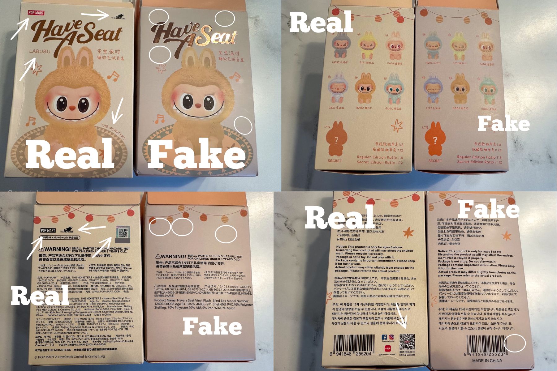
One of the quickest ways to identify a brand mismatch is through typography. On a real Labubu box, the “Pop Mart” and “The Monsters” logos are rendered with razor-sharp precision. The kerning (the space between letters) is consistent, and the font weights are never distorted. Brand strategists know that the logo is the ultimate symbol of authority. In authentic packaging, logos are often treated with a spot UV coating or a slight embossment, adding a three-dimensional quality that suggests a high level of investment in the manufacturing process—something counterfeiters rarely replicate due to cost.
Materiality: Print Quality and Finishing Techniques
The printing technology used for authentic Labubu boxes involves high-resolution offset printing. This results in clean lines and smooth gradients, especially in the character illustrations. If you examine the fur textures illustrated on the box, a genuine product will show fine, distinct lines. Furthermore, Pop Mart frequently employs matte lamination with selective gloss accents. This contrast in textures is a hallmark of sophisticated brand design, signaling to the consumer that they are holding an item of value.
Protecting Intellectual Property Through Packaging Strategy

As Labubu’s popularity has surged, so has the sophistication of those attempting to dilute the brand. Pop Mart’s brand strategy has shifted from purely aesthetic packaging to a “security-first” design philosophy.
Security Features as Brand Guardians
A real Labubu box acts as a guardian of the brand’s intellectual property. This is achieved through layered security features that are integrated into the design rather than tacked on. For instance, the placement of the “Genuine Product” sticker is deliberate. These stickers often use micro-text and intricate patterns that are visible only under magnification. By turning security into a design element, the brand communicates to its community that it is actively fighting to protect the value of their collections.
The Role of the Holographic Seal
The holographic seal on a Labubu box is perhaps the most critical brand identifier. It isn’t just a shiny sticker; it is a sophisticated anti-counterfeiting tool that features multi-angled reflections and, often, a unique tracking code. From a marketing standpoint, the hologram serves as a “seal of quality.” It provides the psychological reassurance necessary for high-ticket transactions in the secondary market. When the brand invests in expensive holographic technology, it signals its dominance and commitment to authenticity.
Brand Strategy and the Cult of Collectibility
The reason why “what a real box looks like” matters so much is tied to the financial and social capital embedded in the Labubu brand. Pop Mart has successfully turned a physical box into a vessel of scarcity and status.
Building Scarcity through Serialized Packaging
The branding strategy behind Labubu involves limited-edition runs and “chase” figures (rare variants). The packaging reflects this through serialization and specific series labeling. A real box will have clear, accurate information regarding the series number, the artist’s credits, and the distribution details. This level of transparency is essential for building a “collectibility” narrative. By making the packaging informative and professional, the brand invites the consumer to become a “connoisseur” of the product.
Community Trust and the Anti-Counterfeit Narrative
Pop Mart has fostered a brand culture where the community itself acts as a defensive wall against fakes. By educating their audience on the specific visual markers of a real box—such as the alignment of the “warning” text on the bottom or the specific texture of the internal foil bag—they have turned their customers into brand ambassadors. This strategy strengthens the bond between the brand and the consumer, creating a shared language of authenticity that adds to the brand’s overall equity.
The Evolution of Brand Verification and Future Outlook
As we move forward, the definition of what a “real” Labubu box looks like is evolving from a purely physical assessment to a hybrid of physical and digital brand markers.
Integrating Digital Anchors
Pop Mart has begun integrating QR codes that lead to official verification mini-programs. This is a brilliant brand strategy that bridges the gap between the physical toy and the digital brand ecosystem. When a user scans a real box, they aren’t just verifying a product; they are often being pulled into the brand’s digital community, where they can see upcoming releases and interact with other fans. This turns a routine “authenticity check” into a brand engagement opportunity.
The Sustainability of Brand Identity
Looking ahead, the brand faces the challenge of maintaining its premium feel while moving toward more sustainable packaging. The “real” Labubu box of the future may use recycled polymers or soy-based inks. The strategic challenge for Pop Mart will be to ensure that these eco-friendly materials still convey the same sense of luxury and authenticity. How the brand navigates this transition will be a testament to its resilience and its ability to stay relevant in a changing global market.
In conclusion, a real Labubu box is a complex artifact of modern branding. It is defined by its typographic precision, its high-quality material finishes, and its sophisticated security features. For the collector, these details are a guarantee of value; for the brand, they are the front line of defense in maintaining a multi-million dollar global identity. Understanding these nuances is essential for anyone looking to navigate the vibrant, high-stakes world of designer toys. Whether you are a casual fan or a serious investor, the box is the first and most important chapter in the story of the Labubu brand.
aViewFromTheCave is a participant in the Amazon Services LLC Associates Program, an affiliate advertising program designed to provide a means for sites to earn advertising fees by advertising and linking to Amazon.com. Amazon, the Amazon logo, AmazonSupply, and the AmazonSupply logo are trademarks of Amazon.com, Inc. or its affiliates. As an Amazon Associate we earn affiliate commissions from qualifying purchases.