
In the Star Wars universe, a lightsaber is more than just a weapon; it is a reflection of the wielder’s soul, their philosophical alignment, and their role within the galaxy. The color of the blade—determined by the attunement of a Kyber crystal—communicates an immediate message to allies and enemies alike. In the world of modern business, your brand identity functions in much the same way. Before a customer reads your mission statement or trials your product, they “see” your brand’s color, energy, and intent.
When we ask the question, “What color of lightsaber are you?” in a corporate context, we are really asking: What is your brand’s fundamental archetype? How do you position yourself in the marketplace, and what emotional resonance do you leave behind? Choosing your brand’s “lightsaber color” is one of the most critical strategic decisions in brand development, as it dictates how you will be perceived in a crowded and competitive galaxy.

The Psychology of Color in Brand Strategy
In brand strategy, color is not merely an aesthetic choice; it is a psychological trigger. Research suggests that up to 90% of snap judgments made about products can be based on color alone. Like the Jedi and Sith, brands use specific hues to signal their values and operational styles.
Blue: The Guardian of Trust and Reliability
In the Star Wars mythos, blue lightsabers are typically associated with Jedi Guardians—those who focus on combat, protection, and the physical defense of the light. In branding, blue is the color of the “Guardian” archetype. It represents stability, intelligence, and trust.
Tech giants and financial institutions like IBM, Chase, and Dell utilize blue to signal that they are dependable stewards of data and wealth. If your brand identifies as a “Blue Lightsaber,” your strategy focuses on consistency, security, and becoming an industry standard. You are not necessarily looking to disrupt the market with chaos; you are looking to stabilize it through excellence.
Green: The Sage of Innovation and Growth
Green lightsabers are often wielded by Jedi Consulars—those who prefer meditation, diplomacy, and a deep connection to the Living Force. In the business world, a green identity signifies a “Sage” or “Nurturer” brand. This color is synonymous with growth, health, and ethical sustainability.
Brands like Starbucks, Whole Foods, and Shopify lean into green to emphasize their role in fostering ecosystems and promoting well-being. A “Green Lightsaber” brand wins by positioning itself as the wise choice—the brand that understands the “big picture” and prioritizes long-term environmental or social health over short-term aggression.
Red vs. Purple: Power Dynamics and Market Disruption
If blue and green represent the established order and wisdom, other colors represent the outliers—the disruptors and the high-status icons. These colors demand attention and signal a different kind of relationship with the consumer.
Red: The Aggressive Market Challenger
In the cinematic universe, red is the color of the Sith, created by “bleeding” a crystal through sheer will and passion. In branding, red is the ultimate “Challenger” color. It is visceral, high-energy, and impossible to ignore. It triggers physical responses—increasing heart rates and stimulating appetite.
Brands like Red Bull, Netflix, and Coca-Cola use red to signal dominance, excitement, and a bias toward action. If your brand is a “Red Lightsaber,” you are likely a market leader or an aggressive challenger. You don’t wait for the market to come to you; you command the market’s attention through bold campaigns and high-intensity engagement. Your brand strategy is built on passion and the refusal to be sidelined.
Purple: The Rare Fusion of Luxury and Authority
Mace Windu’s purple blade is a rarity, signaling a balance between the light and dark, or a unique mastery of both. In brand strategy, purple represents the “Ruler” or the “Magician.” It is the color of royalty, luxury, and mystery.
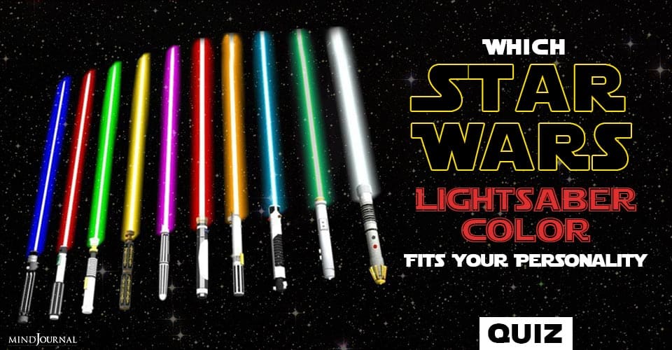
Because purple occurs less frequently in nature, it carries a connotation of being premium and “above the fray.” Brands like Rolex or Hallmark use purple (or its associations) to denote a level of quality that is beyond the reach of the average competitor. A “Purple Lightsaber” brand strategy is about exclusivity. You aren’t for everyone; you are for those who seek the extraordinary.
Building Your “Kyber Crystal”: Authenticity as a Brand Core
The color of a lightsaber is not painted on; it emanates from the core. Similarly, a brand’s visual identity must be an authentic extension of its internal values. If a brand tries to wear “Green” (sustainability) while operating with “Red” (aggressive, unethical exploitation), the “Kyber crystal” of the brand will eventually shatter under the pressure of public scrutiny.
Aligning Internal Values with External Perception
To determine what color your brand truly is, you must look at your internal culture. A brand that prides itself on “moving fast and breaking things” (Red) but markets itself as a “stable, legacy partner” (Blue) creates cognitive dissonance for the consumer. This misalignment is where brand equity is lost.
Strategic brand audits often reveal that a company’s “lightsaber” is flickering because the leadership’s vision doesn’t match the visual messaging. Authentic branding requires a deep dive into the brand’s “Force”—its mission, vision, and values—to ensure that the color chosen for the logo and UI reflects the reality of the service provided.
Consistency Across Touchpoints
Once your color is chosen, it must remain consistent across all “sectors of the galaxy.” From your website’s CSS to your physical packaging and even the tone of your social media responses, the color must be pervasive. This is known as “Visual Cohesion.” A Jedi’s blade doesn’t turn yellow just because they are on a different planet; your brand should not lose its identity when transitioning from a mobile app to a retail storefront.
Case Studies: Galactic Success in the Modern Market
By observing how major corporations handle their visual identity, we can see the “lightsaber” theory in practice.
Apple’s White/Silver Minimalist “Jedi” Approach
Apple’s evolution from the rainbow logo to the minimalist silver/white/black aesthetic represents a shift toward the “Jedi Master” archetype. White and silver signal purity, simplicity, and futuristic sophistication. Apple positions itself as the “Light” in a world of cluttered, “Dark” technology. Their strategy is one of subtraction—removing the unnecessary to reveal the essential.
Coca-Cola’s Red “Sith” Energy
Coca-Cola has owned the color red for over a century. Their strategy is one of “Universal Dominance.” They are everywhere, they are bold, and they represent the “Sith-like” intensity of joy and passion. By maintaining this high-energy red, they ensure that they are the first thing a thirsty consumer sees in a crowded supermarket aisle.
Choosing Your Path: A Strategic Roadmap for Brand Evolution
If you are currently evaluating your brand, or if you are in the process of a rebrand, you must choose your color with strategic intent. It is not about which color you “like,” but which color helps you achieve your business objectives.
Rebranding and Color Shifts
Sometimes, a brand must “heal” its crystal and change colors. This often happens during a pivot. A tech startup might start as “Red” (aggressive, disruptive) to gain market share, but as it matures and prepares for an IPO, it might shift toward “Blue” (reliable, corporate) to appease investors and institutional partners. This transition must be handled delicately; if you change your color too abruptly, you risk alienating the “Rebel Alliance” of early adopters who loved your original spark.

Measuring the Impact of Visual Identity
Modern branding allows us to use A/B testing and AI-driven analytics to see how color affects conversion rates. Before settling on your “lightsaber color,” use data to validate your intuition. Does your “Green” eco-friendly landing page actually convert better than a “Blue” trust-focused one? The data is the “Force” that guides your hand, ensuring that your strategic choice is backed by the reality of consumer behavior.
In conclusion, “What color of lightsaber are you?” is the most important question a brand strategist can ask. It defines your mission, your enemies, and your place in the marketplace. Whether you are the Blue Guardian of stability, the Green Sage of innovation, or the Red Challenger of the status quo, your color is your signal to the world. Choose it wisely, wield it with consistency, and ensure that your brand’s core remains as unbreakable as a Kyber crystal.
aViewFromTheCave is a participant in the Amazon Services LLC Associates Program, an affiliate advertising program designed to provide a means for sites to earn advertising fees by advertising and linking to Amazon.com. Amazon, the Amazon logo, AmazonSupply, and the AmazonSupply logo are trademarks of Amazon.com, Inc. or its affiliates. As an Amazon Associate we earn affiliate commissions from qualifying purchases.