In the world of global branding, few entities command as much visual recognition as Disney. At the heart of this empire lies a color palette that has become synonymous with storytelling excellence, character integrity, and multi-billion-dollar merchandising. When we ask the question, “What color is Snow White’s dress?” we are not merely discussing a costume choice from 1937; we are examining one of the most successful examples of brand identity in history.
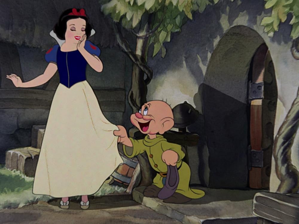
Snow White’s dress—consisting of a navy blue bodice, a bright canary yellow skirt, and puffed sleeves with red teardrop accents—is a masterclass in brand strategy. It utilizes a primary color triad that transcends language barriers and cultural shifts. For branding professionals, the dress is an archetypal case study in how visual consistency builds a “corporate moat” that lasts for generations.

The Anatomy of a Visual Identity: Breaking Down the Snow White Palette
The primary colors of Snow White’s ensemble were not chosen by chance. In the late 1930s, Walt Disney and his team of animators were pioneering the use of Technicolor, and they understood that for a brand to resonate, it needed high contrast and psychological weight.
The Psychology of Royal Blue and Navy
The bodice of the dress is a deep, saturated blue. In brand strategy, blue is the color of trust, reliability, and royalty. By anchoring the character in this shade, Disney established Snow White as a figure of virtue and stability. Unlike a lighter blue, which might suggest flightiness or innocence alone, the navy/royal blue adds a layer of sophistication and “brand authority” that has allowed the character to anchor a massive media franchise.
The Vibrancy of Canary Yellow
The skirt provides the most significant visual real estate of the character design. Yellow is the color of optimism, warmth, and visibility. From a marketing perspective, yellow is one of the easiest colors for the human eye to process from a distance. Whether on a cinema screen or a toy shelf in a crowded retail store, the bright yellow skirt acts as a beacon, ensuring that the brand asset is immediately identifiable.
Red Accents as Emotional Triggers
The “blood-red” accents on the sleeves and the iconic headband serve as the “call to action” in this visual composition. Red is associated with energy, passion, and danger. In Snow White’s brand identity, these small splashes of red prevent the character from feeling too passive. They provide a visual pop that draws the eye to the face and the movement of the character, creating a dynamic brand image rather than a static one.
Consistency as a Corporate Moat: How Disney Maintains Character Integrity
One of the most difficult challenges in brand management is maintaining consistency across decades and various media formats. Snow White has appeared in films, theme parks, digital games, and on millions of pieces of apparel. The “brand” of Snow White’s dress is protected through rigorous style guides and corporate identity standards.
The Role of Color Standardization
Disney utilizes proprietary color specifications to ensure that “Snow White Yellow” looks exactly the same in a Tokyo theme park as it does on a lunchbox in New York. This level of standardization is what separates a world-class brand from a generic character. When a consumer sees a variation of these three colors in that specific configuration, the mental “shortcut” immediately goes to Disney. This is the ultimate goal of visual branding: to own a specific color relationship in the consumer’s mind.
Brand Protection and the “Disney Vault”
For years, the brand equity of Snow White was maintained through a strategy known as the “Disney Vault.” By limiting the availability of the film, Disney increased the “prestige value” of the brand assets. When the character was seen, it felt like an event. The colors of the dress became part of a scarce, high-value cultural currency. Today, even in the era of streaming, the visual identity is guarded with legal and creative ferocity to prevent brand dilution.
Cross-Generational Appeal
Because the colors are so fundamental (the primary triad), they do not go out of style. Trends in “neon” or “minimalist beige” come and go, but the Snow White palette remains relevant. This longevity is a core objective of brand strategy—creating an identity that does not require a “rebrand” every decade, thereby saving millions in marketing costs and preserving historical brand equity.
Color Theory in Marketing: Why the Primary Triad Works

To understand why Snow White’s dress color is so effective, one must look at the science of color theory. The dress utilizes a “triadic color scheme,” which involves three colors spaced evenly around the color wheel. This is a foundational principle in both art and high-level brand design.
Balanced Contrast and Consumer Perception
The triadic scheme is inherently vibrant and balanced. In marketing, balance leads to a feeling of “completeness” for the consumer. When a child—or a parent—looks at Snow White, the visual experience is satisfying. This satisfaction translates into brand affinity. The contrast between the cool blue and the warm yellow creates a visual “vibration” that makes the character stand out against any background, whether it’s a dark forest in a movie or a bright white website.
Simplicity as a Scalability Factor
Great brands are simple. Think of the Apple logo or the Nike swoosh. Snow White’s dress follows this rule of simplicity. It can be reduced to three blocks of color and still be recognized. This scalability is vital for modern branding. A character design must work as a 16×16 pixel icon, a high-definition 4K render, and a physical mascot costume. The bold, primary colors of Snow White allow for this seamless transition across all platforms.
The “Hero” Archetype in Visual Design
In character branding, colors often denote the archetype. The blue/red/yellow combination is the “Heroic Triad.” It is the same palette used for Superman and Wonder Woman. By utilizing this specific color story, Disney’s brand strategists subconsciously positioned Snow White not just as a fairy tale character, but as a heroic icon. This positioning expanded the brand’s reach from “niche children’s story” to “universal cultural symbol.”
From Cinema to Commerce: The Merchandising Power of Character Design
The ultimate test of a brand’s visual identity is its ability to generate revenue. Snow White’s dress is not just a costume; it is a product silhouette that has been sold millions of times over.
The Licensing Goldmine
Disney’s licensing department relies heavily on the “at-a-glance” recognizability of the dress colors. When a third-party manufacturer creates a product, the color specifications are the most critical part of the contract. If the yellow is too orange, or the blue is too light, the “brand promise” is broken. By keeping the colors of Snow White’s dress consistent, Disney ensures that all licensed products contribute to the same unified brand narrative.
The “Princess” Franchise Strategy
In the early 2000s, Disney formalized the “Disney Princess” brand. Snow White’s dress served as a blueprint for this multi-billion dollar franchise. Each princess was assigned a signature color or palette to ensure they didn’t compete visually with one another. Snow White “owns” the primary triad, Cinderella owns “Powder Blue,” and Belle owns “Golden Yellow.” This strategic segmentation of color allows Disney to sell the same product (a doll or a dress) in different colors to the same customer, maximizing the “share of wallet.”
Visual Cues in Retail Environments
In a retail setting, color is the first thing a shopper notices. The bold yellow of Snow White’s skirt is a powerful tool for “stopping power” in aisles. Retailers often use these high-visibility brand assets to draw foot traffic into the toy or clothing sections. The dress acts as a silent salesperson, leveraging decades of emotional connection through a simple color combination.
The Evolution of Brand Assets: Modernizing an 80-Year-Old Identity
While the core colors of Snow White’s dress have remained the same, the way they are presented has evolved to meet modern technological and branding standards. This is the final stage of sophisticated brand management: evolution without alienation.
Digital Rendering and Materiality
In the original 1937 film, the colors were hand-painted. In the 21st century, these colors have been translated into the digital realm. Branding experts worked to find the digital “Hex codes” that felt true to the original ink-and-paint while looking vibrant on OLED screens and mobile devices. This digital transformation ensures the brand remains relevant in a tech-heavy world.
Adapting to Modern Consumer Ethics
Today, branding also involves the ethics of production. The “colors” of Snow White are now associated with Disney’s corporate social responsibility initiatives. How the dyes are sourced for the physical dresses sold in parks and how those colors are marketed to a more diverse, global audience are part of the modern brand strategy. The dress has become a canvas for “inclusive branding,” showing that while the colors remain iconic, the brand’s values can grow.
Conclusion: More Than Just a Dress
The question of what color Snow White’s dress is may seem simple, but the answer is a complex tapestry of brand strategy, color psychology, and meticulous corporate management. By choosing a primary triad of blue, yellow, and red, Disney created a visual identity that is virtually indestructible.
It is a reminder to all brand builders that the choices made at the inception of a project—the specific shade of a logo, the contrast of a product’s packaging—can have a legacy that lasts for nearly a century. Snow White’s dress is a testament to the power of color to create an emotional, lasting, and highly profitable connection with a global audience. It is not just a dress; it is a masterstroke of branding.
aViewFromTheCave is a participant in the Amazon Services LLC Associates Program, an affiliate advertising program designed to provide a means for sites to earn advertising fees by advertising and linking to Amazon.com. Amazon, the Amazon logo, AmazonSupply, and the AmazonSupply logo are trademarks of Amazon.com, Inc. or its affiliates. As an Amazon Associate we earn affiliate commissions from qualifying purchases.