In the vast and intricate universe of brand identity, color reigns supreme as a silent communicator, a potent influencer, and an immediate identifier. More than just an aesthetic choice, the hues a brand embraces meticulously craft its narrative, evoke emotions, and carve out its unique position in the market. While primary colors assert themselves with bold confidence, it’s often the subtle, nuanced shades that confer a deeper layer of sophistication and distinctiveness. Among these, “gray green” stands out – a color often misunderstood, yet possessing an extraordinary capacity to define a brand with quiet authority and profound elegance. This article delves into the essence of gray green, exploring its chromatic makeup, psychological impact, and strategic application in forging a compelling and enduring brand presence. Understanding this understated hue is not merely about identifying a shade; it’s about unlocking a powerful tool for sophisticated brand differentiation.

The Chromatic Spectrum: Defining Gray Green
To leverage gray green effectively in branding, it’s crucial to first understand its precise position within the color spectrum and how it distinguishes itself from similar tones. This foundational understanding allows designers and marketers to wield its unique qualities with precision and intent.
Deconstructing the Hue
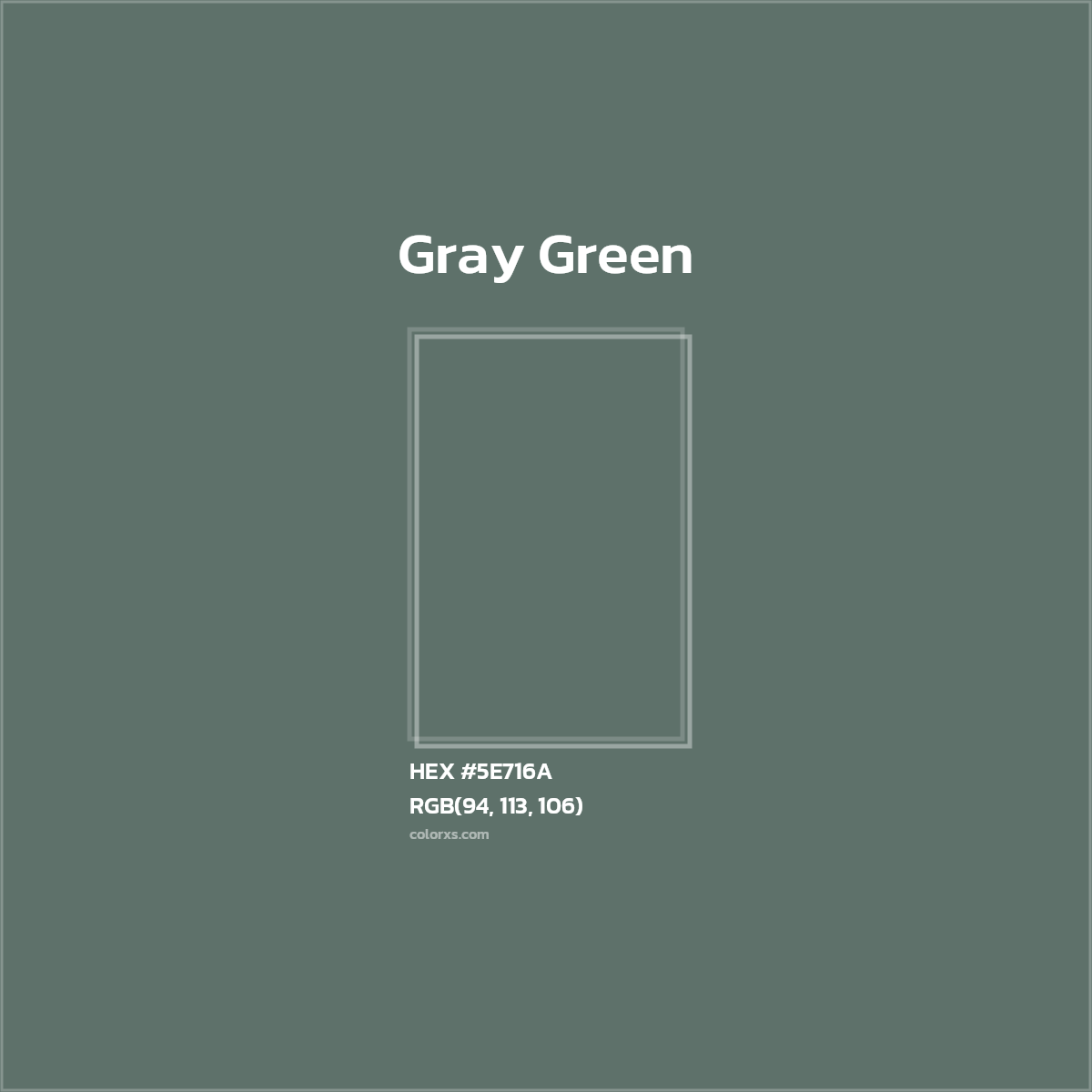
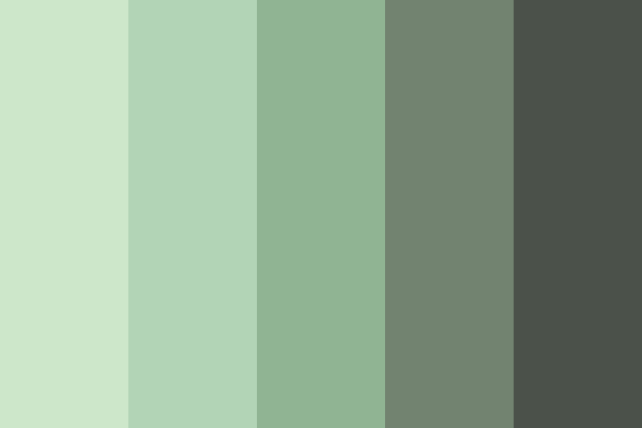
Gray green is not a primary, secondary, or even a simple tertiary color in the traditional sense. It is, instead, a sophisticated compound hue formed by the careful integration of green with a substantial amount of gray. Imagine a vibrant green, then progressively desaturate it by blending in varying degrees of gray until its inherent vibrancy mellows into a subtle, earthy, and muted tone. The result is a color that retains the organic essence of green while gaining the neutrality and timelessness of gray.
This unique combination positions gray green as a chameleon of sorts – it often straddles the line between cool and warm, depending on the specific undertones of green (more yellow or blue) and the proportion of gray. A blue-leaning green with gray will feel cooler and more contemplative, while a yellow-leaning green with gray might evoke a slightly warmer, more organic feel. What remains consistent is its desaturated quality, which lends it an inherent sophistication. It’s a color that speaks of nature, not in its exuberant youth, but in its mature, enduring form – like moss on ancient stones or the subdued foliage of a winter forest. This inherent earthiness, coupled with gray’s contemporary edge, makes it incredibly versatile.
Distinguishing Gray Green from Similar Tones
The nuances of color can be incredibly subtle, and gray green is often confused with other muted greens. However, its defining characteristic – the significant gray component – sets it apart.
- Olive Green: While also earthy, olive green typically carries a much stronger yellow or brownish undertone, making it appear warmer and often more military-inspired or rustic. Gray green lacks this prominent yellow warmth, leaning more towards a cooler or more neutral desaturation.
- Sage Green: Sage green, another popular muted green, tends to be lighter, softer, and often possesses a more pastel-like quality. Its gray component is usually less dominant, allowing the “green” aspect to feel more delicate and ethereal. Gray green, conversely, often feels denser, more grounded, and less overtly “pretty” than sage.
- Forest Green: Forest green is deep, rich, and saturated, evoking dense woodland. It has minimal to no gray component, prioritizing depth and intensity over subtlety. Gray green stands in stark contrast, opting for a quiet subtlety over forest green’s bold statement.
For precision in digital and print applications, understanding specific color codes is vital. While there’s no single “gray green,” examples might range in HEX values from #4A5D4A to #778877, showing varying degrees of green and gray saturation. RGB and CMYK values further define how these subtle differences translate across different media, ensuring brand consistency. The key is to identify the precise blend that resonates with a brand’s unique identity, moving beyond generic descriptions to specific chromatic data.
The Psychology and Perception of Gray Green in Branding
Beyond its technical definition, the true power of gray green in branding lies in its psychological and emotional resonance. A brand’s color palette is not just seen; it’s felt, and gray green offers a nuanced spectrum of feelings that can profoundly shape consumer perception.
Emotional and Symbolic Associations
Gray green is a master of nuanced communication, blending the core associations of its constituent colors to create unique symbolic weight.
From its green lineage, gray green inherits powerful associations with nature, growth, balance, and tranquility. Green is inherently linked to the environment, sustainability, and renewal, making it a natural choice for brands wishing to convey an eco-conscious or organic ethos. It evokes a sense of freshness, vitality, and health, resonating with consumers seeking natural solutions or a connection to the earth.
Simultaneously, the gray component introduces qualities of sophistication, maturity, seriousness, and timelessness. Gray is often associated with wisdom, neutrality, and understated elegance. It anchors green’s vivacity, preventing it from appearing too playful or overtly “natural.” Instead, it grounds the green, infusing it with a sense of stability, reliability, and quiet confidence.
When combined, these elements create a sophisticated palette of emotions:
- Organic Modernity: It suggests a brand that is both deeply rooted in natural principles and forward-thinking, clean, and contemporary.
- Quiet Confidence: Unlike bold, flashy colors, gray green doesn’t demand attention; it earns it through its understated grace, conveying a brand that is assured and authentic.
- Understated Elegance: It speaks of luxury that is not ostentatious but refined, tasteful, and enduring.
- Calm & Balance: In a visually noisy world, gray green offers a sense of peace and equilibrium, making it appealing for brands in wellness, home decor, or restorative services.
- Trustworthiness & Stability: The muted, grounded quality suggests reliability and a steadfast commitment to quality.
These layered associations make gray green incredibly powerful for brands seeking to communicate depth, responsibility, and refined taste without resorting to overly simplistic or vibrant palettes.
Target Audience and Brand Persona
The choice of gray green for a brand’s identity often signals a deliberate strategy to appeal to specific demographics and to project a particular brand persona. This color isn’t for every brand, but for those it suits, its impact can be profound.
Brands that successfully employ gray green often target consumers who value:
- Sustainability and Eco-consciousness: Its inherent link to nature, made sophisticated by gray, appeals to environmentally aware individuals seeking ethical and green products or services. This could be in sustainable fashion, organic food, or renewable energy.
- Luxury and Refinement (Understated): It resonates with affluent consumers who appreciate quality and design that is subtle, timeless, and not overtly flashy. Think high-end architectural firms, bespoke furniture makers, or luxury skincare brands focused on natural ingredients.
- Wellness and Serenity: Brands in the health, wellness, spa, or meditation sectors can use gray green to evoke calm, healing, and a sense of peaceful retreat.
- Innovation and Thoughtfulness (Tech/Design): For certain tech brands, particularly those focused on user experience, digital wellbeing, or sustainable technology, gray green can communicate innovation that is grounded, responsible, and human-centric. It suggests a thoughtful approach rather than pure, unbridled speed.
- Professionalism and Stability: Financial advisory firms, legal practices, or corporate entities seeking to convey stability, trustworthiness, and a serious, grounded approach without being overtly traditional can find gray green to be an excellent choice.
The brand persona communicated by gray green is typically one of integrity, quiet leadership, sophistication, and a deep-rooted commitment to quality and values. It projects an image of a brand that is mature, discerning, and has a strong sense of purpose, often appealing to an educated and discerning clientele who appreciate nuance over overt showmanship.
Strategic Application: Leveraging Gray Green in Corporate Identity and Marketing
The theoretical understanding of gray green translates into tangible strategic decisions across all touchpoints of a brand. Its versatility allows it to be integrated into various aspects of corporate identity and marketing, from the smallest icon to the largest billboard.
Logo and Visual Identity Design
The logo is the cornerstone of a brand’s visual identity, and the careful application of gray green here can set a powerful tone. As a primary color, gray green can anchor a logo, lending it an air of timelessness and sophistication. It works exceptionally well for brands that want their mark to feel established, dependable, and quietly authoritative.
When used as a secondary or accent color, gray green can introduce a subtle organic touch or a sophisticated contrast to a brand’s main palette. For example, a tech company with a primarily blue identity might use gray green for specific branding elements to highlight their commitment to sustainability or user wellness.
Pairing with complementary colors is key to maximizing its impact:
- Neutrals: Cream, beige, off-white, and charcoal grays create harmonious, elegant palettes, enhancing gray green’s understated appeal. This combination often feels organic, minimalist, and high-end.
- Metallics: Gold, brushed silver, or bronze accents can elevate gray green, adding a touch of luxury and warmth without overpowering its subtlety. This pairing is excellent for premium products or services.
- Deep Blues/Navies: These provide a sophisticated contrast, creating a palette that feels professional, trustworthy, and balanced.
- Muted Pinks/Terra Cottas: For a softer, more contemporary feel, subtle pinks or earthy reds can introduce warmth and approachability, balancing gray green’s potential coolness.
The impact on brand recognition and recall is subtle but strong. A well-designed gray green logo isn’t screaming for attention; it’s embedding itself in the viewer’s memory as a symbol of thoughtful quality and refined taste.
Website and Digital Presence
In the digital realm, color choices directly impact user experience (UX) and overall brand perception. Gray green offers unique advantages for websites and digital interfaces.
As a background color, a subtle gray green can create a calming, sophisticated canvas, especially effective for wellness sites, luxury brands, or portfolios where the content itself should shine without visual distraction. It provides excellent legibility for dark or light text, reducing eye strain and contributing to a comfortable browsing experience.
Used for text or interactive elements, a slightly darker gray green can offer a soft alternative to harsh black, maintaining readability while contributing to a softer, more inviting aesthetic. For call-to-action buttons, it can suggest a ‘natural choice’ or an ‘eco-friendly option,’ aligning with brand values.
Crucially, consistency across digital platforms is paramount. Ensuring that the specific HEX/RGB values for gray green are uniformly applied across websites, apps, social media profiles, and digital advertising maintains a cohesive brand experience. This consistency reinforces trust and brand recognition, signaling professionalism and attention to detail.
Packaging and Physical Touchpoints
For physical products, packaging, and retail environments, gray green translates beautifully into tangible experiences, evoking sensory connections that strengthen brand identity.
In product packaging, gray green can immediately convey concepts of natural ingredients, sustainability, or premium quality. Imagine a skincare product in a minimalist gray-green package, suggesting purity and organic efficacy. The tactile feel of the packaging material, combined with the color, can create a holistic sensory experience – a smooth, matte finish can enhance the color’s sophisticated subtlety.
For retail environments, gray green can be used on walls, furniture, or fixtures to create a calming, upscale, and inviting atmosphere. It promotes a sense of peace and comfort, encouraging customers to linger and engage with products. In hospitality, it can create tranquil hotel rooms or sophisticated lounge areas.
Uniforms and stationery bearing the gray green hue extend the brand’s identity to its people and its everyday operations. It projects an image of professionalism, trustworthiness, and a grounded approach, reinforcing the brand’s values in every interaction. The inherent natural quality of gray green also naturally aligns with brands advocating for sustainable practices, completing the circular narrative of their eco-conscious mission.
Case Studies and Emerging Trends
The increasing popularity of gray green and similar muted tones isn’t arbitrary; it reflects a broader shift in consumer preferences and design philosophies. Examining its successful application and its place in current trends further underscores its strategic importance.
Brands That Master Gray Green
While specific brand names using a very specific “gray green” can be challenging to pinpoint without extensive competitive analysis, we can envision how brands across various sectors successfully embody this aesthetic:
- “TerraBloom Organics”: A high-end natural skincare brand uses a deep, rich gray green as its primary color for packaging and web design. This choice immediately communicates organic purity, natural ingredients, and a sophisticated approach to beauty. The color suggests efficacy and a connection to botanical sources without being overtly rustic, appealing to discerning consumers who value both nature and luxury. Their use of minimalist typography and gold foil accents elevates the gray green, reinforcing a premium, eco-luxe positioning.
- “Arbor Architects”: An architectural firm specializing in sustainable, biophilic design might adopt a muted, slightly bluish gray green as its brand color. This choice reflects their commitment to integrating nature into urban spaces and their thoughtful, considered approach to design. The gray component speaks to their professionalism and structural integrity, while the green emphasizes their ecological focus. Their brochures and website would heavily feature this color, often paired with earthy neutrals and clean lines, projecting a sense of harmony and responsible innovation.
- “CalmSpace Tech”: A meditation app or a smart home device company focused on creating tranquil environments could use a soft, desaturated gray green in its UI/UX. This color choice contributes to a sense of calm and well-being, enhancing the user’s experience. It avoids the clinical feel of pure gray or the overwhelming vibrancy of pure green, providing a gentle, inviting digital space that supports relaxation and focus. The gray green signifies technology that nurtures, rather than merely functions.
These examples illustrate how gray green, in its various shades, can be strategically deployed to reinforce specific brand messages, appeal to target demographics, and create a unique identity that stands out through its refined subtlety.
The Evolving Appeal of Muted Tones
The contemporary design landscape is increasingly embracing muted, earthy, and sophisticated palettes, and gray green fits perfectly within this broader movement. There’s a noticeable shift away from the overly bright, synthetic, or digitally-saturated colors that dominated some earlier periods.
This trend is driven by several factors:
- Authenticity and Transparency: Consumers are increasingly seeking brands that feel genuine and authentic. Muted tones, like gray green, often feel more “real” and less artificial, aligning with a desire for transparency and honesty.
- Sustainability Consciousness: As environmental concerns grow, colors associated with nature and natural materials gain prominence. Gray green inherently carries this eco-friendly connotation.
- Mindfulness and Wellness: In a fast-paced, high-stress world, there’s a growing appreciation for spaces and brands that evoke calm, peace, and mental well-being. Muted colors contribute to this serene aesthetic.
- Timelessness and Longevity: Highly saturated or trendy colors can quickly become dated. Muted palettes, by contrast, tend to have a timeless quality, ensuring that brand identities remain relevant and sophisticated for longer periods, reducing the need for costly rebrands. This translates into stronger brand equity and consistent messaging over time.
Gray green, with its elegant blend of nature and neutrality, is positioned as a key player in this evolution. It offers brands a way to communicate depth, responsibility, and refined taste without resorting to fleeting trends or loud declarations. Its enduring appeal lies in its ability to quietly anchor a brand in values that resonate deeply with modern consumers.
In conclusion, the seemingly simple question “what color is gray green?” unravels a complex and strategically rich answer for brands. It is a color of understated power, a sophisticated blend that speaks volumes through its quiet presence. By meticulously defining its chromatic makeup, understanding its profound psychological impact, and applying it strategically across all brand touchpoints, businesses can harness gray green to craft an identity that is not only memorable but also deeply resonant, authentic, and enduringly elegant. In a world clamoring for attention, gray green offers the distinguished voice of quiet confidence and genuine purpose.
aViewFromTheCave is a participant in the Amazon Services LLC Associates Program, an affiliate advertising program designed to provide a means for sites to earn advertising fees by advertising and linking to Amazon.com. Amazon, the Amazon logo, AmazonSupply, and the AmazonSupply logo are trademarks of Amazon.com, Inc. or its affiliates. As an Amazon Associate we earn affiliate commissions from qualifying purchases.