
In the modern marketplace, a brand is far more than a logo or a catchy slogan; it is an emotional ecosystem. When a consumer interacts with a company, their first impression is rarely formed by reading a mission statement or analyzing a product feature list. Instead, that impression is forged in milliseconds through visual stimuli. At the heart of this visual communication lies color.
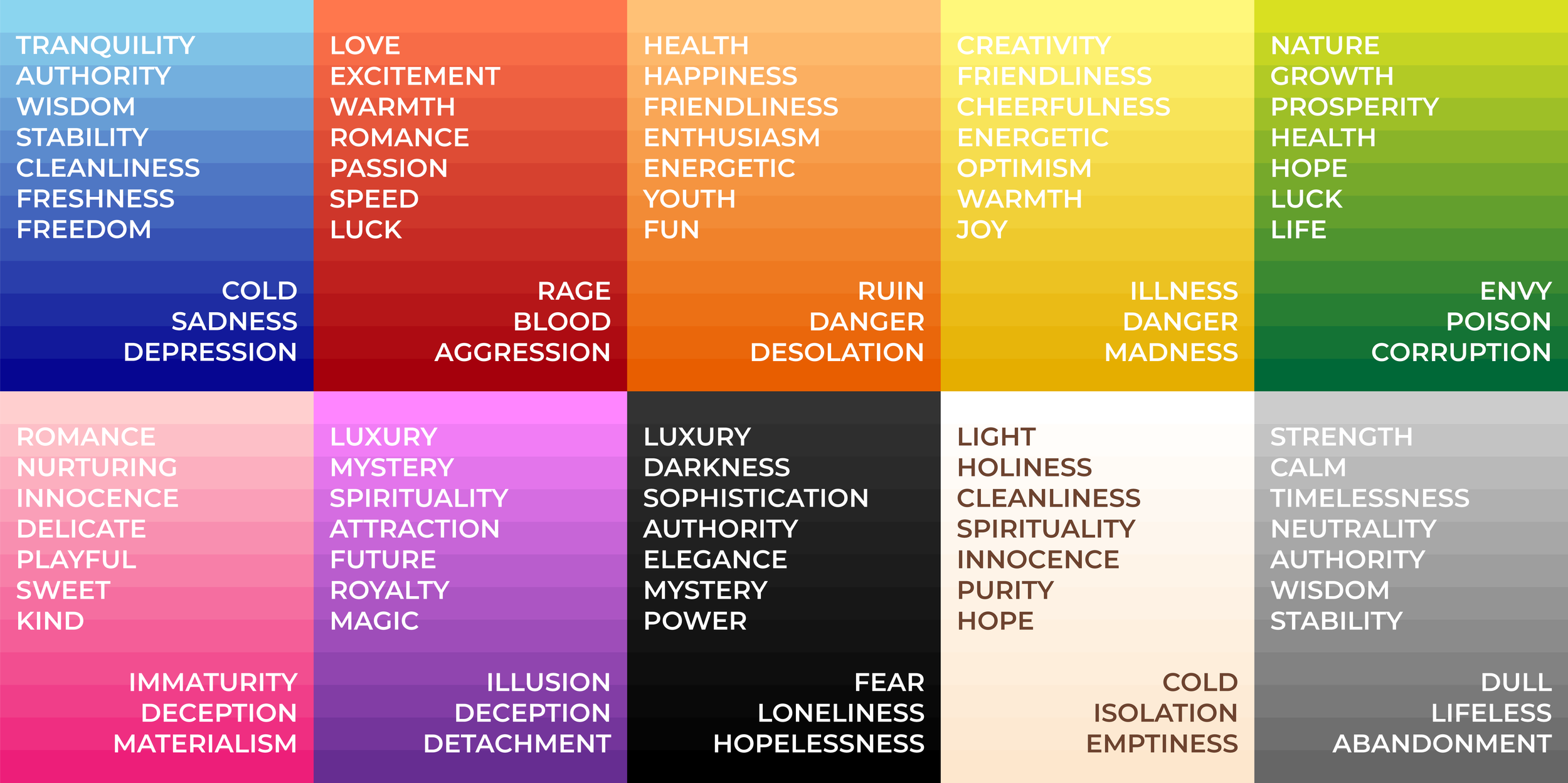
So, what does the color mean? From a branding perspective, color is a silent language that bypasses logical reasoning and speaks directly to the subconscious. It dictates how a brand is perceived, how much a consumer trusts a service, and whether a product feels premium or budget-friendly. Understanding the strategic application of color theory is essential for any business looking to build a cohesive corporate identity and a lasting market presence.

The Psychology of Color in Brand Identity
Color psychology is the study of how different hues affect human behavior and decision-making. In branding, this isn’t just about choosing a “pretty” palette; it is about selecting colors that align with the brand’s core values and the emotional response it intends to evoke in its target audience.
The Emotional Spectrum of Primary Hues
Every color carries a specific psychological weight. For instance, Blue is the most widely used color in corporate branding, particularly in finance, technology, and healthcare. This is because blue is scientifically associated with the sky and the sea—constants in human life that represent stability, trust, and intelligence. When a brand like Chase or LinkedIn uses blue, they are attempting to signal reliability.
In contrast, Red is a high-energy color. It increases the heart rate and creates a sense of urgency or passion. It is no coincidence that clearance sales often use red banners, or that food brands like KFC and McDonald’s utilize it to stimulate appetite and excitement.
Green has shifted its meaning over the last few decades. While it traditionally represented growth and wealth (the color of currency), it is now the universal shorthand for sustainability, health, and organic quality. Brands like Whole Foods or Starbucks leverage green to position themselves as environmentally conscious and community-oriented.
Subconscious Triggers and Consumer Behavior
Beyond simple associations, color influences the “personality” of a brand. A brand using Purple often wants to be perceived as imaginative, wise, or luxurious (think Hallmark or Rolex). Orange suggests playfulness and friendliness (Nickelodeon, Fanta), while Black is the ultimate symbol of sophistication, power, and exclusivity, favored by high-end fashion houses like Chanel. By understanding these triggers, strategists can “prime” a consumer to feel a certain way before they even read a single word of copy.
Building a Strategic Visual Language
Selecting a brand color is not an isolated design choice; it is the foundation of a comprehensive visual language. This language ensures that whether a customer sees an Instagram ad, a billboard, or a product box, the experience remains consistent.
The 60-30-10 Rule in Brand Design
Professional brand designers often use the 60-30-10 rule to create balance. This involves choosing a primary color (60%) that dominates the brand’s presence, a secondary color (30%) to support it, and an accent color (10%) for calls to action, such as “Buy Now” buttons or contact icons.
Using an accent color effectively is a crucial part of conversion rate optimization. If a brand’s primary palette is blue and white, a bright orange or red “Sign Up” button creates a visual “pop” that guides the user’s eye. This strategic use of contrast ensures that the brand is not just beautiful, but functional.
Differentiating from Competitors
One of the most important roles of color in branding is “the isolation effect.” In a crowded marketplace, a brand must stand out from its peers. If every major airline uses blue to signal trust, a new airline might choose bright pink or yellow to signal that they are a “disruptor” or a budget-friendly alternative.
This differentiation is why T-Mobile’s magenta is so iconic. In a sea of AT&T blue and Verizon red, the magenta stands out as a unique, modern, and bold identifier. When a brand “owns” a color in its specific industry, it gains a massive competitive advantage in brand recall.
Cultural Significance and Global Brand Expansion
As brands move beyond local markets and into the global arena, the question of “what does the color mean” becomes significantly more complex. Color symbolism is not universal; it is deeply rooted in culture, history, and religion.
Contextual Meanings in Different Markets
In Western cultures, White is often associated with purity, weddings, and cleanliness (think Apple’s minimalist aesthetic). However, in many Eastern cultures, including parts of China and India, white is traditionally associated with mourning and funerals. A brand that relies heavily on white for a “celebratory” product might find its messaging misconstrued in these regions.
Similarly, Yellow represents joy and sunshine in the United States, but in some Latin American cultures, it can be associated with sorrow, and in parts of Africa, it is reserved for those of high rank or royalty. Global brand strategy requires a nuanced approach to color localization to avoid unintended negative connotations.
Localization vs. Standardization
When expanding internationally, brands face a dilemma: do they keep their colors consistent to maintain a global identity, or do they adapt to local preferences? Most successful brands opt for standardization but adjust their marketing imagery to provide local context. For example, Coca-Cola remains red worldwide because its brand equity is so high that the color has become synonymous with the product itself, transcending local cultural barriers. However, for newer brands, researching the “color landscape” of a target country is an essential step in the market entry phase.
Case Studies: Why Iconic Brands Chose Their Colors
To truly understand the impact of color, we must look at case studies where color choice was a pivotal factor in the brand’s success. These examples demonstrate that color is a deliberate business tool.
The Power of Red: Coca-Cola and Netflix
Coca-Cola’s use of red is perhaps the most famous example of color branding in history. Originally, the red barrels were used so that tax agents could distinguish them from alcohol during transport. Over time, however, the brand leaned into the psychological benefits of red: energy, excitement, and socialization.
Netflix uses a similar strategy. By using a deep red against a black background, they mimic the experience of a dark movie theater with red velvet seats. This color palette reinforces the brand’s identity as a premium entertainment provider, creating a “cinematic” feeling every time the app is opened.
The Trust of Blue: IBM and Chase
IBM, often referred to as “Big Blue,” chose its color to project an image of stability and expertise during the early days of computing when the technology was seen as intimidating. By using a calm, professional blue, they positioned themselves as a safe partner for large corporations.
Similarly, financial institutions like Chase and American Express use blue to communicate security. In an industry where the product is “trust,” blue is the most effective tool for lowering a customer’s skepticism and building a sense of long-term partnership.
The Uniqueness of “Tiffany Blue”
Perhaps no brand has mastered color better than Tiffany & Co. Their specific shade of robin’s-egg blue (Pantone 1837) is so central to their identity that the color itself is trademarked. The “Tiffany Blue Box” has become a symbol of luxury and exclusivity that is more recognizable than the jewelry itself. This proves that when color is applied consistently and tied to a high-quality experience, it can become a brand’s most valuable intangible asset.

Conclusion: Color as a Long-Term Investment
When we ask, “what does the color mean,” we are really asking how a brand intends to live in the minds of its customers. Color is not a superficial layer applied at the end of a project; it is a core component of brand strategy that influences perception, drives behavior, and builds equity.
By combining the principles of psychology, the rigor of design systems, and an awareness of cultural nuances, businesses can create a visual identity that resonates on a human level. Whether it is the trust-inducing blue of a tech giant or the high-energy red of a global retailer, the colors we see define the stories we believe about the brands we buy. In the end, the right color doesn’t just make a brand look better—it makes the brand mean more.
aViewFromTheCave is a participant in the Amazon Services LLC Associates Program, an affiliate advertising program designed to provide a means for sites to earn advertising fees by advertising and linking to Amazon.com. Amazon, the Amazon logo, AmazonSupply, and the AmazonSupply logo are trademarks of Amazon.com, Inc. or its affiliates. As an Amazon Associate we earn affiliate commissions from qualifying purchases.