The history of American retail is often told through the lens of supply chains and stock prices, but the story of Target is fundamentally a masterclass in brand strategy and corporate identity. When people ask, “What year did Target start?” the answer—1962—marks more than just the opening of a store in Roseville, Minnesota. It marks the birth of a “design democracy” movement that would eventually transform the discount retail landscape into a high-style, high-affinity shopping experience.
To understand why Target remains a dominant force in modern branding, we must look beyond the shelves and into the deliberate strategic decisions that have defined its identity for over six decades. From its inception as an offshoot of the Dayton Company to its current status as a cultural touchstone, Target’s journey offers invaluable insights into the power of consistent branding and market positioning.

The Genesis of a Retail Giant: From Dayton’s to the Bullseye (1962)
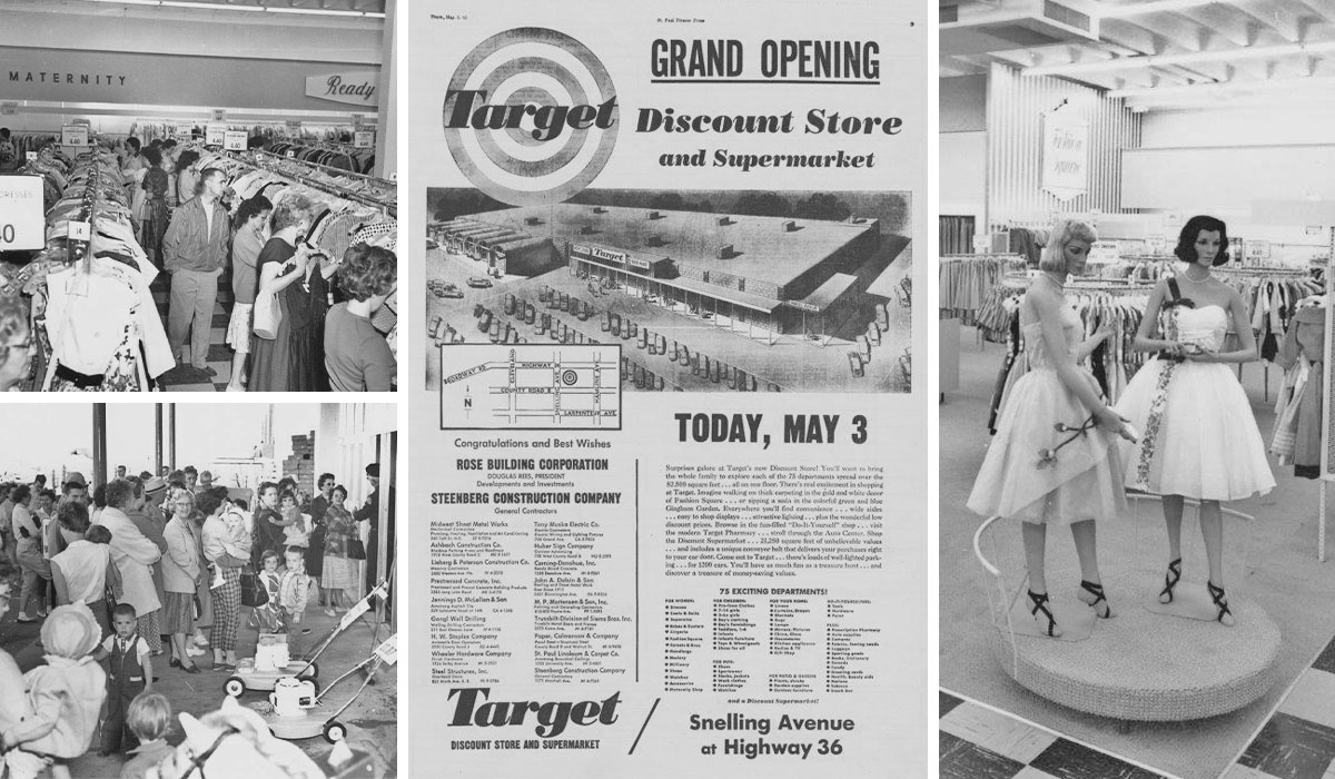
The year 1962 was a watershed moment for American retail. In a single twelve-month span, several of the most influential retail brands in history were founded: Walmart, Kmart, and Target. However, Target’s origin story is unique because it was born out of a premium lineage. The Dayton Company, a respected high-end department store based in Minneapolis, sought to expand into the burgeoning “discount” market without diluting its existing reputation for quality.
The Vision of the Dayton Brothers
The five grandsons of George Draper Dayton recognized that the suburban middle class was growing and that their shopping habits were shifting. They envisioned a “new kind of discount store” that offered the low prices of a discounter but with the aesthetics, cleanliness, and service level of a luxury department store. This was the first major brand strategy decision: differentiation through elevation. While competitors focused almost exclusively on price, Target focused on the experience of the price.
Choosing the Name and the Mark
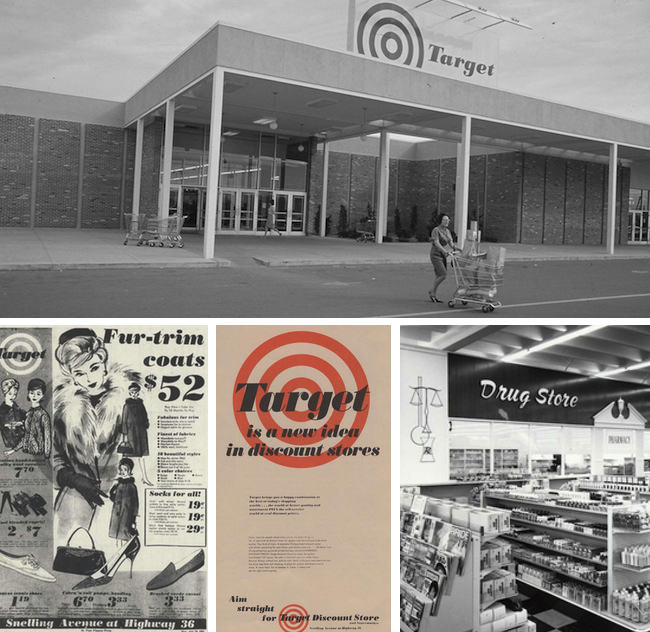
The name “Target” was not chosen at random. It was selected from a list of over 200 possibilities. The branding team wanted a name that implied precision, achievement, and “hitting the mark.” The original logo—a classic bullseye with three rings—was designed to be bold and instantly recognizable even from a distance on a highway. By the time the first store opened on May 1, 1962, the visual identity was already working to establish Target as a destination of intent rather than just a convenience.
Building a Visual Identity: The Evolution of the Logo and Mascot
A brand is more than a product; it is a visual language that communicates values and evokes emotions. Target’s visual identity is one of the most successful examples of minimalist branding in the 20th century. The company’s commitment to its “Red and White” palette has created a psychological shortcut in the minds of consumers, associating those colors with a specific blend of energy and cleanliness.
The Psychology of the Bullseye
In 1968, Target simplified its logo to the version we largely recognize today—a single red dot inside a red ring. This move toward minimalism preceded the modern design trend by decades. Strategically, this simplification allowed the logo to become a versatile design element. It could be hidden in commercials, integrated into high-fashion patterns, or stamped on a credit card. It transitioned from being a store sign to being a “lifestyle symbol.” This is a key tenet of brand strategy: a logo should be simple enough to be remembered and flexible enough to be reimagined.
“Bullseye” the Dog and Brand Personification
In 1999, Target introduced a Bull Terrier named “Bullseye” with the logo painted around its eye. This was a pivotal moment in the brand’s history of personal branding. By using a mascot, Target humanized its corporate identity. Bullseye the dog represented the brand’s personality: playful, approachable, and slightly quirky. The mascot helped Target bridge the gap between being a “big box retailer” and a “friendly neighbor,” a transition that many of its larger competitors struggled to make.
“Expect More. Pay Less.”: The Strategy of Design Democracy
If the 1960s were about establishing the name, the 1990s and 2000s were about defining the ethos. The slogan “Expect More. Pay Less.” is more than a tagline; it is the core brand promise that Target has executed with surgical precision. This strategy, often referred to as “Design Democracy,” centers on the idea that high-quality design should be accessible to everyone, regardless of their zip code or income bracket.
The “Tar-jay” Phenomenon
Target is one of the few brands that successfully leaned into a nickname created by its customers. The mock-French pronunciation “Tar-jay” began as a joke among shoppers who felt the store’s curated selection felt more upscale than a typical discounter. Rather than correcting the narrative, Target’s brand strategy team embraced it. They leaned into the “chic” association, positioning the brand as “premium discount.” This pivot allowed Target to capture a demographic of high-earning shoppers who took pride in finding “deals” that looked expensive.
High-Fashion Collaborations as Brand Catalysts
In 1999, Target launched its first high-profile designer collaboration with architect Michael Graves. This was followed by partnerships with Isaac Mizrahi, Missoni, and Liberty of London. These collaborations were tactical masterstrokes in brand positioning. By bringing world-class designers to the aisles of a discount store, Target effectively “borrowed” the equity of luxury brands to boost its own. This created “brand heat”—a sense of urgency and exclusivity that resulted in lines around the block and products selling out in minutes.
Community and Consistency: The Pillar of Modern Brand Loyalty
In the modern era, a brand’s identity is increasingly tied to its corporate citizenship and its ability to maintain a consistent “voice” across multiple digital and physical touchpoints. Target’s long-term brand health is a result of its commitment to these foundational pillars.
Calling Customers “Guests”
A subtle but profound part of Target’s brand identity is its internal vernacular. At Target, customers are “Guests” and employees are “Team Members.” This is a strategic branding of the corporate culture. By changing the terminology, Target shifts the psychological dynamic of the interaction. A “guest” is someone you welcome into your home; a “customer” is someone you merely transact with. This hospitality-centric branding has created a level of store loyalty that is rare in the retail sector.
Corporate Social Responsibility (CSR) as a Brand Value
Since 1946 (inherited from the Dayton Company), Target has given 5% of its profit back to the communities it serves. This long-standing commitment is a core part of its “Brand Story.” In an age where consumers—particularly Millennials and Gen Z—demand that brands stand for something, Target’s established history of community giving provides a layer of authenticity that cannot be easily replicated by newer competitors. It’s not just marketing; it’s a legacy that reinforces the brand’s promise of being a force for good.
Omnichannel Branding in the Digital Age
As retail shifted online, many legacy brands lost their identity in the transition. Target, however, successfully translated its “Red and White” experience to the digital screen. Whether through its mobile app, its “Circle” loyalty program, or its intuitive website design, the brand remains cohesive. The focus on “Guest Experience” translated into industry-leading “Order Pickup” and “Drive Up” services, proving that the brand’s identity is tied to the ease of the experience, not just the physical location.
Conclusion: The Lasting Legacy of Target’s Brand Strategy
From its founding year in 1962 to its current status as a retail powerhouse, Target has proven that branding is the ultimate competitive advantage. While other retailers focused on the “how” (logistics) and the “what” (inventory), Target mastered the “why.”
By sticking to a consistent visual identity, embracing the “Tar-jay” persona, and prioritizing high design for the masses, Target created a brand that people don’t just shop at—they identify with. The history of Target is a reminder that a brand is a living entity that must evolve with its audience while remaining rooted in its original promise. As Target looks toward the future, its 1962 foundation of “differentiated excellence” continues to be the target it hits every single day.
aViewFromTheCave is a participant in the Amazon Services LLC Associates Program, an affiliate advertising program designed to provide a means for sites to earn advertising fees by advertising and linking to Amazon.com. Amazon, the Amazon logo, AmazonSupply, and the AmazonSupply logo are trademarks of Amazon.com, Inc. or its affiliates. As an Amazon Associate we earn affiliate commissions from qualifying purchases.