In the competitive landscape of global commerce, a brand’s visual identity is far more than a decorative choice; it is a silent ambassador that communicates values, heritage, and aspirations. Among the most enduring motifs in modern corporate design is the “Apollo symbol.” Derived from the Greek god of the sun, music, truth, and healing, the Apollo symbol serves as a powerful archetype for brands seeking to project an image of enlightenment, precision, and unshakeable authority.
Understanding the Apollo symbol requires a deep dive into how ancient mythology intersects with modern brand strategy. This article explores why the Apollo identity remains a cornerstone for high-tier corporate entities, the semiotics of its design, and how businesses can harness this powerful archetype to build a legacy of trust and innovation.
1. The Mythological Foundation: Why Brands Choose Apollo
The selection of Apollo as a brand symbol is rarely accidental. In the realm of brand strategy, companies often look to “The Twelve Archetypes” (a concept popularized by Carl Jung and later adapted for marketing) to define their personality. Apollo fits perfectly into the roles of the “Sage” and the “Ruler.”
The Apollonian vs. Dionysian Balance
In philosophy and branding, the “Apollonian” spirit represents order, logic, and clarity, as opposed to the “Dionysian” spirit of chaos and emotion. For a brand, adopting an Apollo-centric identity signals to the market that the company is a bastion of rationalism. This is particularly vital for sectors where precision is non-negotiable, such as aerospace, high-finance, and healthcare. When a customer sees an Apollo-inspired symbol, they subconsciously associate the brand with a disciplined approach to problem-solving.
A Legacy of Truth and Prophecy
Apollo was also the god of prophecy and truth. In the context of corporate identity, this translates to “visionary leadership.” Brands like Apollo Global Management use this underlying meaning to suggest that they possess the foresight to navigate complex markets. By aligning with a deity who “sees all,” a brand positions itself as an industry leader that anticipates trends rather than merely reacting to them.
2. Visual Semiotics: Deconstructing the Apollo Iconography in Design
To understand the Apollo symbol, one must look at the specific visual cues used in graphic design. Modern logos rarely use a literal illustration of a Greek god; instead, they use stylized icons that evoke his attributes.
The Solar Radiance and Geometric Precision
The most common iteration of the Apollo symbol involves the sun or solar rays. In brand design, the sun represents energy, life, and universality. A solar-themed Apollo logo often utilizes gold, yellow, or deep navy palettes. Gold suggests premium quality and wealth, while the circular shape of the sun implies inclusivity and wholeness.
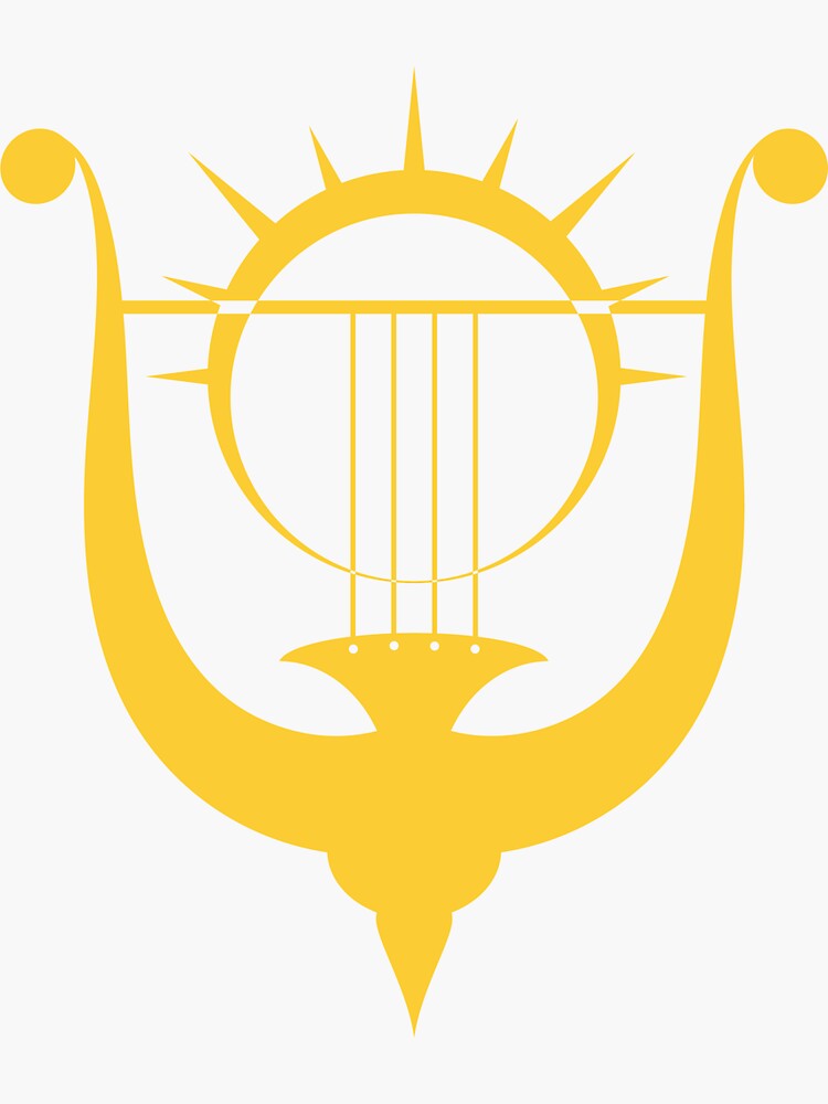
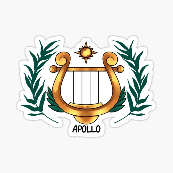
The Lyre and the Bow: Harmony and Focus
Apollo is frequently depicted with a lyre (representing harmony and the arts) or a bow (representing precision and distance).
- The Lyre: Brands in the creative or communication sectors use abstract lyre shapes to suggest that they bring “harmony” to their clients’ lives.
- The Bow: This symbol is often abstracted into a “vector” or “arrow” shape, commonly seen in tech and logistics brands. It suggests a company that hits its targets with unerring accuracy.
Minimalist Modernism
Contemporary brand strategy has moved toward “reductive design.” The modern Apollo symbol is often a minimalist representation—perhaps a single golden arc or a highly stylized “A.” This abstraction allows the brand to feel ancient and established yet sleek and futuristic, bridging the gap between historical reliability and modern innovation.
3. Case Studies: The Success of Apollo-Inspired Corporate Identities
Several global powerhouses have effectively utilized the Apollo name and symbol to dominate their respective markets. These case studies illustrate how the symbol is adapted across different industries.
![]()
Apollo Global Management: The Pillar of Finance
In the world of private equity and alternative investment, Apollo Global Management is a titan. Their brand identity is built on the pillars of strength and resilience. By utilizing the name “Apollo,” the firm communicates a sense of Olympian scale. Their branding doesn’t need to be flashy; the name itself evokes a sense of permanent, structural power that appeals to institutional investors who prioritize stability.
NASA’s Apollo Program: The Pinnacle of Human Achievement
Perhaps the most famous use of the Apollo symbol in history is the NASA Apollo missions. The mission patch—a literal “A” with the moon and earth connected by a flight path—became a symbol of the “impossible made possible.” This brand identity was so successful that it shifted the global perception of the United States as the definitive leader in technology and exploration. For years after, the “Apollo” name became synonymous with the “Hero” archetype in branding.
Apollo Tyres: Durability and Journey
In the automotive industry, Apollo Tyres uses the name to project durability and the concept of the “journey.” Their brand strategy focuses on the sun-like qualities of the god—reliability and the ability to travel vast distances. The logo, while modern, retains a sense of circularity and motion that aligns with the solar attributes of the Greek deity.
4. The Psychological Impact: Building Trust through Archetypes
Why does the Apollo symbol resonate so deeply with consumers? The answer lies in the psychology of familiarity. Mythological symbols tap into a “collective unconscious,” a set of shared images and ideas that humans across cultures recognize.
Establishing Instant Authority
When a startup or a re-branding corporation adopts the Apollo archetype, they are performing a “brand shortcut.” Instead of spending decades building a reputation for wisdom, they lean on the thousands of years of cultural weight behind the Apollo name. It provides an instant sense of authority. In a digital age where consumers are overwhelmed by choice, this perceived “historical weight” can be the deciding factor in brand loyalty.
Communicating “Light” in a Saturated Market
In marketing, “light” is a metaphor for transparency and knowledge. A brand that uses Apollo-centric imagery is signaling that it has nothing to hide. This is particularly effective for consulting firms and software-as-a-service (SaaS) companies. By “shining a light” on complex data or obscure financial paths, these brands fulfill the Apollonian promise of clarity.
5. Integrating Apollo Symbolism into Your Own Brand
If you are considering integrating the Apollo archetype into your brand strategy, it is essential to do so with intentionality. Simply putting a sun in a logo is not enough; the symbol must be backed by a cohesive brand narrative.
Defining Your “Solar” Value Proposition
To use the Apollo symbol effectively, identify which aspect of the deity aligns with your business. Are you the “Healer” (Healthcare/Wellness)? The “Archer” (FinTech/Targeted Marketing)? Or the “Muse” (Design/Content Creation)? Once this is identified, your visual identity should emphasize that specific trait. For example, a healthcare brand might use the laurel wreath—another Apollo symbol—to represent victory over illness and the restoration of health.
Balancing Tradition with Modernity
One of the risks of using mythological symbols is appearing “dated” or “stuffy.” To avoid this, your design language must be forward-looking. Use modern typography, ample white space, and a restricted color palette. The goal is to make the Apollo symbol feel like a legacy that has been modernized for the 21st century.
Consistency Across Touchpoints
A brand symbol is only effective if it is reinforced across all platforms. From your website’s favicon to your corporate headquarters’ signage, the Apollonian themes of order and clarity should be palpable. This means your user interface (UI) should be intuitive (logic) and your customer service should be impeccable (truth).
Conclusion: The Eternal Shine of the Apollo Archetype
The “Apollo symbol” is more than just a reference to an ancient god; it is a sophisticated tool in the arsenal of modern brand strategy. By tapping into the values of logic, clarity, and visionary leadership, brands can create a corporate identity that transcends temporary trends.
In an era of rapid technological change and market volatility, the Apollonian qualities of stability and enlightenment are more attractive to consumers than ever. Whether it is through the subtle use of solar geometry or the bold adoption of the name itself, the Apollo symbol continues to guide the world’s most influential brands toward a future defined by precision, harmony, and enduring success. As long as humanity values truth and progress, the light of Apollo will continue to shine at the heart of the world’s most powerful corporate identities.
aViewFromTheCave is a participant in the Amazon Services LLC Associates Program, an affiliate advertising program designed to provide a means for sites to earn advertising fees by advertising and linking to Amazon.com. Amazon, the Amazon logo, AmazonSupply, and the AmazonSupply logo are trademarks of Amazon.com, Inc. or its affiliates. As an Amazon Associate we earn affiliate commissions from qualifying purchases.