In the world of high-stakes networking, corporate identity, and personal branding, every detail serves as a silent communicator. From the quality of your business card to the firmness of your handshake, these micro-signals aggregate to form a lasting impression. One of the most frequently asked yet overlooked questions in professional circles is: “What side does a name tag go on?”
While it may seem like a trivial detail, the placement of a name tag is a fundamental component of professional etiquette and strategic brand positioning. In this guide, we will explore why the right side is the definitive choice for brand-conscious professionals, how corporate identity is reinforced through identification, and how to master the art of the first impression through meticulous attention to detail.
The Right Side Rule: Why Placement Matters for Your Personal Brand
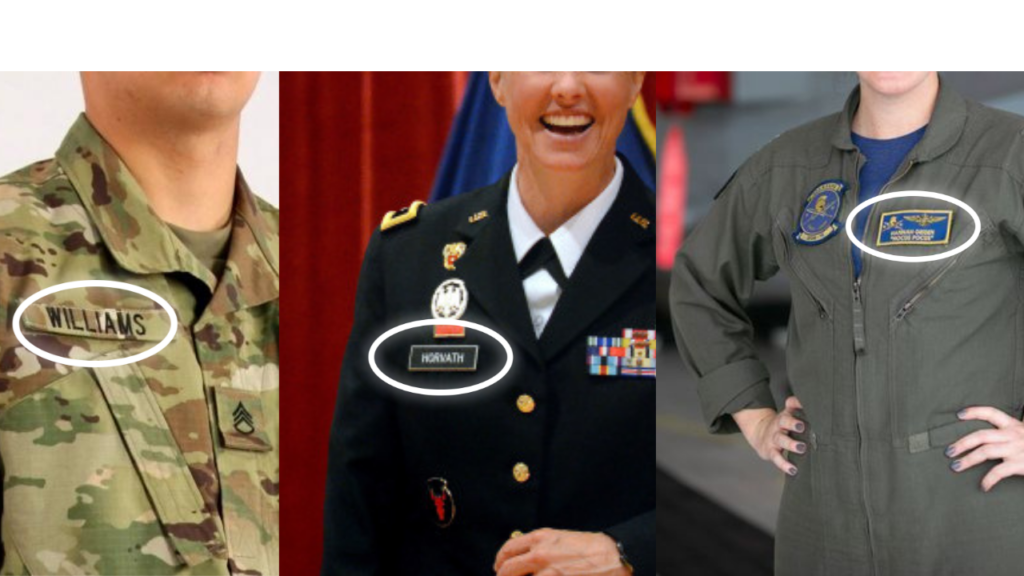
The gold standard for name tag placement is the upper right-hand side of your garment. While many people instinctively reach for their left side—perhaps because they are right-handed or because they associate the left side with the heart—doing so creates a subtle barrier in professional communication. In the context of personal branding, the goal is to make interaction as seamless as possible for your counterpart.
The Line of Sight: Facilitating a Seamless Handshake
The primary reason for placing a name tag on the right side is rooted in the mechanics of the human handshake. In Western professional culture, the right hand is the standard for greetings. When you extend your right hand to greet someone, your right shoulder naturally moves forward, and your body angles slightly toward the other person.
By placing your name tag on the right side, you align it directly with the other person’s line of sight as they look toward your face and hand. This allows them to inconspicuously read your name and title while shaking your hand. If the tag were on the left, their eyes would have to cross your chest to find the information, creating a moment of cognitive dissonance or social awkwardness that can interrupt the flow of a brand-building conversation.
Psychology of Perception: Reducing Cognitive Friction
In brand strategy, “friction” refers to any obstacle that prevents a user or client from achieving a goal. In a networking environment, your “user” is the person you are meeting, and their “goal” is to remember who you are.
Placing a name tag on the right minimizes cognitive friction. It ensures that the most vital information—your name and your brand—is processed almost subconsciously during the greeting. This efficiency reflects well on your personal brand, signaling that you are observant, detail-oriented, and socially savvy. It demonstrates that you understand the nuances of professional engagement, which builds immediate trust and credibility.
Beyond the Name: Integrating Corporate Brand Strategy into Identification
A name tag is not merely a piece of plastic or a sticker; it is a mobile extension of your corporate identity. In a crowded conference hall or a high-level corporate retreat, identification serves as a “mini-billboard” for your organization. To maximize the branding potential of a name tag, companies must look beyond mere placement and consider the design and strategic messaging of the tag itself.
Design Consistency: Matching the Tag to Your Company’s Visual Identity
For a brand to be effective, it must be consistent across all touchpoints. A name tag should mirror the organization’s visual language, including its color palette, typography, and logo usage.
- Color Strategy: Use brand-compliant colors that stand out against professional attire but do not clash. For example, a tech brand might use a sleek “dark mode” aesthetic with white text, while a traditional financial firm might stick to navy and gold.
- Logo Placement: The corporate logo should typically occupy the top left or top center of the tag, providing immediate brand recognition before the viewer even reads the individual’s name. This reinforces the “parent brand” while the name reinforces the “personal brand.”
Hierarchy and Legibility: Communicating Authority Through Typography
The layout of a name tag should follow a clear information hierarchy. Your name is the primary focus and should be printed in a bold, sans-serif font for maximum legibility from a distance of three to five feet.
Beneath the name, the professional title and company name should be clear but slightly smaller. From a brand strategy perspective, this hierarchy tells a story: Who are you, and what authority do you represent? A cluttered name tag suggests a cluttered brand. A clean, well-spaced tag suggests a brand that is organized, modern, and confident.

Contextual Branding: Adapting Your Professional Image for Different Events
Just as a brand adapts its marketing message for different platforms (LinkedIn vs. Instagram), a professional must adapt their identification style to the specific context of an event. The “right side” rule remains constant, but the medium of identification can change to suit the brand narrative.
Trade Shows vs. Executive Boardrooms: Adjusting the Tone
At a large-scale trade show, your brand is competing for attention among thousands. In this environment, name tags are often replaced by lanyards. While lanyards are convenient, they often flip over or hang too low, obscuring your brand. To maintain a high-end brand image, consider “double-clip” lanyards that prevent flipping, or high-visibility badges that stay centered.
In contrast, at an executive boardroom meeting or an exclusive VIP gala, a lanyard can appear too casual and detract from a premium personal brand. In these settings, a high-quality magnetic name tag is the preferred choice. It looks integrated into the suit or dress, maintaining the elegance of the professional attire while still providing the necessary identification.
Digital Name Tags and the Future of High-Tech Branding
As we move further into a digital-first professional landscape, some brands are experimenting with “smart” name tags. These devices use e-ink displays to change titles based on the session an attendee is in, or they incorporate NFC (Near Field Communication) technology.
By tapping a phone against a smart name tag, a new contact can immediately download your digital business card, view your LinkedIn profile, or visit your company’s landing page. This is the pinnacle of modern brand integration—transforming a traditional piece of etiquette into a high-tech lead generation tool. For professionals in the tech and innovation sectors, adopting these tools reinforces a brand image of being “ahead of the curve.”
Mastering the Art of Physical Branding: Tips for Perfection
To truly embody a professional brand, one must execute the “little things” with precision. Even the most expensive suit or the most prestigious title can be undermined by a name tag that is crooked, falling off, or damaging the clothing.
Proper Attachment Techniques: Avoiding Damage to Professional Attire
Your clothing is an investment in your personal brand. Traditional pin-back name tags can leave permanent holes in delicate fabrics like silk or fine wool.
- Magnet Backings: These are the gold standard for modern branding. They are secure and do not damage the fabric. However, those with pacemakers must be cautious.
- Clips: A good alternative for pockets or lapels, though they can sometimes cause the tag to lean forward, making it hard to read.
- Placement Height: Aim for just below the collarbone. Placing the tag too high looks cramped; placing it too low (on the stomach area) is unflattering and forces people to look away from your face to read it.
The “Elevator Pitch” Name Tag: Maximizing the Value of Small Real Estate
If you are at an event where you can customize your name tag, think of it as a headline for your personal brand. Beyond your name and title, consider adding a “hook” or a “value proposition” in a small font at the bottom.
For example, instead of just “Marketing Manager,” you might put “Marketing Manager | Scaling SaaS Startups.” This tiny addition serves as a conversation starter, allowing your brand to communicate its unique value proposition before you even speak. It turns a static identification tool into an active marketing asset.

Conclusion: The Impact of Precision on Professional Identity
In the competitive landscape of modern business, your brand is the sum total of every interaction people have with you. The question of “what side does a name tag go on” is not just about following an arbitrary rule; it is about intentionality.
By placing your name tag on the right side, you are choosing to prioritize the comfort and ease of your peers. You are demonstrating an understanding of social psychology and professional standards. When combined with a clean, brand-aligned design and the right choice of hardware, your name tag becomes more than a label—it becomes a powerful tool for connection, a symbol of your corporate identity, and a testament to your commitment to professional excellence.
In the world of branding, consistency is king. Whether you are at a local chamber of commerce meeting or an international summit, the precision with which you present your identity—right down to the side of your name tag—signals to the world that you are a professional who pays attention to the details that matter.
aViewFromTheCave is a participant in the Amazon Services LLC Associates Program, an affiliate advertising program designed to provide a means for sites to earn advertising fees by advertising and linking to Amazon.com. Amazon, the Amazon logo, AmazonSupply, and the AmazonSupply logo are trademarks of Amazon.com, Inc. or its affiliates. As an Amazon Associate we earn affiliate commissions from qualifying purchases.