
In the world of global sports, few entities possess the sheer brand equity of the Dallas Cowboys. Often referred to as “America’s Team,” the franchise has transcended the boundaries of the National Football League (NFL) to become a case study in successful corporate identity and long-term brand management. At the heart of this identity lies a specific visual language defined by its color palette: Navy Blue, Metallic Silver, and White.
While a casual observer might see these simply as uniform choices, a brand strategist views them as the foundational elements of a multi-billion dollar empire. This article explores the strategic nuances of the Cowboys’ colors, examining how they foster brand loyalty, maintain consistency across diverse media, and contribute to one of the most recognizable corporate identities in the world.

The Psychology and Evolution of the Cowboys’ Brand Identity
The selection of a brand’s color palette is rarely accidental. In branding, colors evoke specific emotional responses and subconscious associations. For the Dallas Cowboys, the choice of navy, silver, and white was designed to project an image of authority, innovation, and purity.
The Symbolism of Navy and Silver
Navy blue is traditionally associated with stability, trust, and confidence. In a corporate context, it suggests a “blue-chip” status, signaling to the market that the organization is professional and reliable. For the Cowboys, the specific shade—often a deep, royal navy—serves as the anchor of their visual identity.
Complementing this is metallic silver. Unlike flat grey, silver implies a premium quality; it is the color of sleek technology and modernism. In sports branding, silver is often used to denote “prestige” and “first place.” When paired, navy and silver create a high-contrast, sophisticated look that separates the Cowboys from the more “primary-colored” palettes of their competitors. This sophisticated combination helps the brand appeal not just to sports fans, but to a broader lifestyle market.
Historical Consistency vs. Modern Adaptation
One of the hallmarks of a powerful brand is its longevity. Since the early 1960s, the Cowboys have maintained a remarkably consistent visual profile. While other franchises undergo frequent rebrands to chase fleeting design trends, the Cowboys have leaned into their heritage.
This consistency builds “brand memory.” When a consumer sees that specific blue and silver star, they immediately associate it with the franchise’s storied history. However, branding also requires subtle adaptation. Over the decades, the Cowboys have refined the hues of their silver and the saturation of their blue to ensure they pop on modern 4K digital broadcasts and look crisp on high-definition smartphone screens. This evolution ensures the brand remains modern without losing its historical soul.
The “Star” as a Global Trademark
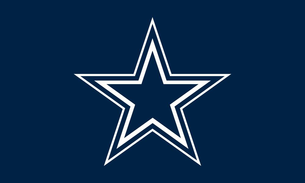
The blue star, outlined in white and navy, is perhaps the most effective logo in sports history. From a design perspective, its simplicity is its strength. It is easily scalable, recognizable from a distance, and works effectively in monochrome or full color. The colors within the star represent the core of the brand strategy: a singular, focused identity that represents the “Lone Star State” while aiming for a national—and global—audience.
Technical Specifications: Maintaining Brand Consistency Across Platforms
For a global brand, “close enough” is never good enough. Brand consistency is the practice of ensuring that the visual identity remains identical across all touchpoints, whether it is an official jersey, a digital app, or a billboard in Times Square.
The Specificity of “Cowboys Blue”
In professional branding, colors are defined by specific codes: Pantone (for print), HEX (for digital), and RGB (for screens). The Dallas Cowboys use a specific set of coordinates to ensure their blue doesn’t lean too purple or too green.
- Navy Blue: Pantone 282 C
- Silver: Pantone 877 C (Metallic) or Pantone 429 C (Matte)
By adhering to these strict technical specifications, the brand ensures that a fan buying a hat in London is getting the exact same experience as a fan attending a game in Arlington, Texas. This uniformity is vital for brand trust.
Managing the Silver-Green Anomaly
An interesting quirk in the Cowboys’ brand strategy—one that is often discussed by design purists—is the “Seafoam Green” pants worn with the home white jerseys. To the naked eye in the stadium, they look silver. However, on television broadcasts, they often take on a greenish-blue tint.

This was a deliberate choice made decades ago by the team’s equipment managers and broadcasters to make the uniforms appear “more silver” under the harsh stadium lights of the 1960s and 70s. This highlights a critical aspect of brand management: the realization that colors change depending on the medium. A brand must sometimes adjust its physical assets to ensure the perceived brand remains consistent in the eyes of the consumer.
Design Assets in Digital vs. Physical Merchandising
In the digital age, a brand must be “mobile-first.” The Cowboys’ navy and silver palette translates exceptionally well to digital interfaces. The deep navy provides an excellent background for white text (ensuring high accessibility and readability), while the silver works as a sophisticated accent color for buttons and calls-to-action on their official apps and website. In physical merchandising, the metallic silver offers a tactile, premium feel that matte colors cannot replicate, allowing for higher price points on “authentic” or “pro-shop” gear.
Branding “America’s Team”: Marketing the Visual Asset
The Dallas Cowboys are not just a football team; they are a lifestyle brand. Their colors are the primary tools used to market this lifestyle to a global audience.
Leveraging Colors for Fan Loyalty and Recognition
Color is the fastest way to signal “belonging.” When a fan wears the navy and silver, they are participating in the brand’s community. The Cowboys’ marketing strategy leans heavily into this “tribal” aspect. By saturating their marketing materials, stadium aesthetics, and social media presence in their signature colors, they create an immersive environment. This “color-blocking” strategy makes the brand impossible to ignore, even in a crowded marketplace like the NFL.
The Role of Color in High-Value Sponsorships
When the Cowboys enter into partnerships with brands like Nike, Ford, or AT&T, their color palette is a central part of the negotiation. A corporate identity as strong as the Cowboys’ requires that partner brands integrate seamlessly with their navy and silver. This is why you will often see “Cowboys Edition” products where the partner’s logo is recolored to match the team’s palette. This co-branding strategy elevates the partner brand by associating it with the prestige of the Cowboys’ visual identity.
Cross-Channel Branding: From Social Media to the Stadium
The Cowboys’ home, AT&T Stadium, is a cathedral of branding. The architecture itself—heavy on glass and metallic silver—is a physical manifestation of the brand’s color palette. On social media platforms like Instagram and TikTok, the team uses color filters and graphics that emphasize the navy and silver, ensuring that their content is instantly recognizable as “Cowboys content” even before the user reads the handle. This cross-channel synergy is the hallmark of a mature brand strategy.
Brand Case Study: The Financial Impact of Visual Identity
The ultimate goal of branding is to drive value. The Dallas Cowboys are consistently ranked as the most valuable sports franchise in the world, with valuations exceeding $9 billion. Much of this value is tied directly to the strength of their brand and, by extension, their iconic visual identity.
Dominating the Licensed Merchandise Market
The Cowboys often lead the NFL in merchandise sales. A large part of this success is the “wearability” of their colors. Navy and silver are versatile, fashionable colors that fit easily into a modern wardrobe. Unlike “louder” color schemes (such as neon green or bright orange), the Cowboys’ palette has a timeless, classic appeal that encourages fans to wear the brand in everyday settings, not just on game day. This increases brand impressions and drives consistent revenue.
Emotional Branding and Consumer Behavior
Effective branding creates an emotional connection. For many fans, the navy blue and silver star evoke memories of family traditions, legendary victories, and a sense of Texan pride. In branding, this is known as “emotional equity.” When a brand successfully attaches its visual identity to the positive emotions of its consumers, it creates a moat that competitors cannot easily cross. The colors become more than just ink on fabric; they become symbols of identity and loyalty.
Longevity in Brand Design
The Cowboys’ refusal to engage in radical rebrands is a strategic masterstroke. While other teams might see a short-term spike in sales from a “new look,” they often dilute their brand equity in the process. By sticking to their core palette, the Cowboys have built a brand that is “recession-proof” and “trend-proof.” They have proven that in branding, consistency is the highest form of sophistication.
Conclusion: The Power of a Unified Palette
The question “what is the Cowboys’ colors?” may seem simple on the surface, but the answer reveals a complex and highly successful brand strategy. Through the intentional use of Navy Blue, Metallic Silver, and White, the Dallas Cowboys have crafted an identity that projects authority, prestige, and timelessness.
By maintaining strict technical standards, adapting to new media, and leveraging their colors to build emotional connections with a global audience, the Cowboys have turned a simple palette into a multi-billion dollar asset. For any organization looking to build a lasting brand, the Dallas Cowboys serve as a premier example of how visual identity, when managed with discipline and strategic foresight, can become the cornerstone of corporate success. In the competitive landscape of modern marketing, the “Star” remains a guiding light for what a perfectly executed brand can achieve.
aViewFromTheCave is a participant in the Amazon Services LLC Associates Program, an affiliate advertising program designed to provide a means for sites to earn advertising fees by advertising and linking to Amazon.com. Amazon, the Amazon logo, AmazonSupply, and the AmazonSupply logo are trademarks of Amazon.com, Inc. or its affiliates. As an Amazon Associate we earn affiliate commissions from qualifying purchases.