In the world of brand strategy and visual identity, color is more than a mere aesthetic choice; it is a psychological trigger that dictates consumer perception and market positioning. When we ask the question, “What happens when you mix red and green?” we are not just exploring the literal production of a muddy brown pigment. From a brand perspective, we are examining the collision of two of the most powerful and contradictory symbols in the human psyche. Red is the color of urgency, passion, and action. Green is the color of growth, tranquility, and health.

When these two forces are mixed—whether through physical layering or strategic juxtaposition—a unique brand tension is created. This article explores how brand strategists navigate this high-contrast relationship to build identities that are memorable, culturally resonant, and psychologically complex.
The Psychology of Contrasts: Red and Green in Corporate Identity
To understand what happens when a brand mixes red and green, one must first understand the concept of complementary colors. On the color wheel, red and green sit directly opposite each other. In design theory, this means they provide the highest level of contrast possible. This “mixing” of opposites creates a visual vibration that can either be jarringly effective or aesthetically disastrous, depending on the execution.
The “Christmas Trap”: Navigating Seasonal Associations
The most immediate challenge any brand faces when mixing red and green is the “seasonal association.” In Western culture, this specific pairing is inextricably linked to Christmas. For a brand, this can be a double-edged sword. If a company uses these colors without a clear strategic focus, they risk looking like a holiday specialty shop year-round.
However, savvy brand strategists bypass this by manipulating the shades. Instead of using a standard “candy apple” red and “forest” green, they might opt for a deep burgundy and a muted olive, or a neon lime and a soft terracotta. By shifting the saturation and value, the brand moves away from seasonal clichés and toward a sophisticated, curated identity.
High-Contrast Branding: Why Performance and Utility Love This Pairing
When red and green are placed side-by-side in a logo or retail environment, they create an “active” visual field. This is why we often see this mix in sectors that demand high visibility and utility. Red signals “Stop” or “Alert,” while green signals “Go” or “Safe.”
When mixed strategically, these colors convey a sense of comprehensive service—covering the entire spectrum of consumer needs from urgency to resolution. This is a primary reason why convenience stores and logistics companies often utilize this palette; it suggests a brand that is both fast (red) and reliable/sustainable (green).
Visual Dynamics: The Science of Complementary Colors in Marketing
Beyond the psychological implications, there is a biological reality to what happens when the human eye perceives red and green together. Because they are complementary, they stimulate different types of cone cells in the retina simultaneously, leading to a phenomenon known as “simultaneous contrast.”
Vibrancy and Eye-Tracking: Capturing Attention in a Crowded Market
When a brand places a red element on a green background (or vice-versa), the edges appear to shimmer. This optical illusion is a powerful tool in packaging design. In a crowded supermarket aisle, a product that utilizes a red-green “mix” will naturally draw the eye faster than a monochromatic or analogous color scheme.
This vibrancy ensures that the brand “pops” off the shelf. However, the mix must be handled with care. Over-saturation can lead to visual fatigue, causing the consumer to look away. The goal for a marketing designer is to find the “sweet spot” where the colors harmonize rather than fight for dominance.
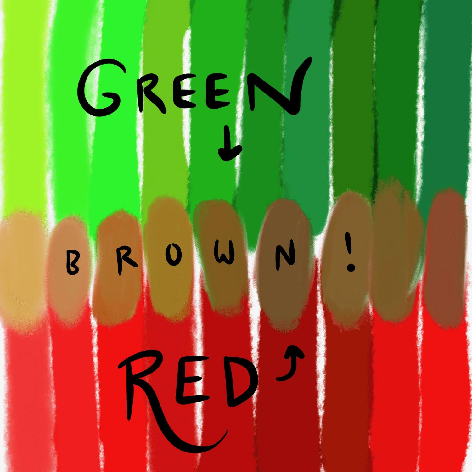
The “Brown” Effect: What Happens When Physical Pigments Merge
In the context of brand collateral—such as printed brochures or physical merchandise—”mixing” red and green literally results in a tertiary brown. While brown is often associated with earthiness and stability (think UPS), it can also be perceived as “dirty” if not intentional.
Strategically, brands rarely mix these pigments to create a third color; instead, they use transparency and layering. By overlaying a semi-transparent green leaf over a red circular logo, a brand can create a sense of depth and complexity. This suggests a brand that is multi-faceted—perhaps a technology company that is also deeply committed to environmental sustainability.
Case Studies: Brands that Mastered the Red-Green Balance

To truly see what happens when you mix red and green, we must look at the global leaders who have turned this difficult pairing into a multi-billion-dollar visual asset. These companies prove that the “mix” is not just about color theory, but about cultural narrative.
Heineken: Evolution of a Green Identity with a Red Star
Heineken is perhaps the most iconic example of a red-green brand. The green bottle and label represent the freshness and natural ingredients of the beer, while the solitary red star provides the necessary “anchor.”
What happens here is a masterful use of the “focal point” strategy. The green provides the brand’s primary atmosphere (cool, refreshing, social), while the red star acts as a seal of quality and a call to action. Without the red star, the brand would feel too passive; without the green, it would feel too aggressive. The “mix” creates a balanced, premium identity that is recognized globally.
Gucci: The Intersection of Heritage and Opulence
In the luxury fashion sector, Gucci’s signature red and green webbing is a symbol of status. Here, the colors are used in a “stripe” format, which prevents them from bleeding into a muddy brown.
The mix of deep forest green and rich crimson speaks to the brand’s equestrian roots and Italian heritage. In this context, the colors don’t mean “stop and go”; they mean “wealth and tradition.” By using these colors on high-end leather and silk, Gucci proves that the red-green mix can be elevated to the highest tiers of corporate identity, provided the materials and the specific hues are chosen with precision.
7-Eleven: Utility and Accessibility through Color Blocking
7-Eleven uses a mix of green, red, and orange. In this trio, green dominates as the background of the “7,” while red is used for the “Eleven” and the trim. The result is a brand that feels approachable and “open.”
The green suggests growth and a welcoming environment, while the red provides the energy required for a “convenience” brand. The mix communicates that the store is a place for a quick “recharge.” This is a purely functional application of the color mix, designed to be visible from a distance on busy roadsides.
Strategic Implementation: How to Mix Red and Green Without Clashing
For brand managers and designers looking to implement this palette, there are specific technical and strategic rules to follow. Mixing these colors is high-risk, but it offers high-reward in terms of brand recall.
Managing Saturation and Value for Digital Interfaces
In the digital age, the way red and green interact on a screen (RGB) is different from how they interact on paper (CMYK). On a digital interface, red and green can be particularly difficult for users with color vision deficiency (CVD).
A professional brand strategy must account for accessibility. To “mix” these colors effectively in an app or website, designers should use different “values”—making the green very dark and the red very bright, or vice-versa. This ensures that even if the user cannot distinguish the hue, they can distinguish the contrast. This level of inclusivity is now a cornerstone of modern brand ethics.
Cultural Context: When Red and Green Mean More Than Just “Stop and Go”
Finally, the result of mixing red and green depends heavily on the geographic market. In many Asian cultures, red is the color of prosperity and luck, while green can represent health or, in some specific contexts, infidelity.
A global brand must ask: “What happens when we mix these colors in a specific region?” In the Middle East, green has deep religious and national significance, often representing paradise. Mixing it with a bold red can create a sense of nationalistic pride or a “premium” local feel. Brand strategy is never just about the eye; it is about the cultural lens through which the eye sees.
Conclusion: Finding the Equilibrium
What happens when you mix red and green? You create a brand identity that is defined by its internal tension. It is a mix that demands attention, balances energy with stability, and challenges the designer to move beyond simple aesthetics.
When handled with professional insight, the red-green mix is a potent tool for brand differentiation. It allows a company to claim a space that is both urgent and sustainable, traditional and modern, vibrant and grounded. In a marketplace of “safe” blues and “minimalist” greys, the strategic mix of red and green is a bold declaration of a brand’s unique character and its refusal to blend into the background.
aViewFromTheCave is a participant in the Amazon Services LLC Associates Program, an affiliate advertising program designed to provide a means for sites to earn advertising fees by advertising and linking to Amazon.com. Amazon, the Amazon logo, AmazonSupply, and the AmazonSupply logo are trademarks of Amazon.com, Inc. or its affiliates. As an Amazon Associate we earn affiliate commissions from qualifying purchases.