When consumers ask, “What color are Timberland boots?” the answer is rarely a simple hex code or a generic shade of brown. To the casual observer, they are “yellow.” To the enthusiast, they are “Wheat.” To the brand strategist, however, that specific shade represents one of the most successful examples of visual identity and market positioning in the history of global footwear.
The “Original Yellow Boot” did not become a cultural icon by accident. It was the result of a rigorous commitment to quality that inadvertently created a brand signal so strong it transcended its original purpose. This article explores the brand strategy behind the color of Timberland boots, examining how a utilitarian choice became a symbol of authenticity, a pillar of streetwear, and a masterclass in corporate identity.
The Psychology of Color in Brand Strategy
In the world of marketing, color is never just an aesthetic choice; it is a communication tool. For Timberland, the choice of “Wheat” was originally rooted in the practicalities of the 1970s outdoor equipment market, but its evolution into a brand signature is a study in emotional resonance.
Why Wheat? The Strategic Choice of Utility
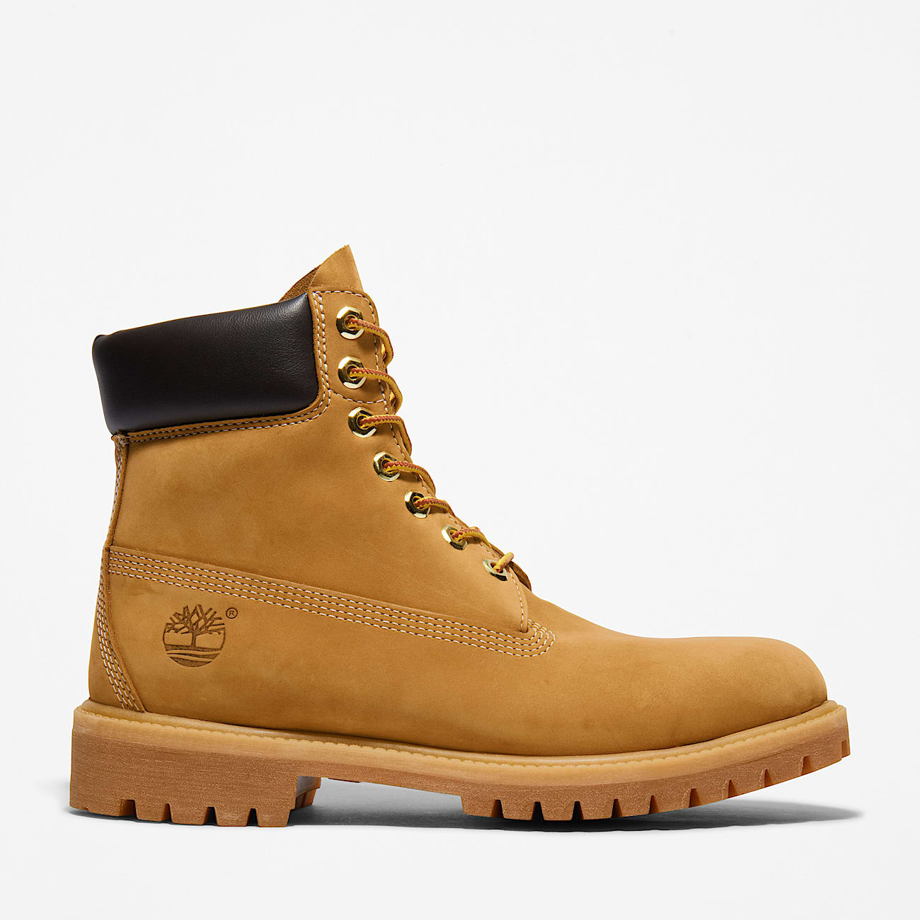
When Sidney Swartz introduced the waterproof Timberland boot in 1973, the light tan nubuck—commonly referred to as “Wheat”—was chosen because it showcased the quality of the leather. Unlike darker dyes that could hide imperfections in the hide, the light Wheat color demanded perfection. From a brand strategy perspective, this was a move toward “radical transparency.” The color told the consumer: “This leather is so high-quality, we don’t need to hide it.”
This transparency built immediate trust with the original target audience: New England laborers who required rugged, dependable gear. The color served as a functional indicator of the boot’s construction, signaling durability and water resistance in a way that standard dark brown work boots of the era did not.
Emotional Resonance and Consumer Trust
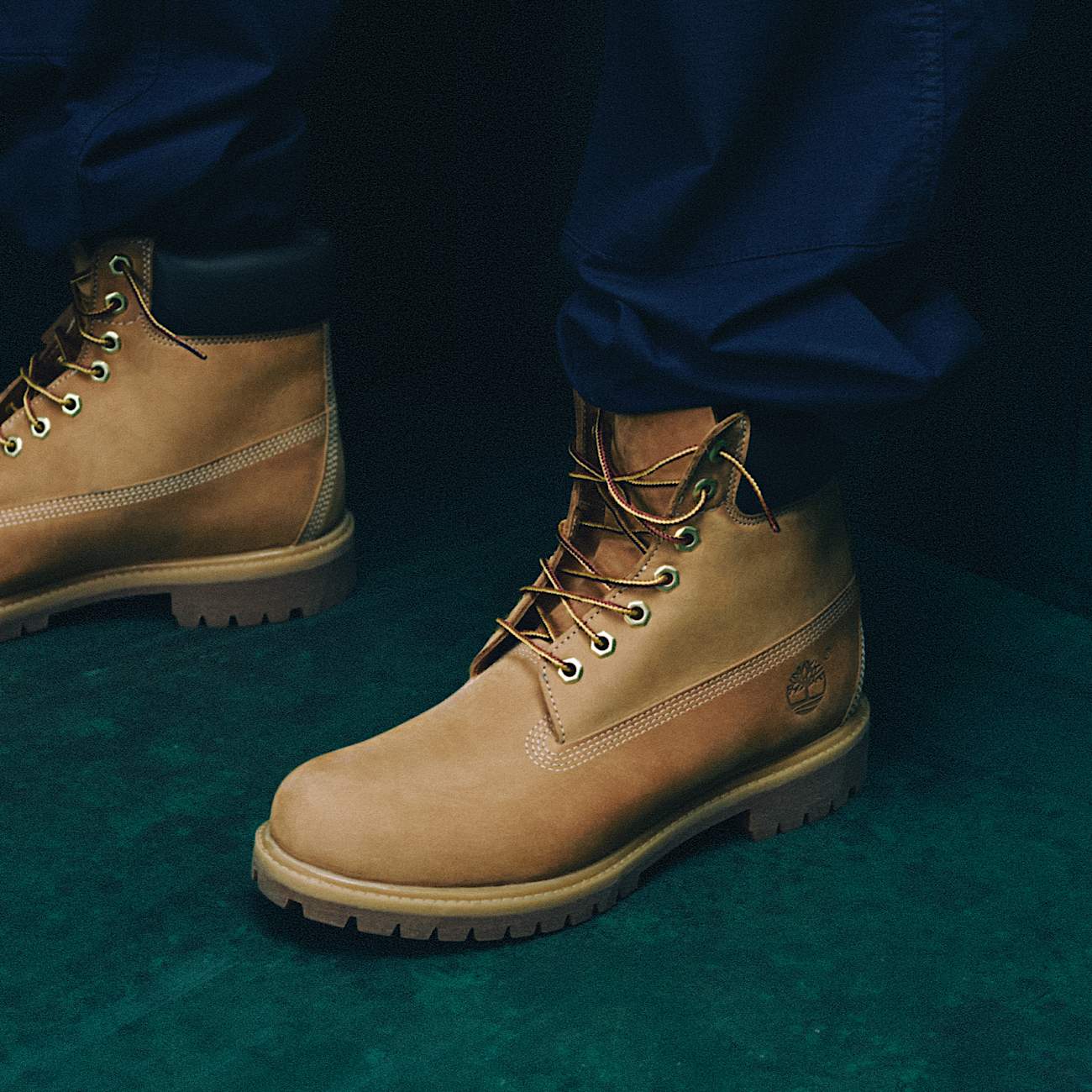
Over time, the Wheat color shifted from a functional signal to an emotional one. In branding, color accounts for up to 90% of a consumer’s first impression. The warm, earthy tones of the Timberland boot evoke feelings of stability, heritage, and the “great outdoors.” By maintaining this specific palette for over half a century, Timberland has occupied a specific “mental real estate” in the consumer’s mind. When someone sees that specific shade of yellow-gold nubuck, they don’t just see a shoe; they see a legacy of American craftsmanship.
Building Brand Equity Through Visual Consistency
Brand equity is the value premium that a company generates from a product with a recognizable name and appearance when compared to a generic equivalent. Timberland’s color is the primary driver of this equity. By refusing to chase fleeting color trends as their primary identity, the brand established a “permanent icon” status.
The Transition from Workwear to Streetwear
One of the most fascinating chapters in Timberland’s brand history is its organic adoption by the hip-hop community in the 1990s. In cities like New York, the “6-Inch Wheat Boot” became a symbol of urban grit and aspiration.
From a strategic standpoint, Timberland’s management initially struggled with this shift, fearing it might alienate their core “outdoorsman” demographic. However, they soon realized that the brand’s “authenticity”—symbolized by the unchanging Wheat color—was exactly what the new demographic valued. The brand didn’t need to change its color to fit the city; the city adopted the color because it represented something “real.” This cross-cultural appeal is a rare feat in branding, achieved only because the visual identity remained consistent.
Maintaining Identity Across Product Extensions
As Timberland expanded into apparel, watches, and different footwear silhouettes, the “Wheat” color remained the North Star of their design language. Whether it is a backpack or a winter parka, the inclusion of “Timberland Wheat” serves as a brand stamp. This consistency allows the company to launch new products with immediate “borrowed” credibility from the original boot. In brand architecture, this is known as “halo branding,” where the flagship product’s reputation protects and elevates the entire portfolio.
Protecting the Palette: Brand Legalities and Market Differentiation
In a saturated market, a brand’s visual identifiers are its most valuable intellectual property. Timberland has spent decades defending the “Yellow Boot” silhouette and colorway against a sea of “fast fashion” imitators.
Color as a Trademark and Intellectual Property
While it is notoriously difficult to trademark a single color in the footwear industry, Timberland has successfully protected the “trade dress” of the 6-inch boot. This includes the combination of the Wheat nubuck, the taslan laces, the hexagonal eyelets, and the quadruple-stitched seams.
By treating the color as an integral part of their proprietary design, Timberland ensures that competitors cannot easily dilute their market share. When a consumer sees a similar-colored boot at a lower price point, the “brand gap”—the difference between the perceived value of the original and the imitation—is highlighted by the subtle differences in the Wheat hue and leather texture.
Navigating the Sea of Imitations
The proliferation of “work-style” boots in the fashion industry poses a constant threat to Timberland’s brand exclusivity. However, Timberland’s strategy has been to lean into their heritage. Their marketing campaigns often focus on “The Original,” reminding consumers that while others may use the color, only Timberland owns the history behind it. This differentiation is crucial for maintaining a premium price point in a commodity-driven footwear market.
The Marketing Funnel: From “The Yellow Boot” to Lifestyle Brand
Timberland’s brand strategy uses the color of their boots as the “hook” at the top of the marketing funnel, drawing consumers in through visual recognition before converting them into long-term brand advocates.
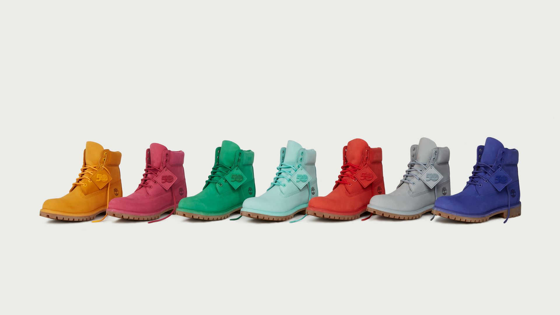
Limited Editions and Brand Heat
While the Wheat boot is the brand’s heartbeat, Timberland utilizes color as a tactical tool through collaborations. By partnering with brands like Supreme, Off-White, and Aimé Leon Dore, Timberland releases the classic boot in limited-run colors—forest green, deep red, or jet black.
These collaborations create “brand heat” and keep the company relevant in the fast-moving world of fashion. Crucially, these limited releases always serve to point back to the original. They are the “remix,” but the Wheat boot remains the “classic.” This strategy allows the brand to be perceived as innovative without sacrificing the stability of its core identity.
Sustainability and the Future of the Timberland Palette
In the modern era, a brand’s “color” is also being redefined by its environmental footprint. Timberland has integrated its “Nature Needs Heroes” campaign into its brand strategy, focusing on sustainable leather sourcing and eco-friendly dyes.
The future of the Timberland color palette is inextricably linked to “green” branding. By committing to হয়ে (circular) design and regenerative leather, Timberland is ensuring that the “Wheat” color represents not just a fashion choice, but an ethical one. For the modern consumer, the “color” of a brand is now judged by its transparency and corporate social responsibility.
Conclusion: The Power of a Singular Vision
So, what color are Timberland boots? They are the color of a deliberate, decades-long brand strategy. The Wheat color is more than a pigment; it is a visual shorthand for durability, a cultural bridge between rural workwear and urban fashion, and a fortress of brand equity.
By maintaining a singular focus on their iconic visual identity while tactically expanding through collaborations and sustainability initiatives, Timberland has achieved what most brands only dream of: a product that is recognizable by its color alone. In an era of constant rebranding and digital noise, Timberland serves as a powerful reminder that sometimes, the most effective brand strategy is to find your “Wheat” and never let it fade.
aViewFromTheCave is a participant in the Amazon Services LLC Associates Program, an affiliate advertising program designed to provide a means for sites to earn advertising fees by advertising and linking to Amazon.com. Amazon, the Amazon logo, AmazonSupply, and the AmazonSupply logo are trademarks of Amazon.com, Inc. or its affiliates. As an Amazon Associate we earn affiliate commissions from qualifying purchases.