In the hyper-competitive landscape of global commerce, a single character can carry the weight of an entire corporate philosophy. Among the most intriguing and enduring symbols in the world of typography and logo design is the “Z” with a horizontal line through it—technically known as the Ƶ (Z-bar). While a layperson might see it as a simple stylistic choice, brand strategists and design experts recognize it as a deliberate tool used to convey precision, heritage, and modern sophistication.
The evolution of the “Z” with a stroke represents a fascinating intersection of functional utility and high-end brand positioning. From the legendary mark of a masked vigilante to the sleek emblems of modern automotive giants and tech-forward startups, this specific glyph serves as a masterclass in how subtle modifications to standard typography can create a distinct, memorable, and legally defensible brand identity.
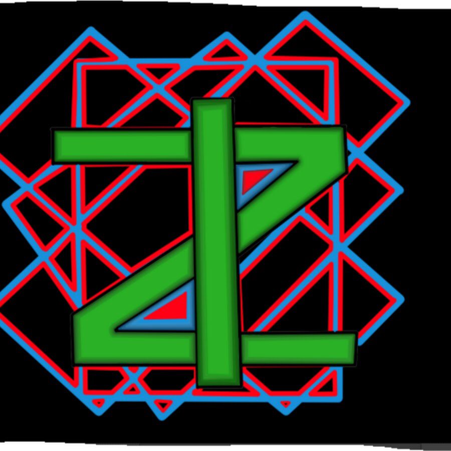
The Visual Language of the Strikethrough Z (Ƶ)
To understand why brands gravitate toward the Ƶ, one must first understand the psychological and historical baggage the symbol carries. In branding, nothing is accidental. Every serif, weight, and crossbar is engineered to evoke a specific emotional response or to solve a practical communication problem.
Origins and the Need for Distinction
Historically, the horizontal bar through the letter “Z” originated in mathematics and scientific notation. Its primary purpose was functional: to prevent the handwritten letter “Z” from being confused with the numeral “2.” In a branding context, this translates to a narrative of “clarity” and “precision.” When a company adopts the Ƶ, they are subtly signaling to their audience that they are a brand of detail and accuracy. This is particularly prevalent in industries where technical excellence is a core value proposition, such as engineering, high-performance manufacturing, and luxury horology.
Psychological Impact of the Horizontal Bar
Visually, the horizontal bar (or “stroke”) acts as an anchor. It breaks the diagonal flow of the “Z,” forcing the eye to pause. In design psychology, this creates a sense of stability and structure. A standard “Z” can feel sharp and aggressive due to its acute angles. The addition of the crossbar balances the character, making it feel more “grounded.” For a brand, this balance is essential; it allows the company to appear energetic and fast (the “Z” shape) while remaining reliable and steadfast (the crossbar).
Case Studies: From Legacy Symbols to Modern Corporate Giants
The use of the Ƶ in brand strategy isn’t a new phenomenon, but its application has evolved significantly over the last century. Examining how different entities have utilized this symbol reveals a pattern of transformation—from a mark of rebellion to a signifier of premium status.
The “Z” as a Cultural Icon (Zorro and Beyond)
Perhaps the most famous “Z” in history belongs to the character Zorro. While often depicted as a simple slashed “Z,” various iterations of the mark in film and literature have included the horizontal stroke to give the symbol more “weight” and a signature, artisanal feel. In branding terms, this created an association between the “Z” and themes of justice, swiftness, and heroism. Modern brands often tap into this subconscious archetype when they want to position themselves as “disruptors” or “protectors” within their respective niches.
Nissan and the Evolution of the Z-Series Branding
One of the most prominent corporate uses of the stylized “Z” is found in Nissan’s iconic sports car lineage. The Nissan “Z” logo has gone through several iterations, but the use of a bold, often modified “Z” has remained a constant. In certain regional markets and historical badges, the “Z” has featured a distinct horizontal emphasis that mimics the Ƶ. By doing this, Nissan didn’t just name a car; they created a sub-brand. The “Z” with its unique flair signifies a departure from their standard commuter vehicles, marking the line as something elite, specialized, and high-performance.
Modern Tech-Branding and Minimalist Identity
In the contemporary era of “bland-ing”—where many tech companies are moving toward hyper-minimalist, sans-serif logos—the Ƶ offers a way to remain minimalist while retaining a unique visual “hook.” When a brand like a fintech startup or an AI-driven consulting firm uses the Ƶ, they are distancing themselves from the “legacy” look of traditional finance or law. The stroke makes the letter look like a custom-designed icon rather than a standard character from a pre-installed font. This “bespoke” feel is a key component of modern brand strategy, signaling exclusivity and innovation.

Why Brands Choose the Crossed Z Over the Standard Character
Choosing a logo is a multi-million dollar decision for global corporations. The preference for a Ƶ over a standard “Z” is driven by three primary strategic pillars: differentiation, legibility, and internationalization.
Differentiation in a Crowded Marketplace
The primary goal of branding is to be distinct. In a world where thousands of brands might use a letter-mark (a logo consisting of a single letter), a standard “Z” is difficult to trademark and even harder to own in the consumer’s mind. By adding the crossbar, a brand creates a unique “glyph.” This modification makes it significantly easier to secure intellectual property rights and ensures that when a customer sees that specific Ƶ, they associate it only with that specific company, rather than a generic letter of the alphabet.
Avoiding Ambiguity (The ‘2’ vs ‘Z’ Problem)
In digital-first branding, legibility is king. Logos must be recognizable as tiny favicons on a smartphone screen or on a massive billboard. The “2 vs. Z” problem isn’t just for mathematicians; it’s a design hurdle. A standard “Z” can sometimes look like a “2” or even a “7” depending on the typeface and the angle. The crossbar eliminates this ambiguity instantly. For brands that operate in technical or financial sectors, where numbers and letters often sit side-by-side, this clarity is a vital part of the user experience (UX) and brand trust.
Global Appeal and Phonetic Neutrality
The “Z” is a powerful letter because it is phonetically strong in many languages. However, the Ƶ version carries an “internationalist” aesthetic. It looks like a character from a universal language. For a brand looking to expand globally, this “Latin-plus” styling feels sophisticated to European markets while remaining recognizable to Western audiences. It suggests a brand that is “traveled” and “cultured.”
Implementing the Crossed Z in Your Personal or Corporate Brand Strategy
If a brand decides to adopt the Ƶ as part of its visual identity, the execution must be handled with surgical precision. It is not enough to simply draw a line through a letter; the stroke must be integrated into the brand’s “DNA.”
Typography and Font Selection
The success of a Ƶ-based logo depends entirely on the weight and placement of the stroke. A line that is too thin makes the logo look like a mistake or a printing error. A line that is too thick can make the letter unreadable. Strategic brand designers often use a “variable width” stroke that tapers at the ends to imply movement.
Furthermore, the choice between a serif and a sans-serif Ƶ dictates the brand’s “voice.” A serif Ƶ (with small decorative feet) feels academic, established, and authoritative—ideal for a law firm or a private equity group. A sans-serif Ƶ (clean, straight lines) feels futuristic, agile, and tech-centric.
Legal and Trademark Considerations
From a brand strategy perspective, the Ƶ provides a “defensible” mark. Trademark law often hinges on whether a mark is “descriptive” or “distinctive.” A plain letter is rarely considered distinctive. However, a stylized letter with a specific modification like a crossbar becomes a “design mark.” This allows brand owners to protect their visual identity more aggressively, preventing competitors from using similar-looking icons in the same industry.
Conclusion: The Future of Minimalist Iconography
The “Z” with a line through it is more than just a character; it is a strategic asset. It represents a bridge between the functional past and the branded future. As we move further into an era of visual shorthand—where logos are increasingly used as social media avatars and app icons—the ability of a symbol like the Ƶ to convey a complex narrative in a single stroke is invaluable.
For a brand, the Ƶ says: “We are precise, we are different, and we are built on a foundation of clarity.” Whether it is used to denote the speed of a sports car, the accuracy of a financial tool, or the innovative spirit of a new tech startup, the crossed Z remains one of the most potent weapons in a brand strategist’s arsenal. It proves that in the world of corporate identity, sometimes the smallest mark can make the loudest statement.
aViewFromTheCave is a participant in the Amazon Services LLC Associates Program, an affiliate advertising program designed to provide a means for sites to earn advertising fees by advertising and linking to Amazon.com. Amazon, the Amazon logo, AmazonSupply, and the AmazonSupply logo are trademarks of Amazon.com, Inc. or its affiliates. As an Amazon Associate we earn affiliate commissions from qualifying purchases.