
In the vast landscape of visual communication, few symbols are as instantly recognizable yet deeply nuanced as the arrow. When rendered in the vibrant, high-contrast hue of yellow, this symbol transcends its utility as a mere directional pointer and becomes a potent tool for brand strategy. For marketers, designers, and corporate strategists, understanding what a yellow arrow means is essential to decoding some of the world’s most successful brand identities.
In the context of branding, a yellow arrow is rarely just a signpost. It is a psychological trigger designed to communicate speed, optimism, reliability, and progress. From the “A-to-Z” smile of Amazon to the fast-casual trajectory of Subway, the yellow arrow serves as a silent ambassador for a brand’s values.
The Visual Language of Motion and Optimism
To understand the impact of the yellow arrow, we must first dissect its two primary components: the geometry of the arrow and the psychology of the color yellow. In brand design, these elements work in tandem to create a specific emotional response in the consumer.
The Semiotics of the Arrow
The arrow is a universal symbol of directionality. In semiotics—the study of signs and symbols—the arrow is an “indexical” sign, meaning it points to something else. In a brand context, it suggests movement toward a goal. Whether it is a literal move toward a destination or a figurative move toward a better lifestyle, the arrow implies a journey. It suggests that the brand is not static; it is dynamic, evolving, and purpose-driven.
The Psychological Impact of Yellow
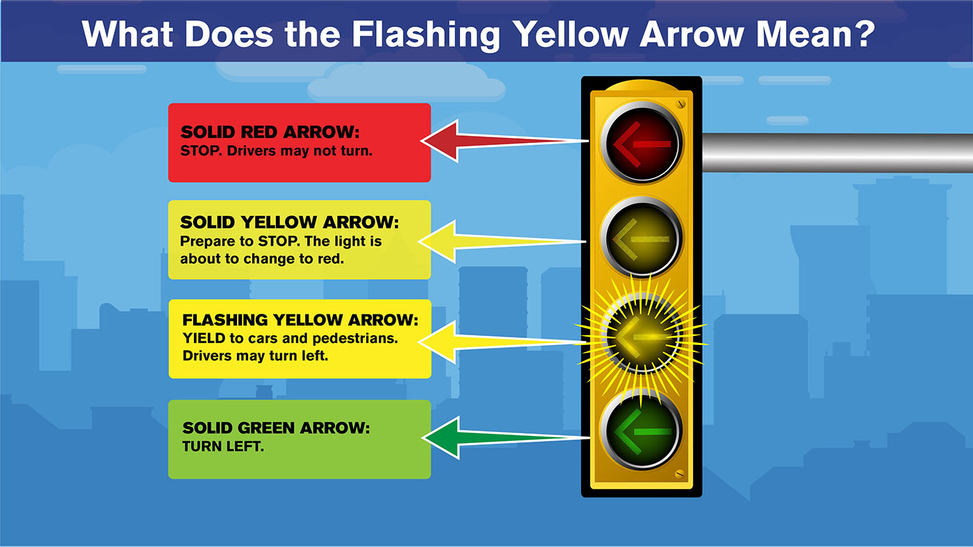
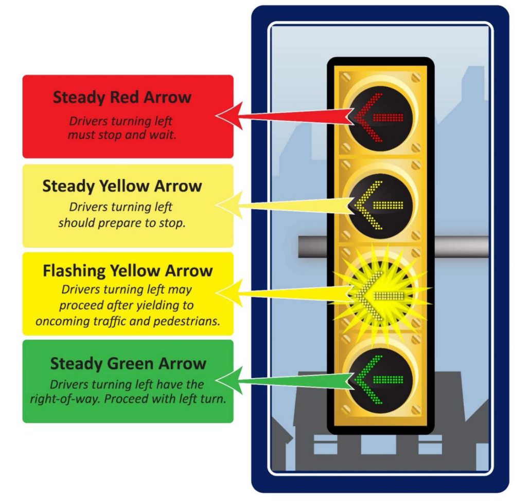
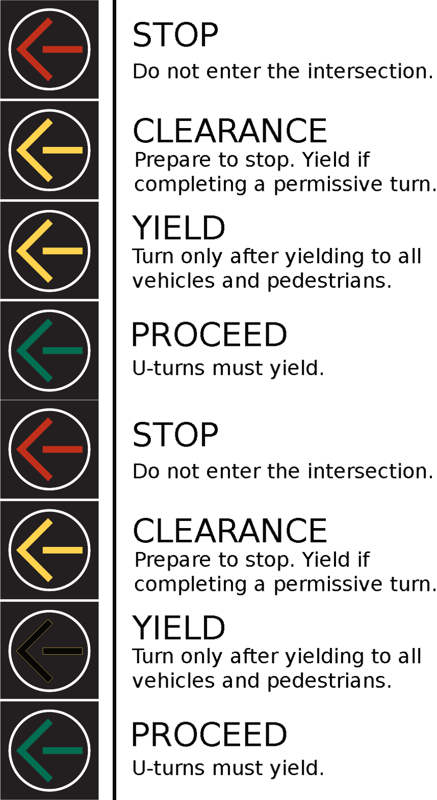
Yellow is the most visible color in the spectrum and the first one the human eye processes. It is inherently associated with the sun, warmth, and clarity. In marketing psychology, yellow is used to evoke feelings of happiness, optimism, and energy. However, it also carries a secondary meaning of caution and alertness (often seen in traffic signage). When a brand utilizes a yellow arrow, it captures that dual sense of “pay attention” and “move forward with joy.” It creates a high-visibility “Call to Action” that feels inviting rather than demanding.
Analyzing the “Amazon Effect”: A Masterclass in Symbolism
Perhaps the most iconic use of the yellow arrow in modern corporate identity is the Amazon logo. Introduced in 2000, this design transformed a simple wordmark into a narrative of logistics and customer satisfaction.
Connecting A to Z
The yellow arrow in the Amazon logo starts under the letter “A” and points directly to the “Z.” This is a strategic masterstroke in brand storytelling. It communicates, without a single word of copy, that the company offers every product imaginable—from A to Z. It reinforces the brand’s core value proposition: variety and completion. The arrow’s path is smooth and slightly curved, suggesting the ease of the customer journey.
The Hidden Smile
Beyond the directional meaning, the curve of the yellow arrow is designed to mimic a smile. This adds a layer of “human-centric” branding to a massive, data-driven tech giant. The yellow color choice is critical here; a red arrow might look aggressive, and a blue one might look too corporate. The yellow smile-arrow conveys a sense of friendly service and the “delight” of receiving a package. For Amazon, the yellow arrow means “everything you need, delivered with a smile.”
Strategic Implementation: Why Brands Choose the Yellow Arrow
When a brand strategist decides to incorporate a yellow arrow into a corporate identity, it is usually to solve a specific communication problem. The goal is often to simplify a complex value proposition into a single, kinetic image.
Communicating Speed and Efficiency
For brands in the logistics and transport sectors, such as DHL or various courier services, the yellow arrow is a shorthand for efficiency. Because yellow is the color of high visibility, it suggests that the brand can navigate through the “noise” of the marketplace to deliver results quickly. The arrow provides the vector—the literal line of flight—while the yellow provides the energy.
Navigational Cues in User Experience (UX)
In the digital age, brand strategy extends into the user interface. A yellow arrow within an app or a website acts as a high-contrast guide. Brands use this specific signifier to reduce “cognitive load” for the consumer. When a user sees a yellow arrow, their brain instinctively knows where to click or which way to scroll. By aligning their brand identity with these functional cues, companies like Subway or Off-White create a seamless transition between their physical marketing and their digital presence.
The Cultural Versality of Directional Cues
One of the reasons the yellow arrow is such a favored tool in global brand strategy is its cross-cultural legibility. Unlike words, which require translation, or complex icons, which might have different religious or social meanings, the arrow is understood globally as “this way.”
Global Consistency
For multinational corporations, maintaining brand equity across borders is a significant challenge. A yellow arrow functions as a “visual Esperanto.” Whether a consumer is in Tokyo, London, or New York, the yellow arrow on a package or storefront communicates a consistent message of forward momentum. This universality is a cost-effective way for brands to build a global presence without having to localize every single aspect of their visual identity.
Niche Reappropriation
In recent years, the yellow arrow has moved from corporate logistics into the world of high fashion and lifestyle branding. The brand Off-White, founded by Virgil Abloh, utilized industrial-style arrows and bright yellow caution-tape motifs to create a “brand of the moment.” In this context, the yellow arrow took on a new meaning: it signaled an “industrial chic” aesthetic and a self-aware commentary on consumerism. This demonstrates the symbol’s versatility—it can represent a billion-dollar logistics firm just as easily as it can represent a luxury streetwear label.
Best Practices for Integrating Directional Symbols
If you are developing a brand identity or a marketing campaign, incorporating a yellow arrow requires a balance of minimalism and intent. It is a loud symbol, and if used incorrectly, it can overwhelm the rest of your design.
Balancing Contrast and Legibility
Yellow is a notoriously difficult color to use on white backgrounds without proper outlining or weighting. When designing a yellow arrow, brand strategists often pair it with a dark “anchor” color—like black, navy blue, or deep forest green. This ensures that the arrow pops and maintains its “High Visibility” status. The contrast ratio is not just an aesthetic choice; it is an accessibility requirement for modern branding.
Avoiding Clichés
Because the arrow is such a common symbol, the risk of falling into a “generic” brand identity is high. To make a yellow arrow truly represent a brand, it must have a unique “weight” or “flair.” Is the arrow sleek and thin, suggesting precision? Or is it bold and chunky, suggesting power? The specific geometry of the arrow—the angle of the head and the thickness of the shaft—will tell the consumer more about the brand’s personality than the color alone.
Conclusion: The Path Forward
So, what does a yellow arrow mean? In the world of brand strategy, it is the ultimate symbol of the “Next Step.” It is an invitation to move forward, a promise of efficiency, and a beacon of optimism.
When we see that flash of yellow pointing the way, we are being guided by a sophisticated piece of visual engineering. From the way it directs our eyes across a webpage to the way it creates a sense of “A-to-Z” reliability on a cardboard box, the yellow arrow is one of the most effective tools in a marketer’s arsenal. It reminds us that successful branding isn’t just about telling a customer where you are—it’s about showing them where you can take them. As markets become more crowded and attention spans shorter, the clear, bright, and purposeful yellow arrow will continue to be a vital shorthand for progress in the global marketplace.
aViewFromTheCave is a participant in the Amazon Services LLC Associates Program, an affiliate advertising program designed to provide a means for sites to earn advertising fees by advertising and linking to Amazon.com. Amazon, the Amazon logo, AmazonSupply, and the AmazonSupply logo are trademarks of Amazon.com, Inc. or its affiliates. As an Amazon Associate we earn affiliate commissions from qualifying purchases.