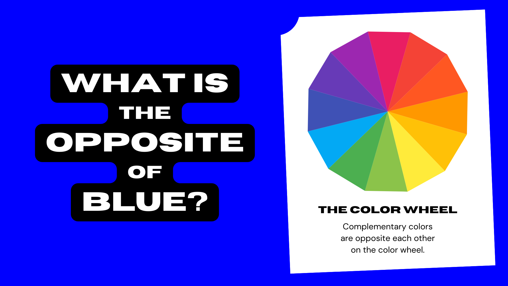
In the world of visual communication and brand strategy, color is rarely just an aesthetic choice. It is a psychological trigger, a cultural signifier, and a strategic tool. When we ask, “What is the opposite of blue?” the answer depends entirely on whether you are looking at a color wheel or a brand positioning map. From a purely chromatic perspective, the opposite of blue is orange. However, from a strategic branding perspective, the opposite of blue represents a move away from stability, tradition, and corporate safety toward energy, disruption, and urgency.
Blue has long been the “safe” harbor of the corporate world. It is the color of IBM, Ford, Chase Bank, and Facebook. It represents trust, intelligence, and calmness. But in a saturated market where every competitor is vying for the same “trustworthy” badge, the strategic “opposite” becomes a powerful weapon for differentiation. To understand the opposite of blue is to understand the art of brand disruption.
The Color Psychology of Blue vs. Its Direct Opposites
To understand why a brand would choose to move away from blue, we must first analyze the psychological weight that blue carries. Blue is the most universally liked color, making it the default choice for global corporations. It lowers the heart rate and evokes a sense of order. However, its opposite—orange—occupies a completely different psychological territory.
The Dominance of Trust and Security
In the financial and technology sectors, blue is ubiquitous. It signals that a company is established and reliable. When a user logs into a banking app, the presence of blue is designed to reassure them that their money is safe. This “safe” positioning, however, creates a sea of sameness. When every brand in a sector uses the same shade of navy or royal blue, they become indistinguishable to the consumer. The psychological opposite here isn’t just a different color; it’s a shift from “stability” to “vitality.”
Identifying the Chromatic Opposite: The Vibrancy of Orange
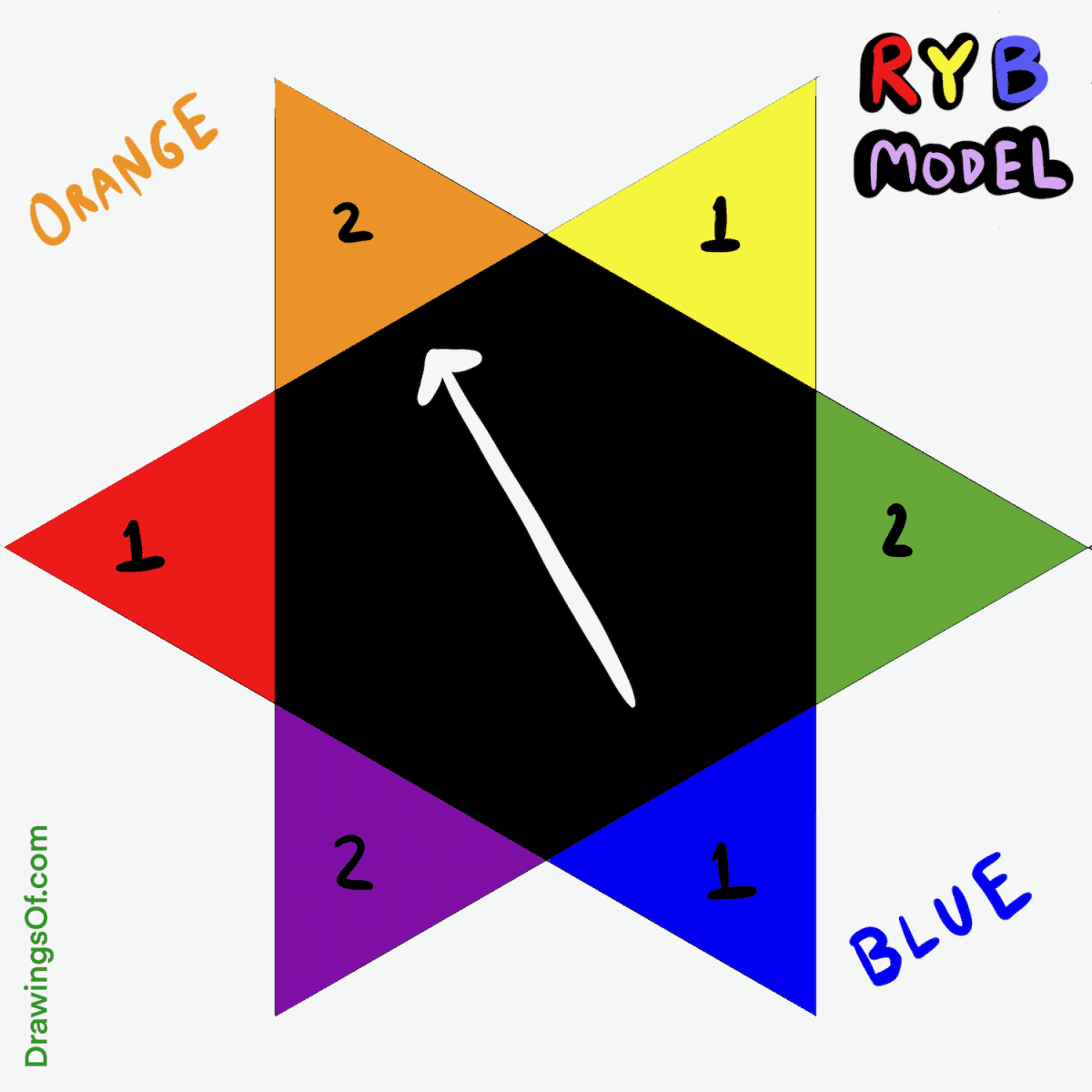
On the traditional RYB (Red, Yellow, Blue) color wheel, orange is the direct complement to blue. While blue is cool and receding, orange is warm and advancing. While blue is quiet, orange is loud. Brands like Nickelodeon, Hermès, and Mastercard (in part) utilize orange to command attention. In branding, using the chromatic opposite of blue is a declaration of presence. It is used to signal affordability, playfulness, and physical energy—traits that are often the antithesis of the stoic, “blue” corporate identity.
Emotional Polarity: Stability vs. Spontaneity
If blue represents the “thinker,” its opposite represents the “doer.” Strategic branding often uses this polarity to target different demographics. A brand targeting retirees or institutional investors will lean heavily into blue’s stability. Conversely, a brand targeting Gen Z or the gig economy might lean into its opposites—bright oranges, warm yellows, or high-energy reds—to signal a break from the status quo. The opposite of blue, in this emotional context, is the spark of spontaneity.
Strategic Differentiation: Moving from Blue Oceans to Vibrant Contrasts
In brand strategy, the “Blue Ocean Strategy” refers to creating an uncontested market space. Ironically, to find a blue ocean today, a brand might need to look visually like the opposite of blue. When a market is crowded with “Blue” brands, the most radical thing a company can do is adopt a palette that contradicts the industry standard.
The “Me-Too” Effect in Tech Branding
Walk through any tech hub, and you will see a parade of blue logos. From Intel to Dell to LinkedIn, the industry has coded blue as the color of “logic.” This has led to a “Me-Too” effect where new startups reflexively choose blue to look “professional.” However, the brands that have successfully disrupted these spaces often choose the opposite path. Think of the bold oranges and magentas used by disruptive telecommunications companies or creative software tools. By rejecting blue, these brands immediately signal that they are not part of the old guard.
Case Studies in Disruptive Color Shifts
Consider the evolution of branding in the luxury sector. While many legacy brands used deep blues and blacks to signal “old money” exclusivity, brands like Hermès claimed orange as their signature. This choice allowed them to stand out in a retail environment dominated by somber tones. Similarly, in the world of logistics, while many companies used blue to signal reliability, FedEx introduced a high-contrast combination of purple and orange. This use of a “blue-adjacent” purple paired with its opposite (orange) created one of the most recognizable and high-energy visual identities in history.

When the “Opposite” is a Competitive Advantage
Choosing the opposite of the industry standard is a high-risk, high-reward strategy. If your competitors are all “blue”—representing cold, distant, and corporate—your brand can gain a competitive advantage by being “orange”—representing warm, approachable, and human. This is not just about the logo; it’s about the entire brand voice. The “opposite of blue” brand talks differently, acts faster, and focuses on the emotional connection rather than just the logical transaction.
The Visual Mechanics of Brand Identity
Beyond the abstract strategy, the “opposite of blue” plays a critical role in the technical side of brand design, particularly in UI/UX and digital marketing. Effective brand identity requires balance, and understanding contrast is fundamental to conversion.
Utilizing Complementary Color Schemes for Digital Engagement
In digital design, the concept of the “opposite” is used to drive user behavior. If a website’s primary brand color is blue, the most effective color for a “Buy Now” or “Sign Up” button is often orange. Because orange is the chromatic opposite, it creates the highest level of visual tension. This tension draws the eye immediately to the call-to-action (CTA). A brand that stays strictly within the blue family for all its elements risks having its most important buttons blend into the background.
The Science of High-Contrast Call-to-Actions
Neuro-marketing studies show that the human brain is wired to notice anomalies. In a “blue” brand environment, the “orange” element is an anomaly. This is known as the Von Restorff effect, which predicts that when multiple similar objects are present, the one that differs from the rest is most likely to be remembered. Strategic branding leverages the opposite of blue to ensure that the user’s journey is guided by intentional visual friction.
Balancing the Palette: The Role of Neutrality
While the opposite of blue is powerful, a brand cannot survive on high contrast alone. The most sophisticated brand identities use the “opposite” sparingly. They might use a deep navy as their foundation (the blue) and use pops of tangerine or coral (the opposite) to highlight innovation or key messaging. This creates a balanced visual hierarchy that conveys both the reliability of the blue and the excitement of its opposite.
Personal Branding and the “Non-Blue” Persona
The concept of the “opposite of blue” also applies to personal branding and professional identity. In an era where everyone is told to be “professional” and “polished” (the hallmarks of a blue persona), there is a growing movement toward the “authentic” and “vibrant” (the opposite).
Crafting a Unique Professional Identity
For consultants, speakers, and creators, the “blue” approach is the safe route—wearing the blue suit, using the standard blue PowerPoint template, and speaking in corporate jargon. However, those who dominate their niche often adopt the strategic opposite. They use bold colors, unconventional layouts, and a voice that prioritizes personality over corporate neutrality. By being the “orange” person in a room of “blue” suits, they become the most memorable brand in the room.
Breaking the LinkedIn Aesthetic
LinkedIn is perhaps the ultimate “blue” environment. The platform’s interface is blue, and the vast majority of profile pictures and headers follow suit. To stand out in the feed, personal brands are increasingly using high-saturation opposites. A profile with an orange background or high-energy graphics breaks the scroll-induced trance of the user. This is a practical application of finding the opposite of blue to gain “mental availability” in a crowded marketplace.
Conclusion: The Strategic Choice of the Opposite
In conclusion, “what is the opposite of blue” is a question that invites us to look at the foundations of how we perceive value and identity. While blue will likely always remain the king of corporate colors due to its association with trust and stability, its dominance creates a massive opportunity for brands brave enough to embrace its opposite.
Whether it is through the literal use of orange to create visual pop and urgency, or the metaphorical move toward disruption and warmth, the opposite of blue represents the frontier of branding. In a world that is increasingly automated and standardized, the brands that succeed are often those that realize that being the opposite of “standard” is the only way to be truly seen. For a brand strategist, the opposite of blue isn’t just a color—it’s a philosophy of differentiation that turns a quiet presence into a loud, unavoidable success.
aViewFromTheCave is a participant in the Amazon Services LLC Associates Program, an affiliate advertising program designed to provide a means for sites to earn advertising fees by advertising and linking to Amazon.com. Amazon, the Amazon logo, AmazonSupply, and the AmazonSupply logo are trademarks of Amazon.com, Inc. or its affiliates. As an Amazon Associate we earn affiliate commissions from qualifying purchases.