
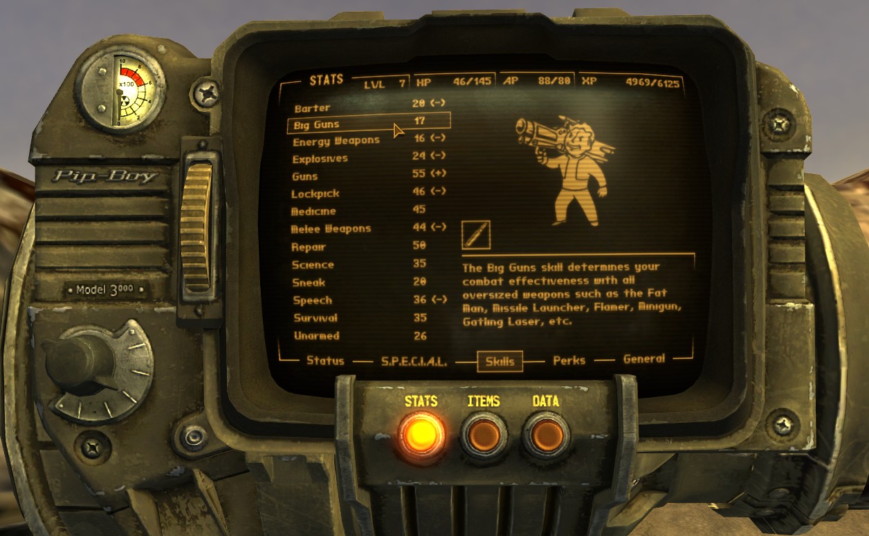
The distinctive, retro-futuristic aesthetic of the Pip-Boy, a ubiquitous in-game device within the Fallout series, has captivated players for decades. Beyond its functional interface and iconic green glow, a significant element contributing to its immersive character is its unique typographical design. The “Pip-Boy font” is more than just a typeface; it’s a carefully crafted visual element that evokes a specific era and a particular vision of technology, deeply embedding itself into the player’s experience. This article will explore the origins, characteristics, and enduring impact of the Pip-Boy font within the realm of digital design and technology.
The Genesis of a Digital Icon: Design Inspirations
The Pip-Boy’s visual language is heavily influenced by mid-20th century American industrial design and the burgeoning field of early computer interfaces. Understanding these inspirations is key to appreciating the intentionality behind the font choice.
Retro-Futurism and the Atomic Age
The Fallout series is set in an alternate history where the post-World War II optimism and fascination with atomic power continued unabated, leading to a technologically advanced but culturally anachronistic society. This “retro-futuristic” aesthetic is central to its identity, and the Pip-Boy is a prime example. The design draws heavily from the visual cues of the Atomic Age, a period characterized by a belief in progress through science and a specific, often bulky and utilitarian, design language. Think of the sleek yet robust designs of early televisions, radios, and scientific equipment from the 1950s and 1960s. These objects often featured bold lettering, clear sans-serif fonts, and a sense of durable functionality.
The Pip-Boy’s interface, with its stark green monochrome display and utilitarian layout, directly mirrors the operational displays of early mainframe computers and military equipment of that era. These were not designed for aesthetic appeal in the modern sense but for immediate readability and unambiguous function in demanding environments. The choice of a font that echoed this practicality was therefore a deliberate one.
Early Computer Typography and Readability
The early days of computing were marked by significant limitations in display technology. Screens had low resolutions, and characters were often rendered using blocky, pixelated fonts. The primary concern was legibility, especially for technical data and operational instructions. Fonts were designed to be as clear and distinct as possible, often with monospace characteristics where each character occupied the same horizontal space. This ensured that text aligned correctly and was easy to scan, crucial for complex readouts and command-line interfaces.
The Pip-Boy font, while not a direct replica of any single early computer font, captures the spirit of this era. It possesses a certain mechanical quality, with characters that are distinct and well-defined. The slightly geometric shapes and the emphasis on straight lines and right angles contribute to its retro-computing feel. It’s a font that suggests efficiency and a direct link to the underlying machinery, a characteristic that aligns perfectly with the Pip-Boy’s role as a portable, integrated personal assistant and diagnostic tool for a wasteland survivor.
Deconstructing the Pip-Boy Font: Key Characteristics
While there isn’t a single, officially named font that the Pip-Boy exclusively uses across all iterations, the distinct stylistic elements are consistent and recognizable. These characteristics work in concert to create the font’s unique identity.
Monospaced Structure and Geometric Forms
One of the most defining features of the Pip-Boy font is its monospaced nature. This means that every character, from an “i” to a “w,” takes up the same amount of horizontal space. This design choice is not merely aesthetic; it has practical roots in early computing. Monospaced fonts facilitate precise alignment of text, which is crucial for displaying data tables, code, or any information that requires columnar structure.
Visually, this monospacing contributes to a grid-like appearance, reinforcing the technological theme. The characters themselves often exhibit strong geometric forms. Straight lines, sharp corners, and consistent stroke widths are common. There’s a deliberate lack of decorative serifs or flourishes, emphasizing a functional and industrial design ethos. This can be seen in the sharp, angular terminals of letters like “S” or “E,” and the uniform width of strokes in characters like “M” and “N.” This geometric precision lends the font an air of technical accuracy and deliberate construction, fitting for a device that serves as a vital piece of equipment.
Minimalist and Utilitarian Aesthetics
The Pip-Boy font embodies a minimalist and utilitarian aesthetic. It’s designed for clarity and immediate comprehension rather than for aesthetic beauty or emotional resonance. The letterforms are often stripped down to their essential components, with a focus on readability in a low-resolution, monochrome environment. This means avoiding overly complex curves or subtle variations in stroke weight that might be lost on a basic display.
The simplicity of the font also contributes to its ability to convey a sense of anachronism. In the post-apocalyptic world of Fallout, technology has advanced in some areas but stagnated or regressed in others. The Pip-Boy’s interface, including its font, harks back to an earlier conception of technology—one that was robust, functional, and perhaps less concerned with the user-friendliness we associate with modern interfaces. This utilitarian approach makes the Pip-Boy feel like a product of its imagined time, a piece of pre-war technology that has endured.
The “Fallout” Style: A Synthesis of Influences
While specific fonts used might vary slightly between Fallout games and for different interface elements, there’s a recognizable “Fallout style” that the Pip-Boy font consistently embodies. This style is a synthesis of the influences mentioned earlier: the clean lines of mid-century industrial design, the functional readability of early computer typography, and the specific retro-futuristic vision of the Fallout universe.
Fan communities and font enthusiasts have often attempted to replicate or identify specific fonts that closely match the Pip-Boy’s appearance. Some popular candidates and closely related fonts include variations of “Courier,” “OCR A,” or custom-designed fonts created by the game developers. However, the true strength of the Pip-Boy font lies not in a single, definitive typeface, but in how its stylistic elements coalesce to create a cohesive and evocative visual identity. It’s the consistent application of these monospaced, geometric, and utilitarian principles that defines the Pip-Boy font as an iconic element of the Fallout experience.
The Pip-Boy Font in Context: User Interface Design and Immersion
The significance of the Pip-Boy font extends beyond its visual characteristics; it plays a crucial role in the overall user interface (UI) design and enhances player immersion within the game world.
Enhancing Readability in a Challenging Environment
The Pip-Boy’s primary function is to provide players with essential information about their character, inventory, quests, and the surrounding environment. In the often chaotic and dangerous world of Fallout, players need to access this information quickly and accurately. The Pip-Boy font’s design is optimized for this purpose.
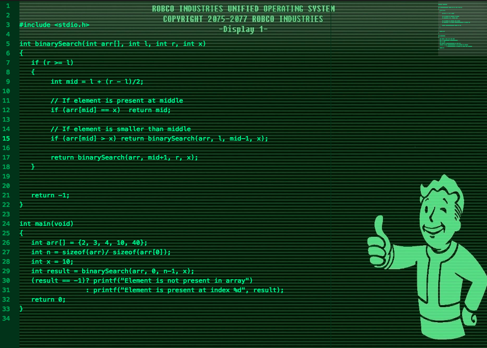
The strong contrast of the green text against the dark background, combined with the clear, distinct letterforms of the monospaced font, ensures that critical data is legible even in low-light conditions or during intense gameplay. The predictable spacing of monospaced text allows players to rapidly scan lists of items, perk names, or objective markers without being distracted by variations in character width. This focus on functional readability is a testament to good UI design principles, where the form of the typography directly supports the user’s interaction with the system.
Reinforcing the Game’s Lore and Atmosphere
Beyond its practical utility, the Pip-Boy font is a powerful tool for world-building and atmospheric reinforcement. By opting for a typeface that evokes a specific technological era, the developers at Bethesda Game Studios have meticulously crafted a visual language that aligns with the game’s overarching narrative and aesthetic.
The font acts as a constant reminder of the Fallout universe’s unique blend of pre-war optimism and post-apocalyptic grit. When a player looks at their Pip-Boy, they are not just looking at a menu; they are interacting with a piece of technology that has survived the Great War and continues to serve a vital purpose. The font’s retro-futuristic feel imbues the device with a sense of history and character, making it feel like an authentic artifact from the game’s world. This attention to detail in typography contributes significantly to the immersion, helping players feel more connected to the characters and the environment they inhabit.
The Pip-Boy Font as a Digital Design Landmark
The Pip-Boy font has transcended its in-game context to become a recognizable element of digital design and a touchstone for retro-computing enthusiasts. Its distinctiveness has led to its adoption and inspiration in various fan projects, mods, and even unrelated digital art.
The success of the Pip-Boy’s typographical design lies in its ability to be both functional within its intended application and evocative of a broader cultural and historical context. It demonstrates how typography, when thoughtfully chosen and applied, can be a fundamental component of a compelling digital experience. It’s a prime example of how careful design choices in UI typography can contribute to a game’s identity, enhance player engagement, and leave a lasting impression in the broader landscape of digital culture.
The Enduring Appeal of Retro Digital Typography
The Pip-Boy font’s popularity is a testament to a wider trend in digital design: the enduring appeal of retro-futuristic aesthetics and the appreciation for the functional typography of earlier computing eras. This fascination is not merely about nostalgia; it’s about recognizing the inherent strengths and unique character of these older design approaches.
Nostalgia and the Romance of Early Technology
For many players, the Pip-Boy font evokes a sense of nostalgia for a time when technology felt more tangible, mechanical, and perhaps even more mysterious. The clunky yet functional interfaces of early computers and scientific equipment hold a certain romanticism. There’s an inherent charm in their directness and their perceived robustness, a contrast to the sleek, often intangible nature of modern digital interfaces. The Pip-Boy font taps into this sentiment, offering a visual connection to a past that never quite happened but remains a potent cultural touchstone.
This nostalgia is not limited to older generations; younger players who are encountering these aesthetics for the first time often find them intriguing and refreshingly different from contemporary designs. The retro-futuristic style, with its bold lines and distinctive typography, offers a unique visual identity that stands out in a crowded digital landscape.
Functionalism as a Design Principle
The resurgence of interest in fonts like the Pip-Boy’s also highlights a renewed appreciation for pure functionalism in design. In an era where aesthetics can sometimes overshadow usability, the clear, legible, and purposeful design of early computer fonts offers a valuable lesson. These fonts were born out of necessity, designed to convey information effectively under technical constraints. This inherent functionality imbues them with a certain honesty and integrity that is often admired.
The Pip-Boy font, with its monospaced structure and geometric precision, exemplifies this functionalist ethos. It’s a design that prioritizes clarity and efficiency, making it an effective tool for information display. This focus on purpose resonates with designers and users alike, reminding them that good design is often about solving problems effectively.

The Legacy of Iconic Typefaces in Gaming
The Pip-Boy font is just one example of how typography has become an integral part of iconic video game experiences. Many other games have developed distinctive typographical styles that contribute significantly to their identity and immersion. From the gothic lettering of Castlevania to the blocky, pixelated fonts of early arcade games, typefaces have proven to be powerful tools for shaping player perception and reinforcing game lore.
The Pip-Boy font’s success lies in its perfect synergy with the Fallout universe. It’s a design that is instantly recognizable, deeply functional, and powerfully atmospheric. Its enduring appeal speaks to the broader cultural impact of well-executed digital design, demonstrating that even something as seemingly simple as a font can become a celebrated element of a beloved franchise and a lasting marker in the history of digital typography.
aViewFromTheCave is a participant in the Amazon Services LLC Associates Program, an affiliate advertising program designed to provide a means for sites to earn advertising fees by advertising and linking to Amazon.com. Amazon, the Amazon logo, AmazonSupply, and the AmazonSupply logo are trademarks of Amazon.com, Inc. or its affiliates. As an Amazon Associate we earn affiliate commissions from qualifying purchases.