In the fast-paced world of digital media, brand identity is often the most valuable asset a company possesses. For decades, the “HBO” acronym stood as the undisputed gold standard of premium television—a hallmark of prestige, quality, and cultural zeitgeist. However, in mid-2023, consumers woke up to find the familiar purple icon on their screens replaced by a bold, blue interface simply titled “Max.”
The disappearance of the HBO name from the primary masthead of Warner Bros. Discovery’s flagship streaming service was more than a technical update; it was one of the most discussed and debated rebranding strategies in recent corporate history. To understand what happened to HBO Max, one must look past the interface and into the complex world of brand architecture, market positioning, and the psychological weight of a legacy name.

The Heritage of Prestige: Why the HBO Brand Mattered
Before analyzing the transition, it is essential to recognize the brand equity that HBO (Home Box Office) had cultivated since 1972. HBO wasn’t just a channel; it was a promise of a specific kind of experience. From The Sopranos and The Wire to Game of Thrones and Succession, the brand represented “Peak TV.”
The “Golden Cuffs” of Quality
The HBO brand functioned as a seal of approval. When viewers saw the static-noise intro, they knew they were about to watch something high-budget, curated, and intellectually stimulating. However, this high-brow reputation created a strategic challenge when it came to scaling a mass-market streaming service. In the “Streaming Wars,” success is often determined by “average revenue per user” (ARPU) and “churn rate” (the rate at which people cancel). To keep churn low, a service needs more than just one prestige drama a week; it needs “lean-back” content—unscripted reality shows, documentaries, and children’s programming.
The Problem of Brand Confusion
When HBO Max launched in 2020, it suffered from a naming identity crisis. At the time, consumers were forced to distinguish between HBO (the cable channel), HBO Go (the mobile app for cable subscribers), and HBO Now (the standalone digital subscription). By adding “HBO Max” to the mix, WarnerMedia sought to signal that this was the “maximum” version of HBO. Ironically, this diluted the brand’s exclusivity. By putting Looney Tunes and Scooby-Doo under the HBO banner, the company began to blur the lines of what “HBO” actually stood for, confusing the brand’s core value proposition.
The Strategy Behind “Max”: Broadening the Horizon
The decision to drop “HBO” from the title “HBO Max” was a calculated move by the leadership at Warner Bros. Discovery (WBD) following the merger of WarnerMedia and Discovery, Inc. Led by CEO David Zaslav, the brand strategy shifted from niche prestige to broad-spectrum entertainment.
Appealing to the “Four Quadrants”
In marketing, a “four-quadrant” brand is one that appeals to all major demographic groups: male, female, over 25, and under 25. While HBO was dominant in the adult demographics, it lacked the family-friendly identity associated with Disney+ or the “something for everyone” reputation of Netflix. By rebranding to “Max,” the company aimed to signal that the platform was a home for Discovery’s massive library of unscripted content—including HGTV, Food Network, and TLC—without making it feel like 90 Day Fiancé was an “HBO show.”
Protecting the “Crown Jewel”
One of the most insightful reasons behind the rebrand was the desire to protect the HBO brand itself. Executives feared that if everything on the streaming service was labeled as “HBO,” the name would eventually lose its association with high-quality, cinematic storytelling. By moving HBO to a sub-brand or a “tab” within the Max ecosystem, they effectively restored HBO to its status as a premium boutique. In the new hierarchy, Max is the “supermarket,” and HBO is the “fine wine aisle.” This allows the company to sell the fine wine without forcing the supermarket to change its name to “The Fine Wine Store,” which might intimidate budget-conscious shoppers.
Visual Identity and Market Positioning
The transition to “Max” required a complete overhaul of the visual brand language. The shift from the deep purples and blacks of HBO Max to the bright “Max Blue” was a deliberate choice to signal a more energetic, accessible, and modern platform.
The Logo and Typography
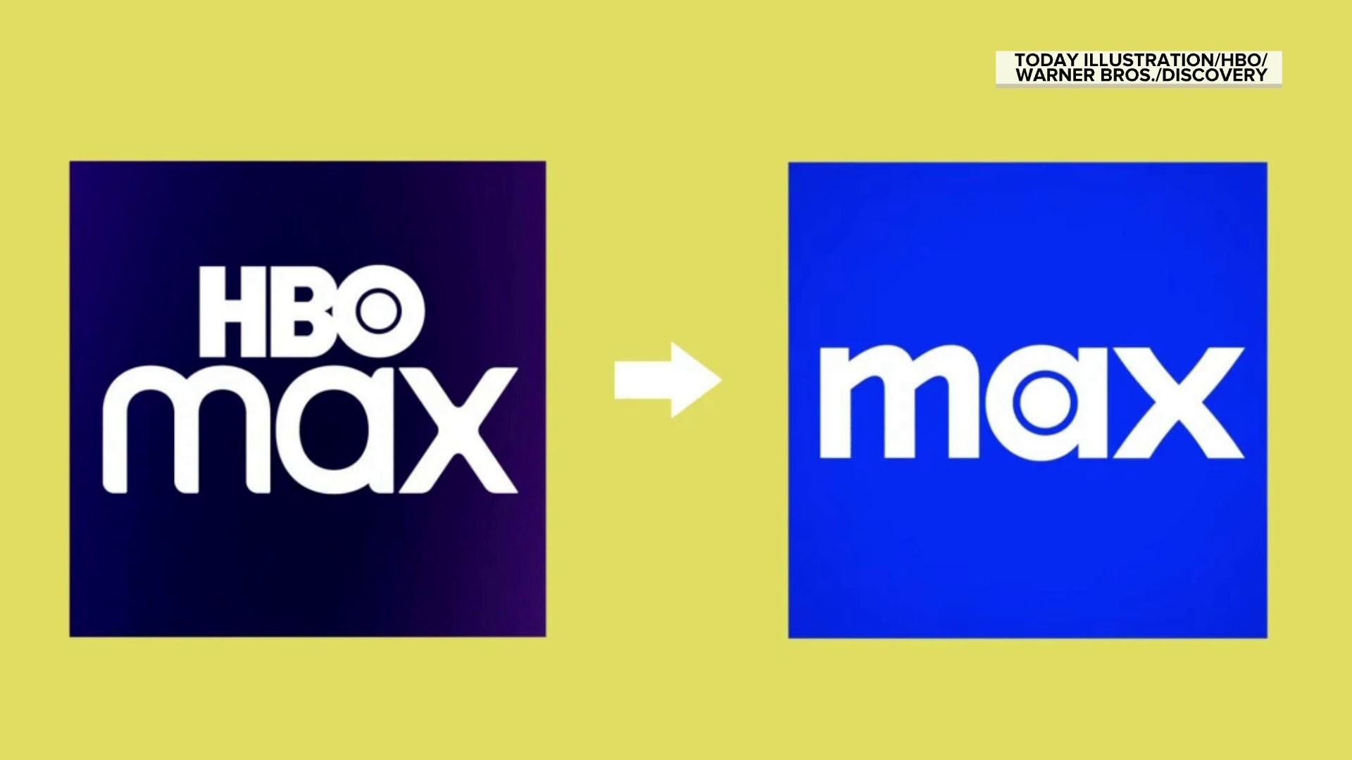
The Max logo retains a subtle nod to its predecessor. The “a” in Max features a circular center that mirrors the “bullseye” inside the “O” of the classic HBO logo. This design choice provides a “brand bridge”—a visual cue that connects the new identity to the old for those who are paying attention, while still presenting a clean break for the casual observer. The typography is bold and lowercase, moving away from the institutional feel of the original Warner Bros. branding toward something that feels more like a tech startup.
Positioning Against Competitors
In the crowded streaming landscape, Max is positioned as the “The One to Watch.” This slogan highlights a shift in brand strategy from being a “supplemental” service (one you subscribe to just for The Last of Us) to being a “primary” service (one you check every night for something to watch). By integrating Discovery+ content, the brand is attempting to compete directly with Netflix’s “infinite scroll” model. The brand story transitioned from “exclusive quality” to “limitless variety.”
The Risks and Rewards of Brand Dilution
Every major rebrand carries significant risk, especially when it involves abandoning one of the most recognizable names in entertainment history. The “Max” rebrand was met with immediate skepticism from brand purists and marketing experts.
The Risk of Becoming “Just Another App”
The primary criticism of the rebrand was that “Max” is a generic name. In a sea of Paramount+, Disney+, and Apple TV+, “Max” lacks the historical weight of its predecessor. Critics argued that by removing “HBO,” the company stripped away its greatest competitive advantage. Without the prestige attached to the name, there was a fear that the service would become a commodity rather than a destination.
The Data-Driven Reward
Despite the initial backlash, the data suggests that the brand strategy is achieving its goal of broadening the audience. By decoupling the “HBO” name from the broader service, the company has seen increased engagement in categories like “Home and Food” and “Kids and Family.” The brand is no longer restricted by the “adult-only” perception of HBO. For a brand strategist, this is a classic case of “Brand Architecture” vs. “Brand Identity.” While the identity (the name and logo) changed, the architecture (how the content is organized) became more logical for a global audience.
Lessons in Corporate Identity: The Future of Max
The story of what happened to HBO Max is a masterclass in how legacy brands must evolve to survive the digital age. It serves as a reminder that a brand is not a static logo, but a living relationship with the consumer.
Adaptation Over Tradition
The “Max” rebrand teaches us that even the most successful brands cannot afford to be complacent. Warner Bros. Discovery recognized that while the HBO name was a powerhouse, it was also a “narrow” brand in a “wide” market. To capture the largest possible share of the streaming market, they had to be willing to sacrifice the short-term recognition of the HBO name for the long-term scalability of a broader identity.

The “Sub-Brand” Strategy
The success of the Max rebrand will ultimately depend on how well they manage the “sub-brands” within the app. By keeping HBO, DC, Harry Potter, and Sesame Workshop as distinct pillars under the Max umbrella, the company is using a “house of brands” strategy. This allows each sub-brand to maintain its specific identity while contributing to the overall value of the “Max” ecosystem.
In conclusion, “HBO Max” didn’t really disappear; it grew up and moved out of its parents’ house. It shed the weight of its prestigious but restrictive heritage to become a versatile, mass-market contender. Whether the “Max” name will ever carry the same cultural weight as “HBO” remains to be seen, but the strategic shift highlights a fundamental truth in branding: sometimes, to grow bigger, you have to be willing to start over.
aViewFromTheCave is a participant in the Amazon Services LLC Associates Program, an affiliate advertising program designed to provide a means for sites to earn advertising fees by advertising and linking to Amazon.com. Amazon, the Amazon logo, AmazonSupply, and the AmazonSupply logo are trademarks of Amazon.com, Inc. or its affiliates. As an Amazon Associate we earn affiliate commissions from qualifying purchases.