
Beyond its myriad interpretations in ancient texts or spiritual traditions, the color red holds an undeniable and potent significance in the realm of modern brand strategy and corporate identity. In the competitive landscape of commerce, every visual element, especially color, is a carefully chosen instrument designed to evoke specific emotions, communicate brand values, and carve out a distinct psychological space in the consumer’s mind. Red, with its raw energy and undeniable presence, stands as one of the most powerful and frequently utilized hues in the branding arsenal. Its symbolism is deep, multifaceted, and culturally nuanced, making it a critical consideration for any brand seeking to make an indelible mark. Understanding the profound impact of red—from its ability to ignite passion and urgency to its role in signaling luxury or danger—is paramount for crafting a truly resonant and effective brand identity. This exploration delves into the strategic application and rich symbolism of the color red within the dynamic world of branding, marketing, and design.

The Primal Power of Red in Brand Psychology
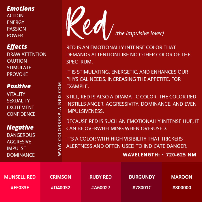
Red is not just a color; it’s a visceral experience. Its physiological impact on humans is well-documented, leading to increased heart rates, heightened senses, and a general state of arousal. This inherent power makes it an incredibly effective tool for brands aiming to elicit immediate and strong emotional responses from their audience.
Evoking Emotion and Urgency
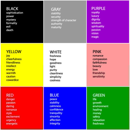
The psychological associations of red are broad and often contradictory, yet consistently powerful. It is the color of love, passion, and romance, making it a natural choice for brands that want to convey warmth, intimacy, and connection. Think of Valentine’s Day branding or the iconic red heart emoji—symbols universally understood to represent deep affection. Conversely, red is also associated with energy, excitement, and action. Brands looking to project dynamism, assertiveness, or a pioneering spirit frequently incorporate red into their visual identity. It’s often used in calls-to-action because it grabs attention and implies a need for immediate response. The urge to “stop” and notice something red is almost instinctive, a primeval response that marketers leverage to great effect. Brands like Coca-Cola have mastered the art of associating red with happiness, energy, and shared moments, while Netflix uses a vibrant red to symbolize excitement and the boundless possibilities of entertainment.
Signifying Danger, Warning, or Stop
On the other side of the emotional spectrum, red also carries connotations of danger, warning, and prohibition. This dual nature is crucial for brands to navigate. Globally, red traffic lights and stop signs universally communicate a need to halt or exercise caution. In branding, this aspect can be subtly employed to convey urgency, exclusivity, or even a sense of cutting-edge disruption that challenges the status quo. For instance, while a financial institution wouldn’t brand itself primarily in red due to associations with “being in the red” (debt), a cybersecurity firm might use red accents to highlight threats and their solutions. Retailers frequently use red for “sale” banners, creating a sense of urgency and scarcity—a “limited time” warning that prompts immediate purchase decisions. This application is less about literal danger and more about drawing immediate attention to critical information or opportunities.
Driving Appetite and Consumer Desire
Perhaps one of red’s most intriguing psychological effects is its impact on appetite. Numerous studies suggest that red can stimulate hunger and increase metabolism, making it a prevalent color in the food and beverage industry. Fast-food giants have long understood this connection, strategically splashing their branding in shades of red to subconsciously encourage consumption. Brands like McDonald’s, KFC, Pizza Hut, and Wendy’s all prominently feature red in their logos and restaurant décor. This isn’t accidental; it’s a deliberate psychological tactic to create an inviting, energetic atmosphere that encourages diners to eat quickly and potentially order more. The vibrancy of red can make food appear more appealing and exciting, tapping into primal instincts related to sustenance and satisfaction.
Cultural Nuances and Global Brand Identity
While some associations with red are universal, its symbolic meaning can vary significantly across different cultures. For brands operating on a global scale, a nuanced understanding of these cultural interpretations is not just beneficial but absolutely essential to avoid missteps and ensure messages resonate appropriately with diverse audiences.
Western vs. Eastern Interpretations of Red
In Western cultures, red’s primary associations often revolve around love, passion, anger, danger, and excitement. It’s the color of romance, but also of warnings and emergencies. In contrast, many Eastern cultures hold vastly different, often more positive, interpretations. In China, for example, red is the color of good fortune, happiness, celebration, and prosperity. It is prominently featured in weddings, New Year celebrations, and other auspicious events. Gifts are often given in red envelopes, symbolizing good luck. Similarly, in India, red symbolizes purity, fertility, love, and prosperity, often worn by brides and associated with goddesses. For a brand launching a product in both markets, a red logo could evoke passion and energy in the West while simultaneously conveying prosperity and good fortune in the East. However, a brand using red to symbolize danger might be misinterpreted in cultures where red signifies celebration.
The Impact on Cross-Cultural Marketing
The varying cultural symbolism of red underscores the critical need for cultural sensitivity in global branding and marketing. A brand that is highly successful with a red-dominant identity in one region might face challenges or even alienate consumers in another if its designers haven’t researched local perceptions. Consider a luxury brand using deep red to signify power and sophistication in Europe; in some parts of Africa, red can be associated with death or mourning, which would be disastrous. A food brand relying on red to stimulate appetite in the West needs to ensure that the color doesn’t carry negative connotations related to anger or war in other target markets. Successful global brands often employ strategies that either standardize a universally understood aspect of red (e.g., its ability to attract attention) or adapt their color palettes, sometimes subtly, to align with local cultural values. This might involve using different shades of red, pairing it with other colors, or even developing entirely localized brand identities.
Strategic Integration of Red in Brand Design
Integrating red into brand design is a delicate art. Its potency demands careful consideration of context, audience, and the overall brand message. When used strategically, red can elevate a brand from ordinary to iconic.
Red in Logos and Visual Identity
Choosing red for a logo or as a dominant part of a brand’s visual identity makes a bold statement. Red logos are inherently memorable and command attention. They project confidence, energy, and a willingness to stand out. This makes red a popular choice for disruptor brands, sports teams, technology innovators, and any entity seeking to convey vitality and a competitive edge. Think of brands like Adobe, CNN, or H&M; their use of red communicates a powerful, dynamic presence. However, the intensity of red also means it must be balanced. Overuse can be overwhelming or aggressive. Designers often pair red with neutral tones like white, grey, or black to create contrast and sophistication, or with complementary colors like green or blue to achieve specific visual effects. The shade of red also matters—a deep, rich burgundy can evoke luxury and tradition, while a bright, fiery scarlet suggests youthful energy and speed.
Red in Marketing Collateral and Campaigns
Beyond the logo, red plays a crucial role in marketing collateral and campaigns. It’s exceptionally effective for calls-to-action buttons on websites, banners, and advertisements, as its high visibility draws the eye and encourages immediate interaction. For product packaging, red can convey excitement and premium quality, especially in industries like cosmetics or food. In social media marketing, a well-placed red element can significantly increase engagement rates due to its attention-grabbing nature. However, marketers must ensure consistency across all touchpoints. A brand that uses red as its primary color in its logo but then uses predominantly blue in its website and advertising creates a disjointed experience that dilutes its brand identity. Consistent application reinforces the brand’s visual language and strengthens its recognition.
Red in Personal Branding
The strategic use of red isn’t limited to corporate entities; it’s also a powerful tool in personal branding. For professionals seeking to project confidence, authority, and passion, incorporating red can be highly effective. A pop of red in an outfit (e.g., a tie, a scarf, or a statement piece of jewelry) can convey dynamism and leadership during presentations or networking events. In digital personal branding, such as a professional website or social media profiles, judicious use of red accents can draw attention to key achievements, calls to connect, or a personal mission statement. It signals an individual who is driven, energetic, and unafraid to make a statement. However, much like corporate branding, it’s about strategic use rather than saturation to maintain professionalism and avoid appearing overly aggressive or attention-seeking.
Case Studies: Red’s Iconic Role in Branding Success
The enduring power of red is best exemplified by global brands that have made it an intrinsic part of their identity, leveraging its symbolism to build lasting connections with consumers.
Coca-Cola: A Timeless Red Identity
Perhaps no brand is more synonymous with the color red than Coca-Cola. Since its inception, Coca-Cola has embraced a vibrant, distinct shade of red that has become instantly recognizable worldwide. This choice is deliberate and deeply effective. Coca-Cola’s red embodies energy, happiness, and refreshment—core values that the brand consistently promotes. It suggests a timeless, classic appeal, yet also evokes a sense of festive celebration and shared moments. The consistency of this red across all its products, advertising, and global campaigns has cemented its place as one of the most powerful and enduring visual identities in history. Coca-Cola’s red doesn’t just represent a beverage; it symbolizes a universal feeling of joy and connection.
Netflix: Modernizing Red for Digital Entertainment
Netflix, a titan in the digital entertainment industry, also harnesses the power of red, but with a modern twist. The iconic Netflix red, often paired with black, projects passion, excitement, and the boundless world of stories available on its platform. It evokes the warmth and allure of a movie theatre’s velvet seats or a dramatic curtain, yet it is also digitally vibrant and assertive. For a brand that disrupted traditional media consumption, red symbolizes its bold, innovative spirit and its ability to captivate audiences globally. The consistent use of this distinct red in its logo, user interface, and marketing materials ensures instant recognition and reinforces the brand’s association with compelling, boundary-pushing content.
Virgin Group: Red as a Rebel and Challenger
Richard Branson’s Virgin Group is a prime example of a brand that uses red to signify a challenger mentality and a rebellious spirit across diverse industries, from airlines to music to telecommunications. The bright, energetic red of the Virgin logo communicates boldness, innovation, and a willingness to break traditional norms. It’s the color of a brand that consistently seeks to disrupt existing markets and offer consumers a fresh, often more exciting, alternative. Virgin’s red isn’t just a color; it’s a statement about its entrepreneurial ethos and its commitment to challenging the status quo, resonating with consumers who identify with audacity and pioneering spirit.
Conclusion
The color red, in its multifaceted glory, is far more than a simple hue on the spectrum; it is a potent psychological tool, a cultural marker, and a strategic asset in the branding landscape. From igniting primal emotions like passion and urgency to subtly influencing consumer behavior, red’s impact is undeniable. Brands wield this color to command attention, differentiate themselves, and forge deep emotional connections with their target audiences. Its diverse interpretations across cultures necessitate a thoughtful and informed approach, ensuring that a brand’s message is not only visually striking but also culturally resonant. Whether it’s the timeless vitality of Coca-Cola, the modern dynamism of Netflix, or the rebellious spirit of Virgin, the strategic deployment of red in logos, marketing collateral, and overall visual identity underscores its unparalleled power. For brand strategists and designers, a profound understanding of red’s symbolism is not merely an aesthetic choice but a critical component in crafting influential, memorable, and successful brands that truly stand out in a crowded world.
aViewFromTheCave is a participant in the Amazon Services LLC Associates Program, an affiliate advertising program designed to provide a means for sites to earn advertising fees by advertising and linking to Amazon.com. Amazon, the Amazon logo, AmazonSupply, and the AmazonSupply logo are trademarks of Amazon.com, Inc. or its affiliates. As an Amazon Associate we earn affiliate commissions from qualifying purchases.