
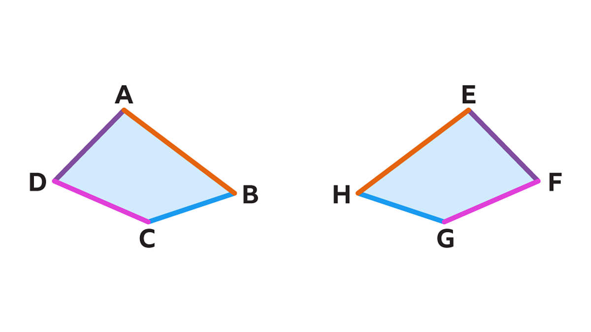
In the world of geometry, congruence refers to figures that are identical in form and size. When one shape is superimposed upon another, they match perfectly. In the world of brand strategy, “congruent shapes” take on a more metaphorical—yet equally precise—meaning. It is the art of ensuring that every visual element, from a logo to the UI of a mobile app, aligns perfectly with the brand’s core values, mission, and psychological positioning.
When a brand achieves congruence, it creates a sense of harmony that the human brain recognizes instantly as “trustworthy.” Incongruence, conversely, creates cognitive dissonance, leaving consumers feeling uneasy without necessarily knowing why. To build a world-class corporate identity, designers and strategists must master the language of shapes to ensure that what a company says is perfectly mirrored by what a company looks like.
The Psychology of Geometry in Corporate Identity
Visual communication is often faster than verbal communication. Before a customer reads a tagline, their subconscious has already processed the geometric language of the brand. Congruent shapes in branding are not chosen by accident; they are selected to evoke specific emotional responses that align with the brand’s industry and purpose.
The Stability of the Square and Rectangle
Squares and rectangles represent the most common shapes in corporate design, particularly for industries that rely on trust, such as banking, law, and insurance. These shapes imply stability, balance, and professionalism. A square is “grounded.” When a brand uses sharp 90-degree angles consistently throughout its stationery and digital assets, it signals a commitment to tradition and reliability. For a financial institution, a congruent use of rectangular framing suggests that the customer’s money is in a secure, well-structured environment.
The Unity of the Circle and Oval
Circles lack beginning or end, representing eternity, unity, and community. In brand strategy, circles are often used to soften a brand’s image, making it appear more approachable and inclusive. When we look at global brands like Mastercard or Olympic symbols, the congruence of circular shapes suggests a global reach and an interconnected world. If a brand’s mission is about “bringing people together,” using aggressive, jagged shapes would be an act of incongruence. Instead, the “congruent shape” for a community-focused brand is the circle—it implies a protective embrace.
The Ambition of the Triangle
Triangles are directional. They point toward progress, movement, and peak performance. Brands in the automotive, sports, or high-growth tech sectors often utilize triangular geometry to suggest that they are always moving upward or forward. However, the orientation matters: an upright triangle represents solid foundations and growth, while an inverted triangle can suggest risk or instability. Achieving shape congruence in this niche requires a careful balance between “edgy” innovation and “stable” leadership.
Achieving Visual Congruence Across Multi-Platform Touchpoints
In the digital age, a brand no longer exists solely on a business card or a storefront sign. It lives on smartphone screens, Apple Watches, billboards, and social media avatars. “What congruent shapes” mean in this context is visual scalability—the ability of a brand’s geometric DNA to remain consistent across radically different dimensions.
Responsive Logos and Scalable Geometry
Modern brand strategy requires “responsive” design. A complex, shape-heavy logo might look magnificent on a desktop website but become a cluttered mess as a favicon or a tiny icon on a smartwatch. Congruence here is maintained through simplification. Strategists look for the “primary shape” of the brand—the one geometric element that can survive even when the text is removed. Whether it is the swoosh, the apple, or the three stripes, these shapes maintain their congruent identity regardless of scale.
Maintaining Integrity in Digital and Physical Spaces
The true test of brand congruence is the transition from the screen to the physical world. If a digital-first brand uses “soft-UI” (rounded corners and fluid, organic shapes) on its app, but its physical packaging arrives in sharp, aggressive, industrial boxes, the brand experience is broken. Congruent shapes require the design language of the software to dictate the industrial design of the hardware. Apple is the gold standard of this: the rounded corners of their iOS icons (known as “squircles”) are mathematically congruent with the physical rounded corners of the iPhone and MacBook hardware. This creates a seamless psychological loop for the user.

Case Studies: When Shape Congruency Defines Market Leaders
To understand how congruent shapes translate into market dominance, we can look at brands that have successfully distilled their entire corporate identity into a specific geometric philosophy.
The Minimalist Precision of Tech Giants
Consider the evolution of Google or Microsoft. In their early years, their logos and identities were cluttered, utilizing shadows, gradients, and complex shapes. As they matured into global utilities, they moved toward “Flat Design”—a philosophy rooted in the use of congruent, simple geometric shapes. Microsoft’s four colored squares represent a window to the world; the congruence lies in the perfect symmetry of those squares, suggesting a platform that is orderly and organized. Google’s use of the circle in its “G” and its dot animations conveys a sense of playful intelligence. Because these shapes are used congruently across every sub-brand (Gmail, Maps, Drive), the user feels a sense of familiarity regardless of which product they are using.
Heritage Brands and Geometric Evolution
Luxury brands often use congruence to signal “timelessness.” Look at the interlocking “C” of Chanel or the “L” and “V” of Louis Vuitton. These shapes have remained virtually unchanged for decades. The congruence here isn’t just spatial; it is temporal. By refusing to follow fleeting design trends that would alter their geometric profile, these brands maintain a congruent identity with their own history. This tells the consumer that the brand is not a fad, but a permanent fixture of high society.
Designing for Emotional Resonance: The “Congruent” Brand Experience
Beyond the visuals, congruence is about the alignment between the “form” of the brand and the “feeling” of the brand. If a brand claims to be “disruptive” and “radical” but uses a standard, serif font inside a boring blue square, the brand strategy has failed. The shapes are not congruent with the message.
Alignment Between Visual Form and Brand Values
To achieve true congruence, a brand must first define its “Shape Language.”
- Organic Shapes: If a brand is about sustainability, wellness, or nature, it should avoid perfect geometry. Instead, it should use “congruent” organic shapes—those found in nature, like leaves or waves. These shapes feel less “manufactured” and more “authentic.”
- Abstract Shapes: Brands focused on high-level innovation or abstract concepts (like AI or cloud computing) often use abstract geometric shapes. These suggest that the brand is solving complex problems that don’t have a simple “physical” form.
The goal is to ensure that when a customer sees the shape, they feel the brand’s value before they even know what the product is.
The Future of Dynamic Shape Branding
As we move into the era of the Metaverse and Augmented Reality (AR), congruent shapes will become three-dimensional. Brands will no longer just have a “flat” logo; they will have a “volumetric identity.” Imagine an AR shopping experience where the “shape” of the brand’s UI floats around you. Maintaining congruence in a 3D space will require even more rigorous design standards. Strategists will need to consider how a brand’s “shape” moves, reacts to light, and occupies space.
A “congruent” brand of the future will be one whose 3D geometry feels as natural and consistent as its 2D predecessor. Whether it is a rotating icon in a VR headset or a physical retail pop-up, the geometric DNA must remain the same.
Conclusion
When we ask “what congruent shapes” contribute to a brand, the answer is: everything. Congruence is the thread that sews together the disparate pieces of a corporate identity into a single, cohesive tapestry. It is the bridge between graphic design and human psychology.
In a marketplace crowded with noise, consumers gravitate toward clarity. Clarity is achieved when the shapes a brand uses are congruent with the story it tells. By mastering the psychology of squares, circles, and triangles, and by ensuring those shapes are applied with disciplined consistency across all platforms, a brand can transcend being just a “company” and become an iconic symbol. In the end, brand strategy is the pursuit of perfect congruence—where the vision of the founder and the perception of the consumer are exactly the same shape.
aViewFromTheCave is a participant in the Amazon Services LLC Associates Program, an affiliate advertising program designed to provide a means for sites to earn advertising fees by advertising and linking to Amazon.com. Amazon, the Amazon logo, AmazonSupply, and the AmazonSupply logo are trademarks of Amazon.com, Inc. or its affiliates. As an Amazon Associate we earn affiliate commissions from qualifying purchases.