
In the competitive landscape of corporate identity, color is never just an aesthetic choice; it is a psychological tool. Among the spectrum of hues available to designers and marketing strategists, few are as polarizing, evocative, or commercially potent as bubblegum pink. While often dismissed as a “juvenile” or “feminine” shade, bubblegum pink has undergone a significant transformation in the realm of professional branding. Today, it stands as a symbol of disruption, high-energy optimism, and strategic boldness.
For a brand strategist, understanding what bubblegum pink means requires looking beyond the surface-level sweetness. It involves analyzing how this high-saturation hue influences consumer behavior, establishes brand positioning, and carves out a unique space in saturated markets.
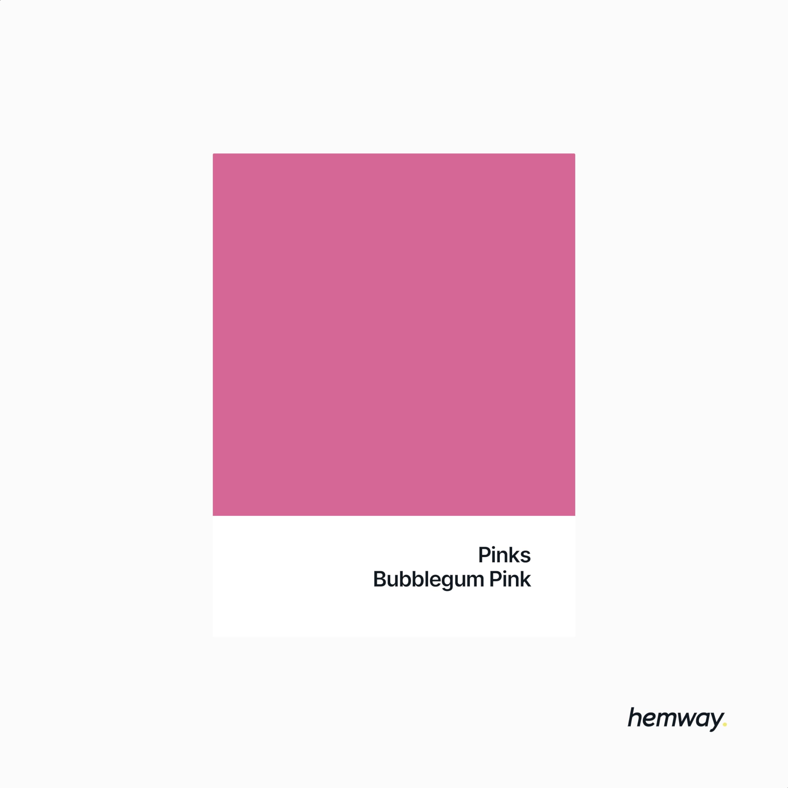
The Psychology of Bubblegum Pink: More Than Just a Playful Hue
Color psychology suggests that bubblegum pink—a bright, saturated, and warm tone—functions as a bridge between the aggressive energy of red and the purity of white. In branding, this creates a unique emotional resonance that can be leveraged to dictate how a customer feels the moment they interact with a product or digital interface.
Emotional Triggers and Consumer Perception
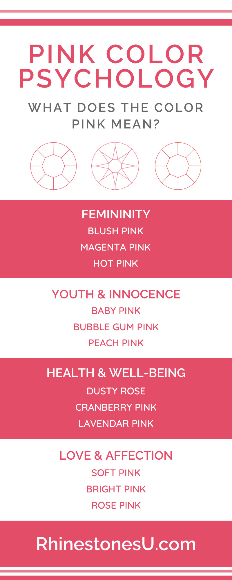
At its core, bubblegum pink triggers feelings of playfulness, youth, and unapologetic joy. Unlike “Millennial Pink,” which is muted and sophisticated, bubblegum pink demands attention. In a psychological sense, it is associated with “approachability.” Brands that utilize this color are often perceived as friendly, transparent, and less “stuffy” than their counterparts using traditional navy or forest green.
However, the psychology goes deeper. Scientific studies on color have shown that bright pinks can have a paradoxical effect: they are physically stimulating—increasing heart rate and blood pressure slightly—while simultaneously being associated with compassion and nurturing. For a brand, this means you can excite a customer about a purchase while making them feel safe and cared for within the brand ecosystem.
Challenging Gender Stereotypes in Modern Branding
Historically, bubblegum pink was strictly categorized within “gendered marketing,” primarily targeting young girls. However, modern brand strategy has reclaimed the color. In the current cultural climate, using bubblegum pink is often a deliberate move toward “gender-neutral boldness.”
Brands are now using this color to signify a rejection of traditional corporate norms. When a fintech company or a tech startup adopts bubblegum pink, they are signaling that they are modern, inclusive, and unafraid to challenge the status quo. It has become the color of the “disruptor,” moving away from its origins as a passive hue to become an active, assertive statement of identity.
Strategic Implementation: When and Why Brands Choose Bubblegum Pink
Choosing bubblegum pink for a brand identity is a high-risk, high-reward strategy. It is not a “neutral” choice; it is a definitive one. Strategists must evaluate the market environment to ensure the color serves a functional purpose beyond mere visual appeal.
Creating Instant Brand Recognition (The “Pop” Factor)
In a digital world where consumers scroll through thousands of images daily, “thumb-stopping” power is a primary KPI for visual identity. Bubblegum pink has an incredibly high “pop” factor. It vibrates against common digital backgrounds (white, light gray, or dark mode blacks), ensuring that the brand’s assets are immediately visible.
This is particularly effective in retail and e-commerce. Whether it is a shopping bag on a busy street or a mobile app icon on a crowded home screen, bubblegum pink ensures the brand is the first thing the eye gravitates toward. This “visual dominance” is a strategic asset for new entrants in a market who need to build brand awareness quickly.
Target Audience Alignment: From Gen Z to Nostalgia-Seekers
The demographic appeal of bubblegum pink is twofold. For Gen Z and Alpha, the color represents “dopamine dressing” and “main character energy”—a trend centered on vibrant self-expression and optimism. For these audiences, the color feels authentic and energetic.
Conversely, for Millennials and Gen X, bubblegum pink taps into “New Nostalgia.” It evokes the aesthetic of the 80s and 90s, but when applied to modern software or luxury goods, it feels “retro-futurism.” By aligning with these emotional currents, brands can create a sense of community and belonging that goes deeper than a transactional relationship.
Case Studies: Brands That Own the Bubblegum Identity
To understand the practical application of bubblegum pink, we must look at the “market leaders” who have successfully integrated the color into their global corporate identity.
Mattel and the Barbie Renaissance
Perhaps no brand “owns” a color more effectively than Mattel owns “Barbie Pink,” a specific shade of bubblegum. For decades, this color was the cornerstone of their marketing. However, the recent “Barbiecore” movement and the 2023 Barbie film demonstrated how a brand can use bubblegum pink to facilitate a total cultural takeover. By saturating the market with this specific hue, Mattel moved the color from a toy aisle staple to a high-fashion, feminist symbol of empowerment. It proved that bubblegum pink could be both a commercial powerhouse and a sophisticated narrative tool.
T-Mobile and the Disruption of the Telecom Industry
In the United States, the telecommunications sector was traditionally dominated by “safe” colors: AT&T’s blue and Verizon’s red. When T-Mobile rebranded, they chose a vivid magenta/bubblegum pink hybrid. This wasn’t just a design choice; it was a declaration of their “Un-carrier” status. The color communicated that they were the rebellious, customer-centric alternative to the “boring” giants. By consistently using this high-energy pink across all touchpoints—from retail stores to stadium sponsorships—T-Mobile achieved a level of brand recall that is nearly unparalleled in the utility sector.
Glossier and the New Era of Minimalist Femininity
Glossier disrupted the beauty industry by using a softer, yet still vibrant, bubblegum pink in their packaging. They utilized the color to create a “community-first” brand. The “Glossier Pink” became a badge of honor for consumers, often shared on social media. In this case, the color didn’t just represent a product; it represented a lifestyle of effortless beauty and digital-native savvy.
Visual Design and Technical Execution
Integrating bubblegum pink into a brand’s visual system requires technical precision. Because the color is so intense, it can easily become overwhelming or “vibrating” (a visual phenomenon where two bright colors clash, causing eye strain).
Complementary Color Palettes and Contrast
To maintain a professional edge, bubblegum pink is rarely used in isolation. Effective brand systems often pair it with:
- Deep Navy or Charcoal: This provides a “grounding” effect, making the pink feel more premium and less like a toy.
- Crisp White: This enhances the feeling of cleanliness and modernism.
- High-Contrast Yellow or Teal: Often used in tech branding to create a “vaporwave” or high-energy tech aesthetic.
The key is balance. A brand strategist might use bubblegum pink for “Action Buttons” (CTAs) or hero photography, while keeping the body text and background neutral to ensure readability and professional gravitas.
Digital Accessibility and High-Saturation Challenges
From a UX/UI perspective, bubblegum pink presents challenges for accessibility. In its brightest forms, it may not provide enough contrast against white text for users with visual impairments. Professional branding requires rigorous testing of “color contrast ratios” to ensure the brand remains inclusive and compliant with ADA (Americans with Disabilities Act) or WCAG (Web Content Accessibility Guidelines) standards. This often means creating a “digital-first” version of the bubblegum hue that is slightly adjusted for screen readability without losing its emotional impact.
The Future of Bubblegum Pink in Corporate Identity
As we look toward the future of design, the meaning of bubblegum pink continues to evolve. It is moving away from being a “niche” or “gendered” choice toward becoming a staple of the “Soft Power” aesthetic.
Sustainability and the “Soft Power” Aesthetic
In an era where consumers are increasingly concerned with sustainability and corporate ethics, bubblegum pink is being used to signal “softness” and “humanity.” Unlike the cold, sterile blues of the 2000s tech boom, the pinks of the 2020s suggest a brand that is empathetic and conscious. It represents a shift toward a “kinder” capitalism where brands aren’t just faceless entities, but colorful participants in the global culture.
Cultural Shifts and Global Market Adaptability
Finally, the meaning of bubblegum pink varies globally. While in the West it may mean “playful disruption,” in other cultures, pink can represent marriage, trust, or spring. For global brands, the use of bubblegum pink is a masterclass in local-to-global strategy. It allows a brand to maintain a consistent visual “voice” while adapting its message to fit the emotional needs of different markets.
In conclusion, bubblegum pink is a sophisticated strategic tool. When used correctly, it allows a brand to bypass logical defenses and speak directly to a consumer’s sense of joy, rebellion, and community. It is a color for brands that are confident in their identity and ready to lead the conversation rather than simply follow the industry standard. For the modern brand strategist, bubblegum pink isn’t just a color—it’s a competitive advantage.
aViewFromTheCave is a participant in the Amazon Services LLC Associates Program, an affiliate advertising program designed to provide a means for sites to earn advertising fees by advertising and linking to Amazon.com. Amazon, the Amazon logo, AmazonSupply, and the AmazonSupply logo are trademarks of Amazon.com, Inc. or its affiliates. As an Amazon Associate we earn affiliate commissions from qualifying purchases.