
In the world of marketing and corporate identity, a brand is far more than a logo or a catchy slogan; it is a visual shorthand for a set of values, a history, and a promise. When we examine the most successful “brands” in human history, few are as instantly recognizable or as emotionally resonant as the American flag. While the flag is a national ensign, from a strategic perspective, it functions as a masterclass in brand identity.
To understand what the colors on the American flag symbolize is to understand the fundamental principles of color theory and brand storytelling. Every hue was chosen—and later codified—to communicate specific attributes to both internal stakeholders (citizens) and a global audience. For brand strategists and designers, the evolution of “Old Glory” offers profound insights into how visual elements can be leveraged to build an enduring and powerful identity.

1. The Visual Identity of a Nation: The Flag as a Master Brand
The American flag serves as the primary visual asset for the “Brand USA” entity. Like any major global corporation, a nation requires a cohesive visual identity that can be scaled across different mediums—from postage stamps and military uniforms to digital platforms and international summits.
The Psychology of Red, White, and Blue
In brand strategy, color is the first thing a consumer perceives, often before they process text or shapes. The selection of red, white, and blue was not accidental; it was a choice rooted in the aesthetic traditions of the time, yet it evolved to carry a psychological weight that few other palettes can match. Red triggers a visceral, high-energy response; white provides the necessary negative space for clarity and balance; and blue evokes stability and depth. Together, they create a triad that suggests a “complete” brand—one that is energetic, clean, and stable.
Consistency and Global Recognition
One of the hallmarks of a successful brand is its ability to maintain recognition despite minor iterations. Over centuries, the American flag has changed its configuration—adding stars as the “company” expanded—yet the core brand assets (the stripes and the color palette) remained constant. This consistency has allowed the flag to become one of the most recognized symbols in the world, proving that a strong brand foundation can survive and thrive through significant organizational growth.
2. Decoding the “Brand Values”: From History to Modern Identity
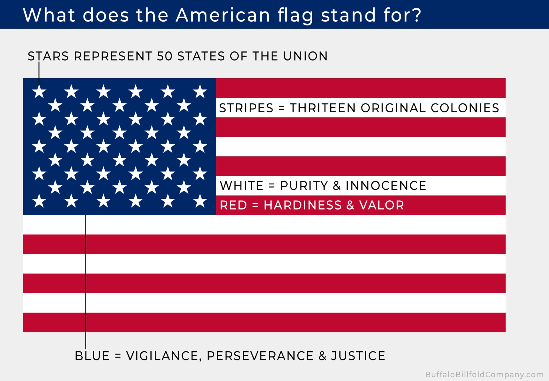
When the Great Seal of the United States was established in 1782, Charles Thomson, the Secretary of the Continental Congress, provided a specific breakdown of what the colors represented. These are not merely poetic descriptions; they are the “Brand Values” of the burgeoning nation.
Red: Courage, Hardiness, and Brand Resilience
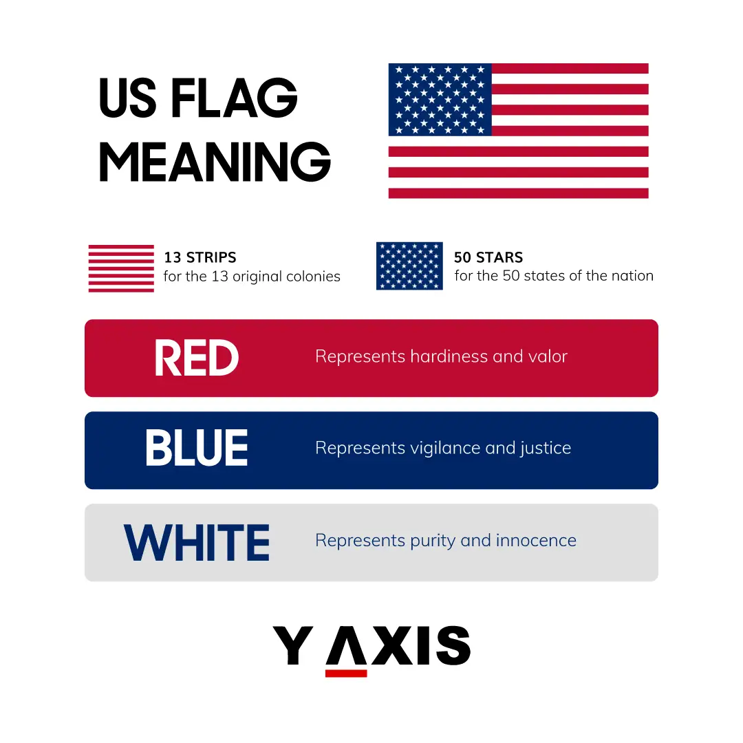
In Thomson’s words, red stands for “hardiness and valor.” In a modern branding context, this translates to resilience and action. A brand that utilizes a bold red in its identity is often positioning itself as a leader, an innovator, or a protector. It suggests a brand that is not afraid of challenges. Just as the American “brand” needed to project strength to the monarchies of Europe, a modern company uses red to signal its competitive edge and its readiness to disrupt the market.
White: Purity, Innocence, and the Ethical Brand
White represents “purity and innocence.” From a brand strategy perspective, this symbolizes transparency and ethical standards. In an era where consumers demand corporate social responsibility (CSR), the “white” in a brand’s palette serves as a visual promise of integrity. It suggests a “clean” operation, free from the baggage of the past, and a commitment to a noble purpose. For the American flag, white balances the intensity of the red, providing a sense of moral equilibrium to the brand’s identity.
Blue: Vigilance, Perseverance, and Justice
The blue of the union (the canton) symbolizes “vigilance, perseverance, and justice.” In branding, blue is the color of trust. It is the most common color used by financial institutions and tech companies because it communicates reliability and long-term vision. The “Brand USA” uses blue to signal that it is a guardian of its principles—a brand that is “vigilant” in its duties and “perseverant” in its goals. This is the cornerstone of brand loyalty; consumers stick with a brand they believe will endure and act justly.
3. Color Theory in Global Branding: Why the Palette Works
The success of the American flag’s color palette is rooted in universal principles of design that are still used by the world’s most successful marketing agencies today. Understanding why these colors work together can help modern brand designers create more impactful visual identities.
Establishing Authority through Primary Palettes
The use of primary (or near-primary) colors is a classic strategy for brands that want to project authority. Think of brands like Coca-Cola, IBM, or Google. By using a palette that is bold and uncomplicated, these brands—like the American flag—occupy a “mental real estate” that is difficult for competitors to displace. The flag’s colors are high-contrast, ensuring that the “logo” is visible even from a great distance or in low-visibility conditions (such as on a battlefield or atop a high-rise).
The Emotional Impact on Consumer Behavior
Colors are not just seen; they are felt. The American flag’s color scheme is designed to evoke a sense of pride and belonging. In branding, this is known as “emotional branding.” When a customer sees the colors of a brand they love, it triggers a dopamine response. By associating the flag’s colors with deeply held values like freedom and bravery, the brand creates a powerful emotional bond with its “users” (citizens). Modern marketers replicate this by aligning their color palettes with the specific emotional outcomes they want their products to provide.
4. Evolution and Adaptation: Rebranding Without Losing Equity
A common challenge for any brand is how to modernize without alienating an existing loyal base. The American flag is a perfect case study in “Brand Evolution.”
Maintaining Core Identity During Growth
As the United States grew from 13 colonies to 50 states, the flag had to be updated. However, the designers were careful not to change the “Core Brand Assets”—the 13 stripes and the three-color palette. Each new star represented a “new product launch” or a “market expansion,” but the overall silhouette of the brand remained the same. This allowed the nation to grow while maintaining a singular, unified identity. In corporate terms, this is the equivalent of a “Brand Architecture” strategy, where sub-brands (states) are housed under a dominant master brand.
The Power of Symbolic Storytelling
Every element of the flag tells a story. The 50 stars and 13 stripes are not just geometric shapes; they are narrative devices. In modern branding, storytelling is the key to differentiation. A brand that can explain why its logo has a certain number of lines or why it uses a specific shade of blue is a brand that has a deeper connection with its audience. The American flag doesn’t just represent a country; it tells the story of its origin and its current scale.
5. Applying Flag Symbolism to Modern Brand Strategy
How can modern businesses take the lessons of the American flag’s symbolism and apply them to their own corporate identities?
Designing for Longevity
The American flag has remained relevant for nearly 250 years. This longevity is a result of a “timeless” design. When developing a brand identity, designers should avoid “trendy” colors or fonts that will look dated in five years. Instead, they should look toward the symbolic weights of colors like those found in the flag—red for energy, white for clarity, and blue for trust—to create a visual identity that can stand the test of time.
Creating a Unified Brand Narrative
The most successful brands are those where every team member (or citizen) understands what the brand stands for. The symbolism of the American flag is taught from a young age, ensuring a unified understanding of the brand’s values. Companies can replicate this by creating a “Brand Bible” that clearly defines the symbolism behind their visual assets. When employees understand that the “blue” in the company logo stands for “vigilance” or “customer trust,” they are more likely to embody those values in their daily work.
The Influence of Heritage Branding
The American flag is a prime example of “heritage branding.” It leans into its history to provide a sense of stability and permanence. Brands that have been around for decades often use “retro” versions of their logos or highlight their founding dates to build trust. The flag’s colors, which have remained unchanged in their symbolic meaning since the 18th century, serve as a constant reminder of the brand’s enduring legacy.
Conclusion: The Ultimate Brand Identity
The colors on the American flag—red, white, and blue—are far more than just aesthetic choices. They are a deliberate communication of hardiness, purity, and justice. As a piece of brand strategy, the flag succeeds because it combines powerful color psychology with a clear narrative and a consistent visual language.
For brand managers and designers, the American flag serves as a reminder that the most effective identities are those rooted in deep-seated values. Whether you are building a startup or managing a global corporation, the goal is the same: to create a symbol that people are proud to stand behind. By understanding the symbolism of the American flag, we can learn how to build brands that are not only recognizable but also meaningful, resilient, and timeless. In the end, a great brand, much like a great flag, is a promise kept.
aViewFromTheCave is a participant in the Amazon Services LLC Associates Program, an affiliate advertising program designed to provide a means for sites to earn advertising fees by advertising and linking to Amazon.com. Amazon, the Amazon logo, AmazonSupply, and the AmazonSupply logo are trademarks of Amazon.com, Inc. or its affiliates. As an Amazon Associate we earn affiliate commissions from qualifying purchases.