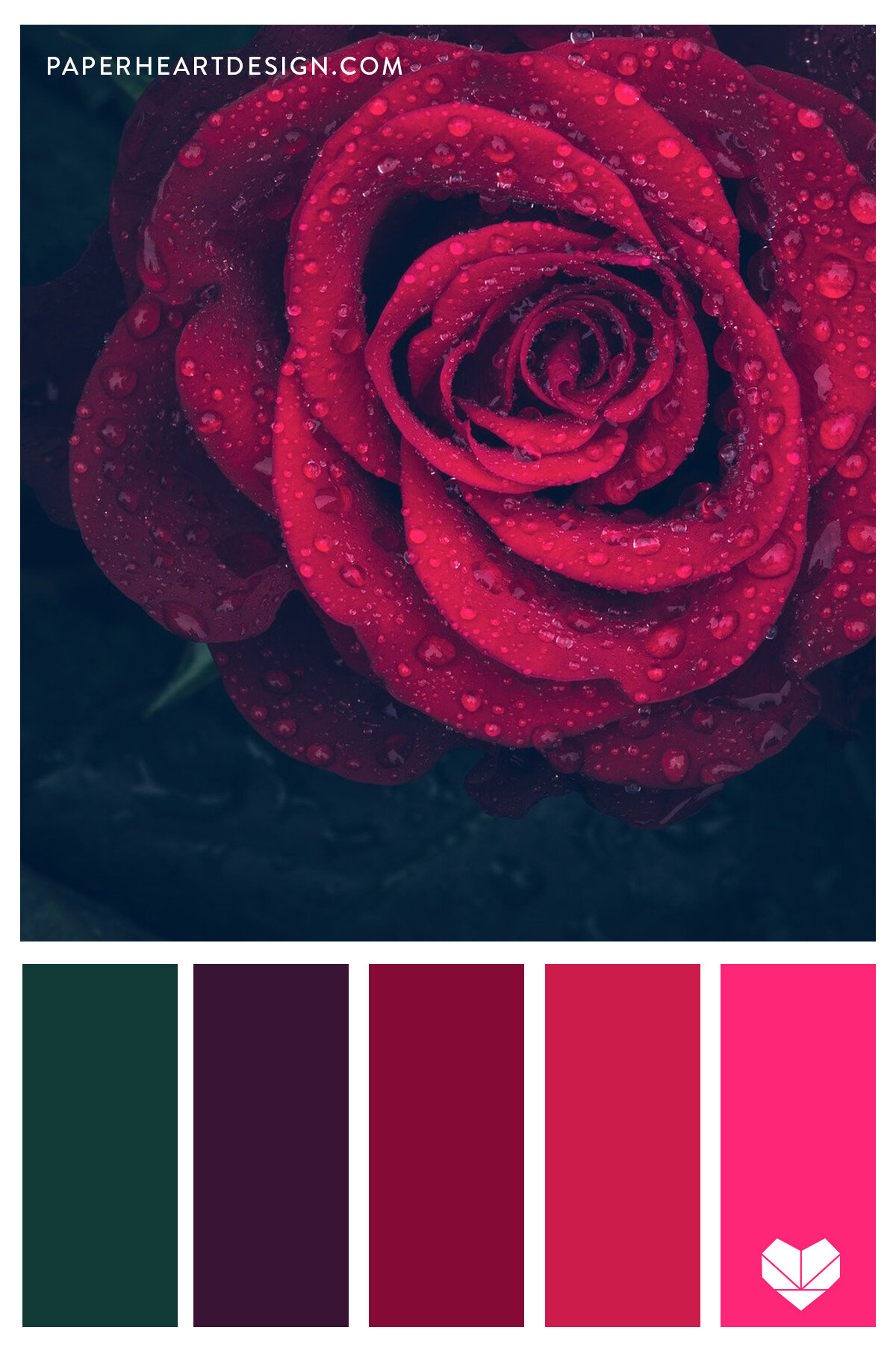
In the competitive landscape of modern branding, color is more than a mere aesthetic choice; it is a psychological tool that communicates values, evokes emotions, and drives consumer behavior. Deep red—often categorized as burgundy, maroon, or oxblood—is one of the most powerful hues in a designer’s arsenal. It carries the energy and passion of bright red but tempers it with the sophistication, authority, and permanence of darker tones. However, because deep red is so visually dominant, selecting the right supporting palette is critical to ensuring a brand appears balanced rather than overwhelming.
Choosing what colour goes with deep red requires an understanding of color theory, brand positioning, and the specific industry context. This guide explores the strategic application of deep red in brand identity and identifies the most effective pairings to create a cohesive and impactful visual language.
The Psychology of Deep Red in Brand Identity
Before selecting a complementary palette, a brand strategist must understand the inherent “weight” of deep red. Unlike its brighter cousins, which often signal urgency or cheapness (think fast-food signage), deep red suggests a legacy. It is the color of vintage wine, mahogany libraries, and velvet theater curtains.
Evoking Power and Sophistication
Deep red is synonymous with “quiet power.” In corporate identity, it is used by brands that want to convey expertise and a high barrier to entry without being overly aggressive. It suggests a brand that has been around for a long time—or one that possesses the gravitas of a legacy institution. When a consumer sees a deep red logo or interior design, the subconscious association is one of reliability, wealth, and intellectual depth.
The Biological and Cultural Response
Biologically, red increases the heart rate and creates a sense of engagement. Deep red maintains this engagement but slows the “flight or fight” response, turning it into a sense of warmth and comfort. Culturally, in many Western societies, it represents luxury and formal occasions. In Eastern cultures, such as in China, various shades of red symbolize luck and prosperity. For a global brand, deep red acts as a bridge between traditional values and modern luxury.
Strategic Color Pairing: Finding the Perfect Complement
The success of a deep red palette depends on the secondary and tertiary colors that support it. Depending on the brand’s mission, the “correct” pairing will shift to emphasize different psychological traits.
The Classic Authority: Deep Red and Gold or Metallic
There is perhaps no combination more evocative of luxury and heritage than deep red and gold. This pairing is a staple for high-end spirits, law firms, and luxury automotive brands. Gold provides a reflective contrast to the “absorbent” nature of deep red, adding a sense of prestige and shimmer.
- Strategy: Use deep red as the primary background color with gold foil or metallic accents for logos and typography. This creates a tactile sense of value.
- Brand Sentiment: Elite, historical, expensive.
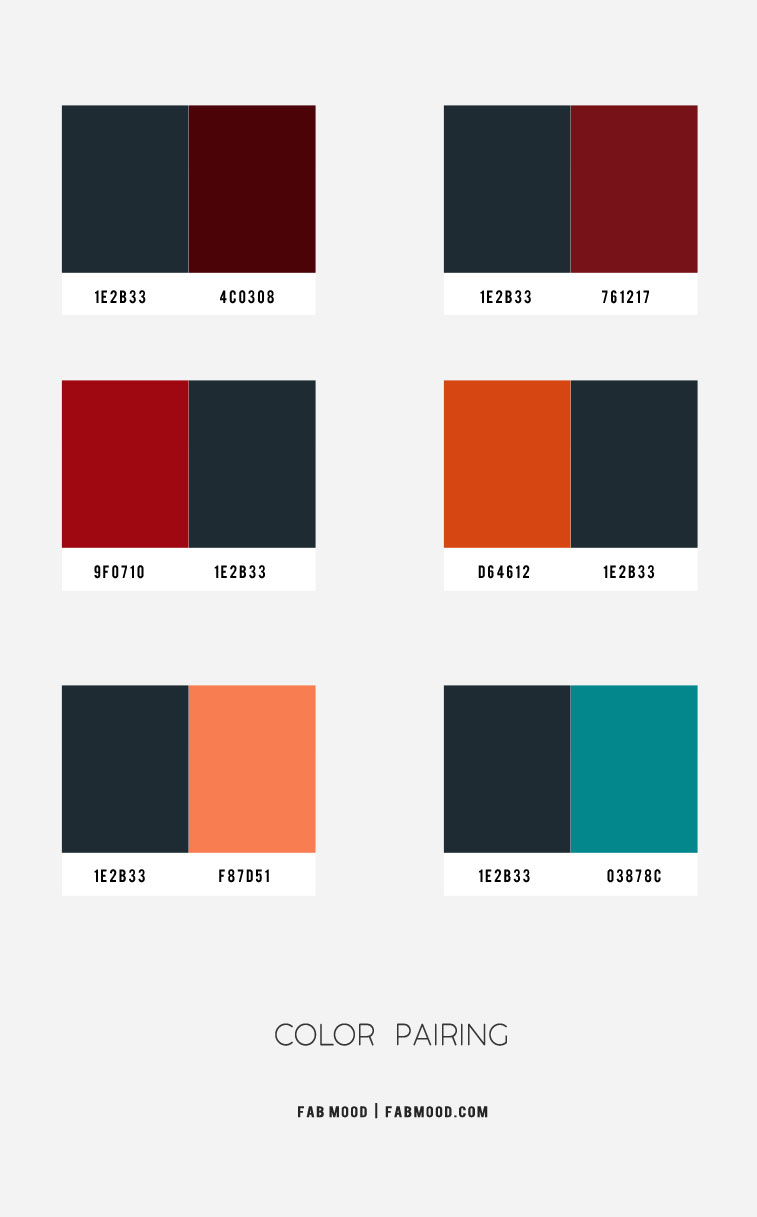
The Modern Minimalist: Deep Red and Charcoal or Slate
For brands in the lifestyle, architecture, or high-end tech sectors, pairing deep red with dark grays like charcoal or slate offers a contemporary edge. Charcoal grounds the intensity of the red, preventing it from feeling too “royal” or “stuffy.” This combination feels urban and sophisticated.
- Strategy: Use charcoal for the majority of the brand’s collateral (websites, packaging) and use deep red as a “hero” color for call-to-action buttons or signature design elements.
- Brand Sentiment: Urban, sleek, innovative.
The Soft Luxury: Deep Red and Cream or Champagne
Pure white can often create a jarring, high-contrast look when paired with deep red, which can look clinical. To maintain a sense of premium “lifestyle” branding, designers often opt for cream, ivory, or champagne. These off-white tones soften the transition and make the red feel warmer and more approachable.
- Strategy: This is ideal for skincare, hospitality, and boutique fashion brands. Use cream as the base for readability and deep red for elegant serif typography.
- Brand Sentiment: Welcoming, artisanal, refined.
Implementing Deep Red Across Different Industries
The “vibe” of deep red changes significantly based on the industry it serves. A brand strategist must ensure that the color pairing aligns with market expectations while still allowing for differentiation.
Luxury and High-End Retail
In luxury retail, deep red is often used to create an immersive environment. When paired with dark wood textures and brass accents, it creates a “clubhouse” feel that encourages customers to linger. Brands like Cartier have mastered the use of deep red to signify that the contents within their packaging are precious. Here, the accompanying “color” is often texture—velvet, leather, or matte-finish paper.
Tech and Innovation Disruption
While tech is traditionally dominated by “safe” blues and “energetic” bright reds, deep red is emerging as a choice for “Deep Tech” or AI companies that want to signal wisdom and serious infrastructure. When paired with a vibrant “electric” purple or a stark neon cyan, deep red provides a grounded foundation for futuristic accents. This prevents the brand from looking like a fleeting trend and instead positions it as a foundational technology.
Food, Beverage, and Hospitality
In the culinary world, deep red is a “hungry” color. It stimulates appetite but, unlike bright red, it encourages a slower, fine-dining experience. When paired with forest green or olive, it evokes a farm-to-table, organic, or Mediterranean feel. This tells the consumer that the ingredients are rich, aged (like wine or balsamic), and curated with care.
Digital Branding and Accessibility Considerations
In the digital age, a brand exists primarily on screens. Deep red presents unique challenges in UI/UX (User Interface/User Experience) design that must be managed to ensure the brand remains accessible and functional.
Contrast Ratios and Readability
Deep red often has a low luminosity value. If you place black text on a deep red background, it becomes almost impossible for those with visual impairments to read. According to WCAG (Web Content Accessibility Guidelines), brand designers must ensure a high contrast ratio.
- Solution: When using deep red for digital backgrounds, typography should almost always be white, cream, or a very light metallic. Conversely, if deep red is used for text, the background must be sufficiently light to ensure the letterforms are crisp.
Deep Red in User Interface (UI) Design
Deep red is an excellent color for “meaningful” interaction. In a dark mode interface, a deep red accent can look incredibly premium. However, designers must be careful not to use it for “error” states exclusively. Because bright red is the universal sign for “stop” or “error,” a deep red brand must find a way to distinguish its brand identity from system warnings. Using a slightly more “plum” or “wine” version of deep red can help differentiate the brand from a standard “system error” notification.
Building a Cohesive Visual Language
A brand is more than just two colors; it is an entire ecosystem. To successfully integrate deep red, a brand must establish a full palette that includes secondary and tertiary colors for various applications.
Creating a Secondary Color Palette
A robust brand guidelines document should include:
- The Core: Deep Red.
- The Neutral: A warm gray or a rich cream.
- The Accent: A “pop” color, such as a burnt orange or a muted teal, to be used sparingly for notifications or highlights.
- The Deep Base: A near-black or deep navy to provide structural weight to layouts.

Consistency Across Physical and Digital Assets
One of the hardest parts of using deep red is “color matching.” A deep red that looks beautiful on an iPhone screen (RGB) may look like a dull brown when printed on matte cardstock (CMYK). Strategic branding requires choosing a Pantone shade that can be replicated across silk-screened shopping bags, embroidered uniforms, and digital newsletters.
When a brand asks “what colour goes with deep red,” they are really asking how to frame their identity. By pairing deep red with gold for heritage, cream for elegance, or charcoal for modernity, a brand can precisely calibrate its message. Deep red is a color of substance; when supported by a thoughtful palette, it creates a brand identity that is not only visually stunning but also psychologically resonant and timeless.
aViewFromTheCave is a participant in the Amazon Services LLC Associates Program, an affiliate advertising program designed to provide a means for sites to earn advertising fees by advertising and linking to Amazon.com. Amazon, the Amazon logo, AmazonSupply, and the AmazonSupply logo are trademarks of Amazon.com, Inc. or its affiliates. As an Amazon Associate we earn affiliate commissions from qualifying purchases.