
In the realm of visual identity, color is more than a mere aesthetic choice; it is a psychological trigger, a cultural signifier, and a fundamental pillar of brand recognition. When designers and brand strategists ask, “What primary colors make brown?” they aren’t just looking for a basic art lesson. They are seeking to understand the foundational alchemy of color theory to create depth, resonance, and reliability in a brand’s corporate identity. Brown, often overlooked in favor of high-energy reds or corporate blues, is a complex “composite” color. Understanding how to build it from its primary roots—Red, Yellow, and Blue—is essential for any brand looking to convey stability, luxury, or organic authenticity.
The Science of Neutrality: How Primary Colors Build the Brand’s Foundation
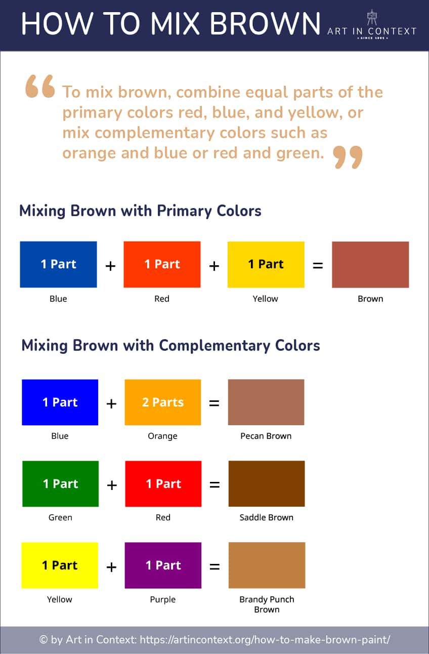
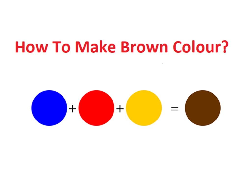
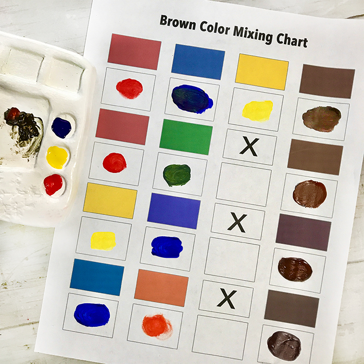
At its most basic level, brown is created by mixing the three primary colors of the subtractive color model: Red, Yellow, and Blue. In the context of branding and physical design, this trio represents the source of all organic palettes. When these three are combined in varying proportions, they cancel out the vibrance of the individual hues, resulting in a rich, earthy neutral.
The Subtractive Model: RYB and the Path to Earth Tones
In traditional branding—specifically for physical packaging and print collateral—the RYB (Red, Yellow, Blue) model is the starting point. To achieve a standard brown, a brand designer typically mixes a primary color with its “complementary” secondary color. For example, mixing Blue (primary) with Orange (a mix of Red and Yellow) creates a deep, sophisticated brown.
From a brand strategy perspective, the ratio of these primaries determines the “temperature” of the brown. A brand aiming for a warm, approachable feel—like a cozy café or a heritage leather brand—will lean more heavily on Red and Yellow. Conversely, a brand seeking a cooler, more modern and industrial aesthetic will increase the Blue content. This granular control over the primary mix allows a brand to own a specific “mood” before a single word of copy is written.
Digital Consistency: Translating Pigment to Screen
While the question of which primary colors make brown is rooted in physical pigments, modern brand strategy requires a seamless transition to the digital space. In the digital world, we use the RGB (Red, Green, Blue) additive model. Here, “brown” is achieved by combining Red and Green (which itself is a derivative of Blue and Yellow) at specific intensities.
The challenge for corporate identity is ensuring that the “Earth Brown” mixed for a recycled paper box (using RYB/CMYK) matches the brown on a smartphone screen (RGB). This technical bridge is where brand integrity is either solidified or lost. Understanding the primary components allows designers to calibrate hex codes and Pantone swatches so that the brand remains recognizable across all touchpoints, from a physical storefront to a mobile app.
The Psychology of Brown: Why Global Brands Choose Earthy Tones
In the competitive landscape of marketing, every color choice is a strategic move. Brown is the color of the earth, wood, and stone. It represents resilience, dependability, and safety. By understanding the primary building blocks of brown, brand strategists can manipulate these psychological associations to fit their market niche.
Reliability and Resilience: The UPS and Timberland Effect
Perhaps the most iconic use of brown in corporate identity is United Parcel Service (UPS). For decades, “Pullman Brown” has been synonymous with the brand’s promise of reliability. By choosing a brown that leans toward a dark, saturated mix of primaries, UPS communicates a sense of “no-nonsense” service and structural integrity.
Similarly, Timberland uses brown to anchor its identity in the outdoors and rugged durability. In these cases, brown isn’t just a color; it’s a commitment to the consumer. It suggests that the brand is grounded and will stand the test of time. When a brand mixes its primaries to create a darker, muddier brown, it leans into this “working class” reliability, positioning itself as a sturdy partner to the consumer.
Luxury and Sophistication: Redefining Brown in High Fashion
Contrary to its “muddy” reputation, brown can also be the height of sophistication when mixed with precision. Luxury brands like Louis Vuitton and Hermès utilize specific shades of brown (and its lighter derivative, tan) to evoke heritage and craftsmanship.
In high-end branding, the “primary” mix often includes a higher percentage of Red and Yellow to create “Cognac” or “Chocolate” tones. These hues suggest warmth, indulgence, and expensive materials like fine leather or dark mahogany. By avoiding the “flatness” of a 1:1:1 primary mix and instead favoring a warmer balance, luxury brands transform a humble earth tone into a symbol of elite status and timelessness.
Strategic Color Theory: Mixing Primary Elements for Market Differentiation
To stand out in a saturated market, a brand must do more than just pick a color; it must calibrate that color to trigger specific consumer behaviors. The way a designer mixes primary colors to achieve brown can fundamentally alter a brand’s market positioning.
Complementary Contrasts: Using Primary Blue to Balance Warm Browns
A common mistake in brand design is using brown in isolation, which can lead to a brand feeling “heavy” or dated. Strategic branding often involves pairing the composite brown with one of its primary ancestors. For instance, pairing a rich chocolate brown with a vibrant primary Blue creates a high-contrast, professional look.
The Blue provides a “pop” of modern energy, while the brown provides the stable foundation. This is frequently seen in the financial and legal sectors, where a brand needs to appear both innovative (Blue) and established (Brown). By understanding that Blue is a primary component of brown, designers can create a harmonious palette that feels naturally “correct” to the human eye.
The “Organic” Advantage: Leveraging Natural Hues for Sustainability Branding
As the “green economy” grows, many brands are moving away from literal green and toward the “primary browns” to signal sustainability. An unbleached, cardboard-style brown suggests that a brand is eco-friendly, raw, and honest.
This strategy is particularly effective for “Direct-to-Consumer” (DTC) brands that want to emphasize their minimalist packaging. By using a brown that looks like it was mixed from raw, natural earth pigments, these companies communicate a “back-to-basics” philosophy. They are telling the consumer that they spend more money on the quality of the product than on flashy, artificial dyes. This “honest” brown is achieved by keeping the primary mix slightly desaturated, mimicking the appearance of recycled materials.
Technical Implementation: Maintaining Brand Integrity Across Mediums
A brand strategy is only as good as its execution. Once a brand has decided on its perfect shade of brown—be it a “Golden Sienna” or a “Deep Umber”—it must ensure that this color remains consistent through various manufacturing and printing processes.
Pantone Matching: Ensuring Your Brown Stays True in Print
Because brown is a tertiary color made from three primaries, it is notoriously difficult to keep consistent in standard four-color (CMYK) printing. Small fluctuations in the amount of primary Cyan, Magenta, or Yellow can shift a brown from looking “rich and earthy” to “sickly and green.”
To combat this, corporate identities often utilize the Pantone Matching System (PMS). A brand will select a specific “Spot Color” brown. This means the ink is pre-mixed using specific primary pigments before it ever touches the paper, ensuring that the brown on a business card in London matches the brown on a billboard in Tokyo. For a brand manager, this is the ultimate safeguard of visual equity.
Accessibility and Contrast: Visual Hierarchy in Digital Identity
In the digital-first era, brand designers must also consider accessibility standards (WCAG). Brown, because it is a low-luminance color, offers excellent contrast when paired with white or light cream. This makes it a strategic choice for typography and UI elements where readability is paramount.
When developing a digital brand guide, it is essential to define how the primary-mixed brown behaves in “Dark Mode” versus “Light Mode.” A brown that looks sophisticated against a white background might disappear or look muddy against a black background. Strategists must decide if the primary mix needs to be lightened (adding “tint”) or darkened (adding “shade”) to maintain the brand’s visual hierarchy across all devices.
Conclusion: The Strategic Power of the Primary Mix
Answering “what primary colors make brown” is the first step in a much larger journey of brand storytelling. By understanding that brown is a careful balance of Red, Yellow, and Blue, brand architects can craft identities that are as nuanced as the markets they serve. Whether it is the rugged reliability of an outdoor gear company, the indulgent luxury of a chocolatier, or the transparent honesty of a sustainable startup, the “primary” roots of brown provide the versatility needed to build a world-class brand. In the end, the most successful brands are those that don’t just pick a color—they master the science and psychology behind the mix.
aViewFromTheCave is a participant in the Amazon Services LLC Associates Program, an affiliate advertising program designed to provide a means for sites to earn advertising fees by advertising and linking to Amazon.com. Amazon, the Amazon logo, AmazonSupply, and the AmazonSupply logo are trademarks of Amazon.com, Inc. or its affiliates. As an Amazon Associate we earn affiliate commissions from qualifying purchases.