
In the world of collegiate athletics and institutional identity, the mascot is often the most visible touchpoint of a brand. Most universities opt for symbols of strength, speed, or local heritage—tigers, eagles, or historical figures. However, Stanford University presents one of the most intriguing anomalies in brand strategy: a mascot that isn’t officially a mascot, and a nickname that refers to a color rather than a creature.
The “Stanford Tree” and the “Cardinal” identity represent a masterclass in organic brand evolution and the power of non-conformity. For brand strategists and marketing professionals, the Stanford model offers profound insights into how a brand can thrive by embracing ambiguity, fostering a DIY subculture, and differentiating itself through an unconventional narrative.

The Foundation of Identity: Color as a Brand Pillar
One of the most common misconceptions about the Stanford brand is that their mascot is a cardinal bird. In reality, the Stanford nickname is “the Cardinal,” referring specifically to the vivid shade of red. This choice represents a pivot from a traditional noun-based identity to an abstract, color-based identity, which provides a unique foundation for institutional branding.
From Controversy to Color: The 1972 Rebrand
Until 1972, Stanford’s athletic teams were known as the “Indians.” Following protests from Native American students and a growing awareness of cultural sensitivity, the university leadership made the strategic decision to retire the name. Instead of immediately adopting a new animal or character, they reverted to the school’s historical color: Cardinal Red.
From a brand strategy perspective, this was a move toward minimalism. By centering the brand on a color, Stanford avoided the pitfalls of outdated archetypes and created a “blank canvas” onto which a new, modern identity could be projected. This transition demonstrates the importance of adaptability in brand management—knowing when a legacy identity has become a liability and having the courage to strip the brand down to its core elements.
The Psychology of “The Cardinal”
Choosing a color as a brand name creates a sense of exclusivity and sophistication. While other schools share names like the “Bulldogs” or “Wildcats,” Stanford’s “Cardinal” is singular in its execution. It shifts the focus from a physical mascot to a shared aesthetic and emotional experience. In corporate branding, this is akin to a luxury brand like Tiffany & Co. owning “Tiffany Blue.” Stanford effectively “owns” this specific red in the collegiate space, using it as a primary visual anchor that signifies prestige, history, and academic rigor.
The Stanford Tree: Disruptive Branding and Organic Growth
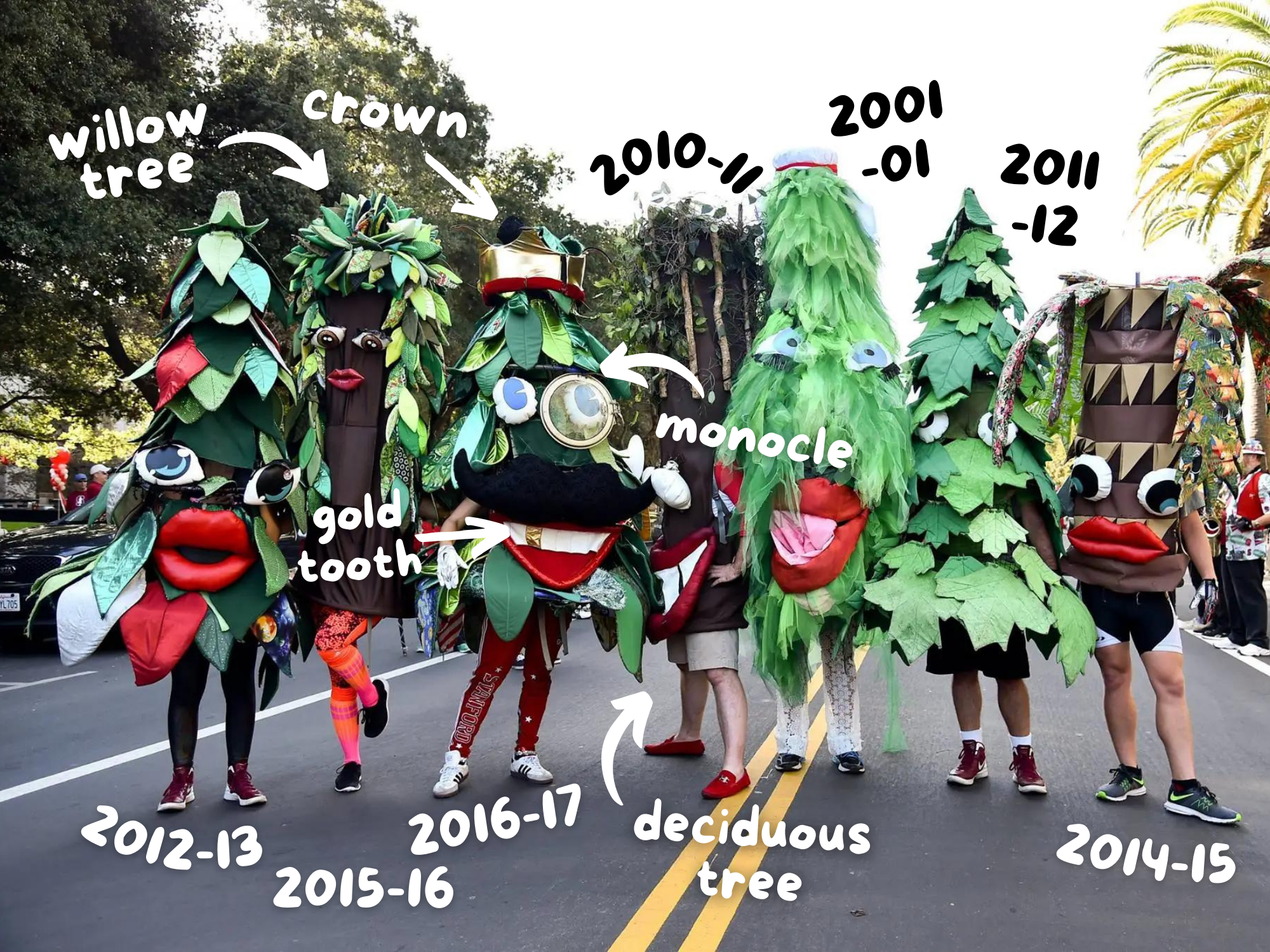
If “the Cardinal” is the official brand, the “Stanford Tree” is the disruptive, unofficial icon that has come to define the university’s public persona. The Tree is technically a member of the Stanford Leland Junior University Marching Band (LSJUMB), but its cultural impact far exceeds its official status.
The Power of the Unofficial Mascot
In traditional brand management, consistency and control are paramount. However, the Stanford Tree represents the power of “bottom-up” branding. The Tree was never designed by a marketing committee or a design firm; it emerged from the student body’s desire for a whimsical, irreverent symbol.
By allowing the Tree to become the de facto mascot, Stanford’s brand gained an authenticity that “top-down” mascots often lack. This illustrates a vital lesson for modern brand strategy: sometimes the most effective brand assets are those created and nurtured by the community itself. When a community “owns” a symbol, their engagement and loyalty are significantly higher than when a symbol is imposed upon them.
Embracing the “Weird” as a Brand Differentiator
The Tree is famously bizarre. It is handmade, often looks slightly disheveled, and changes its appearance every year. In a sea of polished, professionalized sports branding, the Tree stands out as a “glitch in the system.” This perceived “weirdness” is a deliberate brand differentiator.
For Stanford, a university located in the heart of Silicon Valley, the Tree mirrors the “disruptive” spirit of tech innovation. It signals that while the institution is world-class and serious about its research, it does not take itself too seriously. This balance of prestige and playfulness is a difficult brand tightrope to walk, but the Tree manages it perfectly, making the Stanford brand feel accessible and human.
Strategic Differentiation in the Collegiate Market

In any crowded market, differentiation is the key to survival. The collegiate landscape is no different. With hundreds of institutions vying for the same pool of elite students, faculty, and donors, a brand must stand out. Stanford’s mascot strategy provides a blueprint for high-level differentiation.
Moving Beyond Animal Archetypes
Most sports brands rely on “predatory” archetypes—lions, tigers, or bears—to convey strength. Stanford’s choice to remain the “Cardinal” (the color) and celebrate a “Tree” (a redwood) moves the brand into a different psychological space. It shifts the narrative from “physical dominance” to “intellectual growth” and “endurance.”
A tree represents deep roots, longevity, and a connection to the local California landscape (specifically the Palo Alto “El Palo Alto” redwood). From a brand positioning standpoint, this aligns the university with environmental stewardship and historical permanence. It tells a story that is much richer than a simple “win-at-all-costs” sports mentality.
Cultivating an “Intellectual Humor” Brand Persona
The Stanford brand identity appeals to a specific demographic: the high-achieving “nerd” who is also a high-performing athlete or innovator. The absurdity of the Tree serves as a “shibboleth”—a cultural touchstone that those within the community understand and cherish, while outsiders may find it confusing.
This creates a powerful “in-group” vs. “out-group” dynamic, which is essential for building brand tribalism. By not trying to appeal to everyone with a generic mascot, Stanford has created a brand that is deeply loved by those who “get it.” In marketing, a polarizing brand is often more valuable than a neutral one, as it fosters deeper emotional connections and stronger brand advocacy.
Managing the Chaos: Protecting an Unconventional Identity
Maintaining a brand that is intentionally chaotic—like the Stanford Tree—requires a unique approach to brand protection. It is not about strict style guides, but about protecting the spirit of the icon.
The Annual Selection as Content Marketing
Every year, the selection of the “new” Tree is a major event on campus. Candidates engage in “stunts” to prove their worthiness. From a brand perspective, this is a form of recurring content marketing. It keeps the brand fresh, generates earned media, and reinforces the brand’s values of creativity and tenacity.
Instead of a static logo that never changes, the Stanford Tree is a living, breathing brand asset. This fluidity keeps the mascot relevant to each new generation of students. In the corporate world, this is comparable to Google’s “Doodles”—changing the logo to reflect the day’s events while maintaining the core brand identity.
Global Recognition and the Silicon Valley Synergy
The Stanford brand does not exist in a vacuum; it is inextricably linked to the tech ecosystem of Northern California. The Tree, in all its DIY glory, embodies the “hacker” ethos. It represents the idea that anyone with a vision and some glue can create something iconic.
This synergy between the institutional brand and the regional industry brand is a force multiplier. When people see the Stanford Tree, they don’t just see a sports mascot; they see the quirky, brilliant, and unconventional spirit of the place that produced the founders of Google, Hewlett-Packard, and Nike. The mascot becomes a symbol of a broader cultural movement.
Conclusion: The ROI of Non-Conformity
The answer to the question “What is the Stanford mascot?” is more than just “a tree” or “the Cardinal.” It is a testament to the power of unconventional brand strategy. By eschewing the traditional path of athletic branding, Stanford has built an identity that is memorable, authentic, and perfectly aligned with its institutional values.
For brand managers, the Stanford case study highlights three critical takeaways:
- Own your color: A strong visual anchor can be more powerful than a mascot.
- Allow for organic growth: Let your community help shape your brand identity.
- Differentiate through personality: Don’t be afraid to be “weird” if it aligns with your core mission.
In a world of “me-too” branding, Stanford stands tall, rooted in its history and unafraid to let its freak flag—or rather, its handcrafted redwood—fly. The Stanford Tree is not just a mascot; it is a strategic asset that proves that in branding, the most unconventional path is often the most successful one.
aViewFromTheCave is a participant in the Amazon Services LLC Associates Program, an affiliate advertising program designed to provide a means for sites to earn advertising fees by advertising and linking to Amazon.com. Amazon, the Amazon logo, AmazonSupply, and the AmazonSupply logo are trademarks of Amazon.com, Inc. or its affiliates. As an Amazon Associate we earn affiliate commissions from qualifying purchases.