In the world of visual communication, the question “what does blue green make?” transcends the basic physics of light or the chemistry of pigments. While a primary school student might quickly answer “teal” or “turquoise,” a brand strategist sees a sophisticated fusion of two of the most powerful psychological drivers in the marketplace.
The combination of blue and green creates a spectrum of colors—ranging from deep cyan to vibrant aquamarine—that represents a unique intersection of trust and vitality. In a crowded digital landscape, understanding the strategic value of this color blend is essential for building a brand that resonates with modern consumers. This article explores how the fusion of blue and green serves as a cornerstone for brand strategy, corporate identity, and the evolution of visual storytelling.
The Psychological Foundation: The Symbiosis of Trust and Growth
To understand what blue and green make when combined, one must first deconstruct the individual psychological properties of the parent colors. In branding, colors are not merely aesthetic choices; they are silent ambassadors of a company’s values.
Blue: The Pillar of Trust and Stability
Blue is arguably the most dominant color in the corporate world. It is the color of the sky and the sea—vast, constant, and dependable. From a branding perspective, blue conveys professionalism, authority, and security. It is the reason why financial institutions, tech giants, and healthcare providers gravitate toward navy and royal blues. It lowers the heart rate and fosters a sense of calm, creating a “safe space” for the consumer to engage with a service.
Green: The Symbol of Vitality and Renewal
Green, conversely, is the color of nature, growth, and health. It signals safety and permission (the “green light”). In the 21st century, green has also become synonymous with sustainability, organic products, and environmental consciousness. It suggests that a brand is not just static, but alive and evolving.
The Intersection: Finding the Balance
When you mix blue and green, you create a psychological hybrid. You take the structural integrity of blue and infuse it with the organic energy of green. The result is a palette that speaks to “sustainable innovation” or “calm growth.” This combination is particularly effective for brands that want to appear established yet forward-thinking. It bridges the gap between the traditional corporate world and the modern, eco-conscious startup ecosystem.
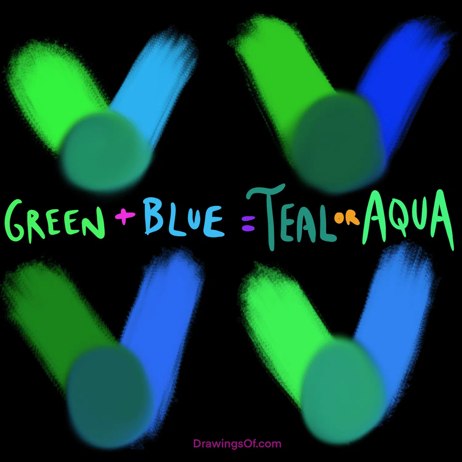
Teal, Turquoise, and Cyan: The New Corporate Palette
The specific shade resulting from the mix of blue and green determines the brand’s specific “voice.” Strategic brand identity requires a nuanced choice between these variations to ensure the visual message aligns with the corporate mission.
Teal: Sophistication and Clarity
Teal is a deeper, more saturated version of the blue-green mix. In brand strategy, teal is often used to represent clarity of thought and professional sophistication. It is less aggressive than pure blue but more serious than pure green. Brands that use teal often position themselves as experts who offer personalized, thoughtful solutions. It is a color that suggests the brand has “depth,” making it a favorite for consulting firms and high-end service providers.
Turquoise: Creativity and Refreshment
Turquoise leans slightly more toward green and is brighter in tone. It evokes the feeling of tropical waters—refreshing, uplifting, and creative. Brands targeting a younger demographic or those in the wellness and lifestyle sectors often use turquoise to stand out. It suggests a brand that is approachable and energetic without being overwhelming or “loud” like orange or yellow.
Cyan: The Digital Frontier
Cyan is the high-energy, high-saturation result of mixing blue and green light (in the RGB model). It is the color of the digital future. Because it is highly visible on screens, cyan has become a staple for tech brands and software companies. It represents the “cool” side of technology—precise, fast, and modern. When a brand adopts cyan, it is signaling that it belongs to the cutting edge of the digital revolution.
Strategic Implementation in Visual Identity
Defining the color is only the first step. The true power of what blue and green make lies in how these colors are implemented across various brand touchpoints.
Logo Design and Visual Harmony
A logo is often the first interaction a consumer has with a brand. When using blue-green tones, designers must consider the “weight” of the color. A teal logo on a white background offers a clean, clinical, and professional look. However, when paired with metallic accents like silver or gold, it shifts toward luxury.
Strategic branding often utilizes a “gradient” approach, transitioning from a deep blue to a vibrant green. This visual movement symbolizes progress—literally showing the brand’s journey from a stable foundation toward a bright, growing future. This technique is frequently seen in logistics and energy companies that want to highlight their transition toward “green” solutions without losing their “blue” heritage of reliability.
Web Design: User Experience and Color Flow
In the digital realm, the blue-green spectrum is highly functional. Studies in eye-tracking show that teal and soft cyan are easy on the eyes, making them excellent choices for backgrounds or primary navigation elements. Unlike red (which signals error or urgency) or yellow (which can cause eye strain), blue-green shades keep the user engaged for longer periods.
From a brand strategy perspective, using these colors in UI/UX design creates a “frictionless” experience. It fosters an environment of peace and efficiency, which is vital for apps and websites where the goal is to guide the user through a complex process, such as a checkout flow or a data dashboard.
Case Studies: Brands that Mastered the Mix
Analyzing successful brands provides a blueprint for how the blue-green palette can be leveraged to dominate a market niche.
The Tiffany & Co. Legacy: Luxury and Exclusivity
Perhaps the most famous example of a blue-green blend is “Tiffany Blue.” This specific shade of robin’s-egg blue (which sits firmly between blue and green) has become one of the most protected and recognizable brand assets in history. For Tiffany & Co., this color makes something very specific: an emotional connection to luxury and special moments. It proves that a color choice can become so synonymous with a brand that the color itself becomes a trademarked asset.
Siemens: The Precision of Cyan
Siemens uses a distinct shade of “Petroleum” (a deep blue-green) and vibrant cyan in its branding. This choice reflects the company’s dual focus on heavy engineering (the blue/stability) and innovative energy solutions (the green/sustainability). By centering their identity on this mix, Siemens communicates that they are a “Green Infrastructure” leader—a direct visual answer to the question of what their brand “makes.”
Fintech and the Rise of “Neo-Mint”
The rise of fintech companies like Monzo or various digital-first banks has seen a surge in “neo-mint” and bright turquoise. These brands are intentionally moving away from the “Staid Navy Blue” of traditional banks (like Chase or Barclays). By mixing blue and green to create vibrant, neon-adjacent shades, they signal to a younger generation that they are a “new kind of money”—one that is mobile-first, transparent, and growth-oriented.
Future-Proofing Your Brand Through Color
As we look toward the future of branding, the intersection of blue and green will only become more relevant. This is driven by two major global trends: the digital-first economy and the global push for sustainability.
Sustainability and the “Green-Blue” Economy
The “Blue Economy” (maritime and water resources) and the “Green Economy” (land and renewable energy) are merging in the public consciousness. Brands that can successfully navigate both—using a visual identity that blends these colors—will be seen as leaders in the global effort to protect the planet. This isn’t just about “greenwashing”; it’s about using color to authentically represent a commitment to holistic environmental health.
Cultural Nuances and Global Branding
Finally, when expanding a brand globally, the blue-green mix is one of the “safest” yet most evocative choices. In many Eastern cultures, the distinction between blue and green is historically fluid (the word ao in Japanese, for instance, can refer to both). In the Middle East, turquoise is often associated with protection and healing.
By choosing a blue-green palette, a brand adopts a color language that is almost universally positive. It avoids the mourning associations of black in some cultures or the aggression of red in others. It is a palette of universal appeal, making it the ultimate tool for brands with global ambitions.
In conclusion, what does blue green make? It makes a statement of balanced progress. It creates a visual bridge between where a company has been (stability) and where it is going (growth). For the brand strategist, it is more than just a color; it is a sophisticated tool for building trust, signaling innovation, and creating a lasting identity in an ever-changing marketplace.
aViewFromTheCave is a participant in the Amazon Services LLC Associates Program, an affiliate advertising program designed to provide a means for sites to earn advertising fees by advertising and linking to Amazon.com. Amazon, the Amazon logo, AmazonSupply, and the AmazonSupply logo are trademarks of Amazon.com, Inc. or its affiliates. As an Amazon Associate we earn affiliate commissions from qualifying purchases.