
In the world of corporate identity and brand strategy, we often discuss the importance of a logo being memorable, symbolic, and scalable. However, long before modern marketing departments existed, nations were perfecting the art of “brand identity” through their flags. Perhaps no flag in the modern era carries as much sophisticated design theory and philosophical branding as the Taegeukgi—the national flag of South Korea.
When asking “what does the Korean flag look like,” one is not merely asking for a description of colors and shapes; they are asking to see the visual manifesto of a culture. For brand designers and strategists, the Taegeukgi serves as a masterclass in minimalist storytelling, balanced composition, and the use of negative space to convey complex narratives.

1. The Anatomy of a National Brand: Visual Components
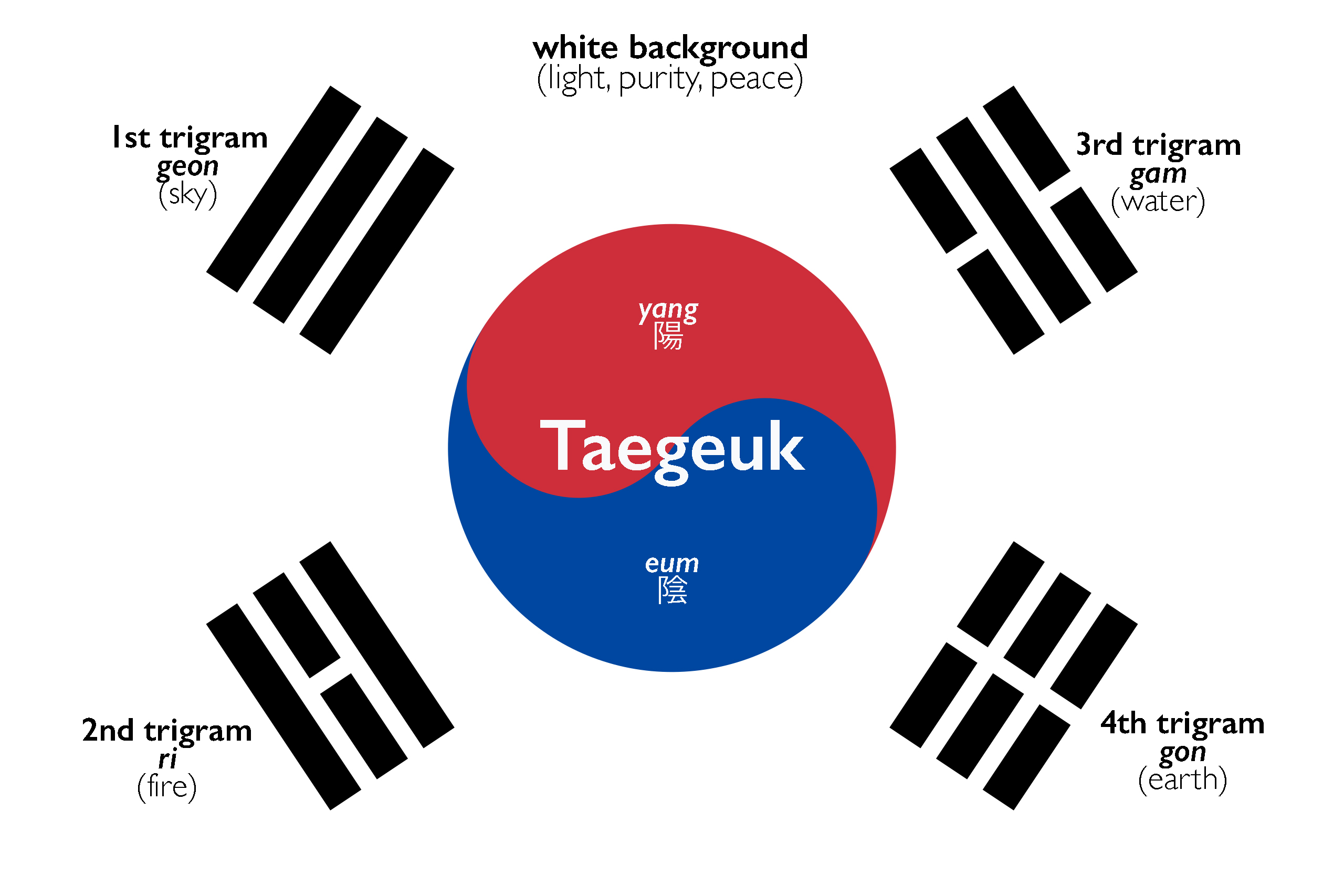
The visual impact of the South Korean flag is immediate. Unlike the complex heraldry of many European flags or the busy patterns of others, the Taegeukgi is built on a foundation of geometric precision and high-contrast color theory. Its design can be broken down into three distinct “brand assets”: the white field, the central circle, and the four black trigrams.
The Canvas of Peace: The White Background
In branding, the background is often overlooked, but in the South Korean “brand guide,” the white field is essential. Traditionally, white is a color of great significance in Korean culture, representing purity, peace, and the “white-clad people” (baegui minjok). From a design perspective, this white space provides the necessary “breathing room” that allows the central elements to pop. It creates a sense of cleanliness and modernism that many contemporary tech and lifestyle brands strive to emulate.
The Core Identity: The Taegeuk
At the heart of the flag is the Taegeuk (the origin of the flag’s name). This is a circular icon divided perfectly into two interlocking semicircles—red on top and blue on the bottom. In visual strategy, this represents the concept of ultimate harmony. The red portion (Yang) represents proactive cosmic forces, while the blue portion (Um) represents responsive cosmic forces. The “S” curve separating them suggests fluid motion, indicating that while these forces are opposites, they are in a constant state of transition and cooperation.
The Supporting Elements: The Four Trigrams
Surrounding the central logo are four black trigrams, known as Gwae. These are placed in the four corners of the flag, creating a balanced frame. Each trigram consists of three parallel lines, some unbroken and some broken in the middle. While they may look like simple bars to the uninitiated, they function as the “secondary brand marks” that anchor the flag’s message in the natural world.
2. Philosophical Design Principles and Brand Logic
The Taegeukgi is more than a beautiful image; it is a logical system. Every element is placed with mathematical and philosophical intent, echoing the principles of balance that define successful, long-lasting brand identities.
The Binary Logic of Um and Yang
Modern branding often relies on the “Rule of Thirds” or the “Golden Ratio,” but the Korean flag utilizes a binary logic rooted in Eastern philosophy. The interplay between the blue (cold/passive) and red (hot/active) creates a visual tension that is resolved by their circular union. This “Unity of Opposites” is a powerful branding tool used by companies like Pepsi or Mastercard, but the Taegeukgi predates modern commercial application, proving that humans are naturally drawn to the resolution of visual conflict.
Negative Space and Minimalist Impact
The placement of the four trigrams—Geon, Gon, Gam, and Ri—demonstrates a sophisticated use of negative space.
- Geon (top left): Three solid lines representing Heaven.
- Gon (bottom right): Three broken lines representing Earth.
- Gam (top right): One solid line between two broken lines representing Water.
- Ri (bottom left): One broken line between two solid lines representing Fire.
By placing these in the corners, the design directs the eye toward the center while providing a sense of structural stability. This “radial balance” ensures that the flag is recognizable even from a distance or when the wind causes the fabric to fold—a key requirement for any effective logo.
3. Brand Evolution and Technical Standardization
Just as a global corporation must maintain strict brand guidelines to ensure consistency across different media, the South Korean government maintains rigorous standards for the Taegeukgi. This ensures that the “brand” remains untainted by variation.
Historical Iterations of the Design
The “brand history” of the Taegeukgi began in the late 19th century. The first version was created in 1882 during the Joseon Dynasty. Throughout the early 20th century, especially during the period of Japanese colonization, the flag became a brand of resistance. Its design fluctuated slightly in terms of the thickness of the lines and the exact shade of the colors until it was officially standardized by the Republic of Korea in 1948. This evolution mirrors how brands refine their logos over decades to achieve a “timeless” look.
Modern Standardization: Color and Proportions
To maintain the integrity of the national identity, the Ministry of the Interior and Safety provides specific coordinates for the flag’s construction. The ratio of the flag is 3:2. The diameter of the Taegeuk circle is half the height of the flag. Even the colors are strictly defined. In the digital age, these have been translated into modern color systems:
- CIE Colors: For textile manufacturing.
- Munsell Color System: Red (6.0R 4.5/14) and Blue (5.0PB 3.0/12).
- Digital Branding: While the government uses traditional systems, web designers typically use specific HEX codes (approximately #CD2E3A for the red and #0047A0 for the blue) to ensure the flag looks consistent on screens, from smartphone apps to international news sites.
4. The Flag as a Tool for Global Soft Power
In the 21st century, the South Korean flag has moved beyond government buildings and into the realm of “Lifestyle Branding.” As Korea’s “Soft Power” (Hallyu) has grown, the Taegeukgi has become a globally recognized symbol of quality, innovation, and cultural depth.
Cultural Branding through Hallyu
The explosion of K-Pop, K-Drama, and K-Beauty has turned the South Korean flag into a “premium” brand mark. When consumers see the Taegeukgi or its colors on a product—be it a Samsung smartphone box or a skincare package—there is an immediate brand association with high-tech efficiency and aesthetic perfection. The flag doesn’t just represent a government; it represents a “Brand Korea” that promises excellence.
Consistency in International Representation
Whether it is at the Olympic Games, the United Nations, or a World Expo, the Taegeukgi remains one of the most visually distinct flags. This is due to its unique color palette. While many flags use red, white, and blue (USA, UK, France, Russia), the specific “Taegeuk Blue” and the unique black trigrams set it apart in a crowded “marketplace” of national identities. This distinctiveness is what every brand strategist aims for: the ability to be identified in a fraction of a second.
5. Lessons for Modern Visual Identity Design
What can modern designers and brand strategists learn from looking at the Korean flag? The Taegeukgi offers several insights into creating a brand that lasts for centuries.
Narrative Storytelling through Geometry
A great brand tells a story without using words. The Taegeukgi tells the story of the entire universe—the sun, the moon, the earth, the heavens, and the balance of life—using nothing but lines and circles. If your brand identity can convey its core values through simple shapes, it will transcend language barriers and become a universal symbol.
Timelessness vs. Trend
The Korean flag has avoided the pitfalls of “trendy” design. It doesn’t rely on gradients, complex textures, or specific fonts that might look dated in ten years. By sticking to fundamental geometric principles and a limited color palette, it remains as modern today as it did a century ago. This “future-proofing” is essential for any brand that intends to outlive its founders.

Conclusion: The Ultimate Corporate Identity
When we ask “what does the Korean flag look like,” we find an answer that bridges the gap between ancient philosophy and modern design. It is a white canvas of peace, centered by a dynamic engine of harmony, and supported by the fundamental elements of nature.
For the professional strategist, the Taegeukgi is more than a flag; it is the ultimate example of a visual identity system. It is balanced, symbolic, technically precise, and globally recognized. It proves that when a “brand” is built on deep-seated cultural values and executed with minimalist precision, it becomes more than just a logo—it becomes an icon. Through the Taegeukgi, South Korea communicates its history, its philosophy, and its future-facing ambition to the world, one perfectly balanced circle at a time.
aViewFromTheCave is a participant in the Amazon Services LLC Associates Program, an affiliate advertising program designed to provide a means for sites to earn advertising fees by advertising and linking to Amazon.com. Amazon, the Amazon logo, AmazonSupply, and the AmazonSupply logo are trademarks of Amazon.com, Inc. or its affiliates. As an Amazon Associate we earn affiliate commissions from qualifying purchases.