
In the world of brand strategy and corporate identity, symbols are the most potent tools available to communicate values, history, and intent. Few symbols carry as much weight or immediate recognition as the American flag. However, in recent years, a visual shift has occurred. The traditional “Old Glory”—vibrant with its red, white, and blue—has increasingly been replaced in specific contexts by monochromatic versions.
Understanding what the black and white American flags mean requires more than a historical analysis; it requires a deep dive into brand semiotics, the psychology of color desaturation, and the strategic way subgroups “rebrand” universal icons to create specialized identities. This article explores the evolution of the black and white American flag through the lens of brand identity, examining how visual modifications alter perception and build niche communities.
1. The Evolution of National Symbols as Visual Identity
At its core, a national flag functions as a “Master Brand.” Like the logos of global giants like Nike or Apple, the stars and stripes are designed for instant recall, evoking a specific set of emotional responses. When a brand chooses to alter its core color palette, it is never an accident; it is a calculated move to shift the brand’s positioning.
From Universal Emblem to Niche Branding
The traditional American flag represents a broad, inclusive brand identity intended to cover a diverse population. By stripping the flag of its colors, the symbol moves from a “universal” brand to a “niche” brand. In branding terms, this is known as sub-branding. A sub-brand takes the equity of the parent brand (patriotism, heritage, strength) but narrows the focus to a specific audience. The black and white flag signals a departure from the “everyone” and moves toward the “someone”—specific groups such as tactical enthusiasts, law enforcement, or minimalist designers.
The Psychology of Monochromatic Design
In the field of brand design, black and white are used to convey authority, timelessness, and grit. While red, white, and blue are associated with vibrancy and celebration, a black and white palette shifts the narrative toward solemnity and seriousness. Brands often adopt a “blackout” aesthetic to signify premium quality or a “no-nonsense” attitude. When applied to the flag, this color shift changes the brand promise from “liberty and justice for all” to a more focused message of resilience, duty, and stoicism.
2. Analyzing the Sub-Brands: What Different Versions Communicate
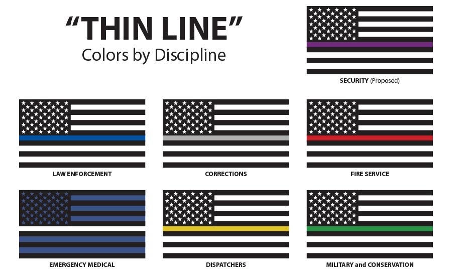
Just as a corporation might have different logos for different product lines, the black and white flag has various iterations that serve as visual identifiers for specific cultural segments. Each version uses the “flag architecture” to communicate a distinct set of values.
The “Thin Blue Line” as a Cultural Brand Extension
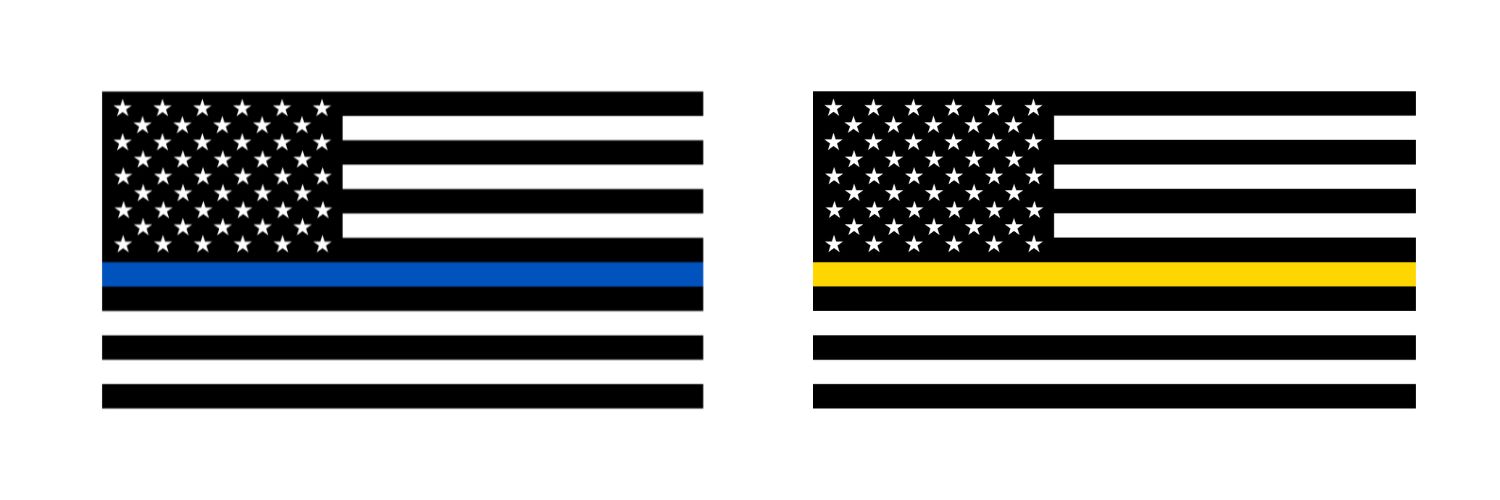
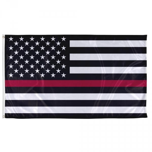
The most recognizable black and white American flag is the one featuring a single blue stripe. In branding terms, this is a masterpiece of tribal marketing. By adding a single point of color to a monochromatic field, the designers created a visual “focal point” that signifies solidarity. From a brand strategy perspective, the “Thin Blue Line” flag identifies the wearer as part of an exclusive group. It creates an “In-Group/Out-Group” dynamic, which is a powerful tool in building brand loyalty and community identity among law enforcement officers and their supporters.
The All-Black Flag: A Statement of Resilience and Determination
Historically, an all-black flag (often seen in tactical gear or military aesthetics) was associated with “no quarter given.” In a modern branding context, however, it has been reclaimed as a symbol of pure resilience. This is common in the “Tactical Branding” niche—companies that sell gear to veterans or outdoor enthusiasts. Here, the black flag is a brand asset that communicates “The Gritty Underdog.” It suggests that the brand (or the person representing it) is focused on the mission above all else, stripping away the “flash” of the traditional colors for a utilitarian, high-performance aesthetic.
High-Fashion and Streetwear Branding Integration
Beyond political or professional affiliations, the black and white flag has been adopted as a visual motif in high-fashion and streetwear. Brands like Off-White or Fear of God have used monochromatic Americana to play with the concepts of irony and deconstruction. In this niche, the flag is “rebranded” as an aesthetic element. By removing the color, the flag becomes a geometric pattern rather than a political statement, allowing the brand to tap into American heritage without inheriting the baggage of traditional nationalism.
3. The Impact of Color Desaturation on Brand Perception
To understand the power of these flags, one must look at how color—or the lack thereof—influences the human brain. Color is the first thing a consumer notices about a brand, often before they even recognize the logo’s shape.
Stripping Identity to Create Solemnity
In corporate identity design, when a company wants to commemorate a tragedy or signal a period of mourning, they often desaturate their logo. For example, during national days of mourning, media outlets may turn their colorful icons to grayscale. The black and white American flag utilizes this same psychological trigger. It communicates that the “brand” of America is in a state of reflection or serious struggle. It transforms a symbol of celebration into a symbol of commemoration.
Contrast and Authority in Modern Marketing
High contrast (the stark difference between black and white) is a design shorthand for authority. In branding, high-contrast logos are easier to read and carry more “weight” on a page or a product. By using a black and white flag, brands in the security, defense, and fitness industries leverage this sense of authority. It suggests a “back to basics” approach where there is no grey area—only the mission and the execution. This clarity is a highly marketable trait in industries where trust and reliability are the primary selling points.
4. Navigating the Controversy of Brand Modification
When a brand modifies a sacred symbol, it risks “Brand Dilution” or backlash. The American flag is protected by a set of cultural norms (and the U.S. Flag Code), and altering it can be seen as a violation of the “Brand Guidelines” of the nation.
Brand Dilution vs. Reinvention
Brand dilution occurs when a symbol is used so frequently and in so many different ways that it loses its original meaning. Some critics argue that the proliferation of black and white flags—whether for political movements, commercial products, or fashion—dilutes the original “brand” of the United States. However, from a marketing perspective, this is often seen as “reinvention.” By adapting the flag to fit modern subcultures, the symbol remains relevant to younger demographics who might find the traditional flag too formal or disconnected from their specific lived experiences.
The Legal and Ethical Boundaries of Flag Usage
In the corporate world, using a national symbol in branding requires careful navigation. While the U.S. Flag Code suggests that the flag should not be used for advertising, the Supreme Court has protected the right to use and modify the flag as a form of “Commercial Speech” and “Free Expression.” For brand managers, the black and white flag offers a loophole: by changing the colors, the symbol becomes an “artistic interpretation” rather than a literal flag, allowing companies to use it on apparel, packaging, and marketing materials without the same level of scrutiny that would follow the use of the official red, white, and blue.
5. Lessons for Modern Brand Managers
The rise of the black and white American flag offers several key insights for brand managers and designers who are looking to evolve their own corporate identities or navigate complex cultural symbols.
Leveraging Existing Archetypes for New Messaging
One of the most effective ways to build a brand is to “piggyback” on an existing archetype. The black and white flag succeeds because it doesn’t try to create a new symbol from scratch; it takes the world’s most recognizable icon and pivots the message. For brands, this means that you don’t always need a revolutionary new logo. Sometimes, a subtle shift in color palette or texture can completely redefine how your audience perceives your values.
The Importance of Context in Visual Communication
The meaning of a black and white flag changes depending on where it is seen. On a police officer’s uniform, it means something entirely different than it does on a piece of high-fashion streetwear or a bottle of “tactical” coffee. This highlights the importance of contextual branding. A visual asset is never viewed in a vacuum. Brand managers must consider the environment in which their symbols appear, as the environment will dictate the audience’s interpretation of the brand’s intent.
Final Thoughts: The Power of the Monochrome Brand
The black and white American flag is a testament to the enduring power of visual identity. By stripping away the colors of “Old Glory,” various groups have managed to carve out distinct sub-brands that communicate grit, authority, mourning, or style. Whether viewed as a sign of solidarity or a commercial aesthetic, these flags prove that in the world of branding, what you take away is often just as important as what you leave behind. As we move further into an era of hyper-niche marketing, the ability to take a universal symbol and “recolor” it for a specific tribe remains one of the most powerful strategies in the brand designer’s toolkit.
aViewFromTheCave is a participant in the Amazon Services LLC Associates Program, an affiliate advertising program designed to provide a means for sites to earn advertising fees by advertising and linking to Amazon.com. Amazon, the Amazon logo, AmazonSupply, and the AmazonSupply logo are trademarks of Amazon.com, Inc. or its affiliates. As an Amazon Associate we earn affiliate commissions from qualifying purchases.