
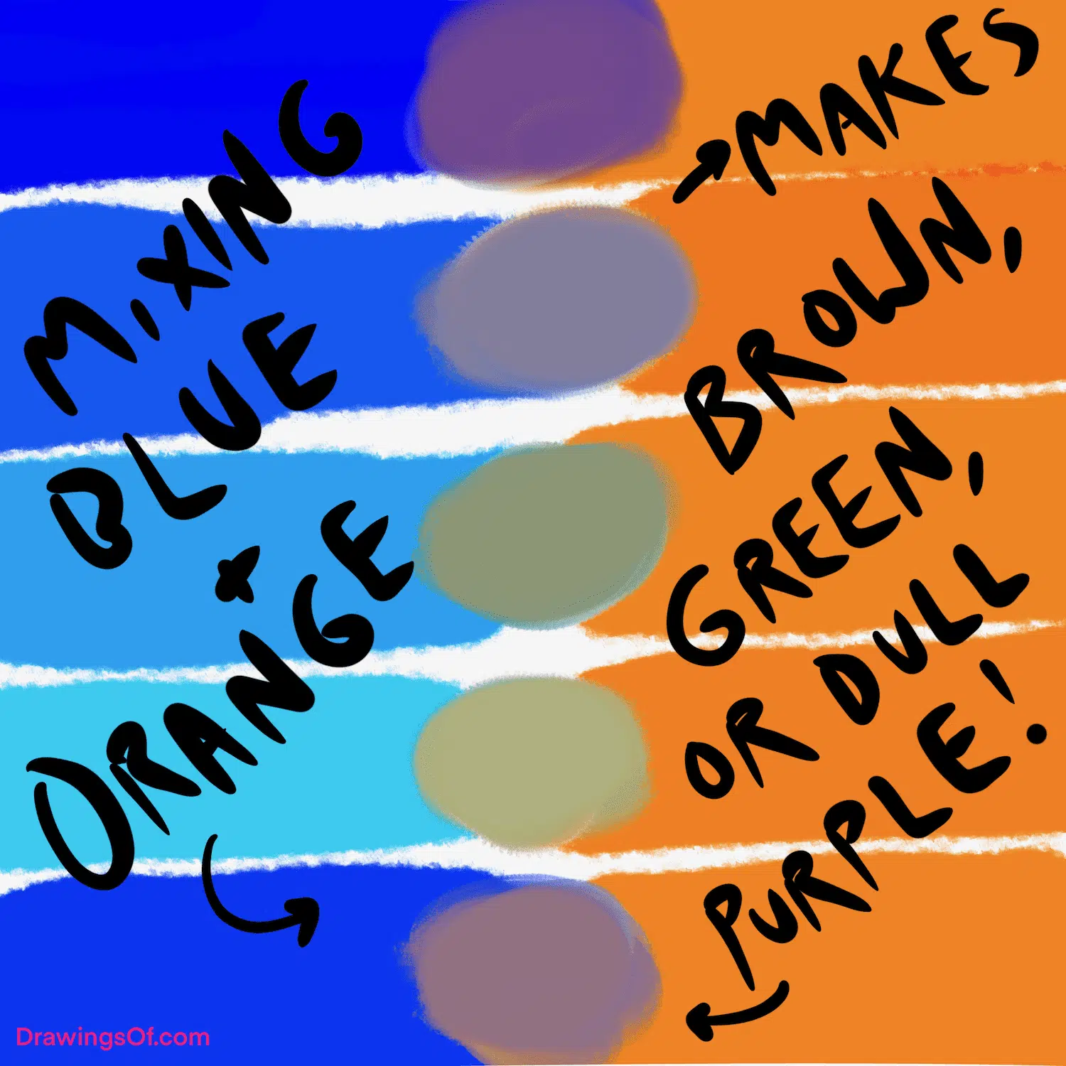
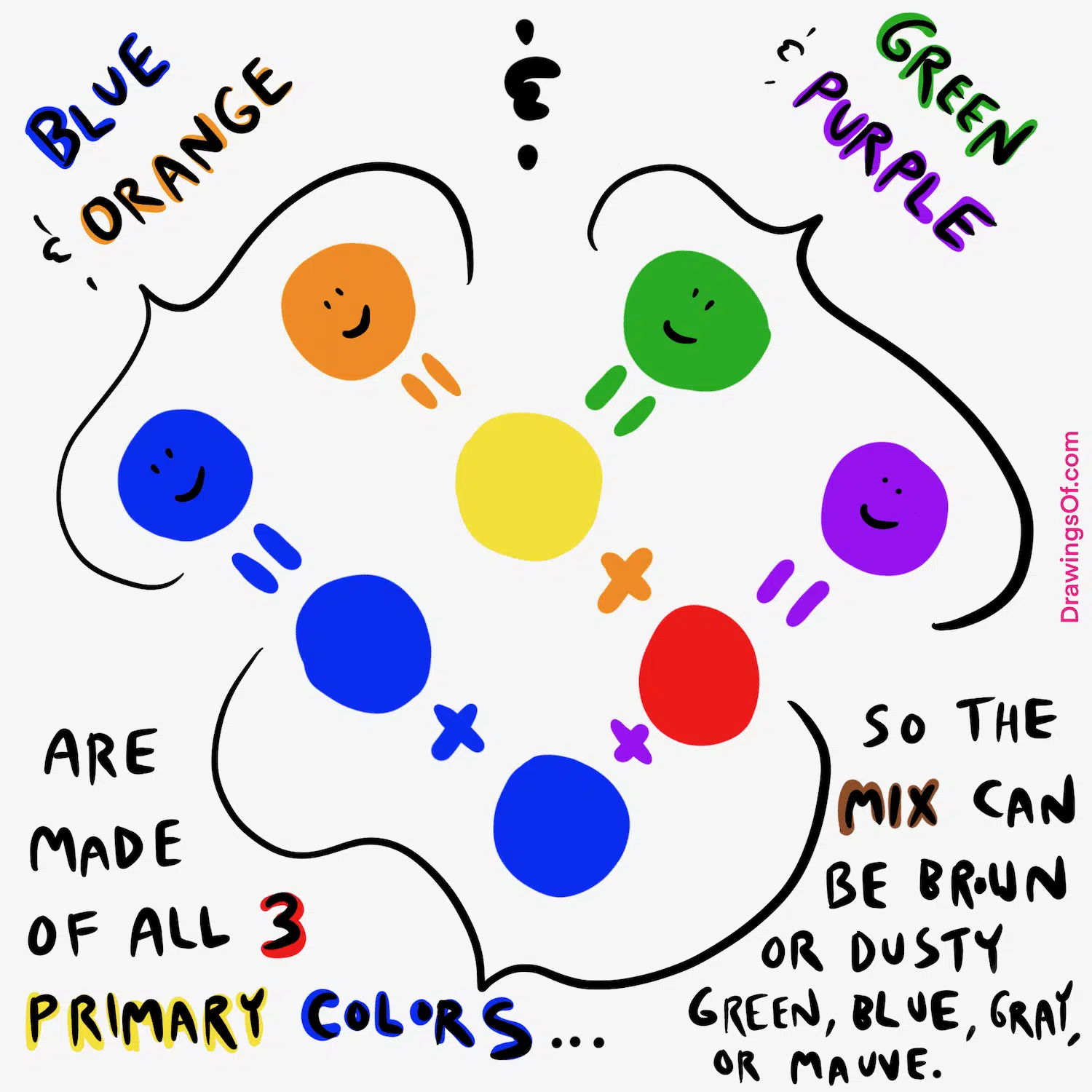
In the world of visual arts and physics, the literal answer to the question “what color do orange and blue make?” is quite straightforward: they create a neutral brown or a chromatic gray. Because they are complementary colors—sitting directly across from one another on the color wheel—they effectively cancel each other out when mixed as pigments. However, in the sophisticated realm of brand strategy and corporate identity, the “mixture” of orange and blue is not about blending pigments into a muddy neutral; it is about the high-energy vibration created by their proximity.
For brand strategists, designers, and marketing executives, the relationship between orange and blue is one of the most powerful tools in the visual arsenal. It represents the perfect equilibrium between stability and excitement, professionalism and playfulness. This article explores the technical, psychological, and strategic implications of this color pairing and how it shapes the way consumers perceive global identities.
The Foundation of Color Theory in Visual Branding
To understand why the pairing of blue and orange is so ubiquitous in modern branding, one must first look at the science of the color wheel. In the subtractive color model (RYB), used for traditional paints and dyes, blue and orange are complementary. This means they possess the highest level of contrast possible between two hues.
Complementary Dynamics: Why Blue and Orange Sit Opposite the Wheel
The color wheel is designed to show the relationships between different wavelengths of light. Blue is a primary color, often associated with the sky and the sea—vast, constant, and calming. Orange is a secondary color, created by mixing the heat of red with the joy of yellow. Because they share no common base (orange contains no blue, and blue contains no orange), the human eye perceives a “vibrant” effect when they are placed side by side.
In branding, this is known as simultaneous contrast. When the eye sees a bright orange logo against a deep blue background, the orange appears more orange, and the blue appears more blue. This optical phenomenon ensures that a brand is not only visible but memorable.
The Physical Result: When Pigments Collide
If a designer were to literally mix blue and orange ink on a palette, the result would be a “neutralized” tone. Depending on the ratio and the specific bias of the starting colors (e.g., a reddish-orange vs. a greenish-blue), the result ranges from a rich, earthy sienna to a sophisticated, slate-like gray.
In corporate identity, these “resultant” colors are often used as secondary or tertiary palette stabilizers. While the “hero” colors provide the energy, the browns and grays derived from their mixture provide the grounding necessary for professional typography and layout design. This creates a cohesive visual ecosystem where the accent colors and the neutral backgrounds are “DNA-related,” leading to a more harmonious brand experience.
The Psychology of Blue and Orange in Corporate Identity
Choosing a color palette for a brand is never a purely aesthetic decision; it is a psychological maneuver. Colors trigger subconscious reactions that can influence trust, purchase intent, and brand loyalty. The combination of blue and orange is a masterclass in psychological balance.
The Trust and Reliability of Blue
Blue is overwhelmingly the most popular color for corporate branding, particularly in the financial, tech, and healthcare sectors. It communicates intelligence, stability, and dependability. From a physiological standpoint, blue is known to lower the heart rate and evoke a sense of calm. However, a brand that is only blue can sometimes appear cold, distant, or overly bureaucratic. This is where the “orange intervention” becomes vital.
The Energy and Creativity of Orange
Orange is the antithesis of blue’s corporate stillness. It is the color of innovation, warmth, and accessibility. It demands attention without the aggressive “warning” signal associated with red. In marketing, orange is often used to signify a “friendly” brand or a “value-driven” proposition. It suggests a company that is forward-thinking and unafraid to break the mold. When a brand introduces orange into its identity, it tells the consumer, “We are professional, but we are also human and energetic.”
Balancing Cold and Warm Tones for Maximum Engagement
The strategic “mix” of these two colors allows a brand to occupy two spaces at once. A tech company might use a deep navy blue to signal its powerful infrastructure (the “brain”) and a bright orange to signal its user-friendly interface (the “heart”). This duality helps brands appeal to both the rational and emotional facets of the consumer’s brain. By balancing the “cold” of blue with the “warm” of orange, brands create a sense of completeness and holistic service.

Case Studies: Brands that Mastered the Blue and Orange Palette
Many of the world’s most recognizable brands have utilized the high-contrast relationship between blue and orange to dominate their respective markets. These case studies illustrate how the “mixture” of these colors—not as a blend, but as a duo—creates a lasting impact.
Gulf Oil and the Heritage of Professionalism
The Gulf Oil logo is perhaps one of the most iconic uses of this palette in history. The light “powder” blue and vibrant orange are synonymous with the golden age of automotive racing. In this context, the blue represents the precision of engineering and the reliability of the fuel, while the orange represents the heat, speed, and excitement of the race track. Decades later, the color combination alone—even without the logo—is instantly recognizable as the “Gulf livery.”
FedEx: Using Contrast to Drive Directional Clarity
While FedEx is often associated with purple and orange, the “FedEx Office” and original iterations leaned heavily into the high-contrast relationship of cool and warm tones. The brilliance of the FedEx identity lies in the “hidden” arrow between the ‘E’ and the ‘x’. By using a bright orange for the second half of the wordmark against a more stable, cooler tone, the eye is naturally drawn toward the end of the word, reinforcing the brand’s core message of movement, delivery, and speed.
Tech and Media: From Mozilla to Nickelodeon
In the digital space, the blue-orange combo is a favorite for icons and interfaces. The Mozilla Firefox logo uses the “fox” (orange) wrapping around the “world” (blue). This perfectly encapsulates the brand’s mission: a fast, energetic tool (orange) that navigates the vast, stable infrastructure of the global internet (blue). Similarly, Nickelodeon’s use of orange in its “splat” logo—often set against blue backgrounds in its programming—defined a generation of children’s media as fun and rebellious yet anchored in a professional broadcasting network.
Applying Complementary Color Schemes to Your Personal Brand
Whether you are designing a corporate identity or a personal brand for a LinkedIn profile or portfolio, the principles of blue and orange can be applied to create a “professional edge.”
Establishing Visual Hierarchy through High-Contrast Accents
One of the biggest mistakes in branding is using too much of a “loud” color. If an entire website is orange, the user will feel overwhelmed and likely leave. Strategic branding involves using blue as the “anchor” color—dominating about 60-70% of the visual space—and using orange as the “accent” color for Call-to-Action (CTA) buttons, icons, or headers. This directs the user’s eye exactly where you want it to go, utilizing the orange as a beacon of importance.
Choosing the Right Shades: From Navy and Burnt Orange to Cyan and Peach
Not all blue-and-orange pairings are created equal. The “vibe” of your brand changes drastically depending on the saturation and value of the hues:
- Navy & Burnt Orange: Conveys heritage, luxury, and “old money” stability. Ideal for law firms or high-end consulting.
- Cyan & Bright Orange: Conveys tech-forward thinking, startups, and agility.
- Baby Blue & Peach: Conveys wellness, skincare, or lifestyle brands that want to feel approachable and soft.
The goal is to find the specific “tension” between the two colors that matches your brand’s unique voice.
The Strategic Evolution of Brand Color Palettes
As we move further into a digital-first economy, the way we perceive color continues to evolve. Designers are no longer just looking at how colors look on a printed business card; they are looking at how they perform on OLED screens and in “Dark Mode” environments.
Adapting for Digital Interfaces and Accessibility
When using blue and orange in digital design, accessibility (WCAG compliance) is paramount. Because blue and orange have a high contrast in hue but can sometimes have a similar “value” (brightness), designers must ensure there is enough light-to-dark contrast for users with color vision deficiencies. A dark navy background with a bright orange button typically passes accessibility tests with flying colors, making it a “safe” yet bold choice for UX/UI designers.
Future-Proofing Your Brand through Color Sustainability
The blue and orange combination is essentially “trend-proof.” Unlike the neon greens of the early 2000s or the “millennial pink” of the 2010s, the complementary relationship between blue and orange is rooted in biological optical science. It is a pairing that the human brain is hardwired to find pleasing and balanced. By adopting this palette, brands can ensure a level of longevity, avoiding the need for a total visual overhaul every five years.
In conclusion, while the literal mixture of orange and blue might result in a humble brown, their strategic partnership in branding results in a visual powerhouse. It is a combination that speaks to the duality of the modern business world: the need to be both a rock of reliability and a spark of innovation. By mastering this contrast, brands can cut through the noise of a crowded marketplace and build an identity that is both aesthetically grounded and emotionally resonant.
aViewFromTheCave is a participant in the Amazon Services LLC Associates Program, an affiliate advertising program designed to provide a means for sites to earn advertising fees by advertising and linking to Amazon.com. Amazon, the Amazon logo, AmazonSupply, and the AmazonSupply logo are trademarks of Amazon.com, Inc. or its affiliates. As an Amazon Associate we earn affiliate commissions from qualifying purchases.