
In the competitive landscape of modern marketing, visual identity serves as the primary handshake between a brand and its audience. Among the spectrum of available colors, pink has emerged as one of the most versatile, psychologically complex, and strategically potent tools in a designer’s arsenal. No longer confined to narrow gender stereotypes, pink has evolved into a symbol of disruption, luxury, and approachability.
However, the efficacy of pink as a brand asset depends entirely on its execution. Determining “what matches with pink” is not merely an aesthetic choice; it is a strategic decision that influences consumer perception, brand positioning, and market differentiation. This guide explores the sophisticated world of pink color theory within the context of brand strategy and corporate identity.

The Psychology of Pink: Why It Matters in Brand Identity
Before pairing pink with other colors, a brand strategist must understand the psychological weight the color carries. Color psychology suggests that different shades of pink evoke vastly different emotional responses. To use pink effectively, a brand must first define the “vibe” it intends to project.
Evolution of Pink: From Gendered Stereotypes to Modern Versatility
Historically, pink was boxed into a “feminine” category, often associated with youth and softness. However, the last decade has seen a radical shift. The rise of “Millennial Pink” transitioned the color into a gender-neutral, sophisticated hue associated with modernism and minimalism. Today, brands use pink to signal anything from high-energy tech disruption (magenta) to high-end, vintage luxury (dusty rose). Understanding this evolution allows a brand to use pink as a tool for inclusivity and forward-thinking.
Evoking Emotion: The Subconscious Impact on Consumers
In branding, lighter pinks like blush or champagne pink evoke feelings of calm, compassion, and nurturing. These are often used in wellness, skincare, and high-end lifestyle brands. Conversely, vibrant pinks like fuchsia or hot pink stimulate energy, excitement, and confidence. These shades are designed to stop a “scroller” in their tracks. By selecting the right shade of pink, a brand can subconsciously dictate how a consumer feels before they even read a single word of copy.
Essential Color Palettes: What Matches with Pink in Brand Design
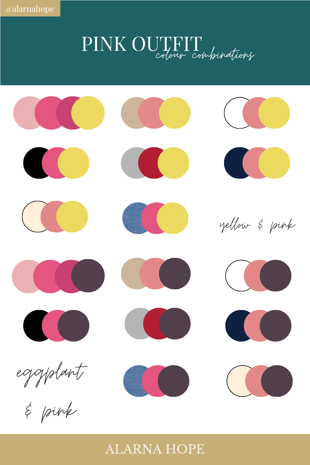
Creating a cohesive brand identity requires a harmonious color palette. When deciding what matches with pink, designers must look at the color wheel to create contrast, balance, or monochromatic elegance.
High-Contrast Pairings: Pink and Navy or Forest Green
One of the most professional ways to utilize pink is by pairing it with deep, “grounding” colors.
- Pink and Navy Blue: This is a classic “Power Palette.” The navy provides a foundation of authority, stability, and corporate trust, while a soft pink adds a touch of accessibility and warmth. This combination is highly effective for consultancy firms or financial services looking to appear more approachable.
- Pink and Forest Green: This is a sophisticated, nature-inspired pairing. It suggests growth, vitality, and organic luxury. It is a favorite for sustainable brands and high-end interior design firms.
Soft and Sophisticated: Pink with Neutrals and Pastels
For brands targeting a minimalist or premium market, pairing pink with neutrals creates an atmosphere of timeless elegance.
- Pink and Charcoal Grey: This pairing is sleek and modern. It balances the “sweetness” of pink with the “industrial” strength of grey.
- Pink and Cream/Beige: This creates a soft, inviting aesthetic. It is frequently seen in the “clean girl” aesthetic of modern beauty branding, emphasizing purity and high-quality ingredients.
Bold and Modern: Pink and Metallic or Neon Accents
In the world of disruptive marketing, pink is often paired with unconventional colors to create a “pop” effect.
- Pink and Gold: This is the international shorthand for luxury and exclusivity. It is widely used in premium packaging.
- Pink and Electric Blue: This high-vibration pairing is common in the creative industries and tech startups. It signals innovation, creativity, and a refusal to follow the status quo.
Implementing Pink Across Different Brand Sectors
The application of pink varies significantly depending on the industry. A brand strategy must align the color palette with the expectations and desires of the target demographic within a specific niche.
Luxury and High-End Fashion
In luxury branding, pink is often used as a “nude” or a neutral. Think of the iconic packaging of brands like Acne Studios. Here, pink is matched with minimalist black typography or white space. The goal is to make pink feel expensive rather than playful. The shade is usually a muted, “dusty” version of the color, which suggests heritage and understated confidence.
Tech and Disruptive Startups
In the tech world, pink is often used to break the monotony of “corporate blue.” Magenta is the most famous example here, used by companies like T-Mobile or Lyft. In these instances, pink is matched with high-contrast whites or deep blacks to ensure legibility on digital screens. It signals that the company is a “challenger brand”—one that is faster, friendlier, and more innovative than the established giants.
Wellness, Health, and Personal Care
For the wellness sector, pink represents the “human touch.” It is often matched with sage green or soft wood tones to create a holistic feeling. In this context, pink is not about being “girly”; it is about empathy and self-care. It bridges the gap between clinical professionalism and emotional support.
Best Practices for Integrating Pink into Your Visual Identity
Choosing the colors that match with pink is only half the battle. A brand strategist must also determine the ratio and application of these colors to maintain brand equity and visual hierarchy.
The 60-30-10 Rule in Graphic Design
A common mistake in branding is overusing a bold color like pink, which can lead to “visual fatigue.” Strategists often recommend the 60-30-10 rule:
- 60% Primary Color: Usually a neutral (White, Grey, or Navy).
- 30% Secondary Color: This is where your chosen shade of pink comes in.
- 10% Accent Color: A complementary color (Gold, Green, or a darker shade of pink) used for Call-to-Action (CTA) buttons or icons.
Using pink as a 30% or 10% element often makes the brand feel more sophisticated than using it as the 60% dominant color.
Accessibility and Digital Readability Considerations
In the digital-first era, accessibility is a cornerstone of brand strategy. Light pink text on a white background is a common “design sin” that fails WCAG (Web Content Accessibility Guidelines). When matching pink, ensure that there is enough contrast for readability. Pairing a vibrant pink with a dark navy background, or using a deep “merlot” pink for text, ensures that the brand is inclusive to users with visual impairments.
Case Studies: Brands That Successfully Mastered the Pink Palette
Looking at successful brands provides a blueprint for how pink can be transformed into a billion-dollar asset through strategic color matching.
T-Mobile and the Magenta Dominance
T-Mobile owns “Process Magenta.” By matching this incredibly bright, aggressive pink with stark black and white, they created a brand identity that is impossible to ignore. In a sea of blue (AT&T) and red (Verizon), T-Mobile’s pink signaled they were the “Un-carrier.” Their strategy proves that pink can be masculine, powerful, and technologically dominant.
Glossier and the Birth of “Millennial Pink”
Glossier is perhaps the best example of using pink to build a community. By matching a specific “Pale Dogwood” pink with minimalist white and real-life imagery, they created an aesthetic so recognizable it became a cultural movement. The “Glossier Pink” wasn’t just a color; it was a lifestyle. It matched perfectly with the brand’s message of “skin first, makeup second,” emphasizing natural beauty and transparency.
Airbnb and the “Rausch” Transition
When Airbnb rebranded, they introduced a color they called “Rausch”—a sophisticated blend of pink and red. By matching this warm, energetic hue with a clean, white UI and professional photography, they shifted their brand identity from a “couch-surfing” app to a global travel and hospitality leader. The pink-red hybrid suggests passion and belonging, which is the core of their brand mission: “Belong Anywhere.”

Conclusion: The Strategic Future of Pink
When asking “what matches with pink,” the answer lies at the intersection of aesthetics and business objectives. Pink is no longer a niche color; it is a high-performance tool for brand differentiation. Whether paired with navy for a look of “approachable authority,” or with gold for “modern luxury,” pink offers a level of emotional resonance that few other colors can match.
For brand managers and designers, the key is to move beyond the surface-level beauty of the color and focus on the strategic “why.” By understanding the psychology, selecting the right pairings, and maintaining a disciplined design hierarchy, any brand can leverage pink to create a lasting, impactful visual identity in an increasingly crowded marketplace.
aViewFromTheCave is a participant in the Amazon Services LLC Associates Program, an affiliate advertising program designed to provide a means for sites to earn advertising fees by advertising and linking to Amazon.com. Amazon, the Amazon logo, AmazonSupply, and the AmazonSupply logo are trademarks of Amazon.com, Inc. or its affiliates. As an Amazon Associate we earn affiliate commissions from qualifying purchases.