
Cream, a hue that evokes warmth, sophistication, and a touch of understated elegance, offers a remarkably versatile foundation for a multitude of design palettes. Its subtle complexity, a gentle whisper of off-white, makes it a perennial favourite in interior design, fashion, and graphic design. However, navigating the vast landscape of colour theory to find the perfect companions for this mellow shade can feel like a daunting, yet ultimately rewarding, endeavour. This article delves into the art and science of pairing colours with cream, focusing exclusively on its application within the realm of Brand identity and design. We will explore how strategic colour choices involving cream can elevate a brand’s message, foster specific emotional responses, and contribute to a cohesive and memorable visual identity.

The Psychology and Brand Implications of Cream
Cream is not merely an absence of colour; it’s a deliberate choice that communicates a distinct set of values and perceptions. Understanding these underlying psychological associations is crucial for any brand aiming to leverage cream effectively.
Conveying Warmth and Approachability
Unlike stark white, which can sometimes feel sterile or overly formal, cream inherently radiates a sense of warmth and comfort. This makes it an excellent choice for brands seeking to appear approachable, friendly, and inviting. Think of artisanal bakeries, cozy cafes, or wellness brands that prioritize a sense of nurturing and care. The gentle undertones of cream can create an emotional connection with the audience, fostering a feeling of familiarity and trust. This is particularly potent in sectors where human connection and personal service are paramount.
Evoking Sophistication and Timelessness
Despite its warmth, cream also possesses an inherent elegance and sophistication. It speaks of quality, refinement, and a certain classic appeal that transcends fleeting trends. Brands that wish to project an image of timeless luxury, heritage, or understated opulence often turn to cream. This applies to high-end fashion houses, artisanal craft businesses, or even financial institutions aiming for a stable and trustworthy image. The neutrality of cream allows for other richer or bolder colours to take centre stage, while still providing a grounding and sophisticated backdrop. It’s a colour that whispers rather than shouts, allowing the brand’s core message to resonate with clarity.
The Neutral Foundation: A Canvas for Brand Storytelling
Cream’s true power lies in its capacity to act as a neutral canvas. It doesn’t demand attention but rather supports and enhances other colours, allowing them to express their full potential. This makes it an invaluable tool for brands that have a complex story to tell or a diverse range of products and services. By using cream as a primary or secondary colour, a brand can create a flexible visual system that can adapt to various marketing materials, from packaging and websites to social media graphics and print advertisements. The consistency of cream across these touchpoints reinforces brand recognition and builds a unified brand experience.
Strategic Colour Pairings for Cream in Brand Design
The true magic of cream emerges when it’s artfully combined with other hues. The selection of these accompanying colours is not arbitrary; it’s a strategic decision that shapes the brand’s perception and emotional impact.
Monochromatic and Analogous Schemes: Subtle Harmony
For brands aiming for an ultra-refined, serene, and cohesive aesthetic, monochromatic or analogous colour schemes incorporating cream are highly effective.
Monochromatic Cream Palettes: The Essence of Minimalism
A monochromatic approach with cream involves using various shades, tints, and tones of cream itself. This can include very pale creams, slightly deeper ivories, or even creams with subtle yellow or beige undertones. This creates an exceptionally sophisticated and minimalist look. Such palettes are ideal for brands that want to convey purity, simplicity, and a focus on premium quality without any distractions. Examples include high-end skincare lines, luxury stationery brands, or avant-garde art galleries. The lack of strong colour contrast emphasizes texture, form, and materiality, drawing the viewer’s attention to the subtlest details.
Analogous Cream Palettes: Gentle Transitions and Flow
Analogous colour schemes involve colours that are adjacent to each other on the colour wheel. When cream is the base, pairing it with colours like soft yellows, muted peaches, light beiges, or even pale greens creates a harmonious and flowing visual experience. These pairings evoke feelings of natural calm, organic growth, and gentle optimism. Brands in the wellness, sustainable living, or artisanal food sectors can benefit immensely from this approach. The colours transition smoothly, creating a sense of ease and comfort, making the brand feel approachable and trustworthy.
Complementary and Triadic Schemes: Adding Vibrancy and Contrast
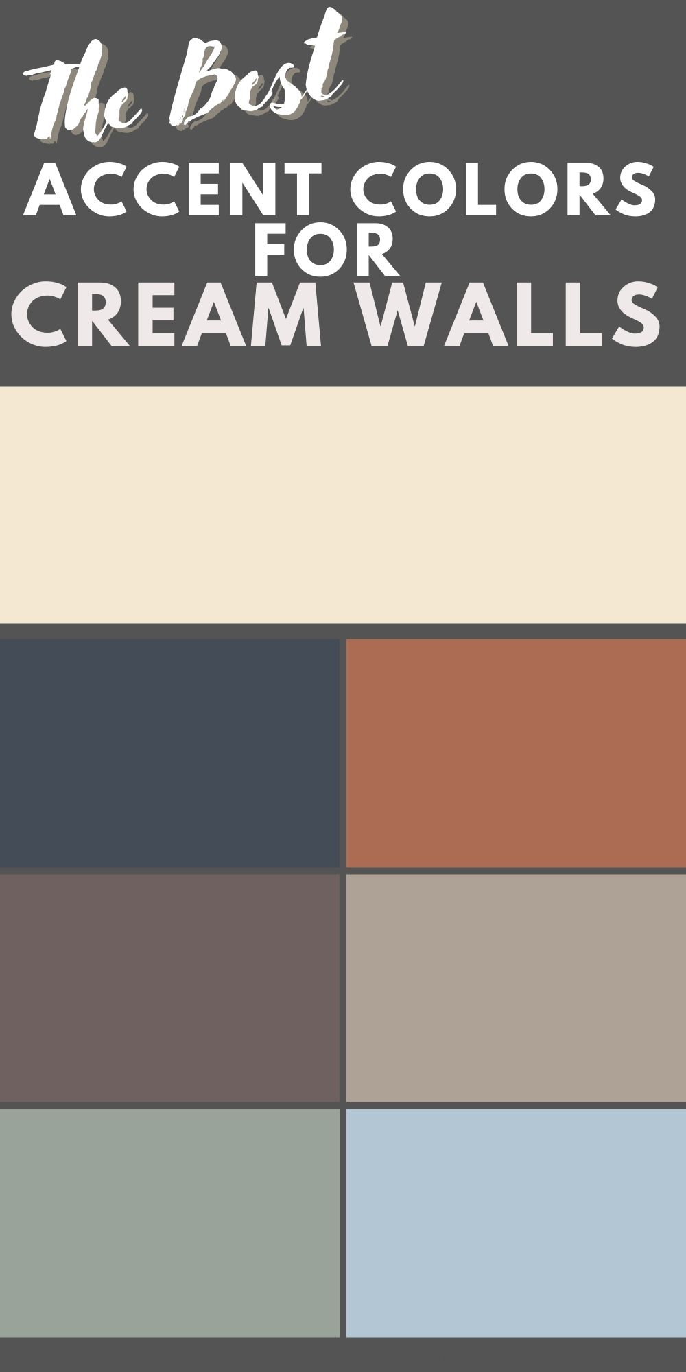
While cream is inherently subtle, it can also be a powerful anchor for more vibrant and impactful colour combinations, creating dynamic and memorable brand identities.
Complementary Pairings: Striking Contrast with a Soft Touch
Complementary colours are opposite each other on the colour wheel, offering the highest contrast. While a direct complementary pairing with cream might be too jarring, we can use softened or desaturated versions to achieve a sophisticated contrast. For instance, a muted, dusty blue or a deep, desaturated teal can create an elegant and intriguing juxtaposition with cream. This combination suggests a balance of calm (cream) and thoughtful depth (the cooler hue). Brands that want to appear both reliable and innovative, or those that blend traditional values with modern sensibilities, can find this pairing highly effective. Think of boutique hotels, curated travel agencies, or businesses that bridge heritage crafts with contemporary design.
Triadic Schemes: Balanced Vibrancy and Playfulness
A triadic colour scheme involves three colours evenly spaced on the colour wheel. When cream is part of a triadic scheme, it often acts as the neutral balancing element. For example, a combination of cream, a muted coral, and a soft sage green can create a palette that is both vibrant and harmonious. The cream softens the intensity of the other two colours, preventing them from becoming overwhelming. This type of palette can be excellent for brands that want to convey a sense of creativity, playfulness, and energetic positivity without appearing juvenile. This could be suitable for children’s brands that aim for a sophisticated feel, or for lifestyle brands promoting joy and self-expression.
Accent Colours with Cream: The Power of Strategic Highlights
One of the most popular and effective ways to use cream in branding is as a primary or secondary neutral, allowing other colours to serve as impactful accents.
Rich Jewel Tones: Luxurious and Bold Statements
Pairing cream with rich jewel tones like emerald green, sapphire blue, deep burgundy, or amethyst purple creates an immediate sense of luxury and opulence. The cream acts as a sophisticated backdrop, allowing these deep, saturated colours to truly shine without being overwhelming. This is a classic combination for high-end brands, particularly in fashion, fine jewelry, or premium spirits. It communicates exclusivity, quality, and a refined taste. The depth of the jewel tone adds personality and intrigue, while the cream ensures the overall aesthetic remains elegant and accessible.
Earthy Tones and Metallics: Natural Elegance and Glamour
Cream pairs beautifully with a range of earthy tones, such as terracotta, ochre, deep forest green, and warm browns. This combination evokes a sense of natural beauty, groundedness, and organic sophistication. It’s ideal for brands in the natural products, sustainable fashion, or artisanal homeware sectors. The warmth of the earth tones complements the cream, creating a welcoming and authentic feel. Furthermore, cream is an exceptional partner for metallic accents like gold, rose gold, or brushed brass. These metallic hues add a touch of glamour and sophistication, elevating the cream and creating a premium feel without being ostentatious. This is a strong choice for brands aiming for a balance of approachability and aspirational quality.
Implementing Cream-Centric Colour Palettes in Brand Applications
The theoretical understanding of colour pairings is only the first step; successful brand implementation requires strategic application across various touchpoints.
Digital Presence: Websites and Social Media
In the digital realm, cream can serve as the primary background colour, offering a clean and inviting user interface. This is particularly effective for websites that prioritize readability and a calming user experience. For social media, a cream-heavy palette can create a consistent and aesthetically pleasing feed. Accents of bolder colours can be used sparingly in graphics or imagery to draw attention to key messages or calls to action. For instance, a beauty brand might use cream as its website background, with rose gold accents for buttons and headings, and occasional imagery featuring vibrant floral elements.
Print Materials: Packaging and Marketing Collateral
On print materials, cream offers a tactile and luxurious feel. High-quality paper stocks with a slight texture can further enhance the premium perception. Cream packaging can make products stand out on shelves, appearing more sophisticated than brightly coloured alternatives. Marketing collateral, such as brochures, business cards, and flyers, can leverage cream as a dominant colour to convey professionalism and elegance. A coffee brand, for example, might use cream for its packaging, complemented by deep espresso brown for its logo and product names, creating an immediate association with rich, high-quality coffee.

Brand Identity and Logo Design: The Cornerstone of Visual Recognition
The inclusion of cream in a brand’s logo or primary colour palette can instantly communicate a specific set of values. A logo designed with cream and a complementary colour can be both memorable and visually appealing. For instance, a minimalist logo for a financial advisor might use a deep navy blue for the typography on a cream background, projecting trust and stability. The consistent use of cream across all brand touchpoints, from the logo to marketing materials, ensures a cohesive and easily recognizable brand identity, reinforcing the desired brand perception and fostering long-term customer loyalty.
aViewFromTheCave is a participant in the Amazon Services LLC Associates Program, an affiliate advertising program designed to provide a means for sites to earn advertising fees by advertising and linking to Amazon.com. Amazon, the Amazon logo, AmazonSupply, and the AmazonSupply logo are trademarks of Amazon.com, Inc. or its affiliates. As an Amazon Associate we earn affiliate commissions from qualifying purchases.