
Pink, a hue that spans from the delicate blush of a rose to the vibrant intensity of fuchsia, is far more than just a single shade. Its versatility in design is often underestimated, making it a powerful tool for brands aiming to evoke specific emotions and create memorable identities. While often associated with femininity, pink’s true strength lies in its ability to communicate a spectrum of messages when paired thoughtfully with other colours. This article delves into the strategic use of colour palettes, specifically focusing on how to best leverage pink within the realm of Brand Strategy, Personal Branding, Corporate Identity, Marketing, and Design. Understanding these colour pairings is crucial for any brand seeking to cultivate a distinct personality, resonate with its target audience, and ultimately, achieve its business objectives.
The Psychology of Pink in Branding
Before exploring specific colour pairings, it’s essential to understand the psychological impact of pink itself. Pink is not a monolithic colour; its various shades carry different connotations.
Understanding Pink’s Emotional Spectrum
- Soft Pinks (Blush, Rose): These lighter, more muted shades often evoke feelings of gentleness, romance, compassion, and serenity. They can create an atmosphere of calm and reassurance, making them ideal for brands focused on wellness, self-care, or products aimed at nurturing. Think of a spa brand or a line of baby products.
- Mid-tone Pinks (Salmon, Coral): These warmer, more vibrant pinks can communicate playfulness, enthusiasm, and creativity. They strike a balance between softness and energy, making them suitable for lifestyle brands, fashion, or businesses that want to appear approachable and energetic.
- Bright Pinks (Hot Pink, Magenta, Fuchsia): These bold and unapologetic shades are synonymous with confidence, boldness, excitement, and even rebellion. They are attention-grabbing and can be used by brands that want to make a strong statement, appeal to a younger demographic, or convey a sense of luxury and glamour. Fashion houses and beauty brands often utilize these shades to exude sophistication and trendiness.
The impact of pink is also influenced by cultural context. While in many Western cultures it leans towards femininity, in other parts of the world, it can be perceived as masculine or universally joyous. A brand’s global strategy must consider these nuances when incorporating pink into its visual identity.
Pink as a Brand Archetype
Pink can effectively represent various brand archetypes. For instance, a soft pink might align with the “Caregiver” archetype, emphasizing nurturing and empathy. A brighter pink could embody the “Jester” or “Hero” archetype, projecting vibrancy and daring. Understanding which archetype your brand embodies will guide your colour choices, including the judicious use of pink. The key is to ensure that the chosen pink and its accompanying palette consistently reinforce the desired brand personality.
Strategic Colour Pairings for Pink
The true power of pink in branding emerges when it’s combined with other colours. These pairings can amplify its inherent qualities, introduce new dimensions, or even temper its intensity.
Complementary and Analogous Palettes
- Pink and Blue: This is a classic and highly effective pairing.
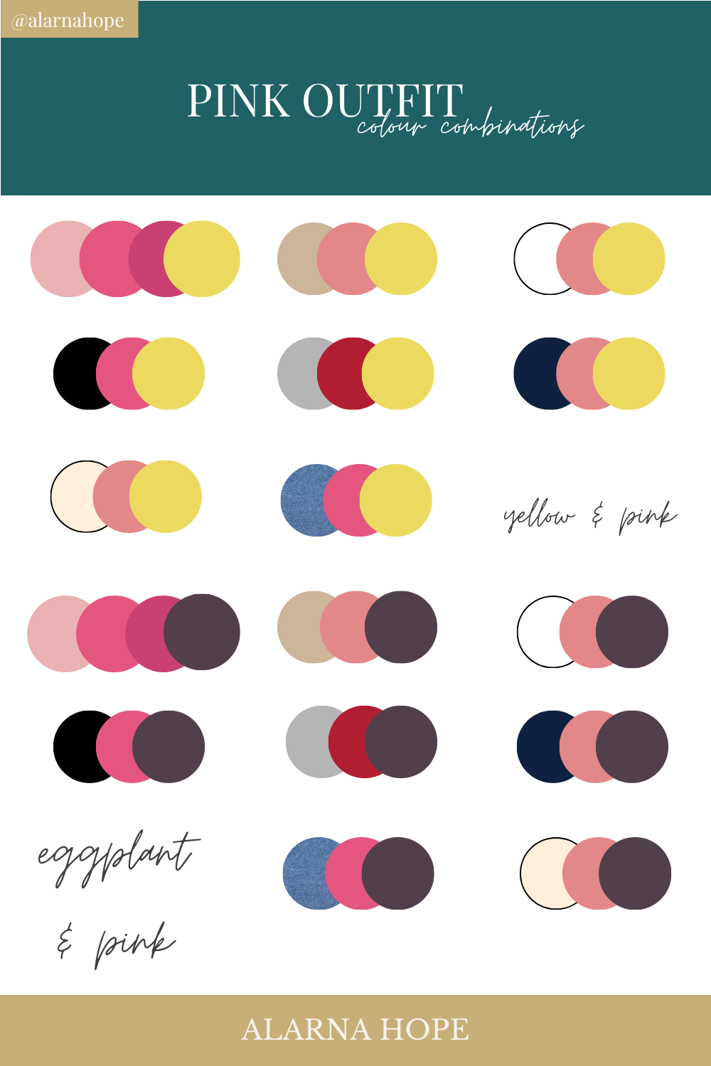
- Soft Pink and Navy Blue: Creates a sophisticated and elegant contrast. Navy grounds the softness of pink, adding a sense of stability and trust. This combination works well for brands in the professional services, finance, or luxury goods sectors that want to appear both approachable and reliable.
- Pastel Pink and Sky Blue: Evokes a sense of calm, serenity, and childlike innocence. Ideal for children’s brands, baby products, or anything related to peace and tranquility.
- Hot Pink and Royal Blue: A bold and energetic combination that conveys excitement and innovation. Suitable for tech companies, sports brands, or anything that aims to be dynamic and forward-thinking.
- Pink and Green: Another potent combination that offers a natural and refreshing feel.
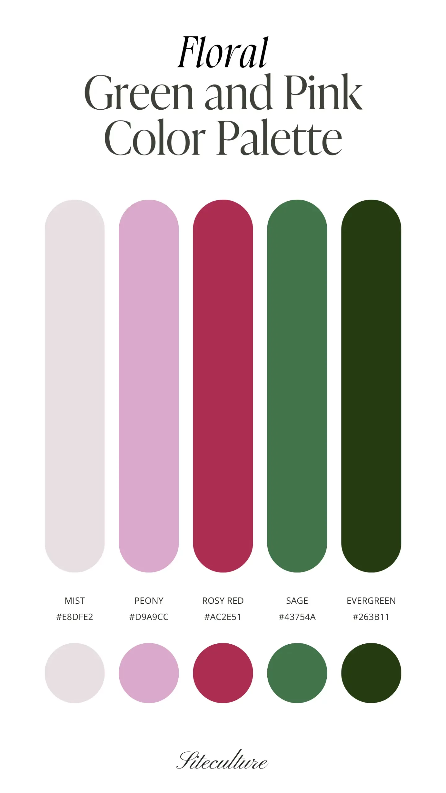
- Blush Pink and Forest Green: Suggests organic growth, health, and a connection to nature. Excellent for eco-friendly brands, wellness products, or anything related to natural beauty.
- Coral Pink and Mint Green: A playful and vibrant pairing that feels summery and optimistic. Works well for lifestyle brands, travel companies, or fashion that aims for a youthful appeal.
- Pink and Yellow: This combination radiates warmth, happiness, and optimism.
- Soft Pink and Pale Yellow: Creates a gentle, cheerful, and inviting atmosphere. Perfect for bakeries, florists, or brands that want to convey a sense of sweetness and joy.
- Fuchsia and Mustard Yellow: A bold and artistic pairing that communicates creativity and individuality. This can be effective for design studios, art-focused businesses, or brands targeting a more bohemian audience.
Harmonious and Contrasting Pairings
- Pink and Grey: A sophisticated and modern pairing that allows pink to stand out without being overwhelming.
- Light Pink and Charcoal Grey: Offers a chic and contemporary feel. The grey provides a neutral backdrop that highlights the pink, making it appear more refined. This is a strong choice for fashion boutiques, interior design firms, or technology brands that aim for a minimalist yet stylish aesthetic.
- Dusty Rose and Medium Grey: A subtler, more mature combination that conveys understated elegance and professionalism. Useful for brands in the beauty industry or those targeting a more mature demographic.
- Pink and White/Cream: This is the epitome of softness and purity.
- Any Shade of Pink with White: Creates a clean, airy, and classic look. White acts as a blank canvas, allowing the pink to shine. This is a versatile pairing for a wide range of industries, from wedding planning to skincare.
- Blush Pink and Cream: Offers a warm, gentle, and luxurious feel. It’s sophisticated without being stark, making it suitable for high-end cosmetic brands or artisanal food products.
- Pink and Black: A powerful and dramatic combination that exudes confidence and glamour.
- Hot Pink and Black: The ultimate statement of boldness and sophistication. Black adds a sense of mystery and luxury, while hot pink injects energy and excitement. This is a popular choice for high-fashion brands, evening wear, or edgy cosmetic lines.
- Pale Pink and Black: Offers a more nuanced and edgy feel, contrasting sweetness with a hint of rebellion. Can be effective for contemporary art galleries or brands with a modern, urban appeal.
Contextual Application of Pink Palettes

The effectiveness of any colour pairing is ultimately determined by the context of its application and the specific objectives of the brand.
Brand Identity and Logo Design
A brand’s logo is its primary visual identifier, and the colours chosen are paramount. When incorporating pink into a logo, consider:
- Memorability: A well-chosen pink palette can make a logo instantly recognizable and memorable. For instance, Barbie’s iconic hot pink is inseparable from its brand identity.
- Differentiation: In a crowded market, a unique and strategic use of pink can help a brand stand out from competitors. A tech startup opting for a soft pink paired with a metallic accent, for example, could disrupt industry norms.
- Target Audience Resonance: The chosen pink and its accompanying colours should appeal to the desired customer demographic. A children’s toy brand might use bright pinks, while a financial advisor might opt for a more muted pink with navy.
Marketing Materials and Digital Presence
Beyond the logo, pink can be effectively used across all marketing collateral, from website design to social media content and advertising campaigns.
- Website and App Design: Using pink strategically on buttons, calls-to-action, or background elements can guide user attention and enhance the user experience. A website for a dating app might use vibrant pinks to convey excitement and romance, while a productivity app might use softer pinks to suggest focus and calm.
- Social Media Campaigns: Pink can be a powerful tool for creating visually appealing and shareable content. Brands can leverage trending shades of pink or use them to consistently reinforce their brand’s mood and message. For example, a fashion retailer might consistently feature its products against soft pink backdrops on Instagram.
- Advertising: Pink can be used to create emotional connections in advertisements. A perfume ad might use a soft, romantic pink to evoke feelings of allure, while a campaign for a new energy drink might opt for a bold pink to convey dynamism.
Product Packaging and Merchandising
The physical presentation of a product is a crucial touchpoint with consumers. Pink in packaging can convey product attributes and brand values.
- Conveying Product Attributes: A pink hue can suggest a product’s flavour, scent, or intended use. For instance, strawberry-scented products are often packaged in shades of pink.
- Enhancing Shelf Appeal: In a retail environment, a well-designed pink package can grab attention and differentiate a product from its competitors.
- Creating a Desired Experience: The colour of packaging can set expectations for the product inside. A luxurious cosmetic product might be presented in a sleek black box with delicate rose gold accents, including hints of pink, to convey opulence.
Avoiding Pitfalls and Maximizing Impact
While pink offers immense potential, its application requires careful consideration to avoid common missteps.
Overuse and Misapplication
- The “Barbiecore” Trap: While a strong brand identity, simply replicating the ubiquitous hot pink without strategic purpose can lead to a lack of originality and appear dated. It’s crucial to consider the nuances of different pink shades and their specific meanings.
- Undermining Brand Credibility: In industries where seriousness and gravitas are expected, an overly enthusiastic or whimsical use of pink can undermine a brand’s credibility. For example, a law firm using bright fuchsia might struggle to be taken seriously.
- Monotony: Relying on pink as the sole or dominant colour without complementary or contrasting elements can lead to a visually uninteresting brand. The key is balance and strategic placement.
Ensuring Cohesion and Consistency
- Brand Style Guides: Developing and adhering to a comprehensive brand style guide is essential. This document should clearly define acceptable shades of pink, their intended applications, and the palettes they should be paired with.
- Consistency Across Platforms: The chosen pink palette must be applied consistently across all brand touchpoints, from digital interfaces to print materials and physical store designs. This reinforces brand recognition and builds trust.
- Evolution, Not Revolution: As brands evolve, their colour palettes may need to be refreshed. However, any changes to the core pink elements should be gradual and well-considered to avoid alienating existing customers.
In conclusion, the question of “what colours go best with pink” is not merely an aesthetic inquiry but a strategic branding imperative. By understanding the psychological nuances of pink, exploring strategic colour pairings, and applying these insights contextually across all brand touchpoints, businesses can leverage this versatile hue to create impactful identities, foster meaningful connections with their audiences, and ultimately, drive success in the competitive marketplace. The thoughtful integration of pink, supported by complementary colours, can transform a brand’s visual narrative, making it more memorable, resonant, and enduring.
aViewFromTheCave is a participant in the Amazon Services LLC Associates Program, an affiliate advertising program designed to provide a means for sites to earn advertising fees by advertising and linking to Amazon.com. Amazon, the Amazon logo, AmazonSupply, and the AmazonSupply logo are trademarks of Amazon.com, Inc. or its affiliates. As an Amazon Associate we earn affiliate commissions from qualifying purchases.