Grey, a color often perceived as neutral, unassuming, or even drab, is in fact one of the most versatile and powerful hues in the branding designer’s toolkit. Its inherent subtlety allows it to recede into the background, providing a sophisticated canvas upon which other colors can truly shine. However, when wielded strategically, grey itself can become a defining characteristic of a brand, conveying qualities of stability, reliability, professionalism, and timeless elegance. The question of “what color goes with grey” isn’t just about aesthetic pairings; it’s about understanding the psychological impact of color combinations and leveraging them to build a compelling and resonant brand identity.
This exploration delves into the strategic use of grey in branding, moving beyond simple color theory to analyze how specific pairings with other colors can evoke particular brand personalities and resonate with target audiences. We will examine the nuances of grey as a primary brand color, the impact of different grey shades, and the synergistic effects of combining grey with a spectrum of other colors, all through the lens of brand strategy and design.
The Power of Grey as a Foundational Brand Element
Grey is not a singular entity; it exists on a spectrum, from the lightest, almost-white silver to the deepest, near-black charcoal. Each shade carries a distinct emotional and psychological weight, influencing how a brand is perceived. Understanding this spectrum is the first step in effectively incorporating grey into a brand’s visual identity.
Understanding the Grey Spectrum
Light Greys (e.g., Silver, Platinum, Ash): These lighter tones exude sophistication, modernity, and a sense of spaciousness. They are often associated with technology, innovation, and a clean, minimalist aesthetic. Brands that utilize light grey can project an image of clarity, efficiency, and forward-thinking. Think of tech companies with sleek interfaces or high-end beauty brands aiming for an ethereal feel. Light greys can also be perceived as approachable and less intimidating than darker shades, making them suitable for brands seeking to foster trust and transparency.
Mid-Tones (e.g., Dove Grey, Slate, Stone): These greys offer a balanced and grounded feeling. They are classic, reliable, and convey a sense of stability and maturity. Mid-tone greys are incredibly versatile, serving as excellent neutral backdrops that don’t overpower other brand elements. They are often found in industries where trust and dependability are paramount, such as finance, legal services, and corporate entities. These shades can also lend a touch of understated luxury and refinement.
Dark Greys (e.g., Charcoal, Gunmetal, Onyx): Dark greys are potent and authoritative. They convey a sense of power, sophistication, and seriousness. These shades are ideal for brands that want to project strength, exclusivity, and a premium image. They can also be used to create a sense of depth and drama. In fashion, dark greys are often associated with timeless elegance and formal wear. In branding, they can communicate a brand’s established position and unwavering commitment to quality.
Grey’s Role in Evoking Core Brand Values
Beyond its inherent mood, grey’s neutrality makes it an exceptional tool for highlighting specific brand values.
- Reliability and Stability: Grey’s lack of strong emotional bias allows it to represent dependability. A financial institution or an insurance company can leverage grey to build trust and assure customers of their steadfastness.
- Sophistication and Elegance: When paired with premium materials or refined typography, grey can elevate a brand’s image, projecting an air of understated luxury and discerning taste. High-end retail or lifestyle brands often employ this strategy.
- Modernity and Innovation: In the tech sector, light to mid-tone greys are frequently used to convey a sense of clean, cutting-edge design and technological advancement.
- Professionalism and Seriousness: For industries requiring a formal and trustworthy presentation, such as consulting or legal services, grey provides a solid and professional foundation.
- Neutrality and Balance: Grey can act as a visual anchor, creating balance and preventing other colors from becoming overwhelming. This is crucial for brands that utilize a vibrant or complex color palette.
Strategic Color Pairings: Amplifying Grey’s Impact
The true magic of grey in branding lies in its ability to interact with other colors. The choice of a complementary or accent color can drastically alter the perception of grey and, by extension, the brand itself. These pairings are not arbitrary; they are carefully selected to evoke specific emotions, communicate desired attributes, and create a memorable visual identity.
Harmonious Pairings: Creating Subtlety and Sophistication
When grey is paired with colors that share a similar level of saturation or luminosity, a harmonious and sophisticated effect is achieved.
- Grey and White/Cream: This classic combination is the epitome of minimalism and clean design. It speaks of purity, clarity, and a spacious, uncluttered aesthetic. Brands that prioritize a modern, airy feel, or those aiming for a sense of calm and order, benefit greatly from this pairing. It’s a safe yet impactful choice for brands across various sectors, from healthcare to interior design.
- Grey and Black: This monochromatic scheme is inherently powerful and chic. It communicates strength, authority, and a timeless sense of style. The contrast between different shades of grey and black creates depth and a luxurious feel. This pairing is particularly effective for luxury brands, fashion houses, and businesses seeking to project an image of established gravitas.
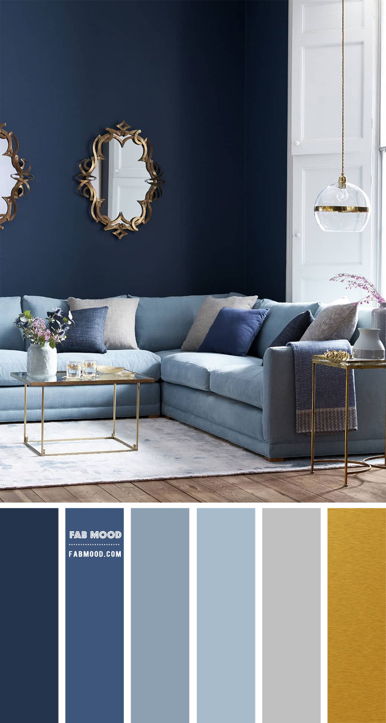
- Grey and Muted Blues/Greens: When combined with softer, desaturated versions of blues or greens, grey takes on a calming and trustworthy persona. This pairing evokes a sense of serenity, reliability, and understated professionalism. Think of brands in the wellness sector, eco-conscious businesses, or those that want to convey a sense of natural tranquility.
- Grey and Pastel Hues: Pairing grey with soft pastels like blush pink, baby blue, or pale lavender creates a gentle, approachable, and slightly whimsical feel. This combination is excellent for brands targeting a younger demographic or those seeking to convey a sense of nurture, creativity, or delicate charm.
Contrasting Pairings: Injecting Energy and Personality
The strategic use of contrasting colors against a grey backdrop can inject energy, highlight key brand messages, and create a more dynamic visual identity.
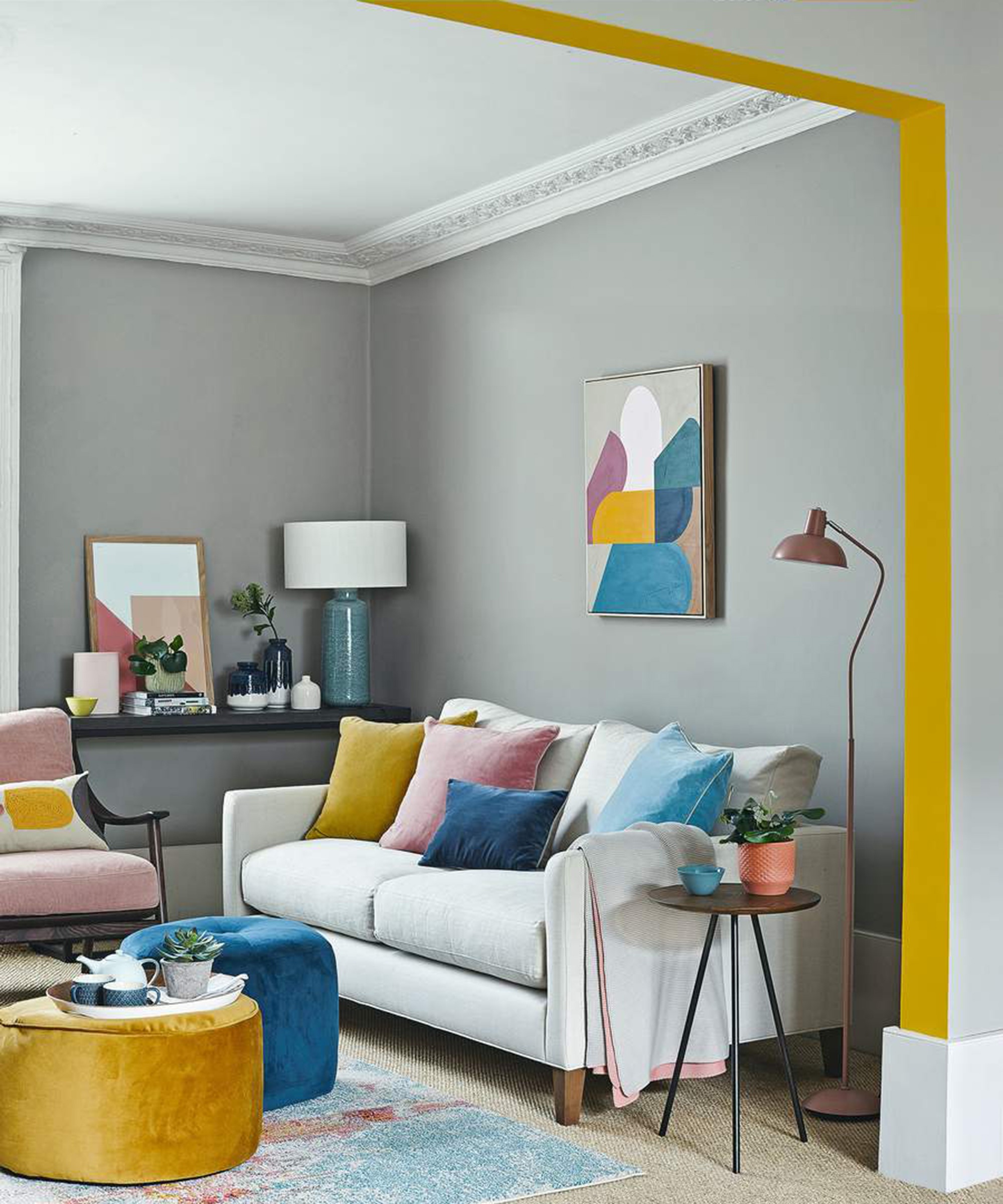
- Grey and Vibrant Yellow/Orange: The juxtaposition of cool grey with warm, energetic yellows or oranges creates a striking and attention-grabbing effect. This pairing conveys optimism, creativity, and innovation. It’s a dynamic combination for tech startups, creative agencies, or brands that want to project a sense of excitement and forward momentum. The yellow or orange acts as a beacon, drawing attention to key calls to action or brand elements.
- Grey and Bold Red/Crimson: Red is a powerful color associated with passion, energy, and urgency. When used as an accent against grey, it creates a sense of intensity and strong emotional appeal. This pairing can be effective for brands that want to convey a sense of leadership, boldness, or a call to action. It’s commonly seen in sports brands, automotive companies, or businesses aiming to make a strong statement.
- Grey and Bright Blue: While muted blues harmonize with grey, a brighter, more electric blue offers a contemporary and tech-forward feel. This combination suggests intelligence, innovation, and a sense of calm confidence. It’s a popular choice for technology companies, software providers, and brands focused on communication and connectivity.
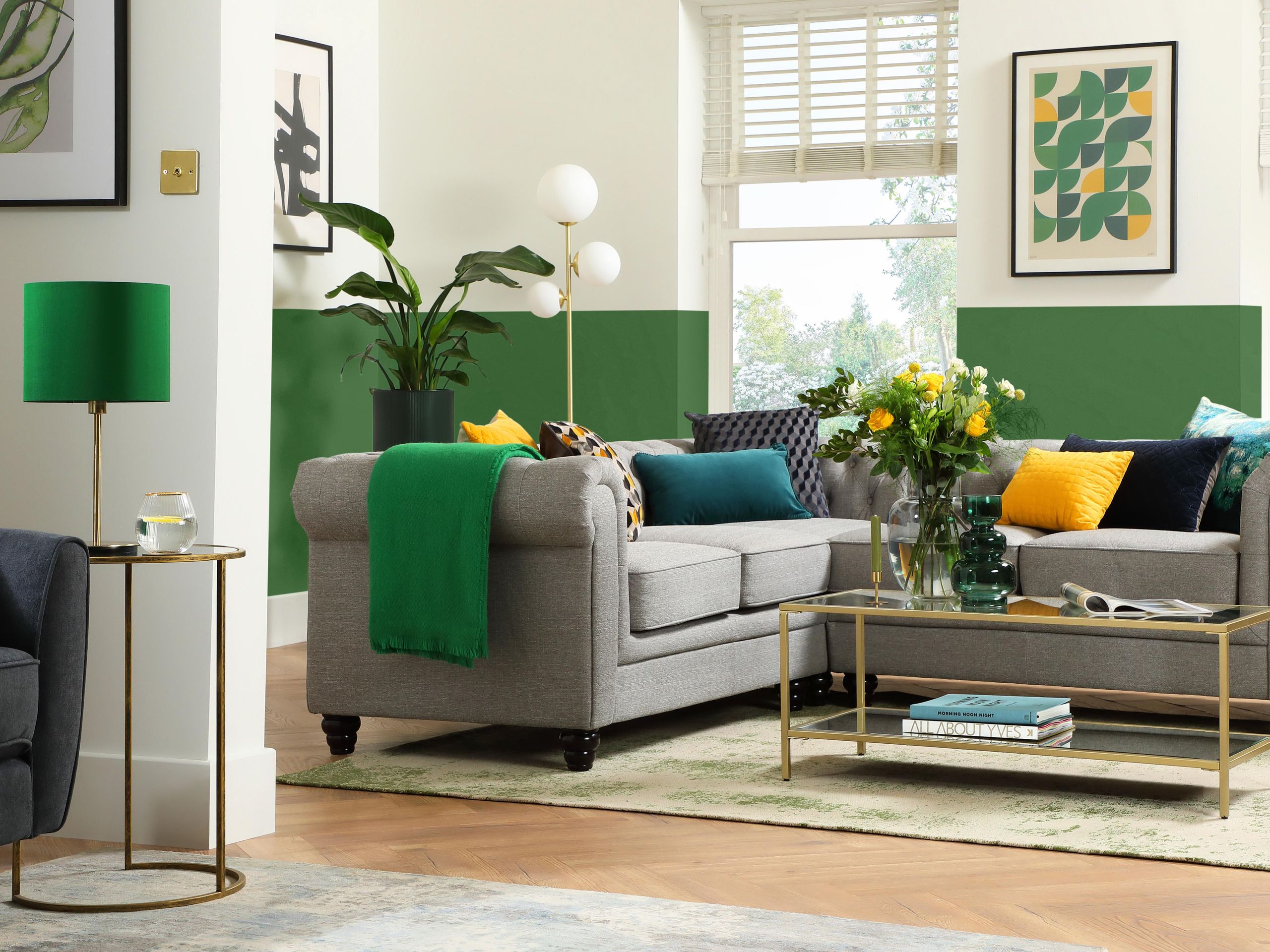
- Grey and Emerald Green/Teal: These richer, jewel-toned greens or teals, when paired with grey, evoke a sense of luxury, sophistication, and a connection to nature or prosperity. This combination can lend a premium feel to brands in fields like finance, high-end hospitality, or sustainable luxury goods.
Designing Brand Systems: Grey as a Unifying Element
In the creation of a comprehensive brand identity, grey often serves as the unifying thread that ties together disparate visual elements. Its flexibility allows it to adapt to various applications, from digital interfaces to print collateral, ensuring consistency and a cohesive brand experience.
Application Across Touchpoints
- Digital Design: In web design and app interfaces, grey is indispensable. It provides clear visual hierarchy, defines interactive elements, and offers a clean backdrop for content. Light greys can create a sense of space and reduce cognitive load, while darker greys can highlight important information or create a sense of depth. The strategic use of grey ensures legibility and user-friendliness, critical for technology-focused brands.
- Print Collateral: Brochures, business cards, and packaging benefit immensely from grey. It can be used for backgrounds, text, or as a dominant color on premium stationery. For example, a charcoal grey business card with minimalist typography and a silver foil accent communicates instant sophistication and professionalism.
- Logo Design: A logo featuring grey can be incredibly versatile. It can adapt to different backgrounds without losing its impact and can be easily translated across all brand materials. The chosen shade of grey in a logo is crucial in setting the initial tone for the brand.
- Photography and Illustration: Grey can be used as a dominant color in brand photography or illustration styles. For instance, a brand might opt for black and white photography with a specific grey filter applied to all images, creating a consistent and artistic feel. Alternatively, grey can be the foundational color in graphic illustrations, allowing other colors to pop as accents.
Ensuring Brand Consistency and Recognition
The deliberate selection of a specific grey shade and its accompanying color palette is fundamental to building strong brand recognition. When applied consistently across all touchpoints, this color scheme becomes intrinsically linked to the brand’s identity, enabling instant recognition and reinforcing its core message.
- Establishing a Visual Hierarchy: Grey is excellent for creating a clear visual hierarchy within any design. By using different shades and tones of grey, designers can guide the viewer’s eye to the most important information, making complex content more digestible and user-friendly.
- Creating Mood and Atmosphere: The chosen grey palette contributes significantly to the overall mood and atmosphere of the brand. A light, airy grey will evoke a different feeling than a deep, authoritative charcoal. This atmospheric control is vital in shaping customer perception and emotional connection.
- Adapting to Market Trends: While grey is timeless, its application can be updated to reflect current design trends. For example, the rise of minimalist aesthetics has further cemented grey’s position as a go-to neutral. Brands that are mindful of these trends can ensure their grey-based identity remains contemporary and relevant.
In conclusion, the question “what color goes with grey” opens the door to a strategic design dialogue that is fundamental to building a successful brand. Grey is far from a passive color; it is an active participant in brand communication, capable of conveying a wide range of emotions and attributes. By understanding the nuances of the grey spectrum and thoughtfully pairing it with complementary colors, brands can craft identities that are not only visually appealing but also deeply resonant and strategically aligned with their core values and target audience. The enduring power of grey lies in its ability to be both a sophisticated foundation and a dynamic canvas, making it an invaluable asset in the arsenal of any brand strategist and designer.
aViewFromTheCave is a participant in the Amazon Services LLC Associates Program, an affiliate advertising program designed to provide a means for sites to earn advertising fees by advertising and linking to Amazon.com. Amazon, the Amazon logo, AmazonSupply, and the AmazonSupply logo are trademarks of Amazon.com, Inc. or its affiliates. As an Amazon Associate we earn affiliate commissions from qualifying purchases.