
In the dynamic world of technology, where data reigns supreme and complex algorithms drive innovation, the ability to visualize and interpret relationships is paramount. At the heart of this capability lies a fundamental mathematical concept: the graph of a function. Far from being a mere academic exercise, understanding what a function’s graph represents is a cornerstone for anyone engaged in software development, data science, artificial intelligence, or building intuitive digital tools. It’s the visual bridge that connects abstract mathematical rules with tangible, understandable patterns, enabling engineers, developers, and analysts to comprehend system behavior, identify trends, and make informed decisions.

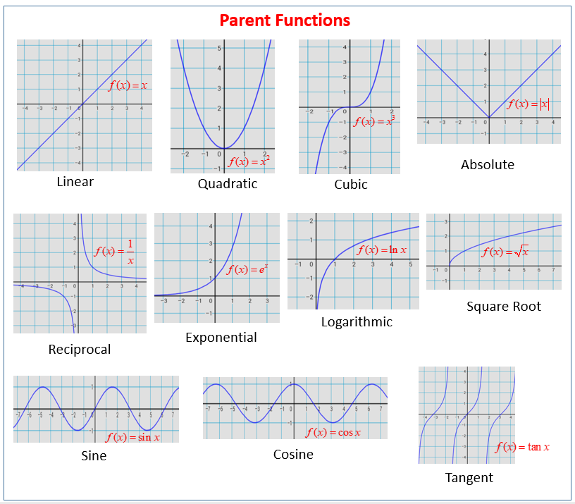
A function, in its essence, is a rule that assigns each input value to exactly one output value. It describes how one quantity depends on another. While the algebraic notation of a function, such as f(x) = x² or y = log(x), precisely defines this relationship, it is through its graphical representation that we gain a profound intuitive understanding. The graph transforms an abstract formula into a picture, making patterns, rates of change, and critical points immediately visible. For instance, observing the upward sweep of an exponential growth graph instantly conveys acceleration, while the oscillatory pattern of a sine wave visually communicates periodicity. In an era increasingly reliant on computational power to process vast amounts of information, the graph of a function is not just a tool for mathematicians; it is a universal language for technologists to speak with data, algorithms, and users alike.
The Core Concept: Bridging Abstract Math and Visual Understanding
The journey from an abstract function to its concrete visual representation on a graph is a foundational step in analytical thinking, indispensable across all facets of technology. It involves translating a rule into a geometric shape, making its properties accessible to the human eye.
Functions as Mappers
At its most basic, a function is a mapping. It takes an element from a set, known as the domain (the set of all possible input values), and associates it with exactly one element from another set, known as the codomain or range (the set of all possible output values). For example, if a function describes the relationship between the time an object has been falling (input) and its velocity (output), for every specific moment in time, there is one unique velocity. This deterministic nature is key; a single input can never yield multiple outputs, though different inputs can certainly lead to the same output. In programming, functions mirror this concept directly, taking arguments and returning a single result, making the mathematical definition highly relevant to computational logic. Understanding functions as mappers is the first step in appreciating how their graphs visually encode these input-output pairs.
The Cartesian Plane and Ordered Pairs
The standard canvas for graphing functions is the Cartesian coordinate system, a two-dimensional plane defined by two perpendicular axes: the horizontal x-axis and the vertical y-axis. Every point on this plane can be uniquely identified by an ordered pair of numbers, (x, y), where ‘x’ represents its position along the horizontal axis and ‘y’ its position along the vertical axis. When graphing a function y = f(x), each input value ‘x’ from the function’s domain is plotted along the x-axis, and its corresponding output value ‘y’ (which is f(x)) is plotted along the y-axis. The collection of all such ordered pairs (x, f(x)) forms the graph of the function. For discrete functions, these might appear as individual dots; for continuous functions, they merge into a continuous line or curve, creating a visual fingerprint of the function’s behavior across its domain. This system provides a standardized, universally understood framework for visualizing mathematical relationships.
From Data Points to Continuous Curves
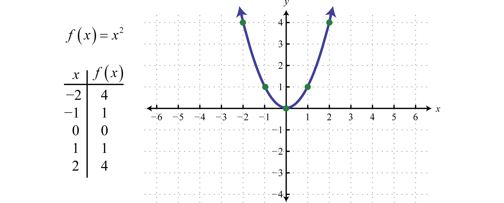
The process of graphing often begins with plotting a series of discrete (x, y) points derived from the function. For instance, to graph y = x², one might plot (-2, 4), (-1, 1), (0, 0), (1, 1), (2, 4), and so on. If the function is continuous, meaning there are no abrupt jumps or breaks in its output for small changes in input, these individual points are then connected to form a smooth curve. This curve represents the entire set of infinite (x, y) pairs that satisfy the function’s rule. The transition from scattered data points to a cohesive curve is where the magic of visualization truly happens. It allows us to observe trends, locate maximums and minimums, identify roots (where the graph crosses the x-axis), and understand the overall shape and behavior of the function at a glance. In digital contexts, this process is automated by plotting libraries and software, which compute thousands or millions of points and render them seamlessly, transforming raw mathematical expressions into insightful visual narratives.
Why Graphs Matter in Technology: A Universal Language
In the tech landscape, where complexity can quickly overwhelm, the graph of a function acts as a powerful simplification tool. It translates intricate data relationships and algorithmic behaviors into an accessible visual format, serving as a universal language for understanding and communication.
Data Visualization and Interpretation
The sheer volume of data generated in every sector of technology demands efficient methods of interpretation. Graphs of functions are fundamental to data visualization, transforming raw numbers into comprehensible patterns. Whether tracking server load over time, illustrating user engagement metrics, showing the distribution of customer demographics, or comparing the performance of different software versions, functional graphs provide immediate insights. A simple line graph can reveal trends and anomalies in network traffic, while a scatter plot can highlight correlations between variables in a dataset. Modern dashboards and analytics platforms rely heavily on these graphical representations, enabling quick decision-making for product managers, marketing teams, and engineers without requiring them to delve into the underlying raw data. This visual summary is critical for identifying issues, spotting opportunities, and communicating findings effectively to diverse audiences.
Algorithm Design and Analysis
For software engineers and computer scientists, understanding the graph of a function is crucial for designing and analyzing algorithms. The performance of an algorithm is often expressed as a function of its input size, represented by O(n) notation (Big O notation). Plotting these complexity functions—such as O(n) (linear), O(n log n) (log-linear), O(n²) (quadratic), or O(2^n) (exponential)—provides a clear visual understanding of how an algorithm’s execution time or space requirements scale with increasing data. This allows developers to choose the most efficient algorithms for specific tasks, especially when dealing with large datasets. Beyond theoretical analysis, graphs are also used to visualize the internal workings of algorithms, such as the path taken by a search algorithm or the convergence of an iterative optimization process, aiding in debugging and performance tuning.
Predictive Modeling and Machine Learning
The fields of predictive modeling and machine learning are profoundly dependent on the graphical representation of functions. In machine learning, models are essentially complex functions that map input features to output predictions. Graphs are indispensable for:
- Visualizing Loss Functions: Understanding how a model’s error changes during training, often plotted as a function of iterations or epochs. A decreasing loss function graph indicates effective learning.
- Representing Decision Boundaries: For classification tasks, graphs illustrate how a model separates different classes in a feature space.
- Evaluating Model Performance: Metrics like Receiver Operating Characteristic (ROC) curves, precision-recall curves, and calibration plots are all functional graphs that provide comprehensive insights into a model’s accuracy, sensitivity, and specificity.
- Interpreting Feature Importance: Graphs can show the impact of different input features on a model’s output, aiding in feature engineering and model interpretability.
The ability to visually inspect these functions and their characteristics is vital for developing, training, and deploying robust AI systems.
User Interface and Experience (UI/UX)
The impact of functional graphs extends directly into the user experience of countless applications and digital tools. From financial apps displaying stock performance over time to fitness trackers showing heart rate trends, interactive graphs make complex information digestible and engaging for end-users. Weather apps use graphs to predict temperature fluctuations, productivity tools visualize progress towards goals, and gaming platforms track player statistics. Good UI/UX design leverages the power of functional graphs to present data intuitively, allowing users to quickly grasp information, identify patterns, and make informed decisions within the application. The clarity and interactivity of these visual elements are crucial for user satisfaction and the overall effectiveness of a digital product.
Tools and Techniques for Graphing Functions in the Digital Age
The digital revolution has transformed the way we create and interact with graphs of functions. Modern tools, ranging from sophisticated programming libraries to dedicated software, have made high-quality, interactive visualization accessible to everyone from data scientists to casual users.
Programming Libraries (Python, JavaScript, R)
The backbone of modern data visualization in tech lies in powerful programming libraries.
- Python: Libraries like Matplotlib and Seaborn are workhorses for static and statistical plotting, respectively. Plotly and Bokeh extend this to interactive, web-based visualizations, crucial for dynamic dashboards and web applications. These libraries allow developers to programmatically define functions, generate data, and render highly customized graphs with fine-grained control, making them indispensable for data scientists and machine learning engineers.
- JavaScript: For web-based interactive graphs, D3.js (Data-Driven Documents) is a gold standard, offering unparalleled flexibility to create custom visualizations directly in browsers. Libraries like Chart.js and Plotly.js provide easier-to-use abstractions for common chart types, enabling front-end developers to embed dynamic functional graphs into web pages with relative ease.
- R: Widely used in statistical computing, R boasts ggplot2, a renowned library based on the “grammar of graphics.” It provides a systematic way to build complex plots layer by layer, making it highly effective for exploring and presenting statistical relationships and functional forms.
These libraries empower developers to not only plot functions but also to integrate these visualizations into larger software systems, AI tools, and data analysis pipelines.
Specialized Software and Platforms
Beyond general-purpose programming libraries, numerous specialized software packages and platforms are designed specifically for mathematical computation and graphing.
- MATLAB: A proprietary numerical computing environment, MATLAB offers extensive capabilities for plotting mathematical functions, visualizing complex data, and simulating dynamic systems. Its intuitive syntax and powerful built-in functions make it a favorite in engineering and scientific research for quickly generating high-fidelity functional graphs.
- Wolfram Alpha / Mathematica: These tools from Wolfram Research are celebrated for their symbolic computation and advanced visualization features. Wolfram Alpha, as a computational knowledge engine, can instantly graph a wide array of functions entered in natural language, making it an excellent resource for quick exploration. Mathematica, its professional counterpart, offers unparalleled power for symbolic manipulation, numerical computation, and sophisticated 2D and 3D functional graphing.
- Desmos and GeoGebra: These are free, web-based graphing calculators that provide highly interactive environments for students and educators to explore functions. Their intuitive interfaces allow users to input functions, manipulate parameters, and see the graphs update in real-time, fostering a deeper understanding of mathematical relationships.
These platforms cater to different user needs, from academic exploration to professional scientific and engineering applications, simplifying the process of visualizing complex functions.
Interactive Visualization and Real-time Data
A significant advancement in digital graphing is the move towards interactivity and real-time data streaming. Static images of graphs, while informative, limit exploration. Modern tools enable users to zoom, pan, hover over points for details, and dynamically change function parameters to observe immediate effects on the graph. This interactivity is crucial for exploratory data analysis, where users need to slice and dice data, test hypotheses, and uncover hidden patterns. Furthermore, with the proliferation of IoT devices, sensors, and live data feeds, the ability to graph functions in real-time is becoming essential. Dashboards in network operations centers, financial trading platforms, and industrial control systems constantly update graphs to reflect current conditions, allowing operators to monitor system health and react promptly to changes. This dynamic visualization pushes the boundaries of how functional graphs contribute to operational intelligence and responsiveness in tech.
Beyond Basic Lines: Exploring Advanced Functional Graphs
While the foundational understanding of y=f(x) on a 2D Cartesian plane is crucial, the scope of functional graphing in technology extends far beyond simple lines and parabolas. Modern applications often demand the visualization of more complex mathematical relationships, pushing the boundaries into higher dimensions and alternative coordinate systems.
Multi-variable Functions and 3D Visualizations
Many real-world phenomena and technological models involve functions with more than one input variable. For instance, the temperature across a surface might be a function of two spatial coordinates, T = f(x, y). Such multi-variable functions require three-dimensional graphs for their representation. Here, the inputs (x, y) are plotted on a horizontal plane, and the output (T or z) is represented by the height above or below that plane, creating a surface. In tech, 3D visualizations are indispensable for:
- Scientific Simulation: Visualizing stress distributions in materials, fluid dynamics, or electromagnetic fields.
- Computer Graphics: Rendering terrains, complex objects, and lighting effects where surface geometry is defined by functions.
- Machine Learning: Representing high-dimensional feature spaces, loss surfaces for complex models, or the decision boundaries in more intricate classification problems.
Tools like Plotly, Matplotlib (withmplot3d), MATLAB, and specialized CAD/CAE software are adept at generating these sophisticated 3D plots, providing critical insight into complex spatial relationships and system behaviors that cannot be captured in two dimensions.
Statistical Distributions and Probability Density Functions
In data science, machine learning, and statistical analysis, understanding the distribution of data is paramount. Functions play a critical role here, particularly probability density functions (PDFs) and probability mass functions (PMFs).
- A PDF describes the likelihood of a continuous random variable taking on a given value. Its graph is a continuous curve (like the familiar bell curve of the normal distribution), where the area under the curve between two points represents the probability of the variable falling within that range.
- A PMF does the same for discrete random variables, depicted as a bar graph where the height of each bar represents the probability of a specific outcome.
These functional graphs are essential for: - Data Analysis: Characterizing datasets, identifying outliers, and understanding underlying patterns.
- Hypothesis Testing: Visualizing confidence intervals and p-values.
- Machine Learning: Understanding the output of generative models, visualizing uncertainty in predictions, and assessing the fit of statistical models to data.
Libraries like Seaborn in Python excel at visualizing these statistical functions, providing invaluable insights into the characteristics and behavior of data crucial for robust analysis and model building.
Parametric and Polar Graphs
Beyond the standard Cartesian y = f(x) format, functions can also be graphed using alternative coordinate systems or through parametric representations, offering new ways to describe and visualize complex shapes and movements.
- Parametric Graphs: Instead of y being directly a function of x, both x and y (and potentially z for 3D) are expressed as functions of a third, independent parameter, often denoted as t (e.g., x = f(t), y = g(t)). This is incredibly powerful for representing paths, trajectories, and animations, where time is a natural parameter. For instance, the path of a projectile or the motion of a robot arm can be elegantly described and visualized using parametric equations.
- Polar Graphs: These graphs use polar coordinates (r, θ) instead of Cartesian (x, y), where r is the distance from the origin and θ is the angle from the positive x-axis. Functions are expressed as r = f(θ). Polar graphs are particularly adept at representing shapes with radial symmetry, such as spirals, circles, and certain floral patterns. They are useful in fields like signal processing, antenna design, and physics, where phenomena often exhibit angular dependence.
The ability to graph functions in these alternative formats expands the technologist’s toolkit, allowing for the visual representation of a wider array of scientific, engineering, and artistic concepts within digital applications.
Conclusion
The graph of a function is far more than a simple mathematical drawing; it is a fundamental visual language that underpins much of modern technology. From the foundational concept of mapping inputs to outputs on a Cartesian plane to advanced multi-dimensional and alternative coordinate system visualizations, functional graphs provide indispensable insights into data, algorithms, and system behavior. They transform abstract mathematical relationships into intuitive visual patterns, enabling technologists to design more efficient algorithms, build more accurate predictive models, create more engaging user experiences, and interpret vast datasets with clarity.
In an increasingly data-driven and computationally intensive world, the ability to effectively generate, interpret, and leverage functional graphs remains a critical skill. As technology continues to evolve, pushing the boundaries of artificial intelligence, real-time data processing, and immersive visualizations, the power and versatility of the graph of a function will only grow, solidifying its position as an enduring cornerstone of innovation and understanding in the digital age.
aViewFromTheCave is a participant in the Amazon Services LLC Associates Program, an affiliate advertising program designed to provide a means for sites to earn advertising fees by advertising and linking to Amazon.com. Amazon, the Amazon logo, AmazonSupply, and the AmazonSupply logo are trademarks of Amazon.com, Inc. or its affiliates. As an Amazon Associate we earn affiliate commissions from qualifying purchases.