
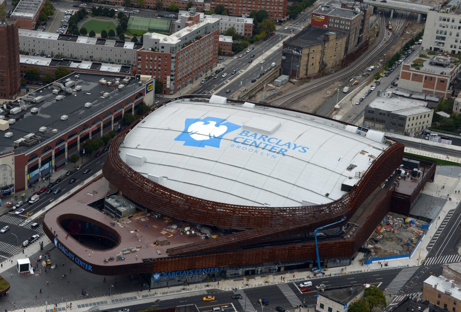
When the NBA’s Nets franchise announced their move from Newark, New Jersey, to the intersection of Atlantic and Flatbush Avenues in 2012, it was more than a change of zip code. It was a calculated, multi-billion-dollar exercise in brand transformation. Where the Nets play in Brooklyn—the Barclays Center—is not merely a sports venue; it is the physical manifestation of a brand strategy that successfully repositioned a struggling franchise into a global lifestyle icon.
By choosing to anchor themselves in the heart of Brooklyn, the Nets didn’t just find a new court; they adopted a cultural identity. This move serves as a definitive case study in how location, visual storytelling, and strategic partnerships can redefine a corporate entity.
From New Jersey to Brooklyn: A Masterclass in Rebranding through Place
The transition of the Nets is often cited in marketing circles as one of the most successful rebrandings in professional sports history. To understand why “where they play” matters so much, one must look at the brand equity—or lack thereof—that preceded the move.
Shedding the Suburban Image
In New Jersey, the Nets suffered from what brand strategists call “identity dilution.” Playing in the shadow of the New York Knicks and sharing a market with more storied franchises, the Nets lacked a distinct personality. Their branding was traditional, utilizing a red, white, and blue color scheme that felt generic and failed to resonate with a specific demographic. By moving to Brooklyn, the brand performed a “clean slate” maneuver. They moved away from a suburban, secondary-market feel toward an urban, primary-market powerhouse.
The Jay-Z Factor: Anchoring the Brand in Cultural Capital
The involvement of Shawn “Jay-Z” Carter as a minority owner during the move was a masterstroke of brand alignment. Jay-Z didn’t just bring capital; he brought “Brooklyn Cool.” He served as the bridge between the franchise and the borough’s gritty, sophisticated, and creative reputation. His influence ensured that the brand wasn’t just seen as a basketball team, but as a lifestyle brand. This alignment allowed the Nets to skip years of community trust-building by leveraging the existing brand equity of a local legend.
Visual Identity and the “Brooklyn Cool” Aesthetic
A brand is only as strong as its visual communication. When the Nets arrived in Brooklyn, they discarded the vibrant colors of their past for a stark, minimalist aesthetic that shocked the NBA landscape at the time.
Minimalism as a Disruptor in Sports Design
The decision to use a black-and-white color palette was a deliberate branding choice designed to stand out by doing less. In an era where sports logos were becoming increasingly complex and neon-heavy, the Nets went the other way. This minimalism signaled a “no-nonsense” Brooklyn attitude. It was sophisticated, timeless, and, most importantly, wearable. The brand strategy shifted focus from the jersey as a uniform to the jersey as “streetwear.” This expanded the brand’s reach far beyond basketball fans and into the fashion and lifestyle sectors.
The Black-and-White Palette: Timelessness over Trend
By selecting black and white, the Nets tapped into the visual language of the borough’s history—specifically the signage of the Brooklyn Dodgers and the classic grit of New York City streets. From a brand strategy perspective, this palette is incredibly versatile. It allows for high-contrast marketing materials that look premium in both digital and physical formats. The “Brooklyn” wordmark, written in a bold, blocky typeface, became an instant icon, effectively turning the borough’s name into a proprietary brand asset for the team.
The Barclays Center: More Than an Arena, a Brand Landmark
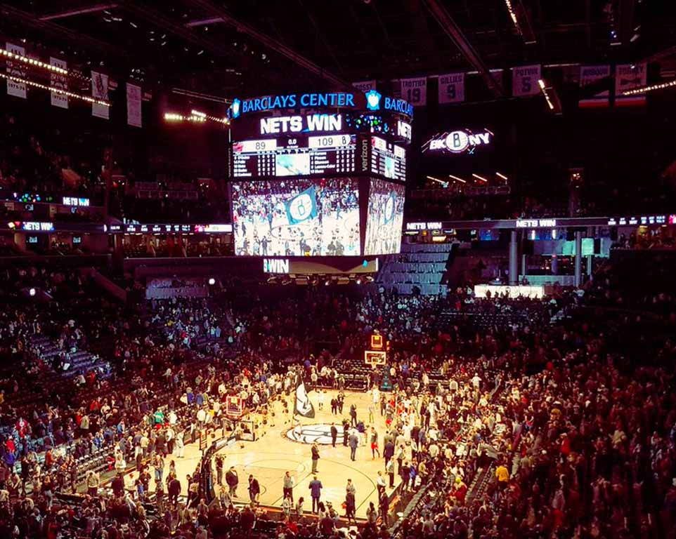
Where the Nets play is just as important as how they play. The Barclays Center is the cornerstone of the Nets’ brand identity, serving as a 24/7 billboard for the franchise’s values of innovation and urban sophistication.
Architecture as Brand Statement
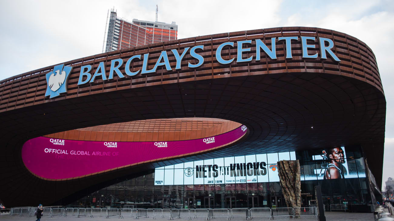
The weathered steel exterior of the Barclays Center, designed to evoke the brownstones and industrial history of Brooklyn, is a physical extension of the brand. Unlike the glass-and-steel monoliths of many modern arenas, the Barclays Center looks “organic” to its environment. This architectural choice reinforces the brand’s message of authenticity. For a brand, your physical headquarters or flagship location is your most potent touchpoint, and the Nets used the Barclays Center to prove they were “of the neighborhood” rather than just “in the neighborhood.”
Creating a “Lifestyle Destination” in Prospect Heights
The brand strategy extended beyond the court and into the concourses. The Nets curated a “Taste of Brooklyn” culinary program, bringing in local vendors instead of generic stadium food. This created a brand ecosystem where the team, the arena, and the local economy were inextricably linked. When fans ask where the Nets play, they aren’t just looking for a map; they are looking for an experience that encapsulates the best of the borough. This experiential branding turned a game of basketball into a premium social event, attracting a demographic of “affluent creatives” that brands find highly desirable.
Community Integration: Localized Marketing as a Growth Engine
A major challenge in brand strategy is maintaining a “premium” feel while remaining accessible to the local community. The Nets’ move to Brooklyn required a delicate balance between global aspirations and local loyalty.
Tapping into “Brooklyn Pride”
The Nets’ marketing campaigns, such as “Hello Brooklyn” and “Brooklyn Ready,” focused heavily on the borough’s collective identity. They didn’t try to bring New Jersey to Brooklyn; they tried to become the vehicle through which Brooklynites expressed their pride. This is a classic “In-Group” marketing strategy. By positioning the team as the underdog representative of a proud borough, the brand built an emotional moat that protected it even during seasons where the team’s on-court performance was lacking.
Global Reach through Hyper-Local Storytelling
Ironically, by being hyper-focused on their specific location in Brooklyn, the Nets became a global brand. In the world of international marketing, “Brooklyn” is a world-class brand name associated with artisanal quality, diversity, and trendsetting. By tethering their identity so closely to the geography of their arena, the Nets were able to sell merchandise in London, Tokyo, and Paris. People who had never stepped foot in the Barclays Center bought the gear because the “Brooklyn Nets” brand represented a specific set of cultural values that transcended sports.
Conclusion: The Power of Place in Brand Strategy
The story of where the Nets play in Brooklyn is a narrative of intentional brand evolution. By moving to the Barclays Center, the franchise didn’t just change venues; they changed their DNA. They transformed from a generic sports entity into a cultural powerhouse by leveraging the unique heritage and “cool factor” of their new home.
The lessons for brand managers and corporate strategists are clear:
- Context is King: The environment in which your brand operates dictates how it is perceived.
- Visual Consistency Matters: A bold, simplified visual identity can disrupt a crowded market.
- Cultural Alignment is Key: Partnering with figures and symbols that already possess high cultural capital can accelerate brand growth exponentially.
Ultimately, the Brooklyn Nets are a testament to the idea that a brand is not just what you sell, but where you stand and who you stand with. As they continue to play at the intersection of Atlantic and Flatbush, they remain a premier example of how location-based branding can redefine the ceiling of a franchise’s potential.
aViewFromTheCave is a participant in the Amazon Services LLC Associates Program, an affiliate advertising program designed to provide a means for sites to earn advertising fees by advertising and linking to Amazon.com. Amazon, the Amazon logo, AmazonSupply, and the AmazonSupply logo are trademarks of Amazon.com, Inc. or its affiliates. As an Amazon Associate we earn affiliate commissions from qualifying purchases.