
In the competitive landscape of modern marketing, color is far more than an aesthetic choice; it is a silent ambassador for a brand’s values, promises, and positioning. Among the vast spectrum of available hues, “Sapphire” stands out as a color of profound psychological depth and historical prestige. When a brand asks, “What is sapphire color?” they are rarely looking for a simple hex code. Instead, they are inquiring about a visual strategy that balances the reliability of traditional blue with the opulence of a rare gemstone.
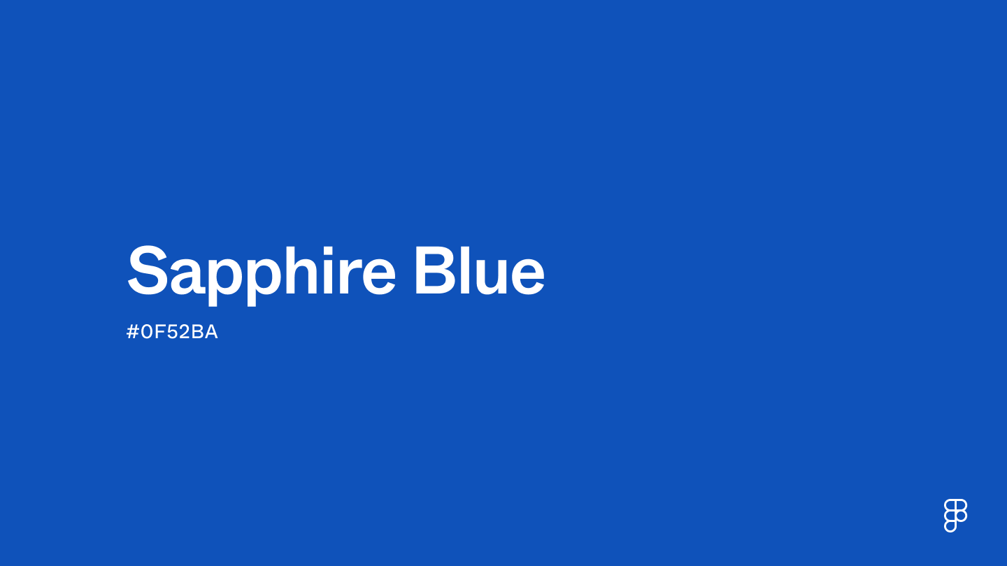
Sapphire color is a deep, saturated shade of blue that evokes feelings of wisdom, royalty, and stability. In brand strategy, utilizing sapphire is a calculated move to establish authority while maintaining an air of sophisticated exclusivity. This article explores the multifaceted role of sapphire color in corporate identity, design, and strategic market positioning.
Defining Sapphire: The Technical and Aesthetic Foundation
To utilize sapphire effectively within a brand’s visual identity, one must first understand its technical composition and how it differs from other shades of blue, such as navy, cobalt, or cyan. Sapphire is characterized by its rich, velvety undertones and high saturation, sitting at a unique intersection of vibrancy and darkness.
The Digital DNA of Sapphire
In the digital space, sapphire is often represented by the Hex code #0F52BA. This specific coordinate in the RGB (Red, Green, Blue) model consists of approximately 5.9% red, 32.2% green, and 72.9% blue. This heavy leaning toward the blue spectrum with a touch of green creates a “true” sapphire—a color that feels “cool” but intense. For brand designers, understanding these ratios is crucial for maintaining consistency across various touchpoints, from high-resolution mobile app interfaces to physical packaging and corporate stationery.
Beyond the Primary Palette
Unlike standard primary blue, which can sometimes feel clinical or overly corporate, sapphire possesses a “gemstone” quality. This means it reflects a sense of multi-dimensionality. In design, this is often achieved through the use of gradients or metallic finishes that mimic the way light interacts with a natural sapphire stone. For a brand, this aesthetic choice signals that the company is not just a utility provider, but a premium entity that values craftsmanship and detail.
The Psychology of Sapphire: Why Brands Invest in Deep Blue
Color psychology is the backbone of effective brand strategy. Every hue triggers a subconscious reaction in the consumer, and sapphire is particularly potent because it bridges the gap between two highly desirable brand traits: trust and luxury.
Establishing Authority and Competence
Blue is globally recognized as the color of communication and reliability. It is the reason why many of the world’s most successful technology and financial institutions utilize blue in their logos. However, sapphire takes this a step further. While a lighter blue might feel “friendly” or “approachable,” sapphire feels “authoritative.” It suggests a brand that has been established for a long time—one that possesses deep-seated knowledge and a high degree of competence. When a consumer sees sapphire, they see a brand that is unlikely to fail them.
The Luxury Factor: From Gemstone to Graphic Design
The name itself—Sapphire—carries the weight of thousands of years of human history. Associated with royalty and the “Blue Blood” lineages of Europe and Asia, the color carries an inherent “premium” tax. By adopting sapphire as a primary brand color, a company can leverage this historical association to justify a higher price point or a more exclusive market position. It tells the customer that the product is an investment, much like the gemstone itself. This is a vital tool for brands looking to pivot from a mid-market position to a “masstige” (mass-prestige) or high-luxury category.
Strategic Application: Incorporating Sapphire into Brand Guidelines
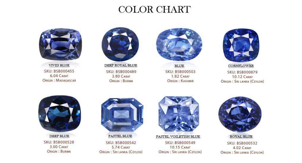
Successfully integrating sapphire into a brand’s visual identity requires a nuanced understanding of color theory and design hierarchy. Because sapphire is such a dominant, heavy color, it must be balanced correctly to avoid overwhelming the viewer.
Creating Visual Contrast
Sapphire works best when paired with colors that either enhance its depth or provide a clean, modern contrast. For a high-end, corporate look, pairing sapphire with silver or “Cool Gray” creates a tech-forward, professional atmosphere. Conversely, pairing it with gold or champagne accents leans heavily into the luxury sector, evoking the classic jewelry settings that the color is named after. For brands that want to appear more modern and energetic, a “pop” of coral or bright white can break up the density of the sapphire, making the brand feel more accessible while retaining its premium core.
Accessibility and Readability in Design
In the age of digital-first branding, accessibility is a non-negotiable component of brand strategy. Sapphire provides an excellent background for white or light-gray text, offering high contrast ratios that meet Web Content Accessibility Guidelines (WCAG). This makes it an ideal choice for “Hero” sections on websites, call-to-action buttons, and mobile UI elements. A sapphire-colored button on a white background doesn’t just look elegant; it commands attention and drives conversions by signaling importance without the “alarmist” energy of red.
Iconic Implementations: How Industry Leaders Use Sapphire to Command Markets
To understand the efficacy of sapphire, we can look at how leading brands have woven the color into their corporate DNA to influence consumer perception and market dominance.
The Financial Sector: Stability in a Hue
In banking and fintech, the “Chase Sapphire” brand is perhaps the most literal and successful use of this strategy. By naming their premier credit card line after the gemstone and using the deep blue color in the physical card design and marketing materials, Chase moved away from the “generic bank” feel. They created an aspirational product. The color choice reinforces the idea of “wealth” and “prestige” while maintaining the underlying “safety” associated with the blue family. It transformed a financial tool into a status symbol.
High-End Technology and Modern Elegance
Tech giants often utilize sapphire to denote their most advanced or “Pro” versions of products. Whether it is the sapphire glass used in high-end wearable technology or the “Midnight Blue” (a close relative of sapphire) used in smartphone finishes, the color is used to distinguish the “standard” from the “extraordinary.” In these instances, sapphire isn’t just a color; it is a signal of superior material science and engineering. For a brand, this creates a “halo effect,” where the prestige of the color elevates the perceived quality of the hardware.
The Future of Sapphire in a Digital-First World
As we move further into a world dominated by OLED screens and high-dynamic-range (HDR) displays, the way we experience sapphire is changing. Digital branding now allows for “vibrant” sapphires that were previously impossible to replicate in print.
Consistency Across Platforms
The challenge for modern brand strategy is ensuring that the “sapphire” a customer sees on their smartphone screen matches the “sapphire” on the physical packaging they receive in the mail. This requires a sophisticated approach to brand management, utilizing tools like the Pantone Matching System (PMS) for print and precise HEX/RGB profiles for digital. A brand that achieves this consistency builds a seamless “world” for the consumer, where every interaction feels intentional and high-quality.
Emotional Resonance in a Crowded Market
As markets become increasingly saturated, brands that can forge an emotional connection will survive. Sapphire, with its calming yet powerful presence, offers a respite from the “attention-economy” colors like neon green or aggressive orange. It invites the consumer to trust, to linger, and to invest. For a brand strategist, choosing sapphire is a commitment to a long-term relationship with the customer—a promise that the brand is as durable and valuable as the stone that shares its name.
In conclusion, sapphire color is more than a mere visual attribute. It is a strategic asset that communicates prestige, fosters deep-seated trust, and defines a brand as a leader in its field. By understanding its technical properties, psychological impact, and practical applications, brands can utilize this “royal” hue to carve out a unique and lasting identity in the global marketplace. Whether you are a startup looking to establish immediate authority or a legacy brand seeking to modernize your luxury appeal, sapphire offers a timeless foundation for excellence.
aViewFromTheCave is a participant in the Amazon Services LLC Associates Program, an affiliate advertising program designed to provide a means for sites to earn advertising fees by advertising and linking to Amazon.com. Amazon, the Amazon logo, AmazonSupply, and the AmazonSupply logo are trademarks of Amazon.com, Inc. or its affiliates. As an Amazon Associate we earn affiliate commissions from qualifying purchases.