
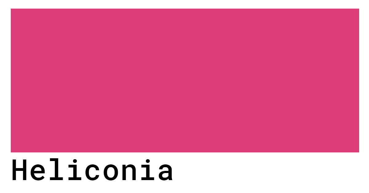
In the competitive landscape of modern commerce, visual identity serves as the silent ambassador of a brand. Every hue, shade, and tint communicates a specific frequency of psychological influence to the consumer. Among the more exotic and impactful choices in the contemporary designer’s toolkit is “Heliconia color.” Derived from the vibrant, tropical flora known as the “Lobster-claw” or “False Bird of Paradise,” Heliconia color is not a singular hex code but a spectrum of high-intensity reds, oranges, and golden yellows.
In the context of brand strategy, adopting a Heliconia-inspired palette is a deliberate move toward boldness, energy, and exoticism. It represents a departure from the “corporate blues” and “minimalist greys” that have dominated the last decade, offering a visceral connection to nature, vitality, and luxury. This article explores the strategic application of Heliconia color in branding, analyzing its psychological impact, its role in market differentiation, and its implementation across digital and physical touchpoints.

The Psychology of Heliconia Color in Brand Identity
Color psychology is the cornerstone of effective brand strategy. When a brand selects a color, it is essentially selecting the emotional shorthand it will use to communicate with its audience. Heliconia color, characterized by its saturated warmth, carries a unique set of psychological associations that can be leveraged to position a brand effectively.
Evoking Emotion through Tropical Vibrancy
The primary characteristic of Heliconia color is its inherent vibrancy. In color theory, warm tones like the reds and oranges found in the Heliconia flower are known to stimulate the senses. They are physiologically linked to increased heart rates and a sense of urgency or excitement. For a brand, this means that Heliconia color is an exceptional tool for grabbing attention in a crowded marketplace.
Unlike standard “Safety Orange” or “Stop Sign Red,” Heliconia hues carry an organic undertone. They feel “alive.” This makes them particularly effective for lifestyle brands that want to communicate passion, adventure, and a zest for life. When a consumer sees a brand utilizing these tropical gradients, the subconscious association is one of energy and warmth, rather than the clinical coldness of tech-centric palettes.
The Symbolism of Growth and Resilience
Beyond mere excitement, the Heliconia flower is a symbol of the tropics—thriving in lush, competitive environments. In branding, this translates to a narrative of resilience and flourishing growth. Brands that position themselves as disruptors or as “natural leaders” often utilize these sunset-adjacent colors to suggest that they are a force of nature.
Using Heliconia color allows a brand to tap into the “Premium Organic” aesthetic. It signals to the consumer that while the brand is rooted in natural principles, it is not passive. It is a bold, blooming entity. This duality—being both natural and aggressive—is a powerful tool for corporate identity in sectors like renewable energy, high-end wellness, and outdoor apparel.
Strategic Implementation: From Logo Design to Multi-Channel Marketing
Identifying a color is only the first step; the strategic implementation determines whether the brand identity succeeds or becomes a visual distraction. Heliconia color is a “loud” choice, meaning it requires careful balancing within a visual hierarchy to ensure it enhances rather than overwhelms the brand message.
Visual Hierarchy and Attention-Grabbing Palettes
In brand design, Heliconia color is often most effective when used as a “hero” color or a high-contrast accent. Because the human eye is naturally drawn to high-saturation warm tones, these colors are perfect for Call to Action (CTA) buttons, logos, and key brand messaging.
A strategic brand manager will often pair the intense reds of the Heliconia spectrum with deep, grounding neutrals—such as charcoal, forest green, or slate. This creates a visual anchor. When the Heliconia color is allowed to “pop” against a darker or more muted background, it creates a sense of luxury and focus. This is a common strategy in personal branding for public speakers or high-level consultants who want to appear energetic yet professional.
Heliconia in Digital vs. Physical Brand Assets
The challenge of using such a vibrant color lies in consistency across mediums. The Heliconia spectrum—often residing in the range of Hex #FF4500 (Orange Red) to #F05D23 (Deep Sunset)—can look vastly different on a backlit smartphone screen than on a matte-finish business card.

For digital-first brands, Heliconia color is a gift. It thrives in RGB environments, standing out against the white backgrounds of web browsers and mobile apps. However, for physical brand assets—such as packaging or signage—strategic branders must invest in high-quality Pantone matching (PMS) to ensure the “fire” of the color isn’t lost in the CMYK printing process. A dull Heliconia is merely a muddy orange; the brand strategy relies on the luminosity of the color to maintain its psychological impact.
Industry Use Cases: Where Heliconia Color Thrives
While any brand can theoretically use any color, Heliconia color has found specific niches where its associations with luxury, nature, and energy provide the highest Return on Investment (ROI) for brand equity.
Luxury Travel and Hospitality Branding
The travel industry has long utilized tropical palettes, but the shift toward “Heliconia branding” represents a move away from the clichéd turquoise of the ocean toward the exotic luxury of the jungle. High-end boutique hotels and eco-resorts use these deep oranges and reds to signal an “exclusive adventure.”
In this niche, Heliconia color suggests a curated experience that is both wild and comfortable. It moves the brand away from the “cheap summer holiday” aesthetic and toward a “transformative tropical retreat.” By incorporating these colors into their corporate identity, hospitality brands can command higher price points by associating their services with the rare beauty of tropical flora.
Organic and Sustainable Consumer Goods
As the “green” market becomes saturated, brands are looking for new ways to signal sustainability without using the color green. Heliconia color offers a sophisticated alternative. It speaks to the “end product” of nature—the flower, the fruit, the result of growth.
For brands in the organic food or skincare sectors, Heliconia hues communicate potency. A skincare brand using a Heliconia-inspired palette suggests that their ingredients are powerful, sun-ripened, and full of antioxidants. It differentiates the product on the shelf, moving it away from the “earthy/crunchy” look of brown and green and toward a “high-performance botanical” positioning.
Building a Cohesive Visual Language
A brand is more than a single color; it is a visual language. To successfully integrate Heliconia color into a brand strategy, one must consider the secondary and tertiary colors that will support it.
Complementary Colors and Secondary Palettes
Strategically, Heliconia color works best when it is part of a triad or a complementary scheme. To lean into the “tropical” aspect, designers often pair it with “Deep Teal” or “Lush Emerald.” This creates a natural harmony that is pleasing to the eye.
However, for a more modern, “Tech-Brand” feel, pairing Heliconia with “Ultra-Violet” or “Electric Blue” creates a high-energy, futuristic vibration. This is often seen in branding for creative agencies or software startups that want to appear at the cutting edge of innovation. The choice of secondary colors determines whether the Heliconia identity feels “rooted in the earth” or “launching into the future.”
Maintaining Consistency Across Global Markets
Finally, a professional brand strategy must account for cultural semiotics. While Heliconia color is generally associated with warmth and energy in Western markets, in many Eastern cultures, these shades of red and orange are tied to prosperity, luck, and sacredness.
For a global brand, this is an advantage. Heliconia color is one of the few palettes that carries almost universally positive associations. It is a color of celebration and life. By adopting this palette, a corporate identity can bypass many of the cultural pitfalls associated with more ambiguous colors, like purple or yellow, and present a unified front of optimism and strength across the globe.
In conclusion, “Heliconia color” is far more than a decorative choice. It is a strategic tool for brands that wish to project energy, exotic luxury, and natural resilience. By understanding the psychological nuances of this vibrant spectrum and implementing it with technical precision across all platforms, brand managers can create a visual identity that not only captures attention but also fosters a deep, emotional connection with their target audience. In a world of visual noise, the Heliconia palette offers a clear, resonant signal of vitality.
aViewFromTheCave is a participant in the Amazon Services LLC Associates Program, an affiliate advertising program designed to provide a means for sites to earn advertising fees by advertising and linking to Amazon.com. Amazon, the Amazon logo, AmazonSupply, and the AmazonSupply logo are trademarks of Amazon.com, Inc. or its affiliates. As an Amazon Associate we earn affiliate commissions from qualifying purchases.