
The annual reveal of a new iPhone model is always met with immense anticipation, and while groundbreaking features often steal the spotlight, one of the most immediate and visually striking aspects consumers consider is the device’s aesthetic. For the iPhone 15 series, Apple once again delivered a thoughtful palette, reflecting both current design trends and its enduring commitment to sophisticated, user-centric aesthetics. Understanding the available colors goes beyond mere preference; it delves into Apple’s design philosophy, material science, and strategic market positioning within the highly competitive technology landscape.
The Palette of Innovation: iPhone 15 and 15 Plus
For the standard bearers of the series – the iPhone 15 and its larger sibling, the iPhone 15 Plus – Apple introduced a range of vibrant yet refined colors, distinct from their Pro counterparts. These models are crafted with a durable aluminum design and feature a new color-infused glass back, which provides a beautiful matte finish that not only looks elegant but also feels pleasant to the touch and offers improved grip compared to the glossier predecessors.
A Fresh Take on Core Hues
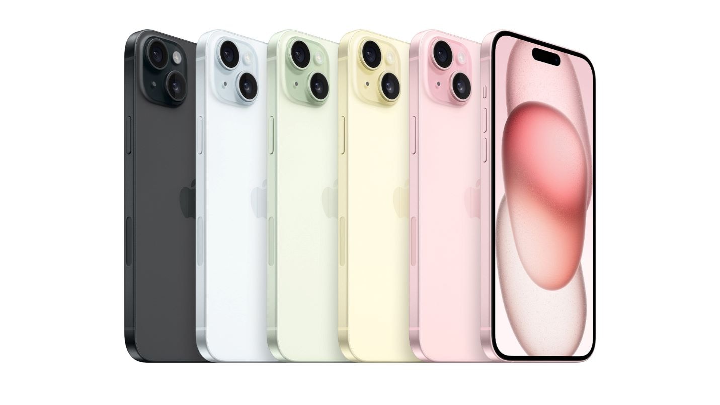
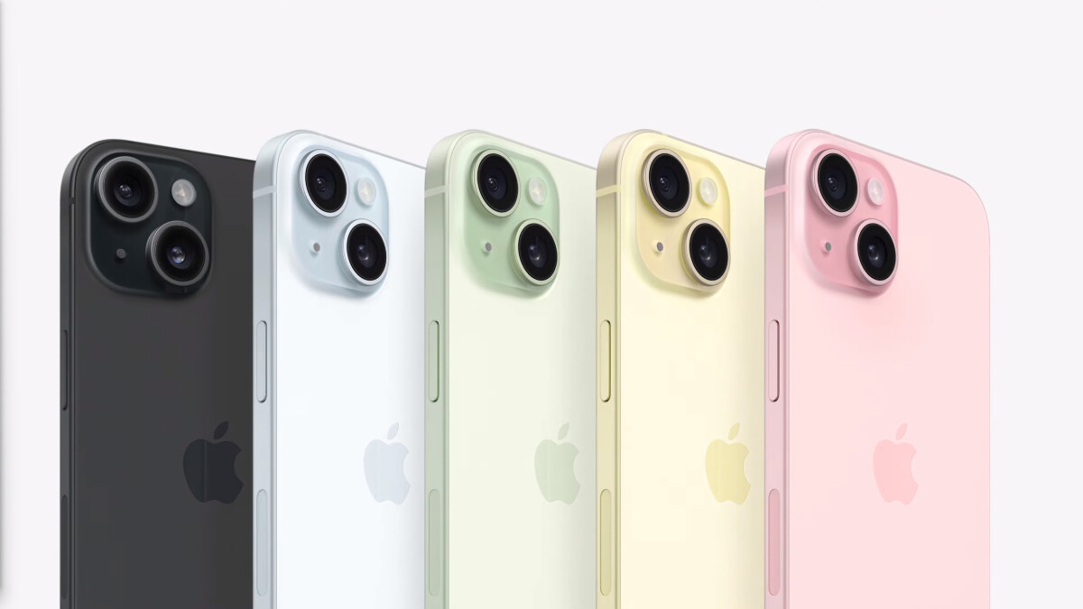
The iPhone 15 and 15 Plus are available in five distinct colors, each possessing a unique character:
- Pink: A soft, pastel shade that exudes a playful yet sophisticated charm. This isn’t a loud, bubblegum pink but rather a muted, almost dusty rose that appeals to a wide demographic seeking a touch of warmth and individuality.
- Yellow: A cheerful and optimistic hue, the iPhone 15’s yellow is understated and creamy, moving away from bolder primary yellows towards a more contemporary, sophisticated pastel. It offers a bright pop without being overwhelming.
- Green: A subtle and refreshing pastel green, reminiscent of mint or seafoam. This color choice conveys a sense of calm and natural elegance, providing a gentle alternative to more traditional device colors.
- **Blue: A light, airy blue that offers a serene and modern aesthetic. This particular shade avoids the intensity of deeper blues, instead opting for a crisp, almost sky-like quality that is both versatile and appealing.
- Black: The perennial classic, Apple’s black for the iPhone 15 is deep and rich, providing a timeless and universally appealing option. It embodies sleekness and professionalism, a safe yet stylish choice for those who prefer understated elegance.
These colors are carefully chosen to resonate with a broader consumer base, often reflecting current fashion and interior design trends towards softer, more integrated palettes. The matte finish helps to achieve this effect, diffusing light beautifully and minimizing fingerprints, contributing to a premium feel that belies their “standard” model designation.
The Subtlety of Apple’s Design Philosophy
Apple’s approach to color for the iPhone 15 and 15 Plus showcases a significant design evolution. The “color-infused glass” back isn’t merely a coating; it’s a meticulously engineered process where color is integrated directly into the glass material itself. This ensures a consistent, rich hue that permeates the entire glass, making it incredibly durable and resistant to scratching or fading. The matte finish is achieved through a dual-ion exchange process and a nanometer-scale texture applied to the back glass, resulting in a satin-like feel that’s both tactilely pleasing and visually distinct. This process highlights Apple’s attention to detail, turning a seemingly simple color choice into an advanced material science feat.
Appeal and Target Demographics
The selection of these specific hues is no accident. Apple understands the psychological impact of color and its role in personal expression. The softer pastels – Pink, Yellow, Green, and Blue – cater to users who desire a device that reflects their personality, offering a gentle break from the starkness of traditional black or white gadgets. These colors often appeal to younger demographics, fashion-conscious individuals, or anyone looking to add a touch of personal flair to their daily tech. The classic Black, on the other hand, remains the choice for professionals, minimalists, or those who prefer a device that seamlessly blends into any environment without drawing overt attention. By offering this balanced array, Apple ensures broad appeal, allowing users to choose a color that truly resonates with their identity and lifestyle.
Pro-Grade Aesthetics: iPhone 15 Pro and 15 Pro Max
Stepping up to the flagship iPhone 15 Pro and iPhone 15 Pro Max models, Apple takes a decidedly different, more premium approach to color, primarily driven by the introduction of an all-new material: titanium. This shift in material significantly influences the available finishes and the overall aesthetic, signaling a clear differentiation between the standard and professional lines.
Introducing the Natural Titanium Era
The most striking introduction in the Pro lineup is the Natural Titanium finish. This color is not merely a paint; it is the inherent hue of the brushed aerospace-grade titanium that forms the phone’s frame. This raw, metallic finish exudes an industrial elegance and sophistication. It’s a muted, silvery-gray that subtly shifts with light, showcasing the material’s unique properties. The use of titanium not only makes these models incredibly strong and durable but also significantly lighter than their stainless steel predecessors, providing a tangible benefit beyond mere aesthetics. This choice reflects a trend towards celebrating natural materials in high-end tech, emphasizing authenticity and robust engineering.
Sophisticated Shades: Blue, White, and Black Titanium
Complementing the Natural Titanium, the iPhone 15 Pro and Pro Max are also available in three other deep, rich colors:
- Blue Titanium: A deep, smoky blue that is sophisticated and muted. Unlike the pastel blue of the standard iPhone 15, this Pro version leans into a darker, more serious tone, achieved through a physical vapor deposition (PVD) coating over the titanium. It feels professional and premium.
- White Titanium: Not a stark, brilliant white, but rather a soft, almost off-white or silver-white, which beautifully complements the brushed titanium frame. It offers a clean, futuristic, and timeless appeal, often associated with purity and high-tech minimalism.
- Black Titanium: A profoundly dark and intensely rich black, again achieved through a PVD coating. This black is incredibly deep, absorbing light and presenting a sleek, almost stealthy appearance. It is the quintessential choice for those who value ultimate sophistication and discretion.
These colors are chosen to reflect the “Pro” designation – they are more subdued, refined, and serious, aligning with the professional and high-performance image Apple cultivates for these flagship devices.
The Technology Behind the Finish

The Pro models’ aesthetic is deeply intertwined with the advanced material science behind their construction. The transition from stainless steel to titanium for the frame is a significant engineering feat. Titanium, known for its exceptional strength-to-weight ratio and corrosion resistance, requires specialized manufacturing processes. The specific colors (Blue, White, and Black Titanium) are achieved through a process called physical vapor deposition (PVD), where ultra-thin layers of ceramic-like material are bonded to the titanium at an atomic level. This PVD coating is incredibly durable and integrates seamlessly with the brushed texture of the titanium, ensuring a finish that is not only visually stunning but also highly resistant to wear and tear. The integration of color at such a fundamental level underscores Apple’s commitment to durability and premium quality in its Pro lineup.
Beyond the Hue: The Strategic Role of Color in Tech Design
The choice of colors for a flagship device like the iPhone 15 series is never arbitrary. It’s a carefully calculated decision that impacts branding, consumer perception, and product lifecycle management. In the fast-paced world of consumer electronics, color serves as a powerful differentiator and a key element of product identity.
Color as a Feature: Differentiating Generations and Models
Apple masterfully uses color as a subtle yet effective way to distinguish between new iPhone generations and to clearly segment its product tiers (standard vs. Pro). Each year, specific new colors are introduced that instantly identify the latest model. For instance, the unique pastel shades of the iPhone 15 and the natural titanium finish of the Pro models immediately set them apart from previous generations. This strategy creates excitement for new releases and helps consumers easily identify the “newest” device. Furthermore, the distinct color palettes for the standard and Pro models reinforce their respective positioning – the vibrant, accessible colors for the masses versus the sophisticated, material-driven hues for the tech enthusiast and professional.
The Psychology of Color in Consumer Electronics
Color psychology plays a crucial role in product design. While specific color preferences are subjective, general associations hold significant sway. Blue often conveys trust, stability, and intelligence; green, nature, harmony, and renewal; yellow, optimism and joy; pink, warmth and playfulness; and black, sophistication, power, and elegance. Apple leverages these psychological associations to align specific emotions with its devices. The playful vibrancy of the standard iPhone 15 colors targets a desire for personal expression and a youthful spirit, while the refined, muted tones of the Pro models appeal to a sense of professionalism, exclusivity, and serious technological prowess. These choices are designed to evoke specific feelings and attitudes that reinforce the brand’s intended message for each product line.
Durability and Material Science
The connection between color and material science is paramount, especially in high-end gadgets. The colors chosen for the iPhone 15 series are not merely cosmetic; they are deeply integrated into the materials themselves, enhancing durability and overall product quality. The color-infused glass on the standard models means the color won’t chip or scratch off easily, maintaining its aesthetic integrity over time. Similarly, the PVD coatings on the Pro models’ titanium frame ensure a highly scratch-resistant and fade-proof finish. This emphasis on material integration means that the aesthetic choices are intrinsically linked to the device’s resilience, demonstrating a holistic approach to design where form and function are inseparable. The Ceramic Shield front cover, present on all models, further contributes to this durability, ensuring that the visual appeal is protected by robust engineering.
Personalization in a Uniform World: Accessorizing Your iPhone
Despite the carefully curated color options Apple provides, the desire for personalization is strong. This is where the extensive ecosystem of accessories comes into play, offering users countless ways to further customize their iPhone 15 experience.
The Ecosystem of Color: Cases and Accessories
Apple’s first-party cases, alongside a vast array of third-party options, provide an additional layer of color choice and protection. Users can choose cases that complement their iPhone’s original color, creating a harmonious look, or opt for contrasting colors to make a bolder statement. For example, a Pink iPhone 15 paired with a deep red silicone case creates a dynamic duo, while a Natural Titanium iPhone 15 Pro could be encased in a clear case to show off its native finish or a leather wallet case for a touch of classic elegance. The ability to swap cases allows for seasonal changes, mood adjustments, or simply adapting the phone’s appearance for different occasions, extending the personalization beyond the initial color choice.
The Enduring Appeal of Choice
Offering multiple color options is a critical strategy for consumer electronics companies. It acknowledges that technology, while functional, is also a personal device, an extension of one’s identity. The initial choice of color is a significant moment for many consumers, allowing them to express their style right out of the box. By providing a diverse yet cohesive palette across its iPhone 15 range, Apple taps into this fundamental human desire for choice and self-expression, fostering a stronger connection between the user and their device.
The Future of iPhone Aesthetics
Apple’s design evolution is continuous, and the aesthetic choices for the iPhone 15 series offer clues as to where the company might be headed with future iterations. The blend of material innovation, subtle color infusions, and a clear distinction between product tiers will likely continue to define its approach.
Predicting Trends: What’s Next for Apple’s Color Palette?
Looking ahead, we might anticipate Apple exploring further refinements in material finishes, perhaps more textures, or even dynamic color-changing technologies, as seen in some experimental concepts within the tech world. Sustainability will also increasingly influence material and color choices, potentially leading to more earth-toned palettes or finishes derived from recycled materials. The trend towards celebrating the natural appearance of materials, as seen with Natural Titanium, suggests that transparency and authenticity in design will remain key. We could also see the reintroduction of bolder, more saturated colors in the standard lineup to periodically refresh the aesthetic or the incorporation of subtle patterns into the glass back.
The Balancing Act: Innovation vs. Tradition
Apple consistently walks a tightrope between introducing groundbreaking innovations and maintaining the iconic design language that makes an iPhone instantly recognizable. Color is a primary tool in this balancing act. While new hues and finishes keep the product line fresh and exciting, certain elements like the minimalist design, the consistent form factor, and the use of premium materials remain constant. The iPhone 15 series exemplifies this perfectly: a new titanium frame and color-infused glass represent significant material and aesthetic innovation, yet the devices are unmistakably iPhones. This careful evolution ensures that Apple remains at the forefront of tech design, offering both novelty and familiarity to its loyal customer base.
In conclusion, the colors of the iPhone 15 series are far more than just surface-level choices. They are a testament to Apple’s meticulous design philosophy, its mastery of material science, and its astute understanding of consumer psychology. From the playful pastels of the standard models to the sophisticated titanium finishes of the Pro lineup, each color tells a story, offering users not just a powerful piece of technology, but also a personal statement in their hand.
aViewFromTheCave is a participant in the Amazon Services LLC Associates Program, an affiliate advertising program designed to provide a means for sites to earn advertising fees by advertising and linking to Amazon.com. Amazon, the Amazon logo, AmazonSupply, and the AmazonSupply logo are trademarks of Amazon.com, Inc. or its affiliates. As an Amazon Associate we earn affiliate commissions from qualifying purchases.