In the dynamic world of brand identity and visual communication, color is a silent, yet powerful, language. It dictates perception, evokes emotion, and shapes a brand’s narrative long before a single word is read. Among the vast spectrum of chromatic choices, pastel colors have emerged as a distinctive and increasingly popular choice, offering a unique blend of sophistication, approachability, and modern appeal. Understanding “what colors are pastel” is not merely an exercise in color theory; it’s a strategic imperative for any brand looking to cultivate a specific tone, connect with a target audience, and carve out a memorable presence in a crowded market.
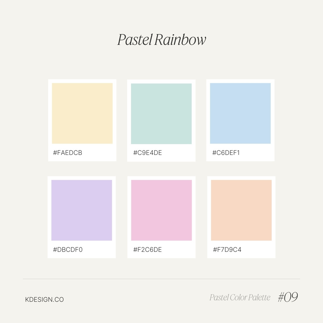
Pastel colors, often characterized by their soft, muted appearance, are essentially tints of pure colors—meaning they have been mixed with a significant amount of white. This infusion of white lightens their intensity, reducing their saturation and creating a gentle, airy quality. From the ubiquitous millennial pink to serene mint green, calming baby blue, delicate lavender, and warm peach, pastels extend across the entire rainbow, offering a subtle variation of every hue. Far from being simplistic, their understated nature holds profound strategic potential for brands, influencing everything from perceived value and emotional resonance to overall market positioning.
Decoding the Essence of Pastel Colors
To harness the power of pastels, a brand must first understand their fundamental characteristics and the psychological underpinnings that make them so effective. It’s not just about aesthetics; it’s about leveraging inherent human responses to color.
The Chromatic Spectrum of Pastels
At their core, pastel colors are defined by a high value (lightness) and low saturation. Imagine taking any vibrant color—a fiery red, a deep sapphire blue, a lush emerald green—and blending it with white until its intensity softens. The result is a lighter, less aggressive version of the original hue. This process doesn’t diminish their character; rather, it transforms it, lending an ethereal quality that can be profoundly engaging.
- High Value, Low Saturation: This technical definition is key. Unlike primary or secondary colors that command attention with their boldness, pastels invite it gently. They don’t shout; they whisper, drawing the viewer in with their subtle charm.
- Examples Across the Spectrum: The range is vast. Think of pinks evolving into blush, rose quartz, or millennial pink; blues becoming sky blue, powder blue, or robin’s egg blue; greens transforming into mint, sage, or seafoam; yellows into buttercup or pale lemon; and purples into lavender or lilac. Each retains a hint of its parent color’s identity but filtered through a veil of softness.
- Contrast with Saturated Colors: Where saturated colors evoke energy, excitement, or urgency, pastels lean towards tranquility, comfort, and sometimes even luxury. This fundamental difference dictates their strategic application in branding. A brand selling extreme sports gear might opt for electric neons, while a wellness retreat would invariably gravitate towards the soothing embrace of pastels.
The Science of Softness: Psychology Behind Pastels
Beyond their visual appeal, pastels tap into deep-seated psychological associations. Their gentle nature often translates into feelings of calm and serenity, making them incredibly effective tools for brands seeking to convey specific emotional messages.
- Calm and Soothing: The most immediate psychological impact of pastels is their ability to calm. They are non-threatening and non-aggressive, reducing visual stress and creating a sense of peace. This makes them ideal for brands in wellness, healthcare, beauty, and hospitality that aim to foster relaxation and trust.
- Approachability and Friendliness: Pastels often communicate a sense of openness and friendliness. They don’t impose; they invite. For startups, children’s brands, or services that require a high degree of user comfort, pastels can soften a brand’s image, making it feel more accessible and less intimidating.
- Sophistication and Elegance: While often associated with softness, pastels can also convey understated luxury and sophistication. When paired thoughtfully with clean typography, minimalist design, and premium materials, they exude a quiet elegance that speaks to discerning consumers. Think of high-end fashion or refined confectionery.
- Nostalgia and Whimsy: Depending on the specific shade and context, pastels can evoke a sense of nostalgia, reminiscent of childhood or simpler times. This is particularly effective for brands appealing to a sense of comfort, heritage, or playful escapism.
- Modernity and Trendiness: In recent years, pastels, particularly millennial pink and specific shades of green and blue, have become synonymous with contemporary design and a forward-thinking aesthetic. Brands leveraging these hues often position themselves as fresh, relevant, and in tune with current cultural sensibilities.
Strategic Application: Why Brands Embrace Pastel Palettes
The deliberate choice of a pastel palette is rarely arbitrary. It’s a calculated move to shape perceptions, build emotional connections, and differentiate a brand in a competitive landscape.
Cultivating Brand Personality and Tone
Pastels are invaluable in helping brands articulate their unique personality and desired tone of voice without uttering a single word. They act as a visual shorthand for a brand’s core values and identity.
- Luxury and Premium: For brands aiming for an aspirational, high-end image, pastels can convey exclusivity and refined taste. When used with metallics or deep neutrals, they suggest quality and attention to detail without being ostentatious. This is prevalent in cosmetics, jewelry, and high-fashion branding.
- Wellness and Serenity: Brands in health, yoga, meditation, or organic products frequently employ pastels to embody their commitment to well-being, tranquility, and natural purity. Mint greens, sky blues, and gentle purples perfectly align with messages of balance and calm.
- Youthful and Playful: While sophisticated, pastels also lend themselves beautifully to brands targeting younger demographics or those with a playful, whimsical spirit. Children’s toys, confectionery, and certain lifestyle brands leverage pastels to create a sense of fun and lightheartedness.
- Innovation and Approachability in Tech: Historically, tech brands gravitated towards stark blues or grays. However, a new wave of tech companies, particularly in software and apps focused on user experience, are adopting pastels to make their products feel less intimidating, more human-centric, and approachable. This signals a shift from purely functional to emotionally resonant design.
Standing Out in a Saturated Market
In a world bombarded by visual stimuli, differentiation is paramount. Pastels offer a distinctive pathway to capturing attention without resorting to overt loudness.
- A Visual Counterpoint: When competitors are all vying for attention with bold, primary colors or intense contrasts, a pastel palette can provide a refreshing and memorable alternative. It can make a brand feel unique, sophisticated, and memorable by offering a softer visual experience.
- Targeting Specific Demographics: The resurgence of pastels is partly driven by their appeal to younger generations (millennials and Gen Z) who often value authenticity, aesthetics, and brands that align with a more mindful, less aggressive consumer culture. Brands can strategically use pastels to resonate with these demographic segments.
- Creating a Niche Aesthetic: By committing to a pastel palette, a brand can cultivate a distinct aesthetic that becomes synonymous with its identity. This fosters stronger brand recall and builds a cohesive visual world that customers can easily recognize and relate to.
Enhancing User Experience and Design Aesthetics
Beyond brand perception, pastels play a practical role in enhancing the usability and aesthetic appeal of products, websites, and marketing materials.
- Readability and Visual Comfort: On digital interfaces, excessive brightness or high contrast can lead to eye strain. Pastels provide a gentle background or harmonious element that is easy on the eyes, improving overall user comfort and readability, especially for prolonged engagement.
- Modern Minimalism: Pastels are a cornerstone of minimalist design, which prioritizes clarity, simplicity, and functionality. Their understated nature allows other design elements, such as typography or iconography, to stand out without visual clutter, creating a clean, modern aesthetic.
- Cohesive Brand Ecosystem: From product packaging and website design to social media graphics and physical store interiors, pastels can be consistently applied across all touchpoints, ensuring a unified and harmonious brand experience. This consistency reinforces brand identity and builds trust.
Implementing Pastel Palettes: Best Practices for Brands
Adopting pastels is more than just picking a few light colors; it requires careful consideration of color theory, application, and brand context to maximize impact and avoid potential pitfalls.
Harmony and Contrast: Building a Cohesive Palette
A successful pastel palette is not just a collection of soft colors but a thoughtfully constructed system that includes supporting hues.
- Pairing with Neutrals: Pastels often sing when paired with clean neutrals like crisp whites, warm grays, light beiges, or even subtle metallics (gold, rose gold, silver). These provide grounding, depth, and sophistication, preventing the palette from becoming overly saccharine or flat.
- Strategic Accents: To add dynamism or highlight key information, brands can incorporate darker, more saturated versions of their chosen pastels, or even a complementary bold accent color. This creates visual interest and hierarchy without overwhelming the overall softness. For instance, a brand using baby blue might use a deep navy for headings.
- Understanding Color Relationships: Basic color theory still applies. Monochromatic pastel schemes (different shades of one pastel), analogous schemes (colors next to each other on the color wheel, like mint and peach), or even carefully chosen complementary pastel schemes (like a pale pink and a light sage green) can create diverse moods and visual harmony.
Medium Matters: Where Pastels Shine Brightest
The effectiveness of pastels can vary significantly depending on the medium of application. Brands must account for these differences.
- Digital vs. Print: Colors appear differently on screens (RGB) than they do in print (CMYK). Pastels, in particular, can be tricky. What looks vibrant and clear on a monitor might appear dull or washed out when printed, or vice versa. Accurate color calibration and professional print proofs are essential.
- Material and Texture: The tactile quality of a product or packaging can greatly enhance a pastel color. A pastel blue on a matte, soft-touch finish will evoke a different sensation than the same color on a glossy, reflective surface. Consider how the material influences the color’s perception.
- Lighting Conditions: For physical branding elements like store interiors or product displays, lighting plays a crucial role. Natural light might reveal subtle nuances, while artificial lighting could alter a pastel’s warmth or coolness.
Avoiding Pitfalls: Maintaining Professionalism and Appeal
While powerful, pastels are not without their challenges. Brands must be mindful of potential misinterpretations.
- Avoiding Childishness or Overly Feminine Connotations: Historically, pastels were often pigeonholed into categories like children’s products or hyper-feminine branding. While this association is evolving, brands must design carefully to ensure their pastel choices align with their broader brand message and don’t inadvertently alienate segments of their audience. Context, typography, and accompanying visuals are key.
- Maintaining Brand Authority: An overly soft or weak application of pastels could dilute a brand’s authority or perceived strength. It’s crucial to balance softness with clear messaging and, when necessary, stronger elements to ensure the brand doesn’t come across as indecisive or insubstantial.
- Adaptability and Longevity: Trends come and go, but strong brand identity endures. While trendy pastels can be effective, brands should consider the longevity of their chosen palette. A well-constructed pastel identity should be adaptable enough to remain fresh and relevant over time, even as styles evolve.
The Evolving Landscape of Pastel Branding
The narrative around pastels in branding is continuously expanding, reflecting broader cultural shifts and innovative design approaches.
Beyond Traditional Associations
Pastels are breaking free from their traditional shackles, finding new homes in unexpected industries.
- Democratizing Tech and Finance: Once dominated by stark, corporate hues, sectors like fintech, software, and even traditional banking are exploring pastel accents to appear more human, approachable, and user-friendly, particularly for digital-native consumers. This signals a move towards greater empathy in service design.
- Gender-Neutral and Inclusive Design: The interpretation of pastels is becoming increasingly gender-neutral. Brands are using soft palettes to appeal to a broader audience, challenging outdated gender stereotypes in product design and marketing.
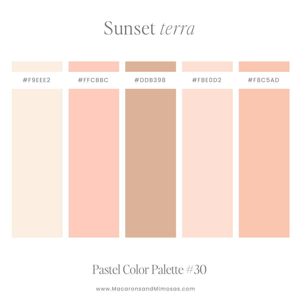
- Sustainable and Ethical Branding: The subtle, natural quality of many pastels aligns well with brands championing sustainability, eco-friendliness, and transparency. Earthy pastels (sage, terracotta, oat) evoke nature and authenticity, resonating with environmentally conscious consumers.
Future Trends and Sustainability
The appeal of pastels shows no signs of waning. As consumer preferences shift towards more mindful consumption and sensory experiences, pastels are poised to remain a relevant and powerful tool.
- Longevity Through Thoughtful Design: While specific “trendy” pastels may cycle, the fundamental qualities of soft, muted colors offer timeless appeal. Brands that integrate pastels thoughtfully, rather than just chasing a trend, will find their palettes enduring.
- Sensory Integration: The future of branding is increasingly multi-sensory. Pastels, with their inherent softness, lend themselves beautifully to creating holistic brand experiences that consider touch, sound, and even scent, further deepening consumer connection.

Conclusion
Understanding “what colors are pastel” is far more than a simple aesthetic discernment; it’s a strategic entry point into a sophisticated realm of brand communication. These soft hues, defined by their high lightness and low saturation, offer brands a potent toolkit for cultivating specific personalities, evoking powerful emotions, and standing out in a crowded marketplace. From conveying calm and approachability to signifying luxury and modernity, pastels provide a versatile palette for crafting memorable and effective brand identities.
By embracing best practices in palette construction, considering medium-specific nuances, and carefully navigating potential pitfalls, brands can leverage pastels to create a cohesive, engaging, and enduring presence. As the branding landscape continues to evolve, the strategic use of pastel colors will undoubtedly remain a cornerstone for businesses seeking to connect with their audience on a deeper, more resonant level, proving that sometimes, the softest whispers can make the loudest statements.
aViewFromTheCave is a participant in the Amazon Services LLC Associates Program, an affiliate advertising program designed to provide a means for sites to earn advertising fees by advertising and linking to Amazon.com. Amazon, the Amazon logo, AmazonSupply, and the AmazonSupply logo are trademarks of Amazon.com, Inc. or its affiliates. As an Amazon Associate we earn affiliate commissions from qualifying purchases.