
In the ever-evolving landscape of web development, creating flexible, responsive, and accessible user interfaces is paramount. At the heart of achieving this lies a nuanced understanding of CSS units, and among the most powerful and often misunderstood is the em unit. Far more than just another way to size text, em represents a fundamental shift from static, pixel-perfect design to a dynamic, context-aware approach, empowering developers to build truly adaptable web experiences.
This article delves into the em unit in CSS, exploring its mechanics, advantages, common pitfalls, and its place alongside other relative units like rem. By the end, you’ll have a comprehensive grasp of em‘s capabilities and how to leverage it effectively in your web projects to enhance scalability, maintainability, and user accessibility.
Understanding CSS Units: Absolute vs. Relative
Before dissecting em, it’s crucial to understand the two primary categories of CSS units: absolute and relative. This distinction forms the bedrock of choosing the right unit for the right job, significantly impacting the responsiveness and adaptability of your designs.
Absolute Units: Fixed and Unyielding
Absolute units in CSS are those that have a fixed physical size. They do not change based on any other element or the user’s settings (beyond basic screen resolution, in some cases). The most common absolute unit is the px (pixel).
- Pixels (
px): Historically,pxhas been the default unit for most web designers. A pixel is a tiny dot on a screen. While convenient for precise, fixed layouts,pxunits don’t inherently scale with user preferences or different screen densities. A16pxfont will always be16pxregardless of whether the user has set their browser’s default font size to a larger value for better readability. Other absolute units includept(points, common in print),in(inches),cm(centimeters), andmm(millimeters), though these are rarely used in web design due to their strong ties to physical dimensions which are less relevant in the digital, fluid web environment.
The primary limitation of absolute units is their rigidity. They offer granular control but at the cost of flexibility. In a world of diverse devices and user needs, a design solely built on absolute units can quickly become inaccessible or break on different screen sizes and user settings.
Relative Units: Dynamic and Contextual
Relative units, on the other hand, are dynamic. Their computed value depends on another measurement, which could be the size of the parent element, the root element, the viewport dimensions, or even the user’s default browser settings. This inherent adaptability makes them invaluable for responsive and accessible web design.
Common relative units include em, rem, % (percentage), vw (viewport width), and vh (viewport height). These units allow elements to scale proportionately, adapting gracefully to various contexts and user preferences. The em unit stands out among these for its unique relationship with an element’s parent, offering both immense power and a specific set of challenges.
The Core Concept of ’em’: Relative to Parent’s Font Size
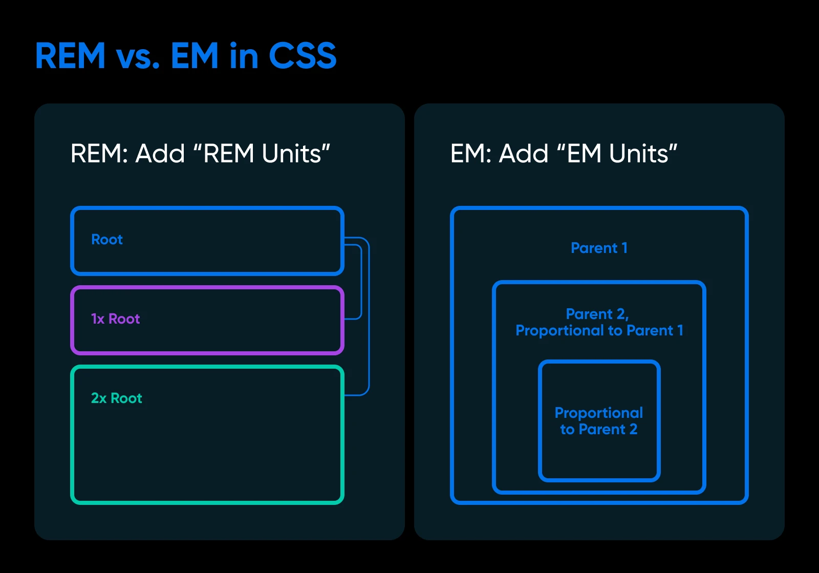
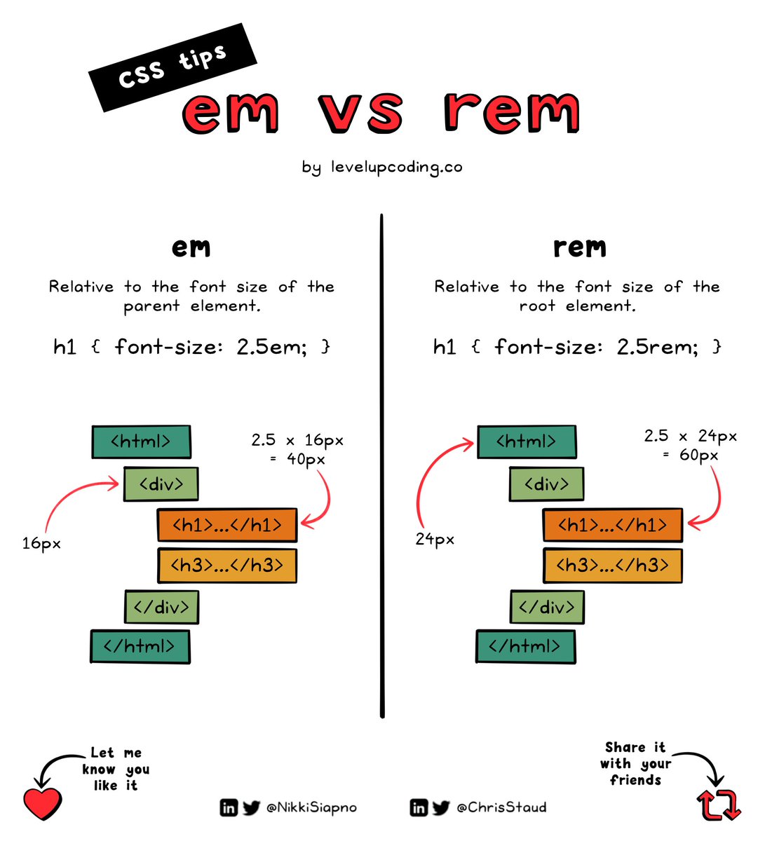
The em unit is defined as being relative to the font-size of the parent element. This foundational principle is what gives em its power and, at times, its complexity. If an element has a font-size of 1em, it means its font size is equal to its parent’s computed font size. If it’s 1.5em, it’s 1.5 times its parent’s font size.
How ’em’ Works: An Illustrative Example
Let’s break down the mechanics with a simple HTML and CSS example:
<div class="parent">

  Parent Element (Default 16px)

  <p class="child">

    Child Paragraph

    <span>Grandchild Span</span>

  </p>

</div>
body {

  font-size: 16px; /* Browser default, often explicitly set for consistency */

}


.parent {

  font-size: 1.25em; /* This means 1.25 * body's font-size (16px) = 20px */

}


.child {

  font-size: 0.8em; /* This means 0.8 * parent's font-size (20px) = 16px */

}


.grandchild {

  font-size: 1.2em; /* This means 1.2 * child's font-size (16px) = 19.2px */

}
In this example:
-
The
<body>element (often the root or initial context) has afont-sizeof16px. -
.parentsets itsfont-sizeto1.25em. Since its parent is the<body>, its computedfont-sizebecomes1.25 * 16px = 20px. -
.childsets itsfont-sizeto0.8em. Its parent is.parent, which has a computedfont-sizeof20px. So,.child‘sfont-sizebecomes0.8 * 20px = 16px. -
.grandchildsets itsfont-sizeto1.2em. Its parent is.child, which has a computedfont-sizeof16px. So,.grandchild‘sfont-sizebecomes1.2 * 16px = 19.2px.
This illustrates the “cascading” or “compounding” nature of em. Each em value is calculated relative to its immediate parent’s computed font-size.
The Cascading Nature and Its Implications
The cascading behavior of em is both its greatest strength and its primary challenge. For font sizing, if you nest several elements that all use em for their font-size, the resulting text size can quickly become unpredictable without careful calculation. This compounding effect means that a seemingly small em value deep in the DOM tree can produce a drastically different result than intended.
For instance, if you have a base font-size of 16px and apply font-size: 1.2em to a list item, then font-size: 1.2em again to a nested span within that list item, the span’s font size will be 1.2 * (1.2 * 16px) = 1.44 * 16px = 23.04px. This can make it difficult to maintain a consistent typographic scale across complex components.
’em’ for Other Properties: Beyond Font Size
A common misconception is that em is only for font sizes. While its definition is tied to font-size, em can be used for almost any CSS property that accepts a length value, such as margin, padding, width, height, line-height, border-radius, and box-shadow offsets.
Crucially, when em is used for properties other than font-size, its value is relative to the element’s own computed font-size, not its parent’s.
Consider this example:
.card {

  font-size: 18px; /* Element's own font size */

  padding: 1em;    /* 1 * 18px = 18px padding */

  margin-bottom: 2em; /* 2 * 18px = 36px margin */

  width: 20em;     /* 20 * 18px = 360px width */

}
In this .card example, if you later change .card‘s font-size to 20px, its padding, margin, and width will automatically adjust to 20px, 40px, and 400px respectively. This behavior is incredibly powerful for component-based design, allowing an entire component to scale uniformly simply by changing its base font-size. This is where em truly shines, providing internal consistency within a modular component.
Advantages and Disadvantages of Using ’em’
Understanding em‘s relative nature reveals both its immense benefits and its inherent complexities.
The Power of Scalability and Accessibility
The primary advantage of em is its contribution to scalability and accessibility.
-
Responsive Design: By sizing elements relative to their container’s text,
emunits facilitate fluid layouts that adapt naturally to different screen sizes. When the base font size changes (e.g., via media queries for smaller screens), allem-based measurements within that context scale proportionately. -
User Accessibility: This is arguably the most significant benefit. Users with visual impairments often increase their browser’s default font size. When
em(orrem) units are used, your entire layout, including text, spacing, and component sizes, scales up or down according to the user’s preference, significantly improving readability and user experience without breaking the design. Designs built withpxunits often ignore user font size preferences, leading to fixed, tiny text for those who need it larger. -
Component-Based Scaling: As demonstrated, using
emfor properties likepaddingandmarginwithin a component makes that component internally consistent. If you want to make a “small” version of a button, you only need to adjust itsfont-size, and itspaddingandborder-radius(if alsoem-based) will scale automatically.
The Challenge of Compound Relativity (The ’em’ Cascade Problem)
While powerful, the cascading nature of em can lead to what’s often termed the “em cascade problem” or “compounding issue.” As seen in the font sizing example, deeply nested elements can inherit and compound font-size values in unexpected ways, making it hard to predict the final rendered size. Debugging these issues requires careful inspection of the computed styles in browser developer tools. This unpredictability can lead to inconsistent typography and make CSS maintenance more cumbersome, especially in large projects with many nested components.
When to Use ’em’: Best Practices
Despite its complexities, em remains a vital tool. Here are scenarios where em excels:
-
Component-Internal Spacing: Use
emforpadding,margin,line-height, andborder-radiuswithin a specific component. This ensures that the component’s internal spacing scales predictably with its ownfont-size. For example, a button’s padding might be0.5em 1em, so if the button’sfont-sizechanges, its padding adjusts proportionately. -
Relative to Text Size: For elements that should always be sized relative to their associated text,
emis perfect. Icons next to text, form input heights, or anything visually tied to the immediate text size benefit fromem. -
Media Queries (Less Common but Valid): While
remis often preferred for media queries,emcan be used. For example,@media (min-width: 40em)would mean40times the browser’s default font size.
’em’ vs. ‘rem’: A Crucial Distinction
To mitigate the em cascade problem, CSS introduced another relative unit: rem. Understanding the distinction between em and rem is critical for modern web development.
Introducing ‘rem’: Root ’em’ for Predictable Scaling
The rem unit (short for “root em”) is similar to em but with one fundamental difference: its value is always relative to the font-size of the root element of the document, which is the <html> element. It never compounds based on parent elements.
<html>

<body>

  <div class="parent">

    Parent Element

    <p class="child">

      Child Paragraph

      <span>Grandchild Span</span>

    </p>

  </div>

</body>

</html>
html {

  font-size: 16px; /* Defines the base for all 'rem' units */

}


.parent {

  font-size: 1.25rem; /* 1.25 * html's font-size (16px) = 20px */

}


.child {

  font-size: 1rem;   /* 1 * html's font-size (16px) = 16px */

}


.grandchild {

  font-size: 1.125rem; /* 1.125 * html's font-size (16px) = 18px */

}
In this rem example, regardless of the font-size set on .parent or .child, the font-size of .grandchild will always be 1.125 * 16px = 18px. This eliminates the compounding issue and makes typography much more predictable and manageable across an entire website.
Practical Scenarios for ‘rem’ Adoption
rem has become the preferred unit for global typography and overall spacing on most modern websites due to its predictability:
-
Global Typography: Set your base
font-sizeon the<html>element (e.g.,100%or16px), then useremfor all text sizing (font-size) throughout your application. This ensures a consistent, scalable typographic hierarchy. -
Global Spacing: Use
remfor generalmarginandpaddingvalues to create a consistent spacing scale across your entire site that scales with the user’s base font size preference. -
Media Queries:
remunits are excellent for media queries (e.g.,@media (min-width: 48rem)). This makes your breakpoints responsive to user text-scaling preferences.
Synergistic Use: ’em’ and ‘rem’ Together
The best practice often involves using em and rem synergistically, leveraging the strengths of both:
-
remfor Base and Global Sizing: Useremfor establishing your overall typographic scale, global spacing, and possibly element dimensions that should scale with the document’s root font size (e.g., general container widths, heights, media query breakpoints). This provides a predictable, consistent foundation. -
emfor Component-Internal Sizing: Useemwithin specific components where you want values to be relative to that component’sfont-size. For instance, abuttoncomponent might havepadding: 0.5em 1em;andborder-radius: 0.25em;. If you later make that buttonfont-size: 0.8rem(making it smaller relative to the root), its internal padding and border-radius will automatically shrink proportionally, maintaining its visual integrity.
This combination allows for highly flexible and maintainable designs: global changes are handled by rem, while component-specific scaling is handled by em.
Practical Implementation and Tools
Mastering em and rem isn’t just about understanding their definitions; it’s also about practical application within your development workflow.
Using ’em’ in Responsive Design Workflows
When implementing responsive designs, em (and rem) values are instrumental for fluid typography and spacing. Instead of rigid pixel values that require multiple media queries for different screen sizes, em values adapt inherently. For instance, setting font-size: clamp(1rem, 2vw + 1rem, 2.5rem) combined with em for line heights and spacing can create truly fluid typography. While rem is generally preferred for font-size across the board, em values for line-height and letter-spacing can provide context-aware adjustments that look good regardless of the specific font-size of an element.
Debugging and Inspection Tools
Modern browser developer tools are indispensable for working with relative units. In the “Computed” tab of your browser’s inspector, you can see the final pixel value that CSS units like em and rem resolve to. This allows you to trace the cascade and understand exactly how your relative units are being calculated, helping to diagnose any unexpected sizing issues quickly.
Preprocessors and Postprocessors
CSS preprocessors like Sass or Less can further streamline the use of em and rem. You can define variables for your base font size or create mixins that convert px values to rem or em on compilation, abstracting away some of the manual calculations. For example:
// Sass example

$base-font-size: 16px;


@function em($pixels, $context: $base-font-size) {

  @return ($pixels / $context) * 1em;

}


.title {

  font-size: em(24px); // Converts 24px to 1.5em relative to base

  padding: em(10px);  // Converts 10px to 0.625em relative to base

}
PostCSS plugins also exist that can automatically convert px values to rem (or em) during your build process, giving you the best of both worlds: writing in familiar pixels and outputting accessible, relative units.

Conclusion
The em unit, though often overshadowed by its root-relative cousin rem, remains a foundational concept in CSS, essential for crafting robust, accessible, and highly scalable web interfaces. While its compounding nature requires a mindful approach, particularly for typography, its unparalleled ability to size elements relative to their own font size makes it indispensable for creating internally consistent and adaptable UI components.
By strategically combining em for component-level adjustments and rem for global typographic and spacing baselines, developers can unlock a powerful synergy. This hybrid approach ensures predictable scaling across an entire application while maintaining the flexibility for individual components to adapt gracefully. Mastering em is not merely about understanding a CSS unit; it’s about embracing a philosophy of flexible design, user empowerment, and future-proof web development, leading to richer, more inclusive digital experiences for all.