
In the intricate world of brand identity and visual marketing, every color choice carries significant weight, subtly shaping perceptions, evoking emotions, and communicating core brand values. Among the vast spectrum, “off-white” stands as a particularly compelling and often underestimated hue. Far from being merely a less-than-perfect white, off-white is a sophisticated family of colors, each with its own character and strategic potential. For brands striving for elegance, warmth, authenticity, or a distinctive minimalist edge, understanding the nuances of off-white is not just about aesthetics; it’s about making a profound statement without uttering a single word.

This article delves into what off-white truly is, dissecting its various forms and psychological impacts, and crucially, exploring its strategic applications within brand identity, design, and user experience. We’ll uncover how leading brands harness the subtle power of off-white to differentiate, connect, and build lasting impressions in a crowded marketplace.
Deconstructing Off-White: Beyond Pure White
To truly appreciate the strategic value of off-white in branding, one must first understand what it is and, perhaps more importantly, what it isn’t. Off-white represents a deliberate departure from the stark, sometimes sterile, purity of brilliant white. It’s white infused with just a hint of another color, introducing complexity, warmth, or a touch of antiquity that pure white cannot achieve.
The Spectrum of Off-White: A Palette of Possibilities
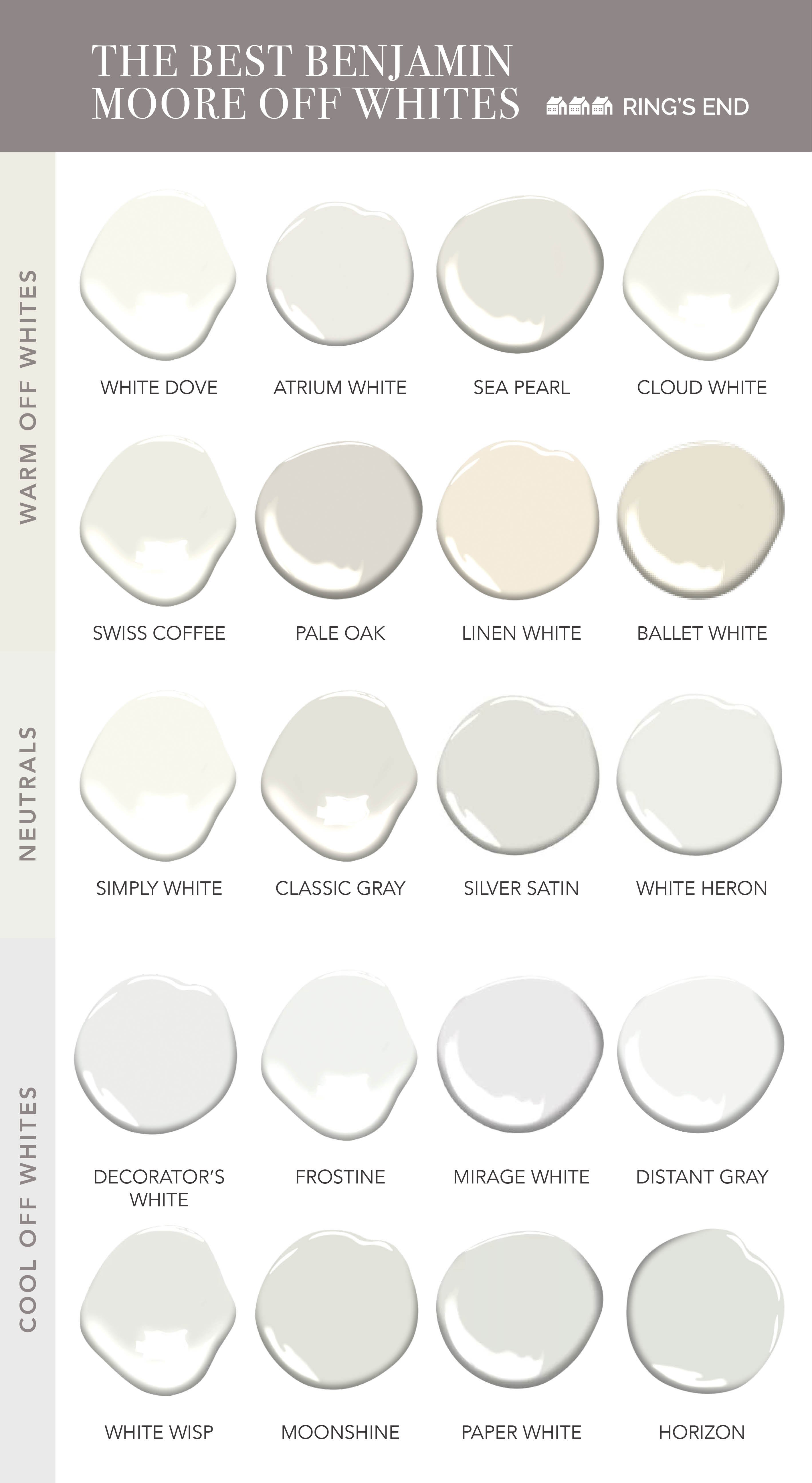
Off-white is not a single color but a vast and varied spectrum, a nuanced collection of shades that derive their character from the underlying tint. These subtle infusions are what differentiate an off-white from its pure counterpart and from each other, allowing for a remarkable range of expressions:
-
Cream: White with a distinct hint of yellow, evoking warmth, richness, and often a sense of classic elegance or confectionery delight. Brands associated with luxury goods, patisserie, or heritage often lean towards cream.
-
Ivory: A yellowish-white, softer than cream, suggesting sophistication, natural luxury (like elephant tusks, historically), and an aged, precious quality. Often seen in high-end fashion, bridalwear, and premium home goods.
-
Ecru: A light, yellowish-brown, unbleached linen or silk tone. It speaks to naturalness, earthiness, sustainability, and artisan craftsmanship. Brands focused on organic products, textiles, or natural beauty often utilize ecru.
-
Beige: A pale, sandy fawn color. While sometimes dismissed as bland, beige offers incredible versatility, conveying comfort, stability, and understated luxury. It can range from cool, grayish-beiges to warmer, golden tones.
-
Parchment: A yellowish-white with an aged, papery quality, reminiscent of old manuscripts. It evokes history, knowledge, tradition, and a refined, scholarly aesthetic.
-
Vanilla: A soft, pale yellow-white, reminiscent of the sweet spice. It brings warmth, comfort, and a gentle inviting quality.
-
Alabaster: A milky, translucent white with a very subtle warmth, often hinting at pink or peach. It suggests purity, delicacy, and artistic craftsmanship, similar to the stone.
-
Eggshell: A soft white with a very slight grayish or yellowish tint, mimicking the natural color of an eggshell. It’s often used in interiors for its gentle, muted quality and practicality.
Each of these shades, while ostensibly “off-white,” carries its own unique psychological footprint, making the selection a powerful strategic choice for brand identity.
The Psychology of Off-White: Emotion and Perception
The subtle differentiation of off-white from pure white results in a distinctly different psychological impact, which is invaluable for brand positioning:
-
Warmth and Approachability: Unlike the cool, sometimes stark formality of pure white, off-whites introduce warmth, making a brand feel more inviting, comfortable, and less imposing. This can be crucial for brands aiming for a friendly, supportive, or luxurious yet approachable image.
-
Sophistication and Elegance: Off-white hues inherently possess a refined quality. They suggest a taste for the subtle, the understated, and the classic. This makes them a go-to for luxury brands, high-end services, and products where perceived quality and sophistication are paramount.
-
Timelessness and Tradition: Many off-whites, particularly ivory, parchment, and aged creams, evoke a sense of history, heritage, and enduring quality. Brands looking to convey longevity, craftsmanship, or a classic aesthetic find off-white to be a powerful ally.
-
Comfort and Serenity: The soft, muted nature of off-white contributes to feelings of calm, peace, and relaxation. This makes it ideal for brands in wellness, hospitality, home decor, or any sector aiming to create a soothing customer experience.
-
Luxury and Premiumness: The deliberate choice of an off-white over a standard white often communicates attention to detail, a curated aesthetic, and an implied higher value. It signals that a brand has put thought into every element, including the foundation of its visual identity.
-
Naturalness and Authenticity: Shades like ecru or unbleached linen tones connect a brand to nature, sustainability, and authenticity. This resonates deeply with eco-conscious consumers and brands emphasizing transparency and natural ingredients.
Strategic Applications in Brand Identity
The versatile nature and rich psychological associations of off-white make it an indispensable tool in the brand builder’s arsenal. Its strategic application can profoundly impact how a brand is perceived and how it differentiates itself in a competitive landscape.
Establishing Brand Personality and Tone
An off-white foundation allows brands to sculpt a very specific personality:
-
For the Luxurious and Exclusive: High-end fashion houses, premium automotive brands, and bespoke service providers often gravitate towards sophisticated off-whites like ivory or alabaster. These shades communicate exclusivity, meticulous craftsmanship, and an unspoken promise of quality that commands a premium. Think of brands like Jo Malone or Tiffany & Co. (though their signature is blue, their packaging often integrates soft whites).
-
For the Warm and Welcoming: Boutique hotels, artisan coffee shops, and wellness brands might opt for creams or soft vanilla tones. These create an inviting, cozy atmosphere that encourages lingering and fosters a sense of belonging and comfort.
-
For the Minimalist and Modern: Brands aiming for a sleek, clean, yet approachable modern aesthetic often use cooler off-whites with subtle grey undertones. This maintains the clarity of minimalism while softening the potential harshness of pure white, making the brand feel more grounded and human.
-
For the Earthy and Sustainable: Eco-friendly brands, natural beauty products, or organic food companies frequently employ ecru or natural linen shades. These colors directly communicate their commitment to natural ingredients, sustainable practices, and an authentic, unrefined quality.
Versatility and Complementation: The Master Neutral
One of off-white’s greatest strengths is its incredible versatility as a neutral. It acts as a sophisticated backdrop that can elevate and enhance other colors in a brand’s palette:
-
Elevating Bold Accents: When paired with vibrant hues (e.g., a deep sapphire, emerald green, or burnt orange), off-white allows the accent color to pop with greater intensity, while simultaneously providing a grounding, elegant counterpoint. This creates a dynamic yet balanced visual identity.
-
Harmonizing with Earth Tones: Off-white blends seamlessly with natural browns, greens, and muted blues, creating a cohesive and organic palette that feels natural and understated.
-
Amplifying Metallics: Gold, silver, and copper accents truly shine against an off-white background. The metallic gleam is amplified, imparting a sense of luxury, prestige, and high value without feeling ostentatious. This combination is a staple for jewelry brands, luxury goods, and high-end design.
-
Softening Dark Palettes: For brands using dark, dramatic colors like charcoal or navy as primary hues, off-white can serve as a secondary color for text, highlights, or negative space, providing necessary contrast and preventing the overall look from becoming too heavy or oppressive.
Off-White in Design and User Experience
Beyond a static logo or color palette, off-white plays a pivotal role in the dynamic aspects of design and user experience, influencing everything from digital interfaces to physical retail spaces.
Web and Digital Design: Crafting a Gentle Digital Experience
In the digital realm, where screens can be harsh and overwhelming, off-white offers a soothing alternative to pure white backgrounds:
-
Improved Readability and Reduced Eye Strain: A soft, off-white background for text-heavy websites or apps can significantly reduce eye strain compared to bright white. The subtle warmth or grey tint provides a gentler contrast, making long-form content more comfortable to read.
-
Sophisticated UI Elements: Using off-white for cards, buttons, or navigation bars can impart a sense of understated elegance to a user interface. It creates a modern, clean look that feels less aggressive and more inviting than stark white.
-
Warm and Welcoming Digital Environments: For brands in hospitality, wellness, or creative industries, an off-white digital presence can immediately convey their brand values of comfort, serenity, and refined taste.
Product and Packaging Design: The Tangible Touch of Quality
The physical application of off-white in product and packaging design speaks volumes about a brand’s commitment to quality and attention to detail:
-
Perception of Premiumness: An off-white box for a perfume, a cosmetic product, or a piece of technology instantly elevates its perceived value. It suggests a product that is carefully curated, thoughtfully designed, and worthy of a higher price point. The color itself becomes part of the luxury experience.
-
Craftsmanship and Authenticity: For artisanal goods, handcrafted items, or organic products, packaging in an ecru or natural off-white tone reinforces the brand’s story of authenticity, natural materials, and meticulous creation.
-
Cleanliness and Purity (with warmth): While white signifies cleanliness, off-white achieves this with added warmth, making it ideal for high-end skincare, baby products, or health-focused brands that want to convey purity without being clinical.
Retail and Interior Branding: Shaping the Physical Experience
A brand’s physical spaces—retail stores, offices, cafes—are crucial touchpoints that embody its identity. Off-white plays a transformative role in creating these immersive experiences:
-
Creating Ambiance: Off-white walls, fixtures, and furniture can establish a specific ambiance. An ivory interior might signal a luxury boutique, while a cream-toned café might evoke a cozy, welcoming atmosphere.
-
Showcasing Products: As a neutral backdrop, off-white allows products to stand out without competing for attention. In art galleries, showrooms, or high-end retail, off-white walls provide a clean canvas that highlights the colors and textures of the merchandise.
-
Sense of Space and Light: Off-white effectively expands spaces and reflects natural light, making smaller areas feel more open and inviting. This is particularly valuable for creating aspirational retail environments.
-
Brand Consistency: Extending the off-white palette from digital to physical spaces ensures a cohesive brand experience across all touchpoints, reinforcing brand recognition and trust.
Case Studies and Best Practices for Off-White Adoption
Numerous brands have masterfully leveraged off-white to carve out unique positions and build strong emotional connections with their audiences. While direct “off-white” brand names are rare, its influence is pervasive in branding:
Brands Successfully Leveraging Off-White Archetypes
-
High-End Fashion & Cosmetics: Many luxury brands utilize off-whites (especially ivory, cream, and alabaster) for their packaging, brand collateral, and retail interiors. This choice reinforces their image of sophistication, timeless elegance, and premium quality. Think of the understated packaging often found with designer perfumes or high-end skincare.
-
Artisanal and Craft Brands: Brands that emphasize handmade quality, natural ingredients, or sustainable practices frequently adopt ecru, parchment, or natural linen-toned off-whites. This communicates authenticity, organic origins, and a connection to craftsmanship.
-
Minimalist Lifestyle Brands: Companies focusing on minimalist aesthetics, sustainable living, or well-being often use cooler, subtly greyed off-whites. This provides a clean, modern look that is less stark than pure white, aligning with a calm and mindful brand personality.
-
Premium Tech Accessories: While tech often favors stark white or black, premium accessory brands (e.g., high-end audio, sleek device cases) sometimes incorporate a subtle off-white for a warmer, more sophisticated feel that stands out from the generic.

Considerations for Implementation: Mastering the Off-White Hue
To effectively integrate off-white into a brand’s identity, several best practices should be observed:
-
Consistency is Key: Ensure the chosen off-white shade is consistently applied across all brand touchpoints—website, social media, print materials, packaging, and physical spaces. Inconsistencies can dilute the intended brand message.
-
Understand Materiality: The exact appearance of an off-white color can vary significantly depending on the material it’s applied to (e.g., glossy paper, matte fabric, digital screen, painted wall). Always test your chosen off-white on the actual materials to ensure the desired effect.
-
Lighting Conditions: Be mindful of how lighting affects your off-white. A warm off-white might appear yellow under certain artificial lights, while a cool off-white might look too grey. Consider the typical environments where your brand will be seen.
-
Strategic Pairing: While off-white is versatile, its impact is amplified by the colors it’s paired with. Thoughtfully select accent colors, metallics, or darker neutrals that complement and enhance the off-white’s intended message.
-
Cultural Context: While off-white generally carries positive associations in most Western cultures, it’s always prudent to consider any specific cultural nuances if your brand operates internationally.
In conclusion, off-white is far more than an accidental shade; it is a meticulously chosen hue with profound implications for brand identity and perception. By understanding its diverse spectrum, psychological resonance, and strategic applications across various design domains, brands can harness the subtle power of off-white to convey sophistication, warmth, authenticity, and a timeless elegance that resonates deeply with their audience. In a world saturated with bold statements, the quiet confidence of an off-white can often be the most compelling brand story of all.
aViewFromTheCave is a participant in the Amazon Services LLC Associates Program, an affiliate advertising program designed to provide a means for sites to earn advertising fees by advertising and linking to Amazon.com. Amazon, the Amazon logo, AmazonSupply, and the AmazonSupply logo are trademarks of Amazon.com, Inc. or its affiliates. As an Amazon Associate we earn affiliate commissions from qualifying purchases.