
In the intricate tapestry of brand strategy, every element, from a logo’s curve to a tagline’s cadence, is meticulously chosen to evoke specific emotions and convey a distinct message. Among these powerful tools, color stands out as a primary driver of perception, wielding an almost primal influence on human psychology. And within the vast spectrum of hues, black holds a singular, often paradoxical, position. Far from being merely the absence of light, black is a color of profound depth, complexity, and undeniable authority. For brands, understanding what the color black means—its psychological associations, its cultural resonance, and its strategic applications—is not just an aesthetic choice, but a critical component of crafting a compelling and memorable corporate identity.
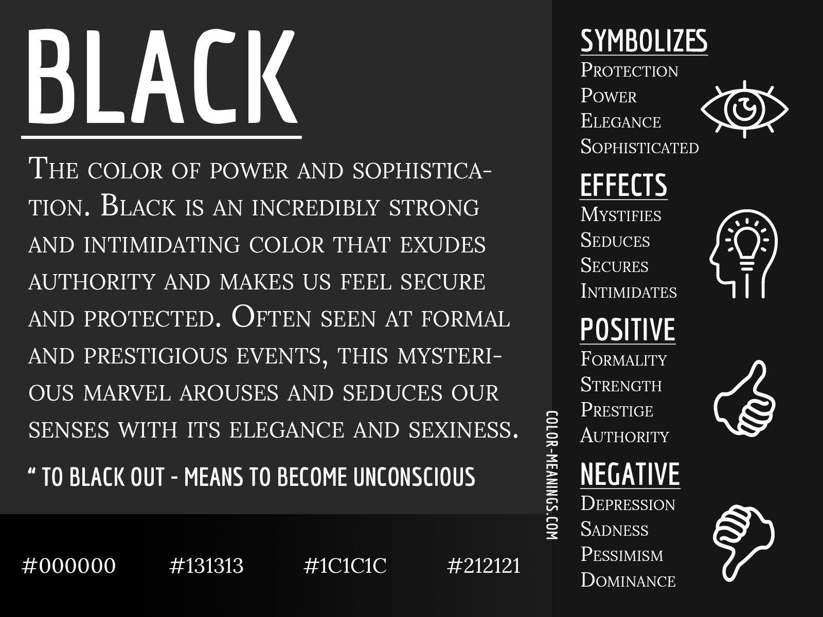
This article delves into the multifaceted world of black, exploring its symbolic power, its strategic deployment in brand building, and the careful considerations necessary to harness its immense potential effectively. From luxury fashion houses to tech giants, black has been a perennial favorite, but its impact is rarely accidental. It’s a deliberate decision, often rooted in a deep understanding of human perception and market dynamics. By peeling back the layers of its meaning, we can unlock how brands leverage black to communicate sophistication, strength, mystery, and an unshakeable sense of prestige, shaping consumer perception and forging lasting connections.
The Psychology of Black: A Spectrum of Interpretations
The human mind assigns a rich array of meanings to the color black, making it one of the most psychologically potent colors in existence. Its interpretations are diverse, ranging from the universally acknowledged to the culturally nuanced, yet certain core associations consistently emerge, proving invaluable for branding.
Authority, Power, and Sophistication
Black is unequivocally linked with authority and power. Think of the formal wear of executives, judges, and security personnel; the black suit is a universal symbol of seriousness, control, and respect. This psychological anchoring stems from its visual weight and definitive presence. It commands attention without needing to shout. For brands, this translates into an immediate perception of gravitas and stature. A brand that extensively uses black in its identity often seeks to convey that it is established, strong, and in command of its domain. This isn’t just about being “big” but about being influential and having a strong, authoritative voice in its industry.
Beyond mere power, black also embodies sophistication. It’s the color of elegance, refinement, and timeless style. From the “little black dress” to high-end automobiles, black exudes an understated glamour that speaks volumes without ostentation. It suggests a curated taste, an appreciation for quality over flashiness, and an inherent sense of class. Brands aiming for a high-end or luxury market frequently leverage black to align themselves with this sophisticated image, suggesting that their products or services are not merely functional but represent a lifestyle choice of discerning individuals.
Mystery, Elegance, and Exclusivity
There’s an inherent allure to black that stems from its enigmatic quality. It conceals, it protects, and it holds secrets. This sense of mystery can be incredibly powerful in branding, creating an aura of intrigue and depth around a product or service. Brands that wish to appear cutting-edge, innovative, or even a little unconventional often employ black to signal this elusive quality, inviting consumers to explore and discover what lies beneath the surface. This can foster a sense of curiosity and engagement, making the brand feel more aspirational or exclusive.
Coupled with mystery is an undeniable elegance. Black is sleek, clean, and often associated with minimalist design principles. It can make other colors pop, or it can stand alone as a statement of refined simplicity. This elegance often goes hand-in-hand with exclusivity. When something is presented in black, especially in packaging or limited editions, it often signals rarity and premium status. It suggests that not everyone can have it, or that those who do are part of an exclusive group. This psychological tactic plays on desires for status and unique ownership, making consumers feel privileged to engage with the brand.
Control, Seriousness, and Formality
The color black evokes a strong sense of control and seriousness. In branding, this can be crucial for industries where trust, precision, and reliability are paramount. Financial institutions, legal firms, and security companies often integrate black into their branding to underscore their commitment to integrity, rigor, and meticulous attention to detail. It communicates that they are not frivolous or lighthearted but are deeply focused on their core responsibilities.
Furthermore, black inherently conveys formality. It’s the color of ceremonies, official documents, and professional settings. For brands, this means that black can be used to establish a formal tone, signaling that their offerings are of a serious nature and demand respect. This doesn’t mean a brand must be stiff or unapproachable, but rather that it maintains a certain level of professionalism and decorum. It helps to set expectations for the brand’s interaction style and the quality of its service or product.
Black in Brand Strategy: Crafting Identity and Perception
Integrating black into a brand’s visual identity is a strategic decision that shapes how it is perceived, influencing everything from market positioning to consumer trust. Its application is deliberate, chosen to resonate with specific brand values and target demographics.
Establishing Premium and Luxury Positioning
Perhaps black’s most celebrated role in branding is its ability to instantly signal premium quality and luxury. High-end fashion brands like Chanel, Dior, and Yves Saint Laurent have long relied on black as a cornerstone of their identities, evoking sophistication, exclusivity, and timeless elegance. The understated power of black allows the product itself to shine, while the packaging or brand collateral imbues it with an aura of prestige. This positioning is not accidental; it’s a direct consequence of black’s psychological associations with quality, craftsmanship, and a discerning taste that transcends fleeting trends. For luxury brands, black isn’t just a color; it’s a statement about their heritage, their design philosophy, and their commitment to excellence.
Conveying Strength and Reliability
Beyond luxury, black serves as a powerful symbol of strength, durability, and reliability. Industrial brands, automotive manufacturers, and tech companies often leverage black to communicate robustness and cutting-edge performance. Think of power tools, heavy machinery, or advanced electronics; black suggests resilience, sophisticated engineering, and a product designed to perform under pressure. For consumers, this translates into trust. A black product or brand identity can imply that the company stands behind its offerings, that they are built to last, and that they embody a steadfast commitment to quality and functionality. This makes black an excellent choice for brands that want to project stability, security, and unwavering competence in their respective fields.
Embracing Minimalism and Modernity
In an increasingly cluttered visual landscape, many modern brands strive for clarity, simplicity, and a clean aesthetic. Black is a cornerstone of minimalist design, allowing brands to cut through noise and focus on essential elements. Its starkness can create a powerful visual statement that feels contemporary and forward-thinking. Brands like Apple (in its early days and for specific product lines), Nike, and various design agencies often use black to achieve a sleek, sophisticated, and modern look. This approach not only enhances readability and visual impact but also communicates a brand philosophy that values precision, efficiency, and a focus on core function over superfluous ornamentation. Black, in this context, becomes a symbol of intelligent design and a confident, modern outlook.
Design Considerations: Mastering Black’s Visual Impact
While black is a versatile and powerful color, its effective use in branding requires careful consideration of its nuances, interactions with other colors, and specific applications across various mediums.

The Nuances of “True Black” and Its Variations
“Black” is rarely just one color. In design, there are countless variations, each with a subtle yet significant impact. Pure black (often referred to as “true black” or “rich black” in print, which mixes CMYK values to create a deeper, more saturated black) versus a simple k-only black can have vastly different effects. A flat, untextured black might feel severe or hollow, while a rich, deep black can exude luxury and depth. Designers also play with shades of black, incorporating hints of blue, brown, or even purple to create warm blacks, cool blacks, or soft blacks, which can profoundly alter the emotional temperature of a brand’s visual identity. Understanding these subtle variations and their psychological effects is crucial for ensuring the chosen “black” aligns perfectly with the brand’s desired tone and message, whether it’s a soft, approachable sophistication or a stark, powerful dominance.
Pairing Black with Other Colors for Maximum Effect
Black rarely works in isolation; its true power is often unlocked through its interaction with other colors. Black provides a grounding, anchoring effect, making other colors appear more vibrant, crisp, and defined.
-
Black and White: The classic monochrome pairing is timeless, representing stark contrast, clarity, and sophistication. It’s a minimalist’s dream, conveying elegance and precision.
-
Black and Gold/Silver: This combination is the epitome of luxury and opulence. Gold or silver accents on a black background instantly elevate a brand to premium status, signaling exclusivity and high value.
-
Black and Bright Accents: Pairing black with a single, vibrant accent color (e.g., a bold red, electric blue, or shocking pink) creates dynamic tension and can make the accent color pop dramatically. This strategy is often used by modern brands to inject personality and energy while maintaining a sophisticated base.
-
Black and Earth Tones: For a more grounded, organic, or understated luxury feel, black can be paired with natural greens, deep browns, or muted greys to create a sophisticated yet approachable palette.
Strategic color pairing allows brands to leverage black’s strengths while introducing additional emotional layers and visual interest, ensuring the overall palette tells a cohesive brand story.
Practical Applications: Logos, Packaging, and Digital Interfaces
Black’s versatility makes it applicable across virtually all brand touchpoints.
-
Logos: A black logo often conveys timelessness, strength, and professionalism. Its simplicity ensures readability and memorability, and it works well across various backgrounds and applications. Many iconic brands maintain black as their primary logo color for these reasons.
-
Packaging: Black packaging immediately signals premium quality, exclusivity, and a heightened sensory experience. It creates anticipation and elevates the perceived value of the product inside, particularly effective in cosmetics, spirits, and luxury goods.
-
Digital Interfaces: In web design and apps, black can create a sleek, modern, and immersive user experience. Dark modes are popular for reducing eye strain and enhancing content, while black backgrounds can make vibrant UI elements stand out. However, overuse can lead to a heavy or overwhelming feel, requiring careful balance with lighter elements and ample white space.
-
Merchandise & Uniforms: Black apparel for uniforms or merchandise conveys professionalism, unity, and a sense of understated authority. It’s practical, sophisticated, and universally flattering.
Each application requires a nuanced approach, considering the medium, the target audience, and the overarching brand message to ensure black is used to its fullest potential without unintended negative connotations.
Cultural and Contextual Meanings: A Global Perspective
While some associations with black are universal, its meaning can be profoundly influenced by cultural context and historical perception, which brands must navigate carefully, especially in global markets.
Western Perceptions vs. Eastern Interpretations
In many Western cultures, black carries strong associations with death, mourning, and sorrow, particularly in traditional funeral attire. However, it also signifies formality, power, elegance, and rebellion. In contrast, certain Eastern cultures hold different interpretations. For instance, in some parts of Asia, white is the color of mourning, while black can be associated with prosperity, masculinity, or simply be seen as a neutral, formal color. In China, black historically symbolized water, winter, and the north, and has been associated with stability, formality, and even honor. In Japan, black can represent mystery, experience, and the void, but also sophistication and formality.
Brands expanding globally must conduct thorough cultural research to ensure their use of black resonates positively and appropriately with local audiences. What signifies luxury and power in New York might carry an entirely different, potentially detrimental, meaning in Beijing or Mumbai.
Evolution of Black’s Symbolism in Contemporary Culture
The meaning of black is not static; it evolves with societal shifts and emerging trends. In contemporary culture, black has cemented its status as the color of modern minimalism, sustainability (often linked with recycled materials or eco-conscious brands due to its utilitarian aesthetic), and sophisticated technology. The rise of “dark mode” in digital interfaces, for example, has popularized black as a functional and aesthetic choice beyond its traditional symbolic meanings.
Furthermore, black has long been intertwined with counter-culture movements, rebellion, and artistic expression, giving it an edge that many contemporary brands leverage to appeal to younger, more avant-garde audiences. This dynamic evolution means brands must stay attuned to current cultural currents to ensure their use of black remains relevant and impactful, avoiding outdated or unintended associations.
Strategic Pitfalls and How to Avoid Them
Despite its immense power, the strategic use of black in branding is not without its challenges. Missteps can lead to unintended negative perceptions or dilute the brand’s overall message.
Overuse and Potential for Negative Associations
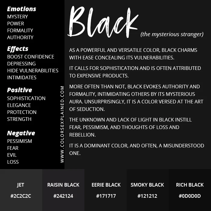
While black conveys authority and sophistication, its overuse can lead to a brand appearing overly somber, aggressive, or even oppressive. Too much black can feel heavy, unapproachable, or monotonous, draining energy rather than evoking it. In some contexts, particularly for brands aiming for warmth, friendliness, or accessibility, an abundance of black might create a barrier with the audience. For instance, a children’s toy brand or a wellness product might find that black conflicts with their core message of joy, comfort, or vitality.
Furthermore, the negative associations of black (death, evil, sadness, fear) can inadvertently seep into brand perception if not managed carefully. Brands must consciously balance black with other colors, textures, and messaging to mitigate these potential drawbacks and ensure the overall impression remains positive and aligned with brand values. The goal is to harness black’s power without succumbing to its darker side.
Ensuring Brand Cohesion and Messaging Clarity
A critical pitfall is using black without a clear strategic purpose, leading to a disjointed brand identity. If a brand’s values are about openness, community, and vibrancy, an all-black identity might create confusion. The color black chosen must be harmonious with the brand’s core message, mission, and the emotional response it wishes to elicit. It’s not enough for black to “look good”; it must mean something specific within the context of the brand.
Achieving brand cohesion means that every element—from the choice of black’s shade to its pairing with fonts and imagery—works together to reinforce a unified narrative. Brands should conduct thorough market research and internal strategy sessions to define precisely what black should communicate for them. This clarity ensures that black enhances the brand’s message, rather than complicating or contradicting it, creating a powerful, consistent, and memorable identity that resonates deeply with its target audience.
In conclusion, the color black is far more than a mere hue; it is a profound semantic tool in the brand strategist’s arsenal. Its meanings are rich, varied, and potent, capable of communicating everything from luxury and power to mystery and modernity. By understanding its psychological impact, cultural nuances, and design considerations, brands can master the art of using black to forge identities that are not only visually striking but also deeply resonant, strategically effective, and timelessly impactful.
aViewFromTheCave is a participant in the Amazon Services LLC Associates Program, an affiliate advertising program designed to provide a means for sites to earn advertising fees by advertising and linking to Amazon.com. Amazon, the Amazon logo, AmazonSupply, and the AmazonSupply logo are trademarks of Amazon.com, Inc. or its affiliates. As an Amazon Associate we earn affiliate commissions from qualifying purchases.