
In the world of brand strategy and corporate identity, color is never “just a color.” It is a psychological trigger, a cultural shorthand, and a strategic tool that dictates how an audience perceives the values of an organization. When we ask, “What color is democratic?” we aren’t merely discussing political affiliations or the specific hex codes used by a party. Instead, we are exploring the concept of “democratic branding”—the visual markers of accessibility, inclusivity, transparency, and the “common man.”
A democratic brand is one that positions itself as being “for the people.” It avoids the gatekeeping visual cues of luxury or the aggressive posturing of disruptive tech. To understand what color democracy wears, we must dive into the psychology of visual identity and the strategic choices that allow a brand to feel approachable to the widest possible demographic.
The Psychology of Blue: Why Stability Defines Democratic Identity
If there is one color that dominates the concept of democratic institutions globally, it is blue. From the United Nations to the logos of the world’s largest social networks, blue has become the universal signifier of trust, stability, and collective belonging. In the context of brand strategy, blue is the “safe” choice, but its prevalence in democratic aesthetics is far from accidental.
The Historical Weight of Blue in Institutional Trust
Blue is one of the few colors that maintains a positive or neutral connotation across almost every culture. Unlike red, which can signal danger or passion, or yellow, which can signal caution, blue is associated with the sky and the sea—vast, constant, and universal. For a brand trying to appear “democratic,” these associations are vital. They suggest that the brand is a pillar of the community, something that is reliable and won’t change overnight.
When a brand chooses a mid-tone or navy blue, it is communicating that it is an “institutional” player. It is not trying to be a rebel; it is trying to be the foundation. This is why financial institutions and government agencies—entities that need to appear democratic and accountable—default to this palette.
From Politics to Corporate Identity: The Blue Wave
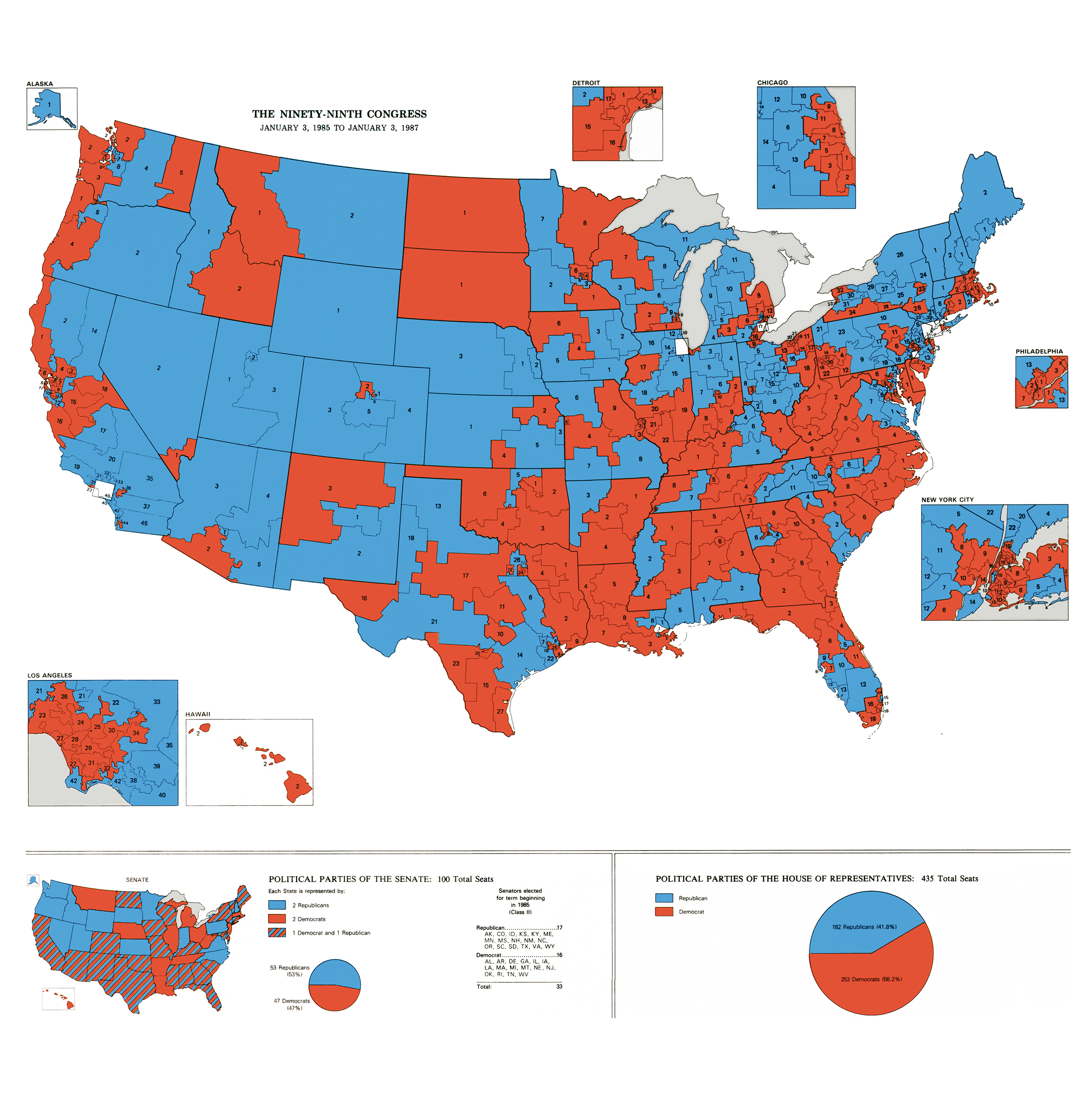
In the United States, the association between the color blue and the Democratic Party has solidified since the 2000 election. However, in a broader branding context, this “Democratic Blue” represents more than just a party line; it represents a specific type of corporate populism. Tech giants like Facebook, LinkedIn, and Twitter (in its original form) utilized blue to suggest a “Global Town Square.” The goal was to look like a utility—a democratic space where everyone has a voice. By adopting the color of democracy, these brands successfully integrated themselves into the daily lives of billions, positioning their platforms as essential public infrastructure.
Beyond the Ballot: Branding for the “Common Man”
To create a democratic brand identity, a designer must look beyond a single color and focus on the “democratic aesthetic.” This involves a shift away from exclusivity and toward high-legibility, high-contrast, and “honest” color palettes. A democratic brand does not try to hide behind complex gradients or gold-foiled textures; it presents itself clearly.
Democratic Design Principles: Accessibility and Readability
A brand that is truly democratic must be accessible to people of all visual abilities. This is where brand strategy meets social responsibility. In a democratic visual system, the “colors” are often defined by their contrast ratios. High-contrast pairings—such as black on white, or navy on off-white—are the hallmarks of democratic design because they ensure that the message is legible to everyone, including those with visual impairments.
In this niche, “Democratic” is less about a specific hue and more about the clarity of that hue. Brands like IKEA or Target use primary colors (Blue/Yellow and Red/White, respectively) to signal that they are for the masses. Primary colors are the building blocks of the visual world; they are understood by children and adults alike, making them the most democratic tools in a designer’s toolkit.
Case Study: How “Everyday” Brands Use Color to Signal Value
Consider the branding of a grocery chain like Aldi or Lidl compared to a high-end organic boutique. The “democratic” brand uses bold, unapologetic colors. There is no nuance or “greige” (gray-beige) palettes that signal “expensive minimalism.” Instead, the use of bright blues, reds, and oranges tells the consumer: “This is for you. You can afford this. You belong here.” This is strategic color placement used to bridge the gap between a corporate entity and the working-class consumer, creating a visual sense of economic democracy.
The Shift Toward Vibrancy: Modern Democratic Branding

As we move further into the 21st century, the definition of what looks “democratic” is evolving. The traditional, stoic navy blue is being challenged by a more vibrant, diverse palette. Modern democratic branding is less about “fitting in” and more about “representing everyone.”
Breaking the Monolith: Inclusive Palettes and Diversity
A new wave of brand strategy focuses on “Inclusive Design.” Here, the color of democracy is not one color, but a spectrum. Brands are increasingly moving away from a single corporate color toward a multi-colored approach. This reflects a modern understanding of democracy as a pluralistic society.
When a brand uses a palette that includes various skin tones, or a “rainbow” of secondary colors, it is signaling that its “democracy” includes marginalized groups. This is a move from “Universalism” (everyone is the same) to “Inclusivity” (everyone is different but equal). For a brand, this means that the “democratic” color is often a dynamic one—one that changes or expands based on the context of the audience.
The Rise of Purple and the “Middle Ground” Strategy
In polarized markets, many brands are looking for a “purple” strategy. By blending the traditional red and blue, brands can signal a “Big Tent” philosophy. Purple is historically associated with royalty, but in modern brand strategy, it has been reclaimed as the color of bipartisanship and unity. Brands that want to avoid being pigeonholed into a specific political or social niche often adopt purple or teal. This allows them to appear democratic in the sense of being a “unifier”—a space where different ideologies can meet.
Brand Strategy: Implementing a “Democratic” Aesthetic
For a business owner or a marketing executive, choosing to “go democratic” with a visual identity is a specific strategic move. It is the opposite of “prestige branding.” While prestige branding relies on dark tones, metallic accents, and lots of “white space” to signal scarcity and high cost, democratic branding relies on “fullness” and “vibrancy.”
Avoiding Elitism in Luxury Branding through Color
If a brand wants to be perceived as democratic, it must strictly avoid “luxury” markers. Gold, silver, and deep “wine” reds are often perceived as elitist. They suggest a barrier to entry. If your brand strategy is to capture a mass market, your palette should favor “open” colors—sky blues, grass greens, and clear whites.
Even the finish of the color matters. A matte finish is often perceived as more “honest” and “democratic” than a high-gloss or metallic finish. This is because matte surfaces don’t reflect or distort; they are exactly what they appear to be, which aligns with the democratic value of transparency.
The Role of Contrast and Clarity in Visual Equity
Visual equity is the idea that every person should have the same experience with a brand, regardless of their background or physical ability. In branding, this is achieved through rigorous testing of color palettes. A “democratic” brand strategist will use tools to ensure that their color choices pass WCAG (Web Content Accessibility Guidelines). If a brand’s colors are not accessible, the brand is, by definition, not democratic. It is excluding a portion of the population. Therefore, the “color” of democracy is often defined by its luminance—the brightness and contrast that allow the brand to be “seen” by all.
The Future of Color in Global Brand Identity
As brands expand globally, the question of “What color is democratic?” becomes even more complex. Brand strategy must account for the fact that color meanings are not universal. While blue is a safe bet in the West, other colors take the lead in different democratic contexts.
Cultural Nuances: When Blue Isn’t Democratic
In some cultures, white is the color of mourning, while in others, it is the color of purity and new beginnings. In many parts of the world, green is the color most associated with “the people” and social movements. A global brand must be careful not to impose a Western “Blue/Red” democratic binary on a market where those colors might carry different baggage. The future of democratic branding lies in “localization”—the ability to adapt a brand’s color palette to reflect the local visual language of the “common man” without losing the core identity of the corporation.

Sustaining a Democratic Brand in a Polarized Market
In an era of intense social polarization, brands are finding it harder to stay “neutral.” Every color choice is scrutinized. However, the most successful democratic brands are those that return to the core principles of the aesthetic: simplicity, honesty, and accessibility. By focusing on colors that promote clarity and trust, rather than those that signal “tribal” affiliation, brands can maintain a democratic identity that transcends temporary political shifts.
In conclusion, the color of democratic branding is not a single point on the visible spectrum. It is a strategic philosophy. It is the use of Blue to build trust, Primary Colors to signal accessibility, and High-Contrast Palettes to ensure inclusivity. To be “democratic” in the world of branding is to be visible, legible, and welcoming to all. It is the visual manifestation of the promise that a brand is not just for the few, but for the many.
aViewFromTheCave is a participant in the Amazon Services LLC Associates Program, an affiliate advertising program designed to provide a means for sites to earn advertising fees by advertising and linking to Amazon.com. Amazon, the Amazon logo, AmazonSupply, and the AmazonSupply logo are trademarks of Amazon.com, Inc. or its affiliates. As an Amazon Associate we earn affiliate commissions from qualifying purchases.