
In the competitive landscape of modern marketing, where digital noise often drowns out substance, brand architects are increasingly looking toward the past to anchor their visual identities in something tangible, credible, and enduring. One of the most potent symbols in this resurgence of “heritage branding” is the apothecary jar. While traditionally a functional vessel for chemists and herbalists, the apothecary jar has evolved into a sophisticated branding tool that communicates precision, transparency, and artisanal quality.
For a brand strategist, an apothecary jar is more than a glass container; it is a high-connotation design element used to command premium pricing and foster consumer trust. Understanding the intersection of its historical utility and its modern psychological impact is essential for any brand looking to position itself within the luxury, wellness, or artisanal sectors.

The Evolution of the Apothecary Jar in Modern Brand Strategy
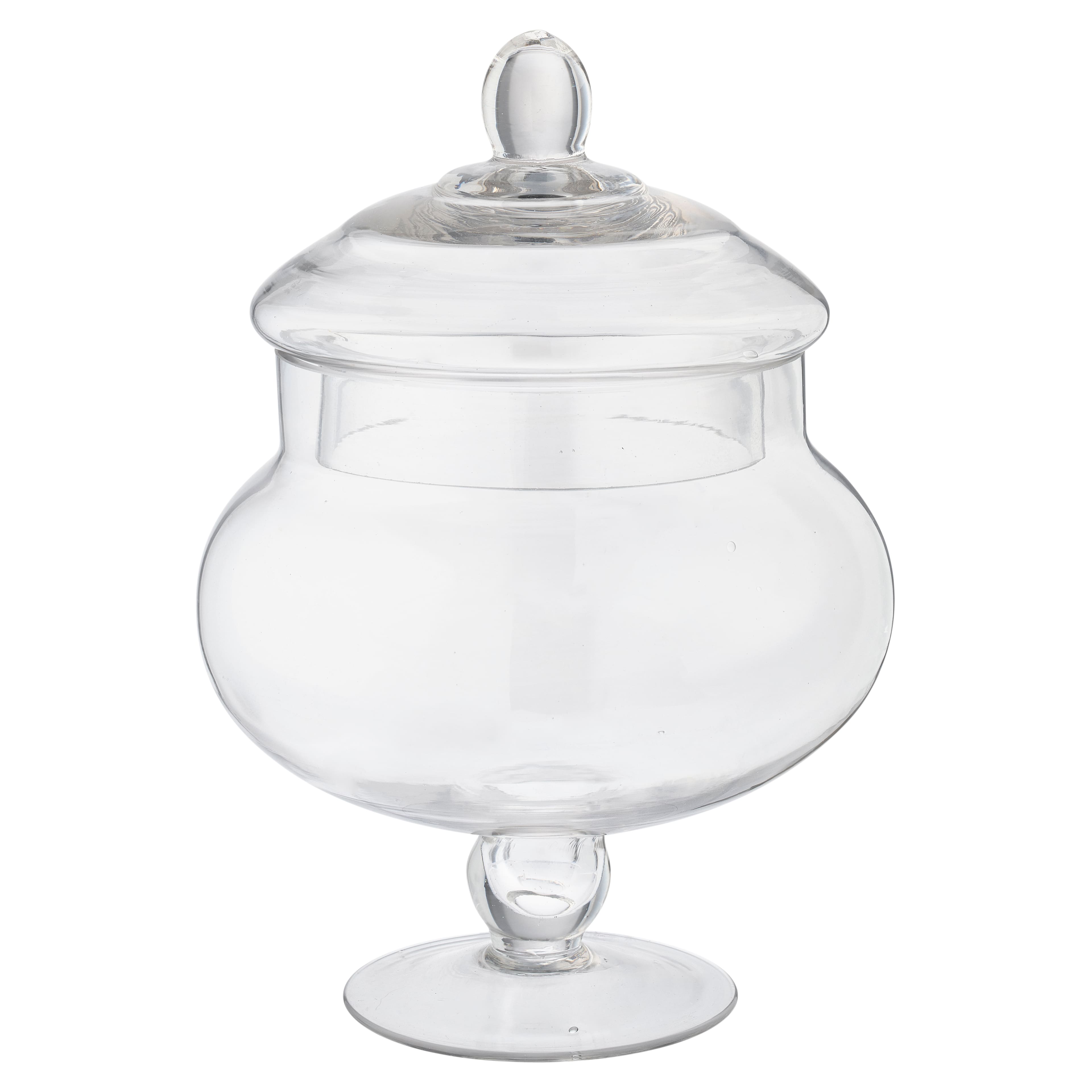
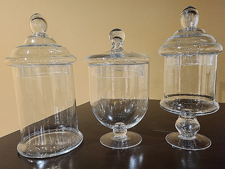
The origins of the apothecary jar date back to the 13th century, particularly in the Middle East and Europe, where they were used to store medicinal herbs, tinctures, and chemical compounds. These vessels were designed for durability and protection, often featuring heavy glass or ceramic walls and airtight stoppers. In the context of branding, this history is invaluable. It taps into the “Pharmacist’s Credibility”—a subconscious association with expertise, healing, and formulated precision.
In the late 20th century, mass production led to a saturation of plastic packaging, which prioritized cost-efficiency over aesthetics. However, as the market moved toward the “Premiumization” trend of the 2010s and 2020s, brands began to revert to the apothecary aesthetic to differentiate themselves from the disposable nature of “fast” retail. Today, the jar serves as a cornerstone for brand storytelling, bridging the gap between ancient wisdom and modern science.
From Utility to Luxury Iconography
The transition of the apothecary jar from a functional medical tool to a luxury icon was driven by the fragrance and skincare industries. Brands like Kiehl’s, Le Labo, and Aesop have utilized the cylindrical, amber-hued, or clear glass jars to create a “laboratory chic” aesthetic. This choice is a deliberate brand strategy to signal that the product inside is the result of rigorous research and small-batch craftsmanship. By adopting this silhouette, a brand immediately bypasses the need to explain its quality; the packaging performs the heavy lifting of establishing prestige.
The Rise of the “Clean Label” Movement
In brand design, the apothecary jar is the ultimate vessel for the “clean label” movement. Because these jars are often transparent or use minimalist labeling that mimics old-fashioned prescription pads, they suggest that the brand has nothing to hide. In an era where consumers are skeptical of “greenwashing” and synthetic ingredients, the apothecary aesthetic offers a visual shorthand for transparency. It suggests that the contents are pure enough to be showcased in glass, rather than hidden behind opaque, multi-layered plastic.
The Psychology of the Apothecary Aesthetic: Trust and Tactility
The effectiveness of the apothecary jar in branding lies in the psychological triggers it activates in the consumer. A brand strategist must consider not just how a product looks on a shelf, but how it feels in the consumer’s hand and what emotional resonance it carries.
The Weight of Authority
In the world of packaging design, weight is often equated with value. Plastic is light and perceived as cheap; glass is heavy and perceived as permanent. The thick-walled base of a traditional apothecary jar provides a physical “anchor” for the brand. When a customer picks up a heavy glass jar, the tactile feedback reinforces the idea that the product is an investment. This is a crucial element of brand positioning: the physical sensation of the packaging should match the price point and the brand’s promise of quality.
Nostalgia and the “Heritage Play”
Human beings are naturally drawn to heritage. Even for “Digital Native Vertical Brands” (DNVBs) that have no real history, adopting apothecary-style packaging creates a “synthetic heritage” that makes the brand feel established. This use of nostalgia is a powerful marketing tool. It evokes a time when products were made to last and were sold by experts rather than algorithms. By using apothecary jars, a brand can tap into the collective memory of the local pharmacy or the old-world perfumery, creating an immediate sense of familiarity and safety.
Minimalist Stoicism
Modern apothecary branding often leans into minimalism. The jar itself—whether it features a ground-glass stopper, a cork, or a simple black screw cap—becomes the hero. This stoic design approach tells the consumer that the brand is confident. It doesn’t need loud colors, flashing graphics, or hyperbolic claims to get attention. This “quiet luxury” approach is highly effective for targeting high-net-worth individuals and sophisticated consumers who value subtlety over overt marketing.
Case Studies: Successful Brand Deployment of Apothecary Elements
To understand the impact of the apothecary jar on brand equity, one must look at the market leaders who have successfully integrated this vessel into their corporate identity.
Kiehl’s Since 1851: The Original Blueprint
Kiehl’s is perhaps the most famous example of a brand that has maintained its apothecary roots to build a global empire. Their packaging is deliberately utilitarian. The jars look like they could have been pulled off a shelf in the 19th century. By maintaining this consistent visual identity, Kiehl’s has successfully scaled from a single New York pharmacy to a multi-billion dollar brand under the L’Oréal umbrella, all while keeping the “small-town expert” feel that drives customer loyalty.
Le Labo: The Power of the Prescription Label
Le Labo revolutionized the fragrance industry by utilizing the apothecary aesthetic to its fullest potential. Their bottles are essentially modern apothecary jars, but the true genius lies in the labeling. Each label is printed on-site with the date, the location, and a “compounded for” name, mimicking a personalized medical prescription. This brand strategy shifts the product from a mass-produced luxury good to a bespoke, hand-crafted remedy. The jar is the stage, and the label is the story.
Diptyque and the Evolution of the “Votive”
While primarily known for candles, Diptyque’s glass vessels are a modern evolution of the apothecary jar. The clear glass and the iconic oval label—reminiscent of 18th-century medallions—create a brand identity that is both scholarly and artistic. When the candle is finished, the jar is rarely thrown away; it is repurposed as a storage vessel for makeup brushes or pens. This “second life” of the packaging is a brand strategist’s dream, as it ensures the brand remains a permanent fixture in the consumer’s home long after the initial purchase.
Incorporating Apothecary Elements into Your Corporate Identity
For brands looking to adopt this aesthetic, it is not enough to simply put a product in a glass jar. The execution must be precise to avoid looking like a generic imitation.
Typography and Labeling Strategy
The label is the most critical companion to the apothecary jar. To maintain the brand’s integrity, designers often opt for:
- Monospaced Fonts: Suggesting a typewriter or an old printing press.
- Serif Typefaces: Evoking tradition and academic authority.
- Grid-Based Layouts: Utilizing technical data, ingredient percentages, and “batch numbers” to emphasize the formulation’s scientific nature.
- Tactile Paper Stocks: Using uncoated, textured paper that feels organic to the touch.
Materiality and Sustainability
In the modern market, the apothecary jar is also a statement on sustainability. Glass is infinitely recyclable and, more importantly, reusable. Brands that utilize apothecary jars can build their identity around the “Circular Economy.” Offering “refill stations” or encouraging customers to repurpose their jars aligns the brand with environmentally conscious values. This adds a layer of “Ethical Branding” to the aesthetic appeal, making the choice of an apothecary jar both a visual and a moral decision.
Color Theory in Apothecary Glass
The choice of glass color is a key strategic decision:
- Amber Glass: Traditionally used to protect light-sensitive chemicals, it now signals “natural,” “organic,” or “remedial” qualities.
- Clear Glass: Communicates purity, transparency, and modernism.
- Cobalt Blue: Evokes a sense of mystery, luxury, and 19th-century “poison bottle” intrigue, often used in premium spirits or night-time skincare.
The Future of the Apothecary Jar in Brand Design
As we look toward the future of brand strategy, the apothecary jar remains as relevant as ever. In a world increasingly dominated by the intangible—AI, digital services, and the metaverse—physical products that ground us in history and sensory experience become more valuable.
The apothecary jar is the antithesis of the digital age. It is heavy, it is fragile, it is beautiful, and it requires a certain level of mindfulness to use. For brands, it represents a commitment to quality over speed. Whether it is used in the beauty industry, the food and beverage sector, or even as a decorative element in high-end corporate offices, the apothecary jar stands as a testament to the power of timeless design.
In conclusion, “what is an apothecary jar?” is not a question about a piece of glass. It is a question about how a brand chooses to present its soul to the world. By choosing the apothecary aesthetic, a brand is declaring that it values heritage, transparency, and the enduring power of well-crafted design. It is a strategic move that transforms a simple product into a legacy.
aViewFromTheCave is a participant in the Amazon Services LLC Associates Program, an affiliate advertising program designed to provide a means for sites to earn advertising fees by advertising and linking to Amazon.com. Amazon, the Amazon logo, AmazonSupply, and the AmazonSupply logo are trademarks of Amazon.com, Inc. or its affiliates. As an Amazon Associate we earn affiliate commissions from qualifying purchases.