
In the landscape of modern commerce, visual communication often precedes verbal interaction. Long before a potential client reads a mission statement or views a product demonstration, they have already formed a subconscious opinion of a brand based on its visual identity. When we ask the question, “What colour are you?” we are not simply engaging in a whimsical exercise. Instead, we are delving into the profound world of brand strategy and visual psychology—a discipline where specific hues translate into trust, urgency, luxury, or innovation.
Understanding your brand’s color profile is a foundational step in establishing a market presence that resonates with a target audience. It is the difference between blending into the background and creating an indelible mark in the consumer’s mind. This guide explores the strategic application of color psychology, how to define your brand’s chromatic DNA, and the methodologies for implementing these choices across a cohesive corporate identity.
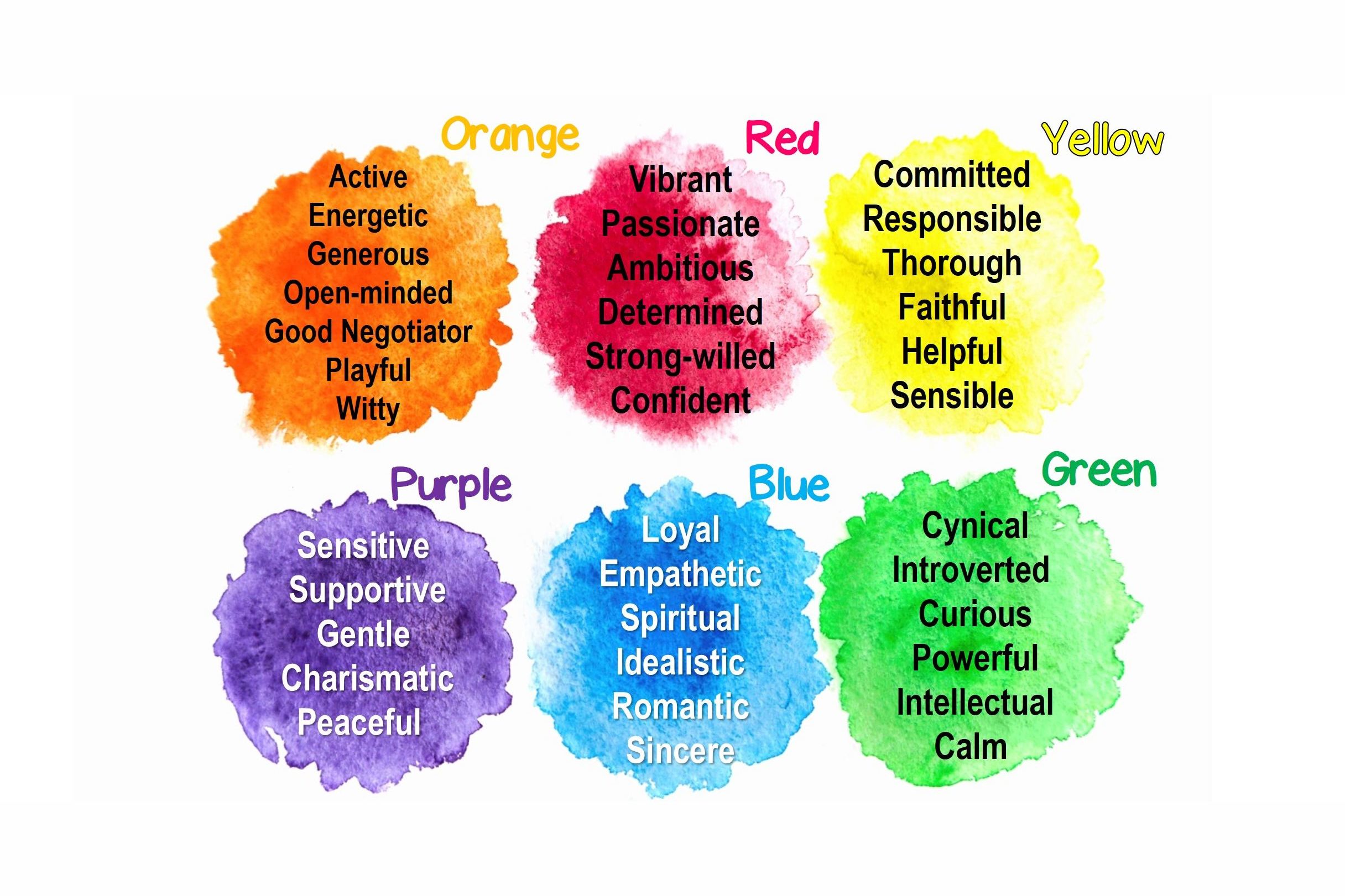
The Science of Perception: Color Psychology in Modern Branding
Color psychology is the study of how hues affect human behavior and decision-making. In branding, it is a tool used to evoke specific emotions and reinforce brand values. Research suggests that up to 90% of snap judgments made about products can be based on color alone. Therefore, choosing the right palette is not merely a matter of aesthetic preference; it is a critical business decision.
Blue: The Anchor of Trust and Professionalism
Blue is arguably the most prevalent color in the corporate world, particularly within the technology, finance, and healthcare sectors. It is psychologically associated with stability, intelligence, and reliability. When a brand identifies as “Blue,” it is signaling to the market that it is a safe pair of hands.
For financial institutions, a deep navy suggests tradition and security. For tech giants, a vibrant sky blue or “electric” blue suggests innovation combined with a user-friendly approach. The strategic goal of a blue-centric brand is to lower the consumer’s perceived risk, fostering a sense of long-term partnership.
Red: Energy, Urgency, and the Call to Action
At the opposite end of the spectrum lies Red. This color is physiologically known to increase the heart rate and create a sense of urgency. Brands that lean into red are often those that thrive on excitement, passion, and immediate action. In the food and beverage industry, red is frequently used to stimulate appetite, while in retail, it is the primary tool for clearance sales and limited-time offers.
A “Red” brand is bold and provocative. It does not wait for the customer to approach; it demands attention. However, strategic application is key—too much red can trigger feelings of danger or aggression, so it must be balanced with neutral tones to maintain a premium feel.
Green: Growth, Health, and Sustainability
In an era where Corporate Social Responsibility (CSR) and sustainability are at the forefront of consumer consciousness, Green has become a powerhouse in brand strategy. It represents nature, renewal, and ethical practices. For brands in the organic food, wellness, or renewable energy sectors, green is the natural choice.
Beyond environmentalism, green is also the color of “go.” It signals safety and permission. A brand that identifies as green often positions itself as a nurturing entity, focused on the well-being of the consumer and the planet.
Decoding Your Brand DNA: The Strategic Selection Process
Determining “what colour you are” requires a rigorous audit of your brand’s core values, target demographic, and competitive landscape. It is a process of alignment—ensuring that the visual output matches the internal reality of the business.
Defining Brand Archetypes
Before selecting a palette, a brand must identify its archetype. Are you the “Explorer” (rugged, earthy tones), the “Sage” (sophisticated, muted greys and blues), or the “Magician” (mysterious purples and deep indies)? Archetypal branding provides a framework that makes color selection more objective.
For instance, a brand positioning itself as an “Outlaw” or a disruptor in the tech space would likely avoid the safe, corporate blues. Instead, they might opt for a high-contrast combination of black and neon yellow to signal a break from tradition. By identifying the brand’s personality first, the color selection becomes a logical extension of that identity.
Analyzing the Competitive Landscape
In brand strategy, “differentiation” is the name of the game. If every major competitor in your niche is using blue, there is a significant strategic advantage to choosing a different path. This is known as “visual disruption.”
By conducting a competitive color audit, a brand can find “white space” in the market. If the industry is dominated by clinical whites and greys, a brand that introduces a warm terracotta or a vibrant teal will immediately stand out on a shelf or in a digital feed. The goal is to be recognizable at a glance, creating a shorthand for your brand that does not require words.
Designing a Cohesive Brand Identity System
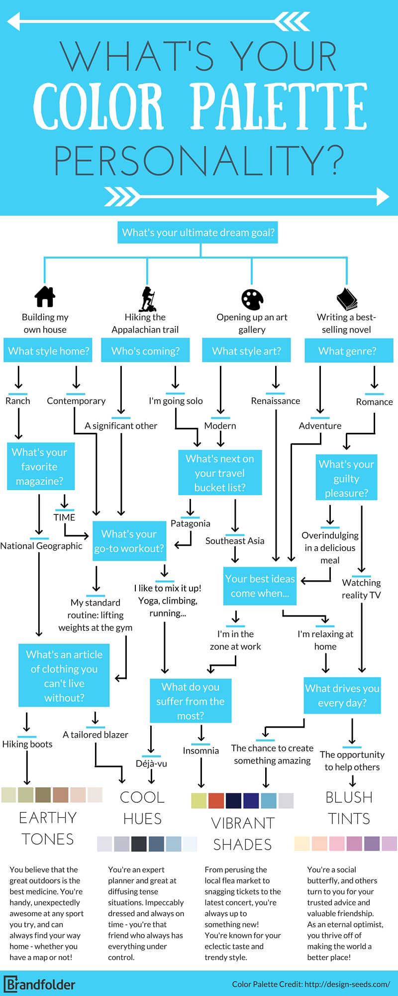
Once the primary color is identified, the next step is building a comprehensive system. A brand is rarely a single color; it is a symphony of primary, secondary, and accent tones that work together to create a visual language.
The 60-30-10 Rule in Visual Identity
A common mistake in branding is using too many colors in equal proportions, which leads to visual clutter and a lack of focus. Strategic design often follows the 60-30-10 rule:
- 60% Primary Color: This is the dominant brand color, usually used for backgrounds or the most significant brand assets.
- 30% Secondary Color: This supports the primary color and adds depth to the visual identity.
- 10% Accent Color: This is a high-contrast color used sparingly for calls to action, buttons, or highlights.
This hierarchy ensures that the brand remains legible and professional across all mediums, from business cards to high-scale digital platforms.
The Role of Neutrals and Negative Space
High-level branding understands the power of what is not there. Neutrals—whites, blacks, and greys—act as the “connective tissue” of a brand’s visual identity. They provide the necessary breathing room for the primary colors to pop. A brand that identifies as high-end luxury often utilizes a large amount of white space combined with a single, sophisticated accent color like gold or deep emerald. This use of negative space signals confidence and exclusivity.
Case Studies: When Color Defined the Brand Story
To understand the impact of color selection, we can look at global leaders who have successfully “claimed” a color in the consumer’s mind.
Tiffany & Co.: The Power of the “Tiffany Blue”
Perhaps the most famous example of color as brand equity is Tiffany & Co. The specific shade of robin’s-egg blue used by the company is so central to its identity that it is a trademarked color (PMS 1837). This color evokes immediate feelings of luxury, heritage, and the excitement of a gift. The color itself has become a premium asset; the blue box is as iconic as the jewelry inside. This is the pinnacle of the “What colour are you?” question—where the color and the brand are synonymous.
Ferrari: The Red of Performance
Ferrari’s “Rosso Corsa” (Racing Red) is not just a paint choice; it is a statement of Italian national pride and high-octane performance. In the early days of motor racing, colors were assigned to nations, and red was Italy’s. Ferrari leaned into this, making the color a core part of its brand strategy. Today, a red sports car is almost universally associated with the Ferrari brand, regardless of the manufacturer. They have successfully monopolized the “Red” space within the luxury automotive industry.
Implementing Your Color Strategy Across Digital Touchpoints
In the digital age, a brand’s color identity must be versatile. It must look as good on a smartphone screen as it does on a physical billboard. This requires a technical understanding of color reproduction and digital accessibility.
Consistency Across Platforms
Strategic branding requires consistency. A brand’s blue must look the same on an Instagram post as it does on a printed brochure. This involves establishing strict brand guidelines that define color values in various formats:
- HEX codes for web design.
- RGB for digital displays and screens.
- CMYK for traditional printing.
- Pantone (PMS) for precise color matching in manufacturing and high-end print.
Consistency builds familiarity, and familiarity builds trust. If a brand’s colors shift slightly across different platforms, it can subconsciously signal a lack of attention to detail or a fragmented corporate structure.
Accessibility and Inclusive Design
A modern brand strategy must also consider accessibility. “What colour are you?” must also account for how that color is perceived by individuals with color vision deficiency (CVD). Strategic designers use high-contrast pairings to ensure that text remains readable and that brand elements are distinguishable for all users.
Incorporating accessibility is not just a legal or ethical requirement; it is a brand statement. It shows that the brand is inclusive, forward-thinking, and user-centric. By choosing a palette that meets Web Content Accessibility Guidelines (WCAG), a brand expands its reach and reinforces its reputation as a responsible market leader.

Conclusion: The Strategic Path Forward
So, what colour are you? The answer should be a reflection of your brand’s deepest ambitions and its promise to the customer. It is a strategic choice that bridges the gap between a company’s internal values and the external market’s perception.
Whether you choose the stability of blue, the passion of red, the growth of green, or the luxury of a well-placed neutral, your color palette is your silent ambassador. By applying the principles of psychology, analyzing the competitive landscape, and maintaining rigorous consistency, you can transform a simple “quiz” concept into a powerful engine for brand recognition and business growth. Color is the first chapter of your brand’s story—make sure it is a compelling one.
aViewFromTheCave is a participant in the Amazon Services LLC Associates Program, an affiliate advertising program designed to provide a means for sites to earn advertising fees by advertising and linking to Amazon.com. Amazon, the Amazon logo, AmazonSupply, and the AmazonSupply logo are trademarks of Amazon.com, Inc. or its affiliates. As an Amazon Associate we earn affiliate commissions from qualifying purchases.