
To the casual observer, Hello Kitty is a simple, white feline character with a red bow. However, in the world of high-stakes brand strategy and corporate identity, the colors of “Kitty White”—as she is officially known—represent a masterclass in visual communication. Since her debut in 1974, Hello Kitty has transformed from a small vinyl coin purse illustration into a global phenomenon worth billions of dollars. This meteoric rise was no accident; it was fueled by a meticulously crafted color palette and a design philosophy that prioritizes emotional resonance over narrative complexity.

Understanding “what color Hello Kitty is” requires looking beyond the literal pigments. It involves analyzing how Sanrio, her parent company, uses white, red, and pink to build a brand that is infinitely adaptable, culturally transcendent, and commercially unstoppable.
The Psychology of White: The “Blank Slate” Strategy
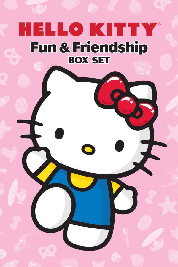
The most prominent color of Hello Kitty is, unsurprisingly, white. In the context of branding, white is often associated with purity, simplicity, and cleanliness. However, for Sanrio, the choice of white for Kitty White’s “fur” serves a deeper, more strategic purpose: it functions as a psychological blank slate.
Emotional Projection and Consumer Connection
One of the most famous aspects of Hello Kitty’s design is her lack of a mouth. Sanrio designers have frequently explained that this allows the consumer to project their own emotions onto the character. If you are happy, Hello Kitty looks happy; if you are sad, she seems to share your melancholy. The color white is the visual anchor for this “mirroring” effect. Unlike a character with a vibrant orange or deep brown complexion, which dictates a specific energy or origin, white is neutral. It provides a clean backdrop that does not compete with the consumer’s current state of mind.
Versatility in Product Design
From a brand management perspective, a white primary character is a dream for licensing. Hello Kitty has been featured on everything from high-end jewelry and Fender Stratocaster guitars to EVA Air jet engines and motor oil. Because white is a neutral base, the character can be integrated into any color scheme required by a partner brand without losing her core identity. This adaptability is a cornerstone of Hello Kitty’s longevity. She can fit into a minimalist “Scandi-chic” nursery or a neon-drenched Tokyo street fashion line with equal ease.
The Power of the Red Bow: Contrast and Recognition
While white provides the base, the iconic red bow is the focal point of the brand’s visual hierarchy. In the early years of Hello Kitty (the mid-1970s), the color palette was strictly limited to primary colors: white, red, and a specific shade of blue for her overalls. This primary palette was essential for building brand recognition in a crowded marketplace of children’s goods.
Red as a Catalyst for Attention
In marketing psychology, red is the color of energy, passion, and immediate attention. It is the most visible color in the spectrum and has been proven to increase heart rates and trigger impulse behavior. By placing a bright red bow on a stark white head, Sanrio created a high-contrast visual anchor. Even from a distance or on a cluttered shelf, the human eye is drawn to that specific splash of red. This “visual shorthand” allows the brand to be recognized even when the character’s full face isn’t visible.
Establishing the “Kawaii” Aesthetic
The combination of white and red also taps into traditional Japanese aesthetics. The colors are reminiscent of the Japanese flag (the Hinomaru) and the sacred colors of Shinto shrines. While Hello Kitty was designed to have a “British” backstory to appeal to the 1970s Japanese fascination with the West, her color DNA remained deeply rooted in Japanese visual culture. This synthesis of Western “cuteness” and Eastern color symbolism helped define the “Kawaii” (cute) movement that Sanrio would eventually lead globally.
The Pink Evolution: Marketing to the Modern Era
As the Hello Kitty brand matured and sought to capture a wider demographic—specifically teenagers and young adults—the color palette underwent a significant shift. The primary red was often replaced or supplemented by various shades of pink. This transition was a calculated move in personal and corporate branding to move Hello Kitty from a “children’s toy” to a “lifestyle icon.”

Soft Power and Femininity
Pink is traditionally associated with sweetness, romance, and playfulness. By leaning into pink, Sanrio was able to segment its market. While the “Classic Red” line appealed to nostalgic adults and young children, the “Pink Era” targeted the burgeoning “lifestyle” market. This allowed Hello Kitty to enter the realms of cosmetics, fashion accessories, and home decor. The shift to pink helped soften the brand’s image, making it more palatable for the “soft-girl” aesthetic and the various subcultures of J-fashion that emerged in the 1990s and 2000s.
Tiered Branding Through Hue
Sanrio uses color to denote different brand tiers. A “Hello Kitty” product in deep, sophisticated rose-gold or muted pastel pink is often positioned as a premium or “adult” item, whereas the bright primary red remains the hallmark of the core mass-market toys. This use of color as a “status signal” allows the brand to maintain its ubiquity without diluting its perceived value in more exclusive niches.
Branding Through Minimalism: The Visual Identity System
The “color” of Hello Kitty is as much about what is missing as what is present. The brand’s identity is built on a philosophy of “less is more.” This minimalism is a strategic choice that has allowed the brand to survive decades of changing design trends.
Consistency as Brand Equity
Sanrio maintains incredibly strict brand guidelines regarding Hello Kitty’s colors. The “Sanrio Red” and “Sanrio Pink” are not just colors; they are protected assets. When a brand partners with Sanrio, they must adhere to specific Pantone matching systems to ensure that the character looks identical whether she is printed on a t-shirt in New York or a lunchbox in Seoul. This consistency builds trust and reliability—two pillars of successful long-term branding.
The Contrast of the Yellow Nose
Often overlooked in the white-red-pink debate is the tiny yellow nose. This small dot of yellow serves as the only “warm” secondary color on her face. It breaks up the starkness of the white and provides a sense of balance. In design terms, yellow represents optimism and joy. While it is a minor element, it completes the “color wheel” of the character’s face, ensuring she feels approachable rather than clinical.
The Commercial Impact of Color Consistency in Licensing
The genius of Hello Kitty’s color strategy is most apparent in the world of corporate licensing. Sanrio does not just sell products; they sell a visual identity. Because Hello Kitty’s colors are so well-defined, she can be “reskinned” to fit any trend while remaining 100% recognizable.
Collaborative Branding
In recent years, we have seen “Goth Hello Kitty” (using black and purple), “Vaporwave Hello Kitty” (using neon teals and magentas), and even “High-Fashion Hello Kitty” (using monochromatic silvers and golds). These iterations work because the silhouette—the white head and the bow—is so iconic that the actual color can be altered to suit a collaborator’s brand identity.
This flexibility has allowed Sanrio to partner with brands as diverse as Balenciaga, Dr. Martens, and Sephora. Each collaborator brings their own color story, but the “core” color of Hello Kitty (the white space of her face) remains the unifying factor. This is the ultimate goal of brand strategy: to create an icon so strong that it can change its colors without losing its soul.
Conclusion: More Than Just a Palette
What color is Hello Kitty? She is the white of a blank canvas, the red of an urgent heartbeat, and the pink of a playful lifestyle. She is a masterwork of minimalist design and strategic color theory.
Sanrio’s ability to maintain a character for fifty years without a complex backstory or a television series (in the traditional sense) is largely due to this visual brilliance. By choosing colors that evoke universal emotions and maintaining a strict identity system that ensures global consistency, Hello Kitty has become a universal language. She is not just a character; she is a color-coded symbol of “Kawaii” culture that continues to prove that in the world of branding, simplicity is the ultimate sophistication. For marketers and brand strategists, the lesson of Kitty White is clear: define your colors, maintain your consistency, and never underestimate the power of a blank slate.
aViewFromTheCave is a participant in the Amazon Services LLC Associates Program, an affiliate advertising program designed to provide a means for sites to earn advertising fees by advertising and linking to Amazon.com. Amazon, the Amazon logo, AmazonSupply, and the AmazonSupply logo are trademarks of Amazon.com, Inc. or its affiliates. As an Amazon Associate we earn affiliate commissions from qualifying purchases.