
In the landscape of modern branding, grey is often unfairly characterized as a “filler” color—a neutral background meant to fade into the periphery while more vibrant hues take center stage. However, for brand strategists and visual identity designers, grey is a powerhouse of versatility. It represents sophistication, stability, and neutrality. When utilized correctly, grey acts as a foundational anchor that can elevate a brand’s perceived value and emotional resonance.
Choosing the right color to pair with grey is not merely an aesthetic exercise; it is a strategic decision that influences consumer trust, brand recall, and market positioning. Whether a brand aims for the rugged reliability of charcoal or the sleek, futuristic appeal of silver, the accompanying palette determines the final narrative. This guide explores the most effective color pairings for grey within the context of brand strategy and corporate identity.

The Psychology of Grey in Brand Identity
Before selecting a secondary color, it is vital to understand the psychological weight of grey itself. In the spectrum of color theory, grey sits between the absolute authority of black and the pure clarity of white. It suggests a middle ground of logic, composure, and maturity.
From a brand perspective, grey communicates professionalism and high-end positioning. It is no coincidence that many of the world’s most prestigious brands—Apple, Mercedes-Benz, and Swarovski—utilize grey or silver as a primary component of their visual identity. It conveys a sense of “timelessness.” Unlike trendy neons or saturated primaries that may feel dated within a few years, a well-executed grey palette maintains its relevance across decades.
However, grey can also be perceived as detached or sterile if not balanced correctly. This is where strategic pairing becomes essential. By introducing a secondary color, a brand can inject warmth, energy, or authority into its identity while maintaining the sophisticated foundation that grey provides.
High-Impact Color Pairings for Modern Branding
1. Grey and Vibrant Yellow: The Dynamic Balance
One of the most celebrated pairings in contemporary design is the combination of a medium-to-dark grey with a bright, luminous yellow. This duo represents the intersection of “Ultimate Gray” (reliability) and “Illuminating” (hope), as famously highlighted by Pantone.
In branding, this combination works exceptionally well for tech startups, creative agencies, and logistics firms. The grey provides a bedrock of corporate stability and efficiency, while the yellow cuts through the noise with energy and optimism. It is a high-contrast pairing that ensures legibility in digital interfaces and physical signage alike.
2. Grey and Royal Blue: The Authority Standard
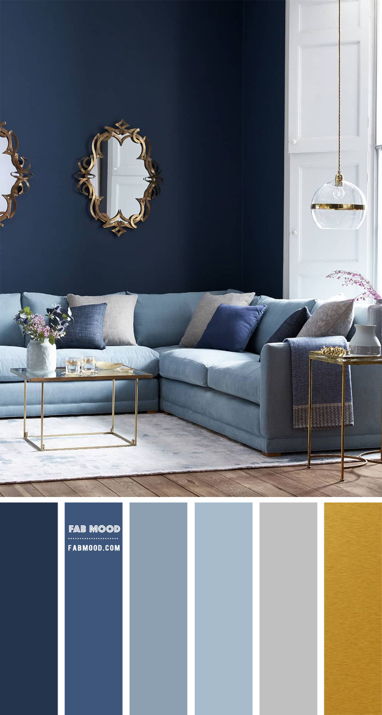
For financial institutions, legal firms, and software-as-a-service (SaaS) companies, the pairing of grey and blue is a gold standard. Blue is universally associated with trust, intelligence, and calm. When paired with a slate or light grey, it creates an atmosphere of “approachable authority.”
A deep charcoal paired with a vibrant royal blue creates a sense of cutting-edge technology and security. Conversely, a light heather grey paired with a navy blue evokes tradition and heritage. This palette is particularly effective for brands that need to communicate safety and reliability without appearing stagnant.
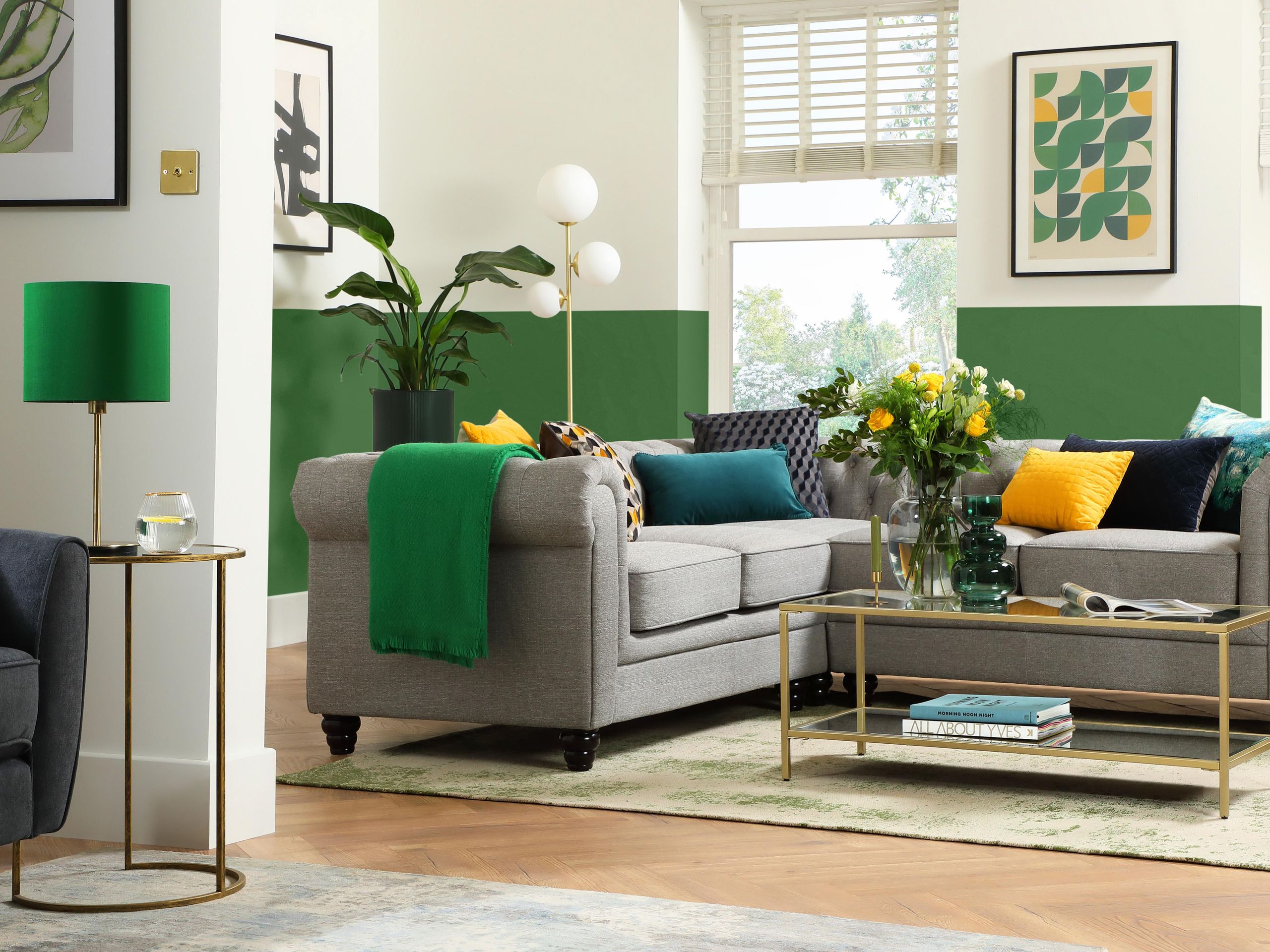
3. Grey and Emerald Green: Modern Sustainability
As ESG (Environmental, Social, and Governance) values become central to corporate identity, the combination of grey and green has surged in popularity. This is a departure from the traditional green-and-brown “earthy” palettes.
By pairing a sophisticated cool grey with a rich emerald or forest green, a brand can communicate a commitment to sustainability through a premium, urban lens. This is frequently seen in high-end sustainable fashion, “green” fintech, and modern architectural firms. The grey removes the “granola” stereotype often associated with eco-friendly brands, replacing it with a sense of polished, professional environmentalism.
4. Grey and Burnt Orange: The Creative Industrialist
Orange is often a difficult color to work with in branding because of its overwhelming vibrancy. However, when placed against a cool, matte grey, orange becomes grounded and purposeful. This pairing is synonymous with “industrial creativity.”
It suggests a brand that is both a “maker” and a “thinker.” Construction technology companies, hardware brands, and innovative design studios often lean into this palette. The grey represents the steel and concrete of the physical world, while the orange represents the spark of human innovation and activity.
5. Grey and Rose Gold or Soft Pink: The Premium Lifestyle
In the lifestyle, beauty, and wellness sectors, grey serves as a modern alternative to white or beige. A soft, warm grey—often referred to as “greige”—paired with a dusty rose or metallic rose gold creates a sense of inclusive luxury.
This combination is highly effective for brands targeting a sophisticated demographic that values minimalism and tranquility. While white can sometimes feel “medical” or “empty,” a soft grey provides a layered, textural depth that makes the pink tones feel more mature and less whimsical.
The Technical Execution: Warm vs. Cool Greys
In brand strategy, not all greys are created equal. The “temperature” of the grey chosen will dictate which colors harmonize with it and which ones clash.
Cool Greys
Cool greys have blue or green undertones. They are best suited for tech, medical, and high-performance sectors. Cool greys pair exceptionally well with:
- Electric Blues: To emphasize speed and connectivity.
- Vibrant Purples: To suggest luxury and mystery.
- Crisp Whites: To maximize a sense of cleanliness and precision.
Warm Greys (Greige)
Warm greys have yellow, brown, or red undertones. These are more “humanist” greys, often used in hospitality, organic food branding, and personal services. Warm greys pair best with:
- Terracotta and Clay: To evoke an artisanal, handcrafted feel.
- Olive Green: For a natural, sophisticated look.
- Gold Accents: To create a sense of heritage and warmth.
Utilizing Grey in Digital Brand Systems (UI/UX)
The strategic use of grey extends beyond the logo and into the entire digital ecosystem of a brand. In UI/UX (User Interface and User Experience) design, grey is the most critical color for establishing hierarchy and readability.
Managing White Space and Depth
Most modern software interfaces use varying shades of grey to create “elevation.” A darker grey background with lighter grey cards suggests depth, helping the user understand which elements are interactive and which are informational. By using a “signature color” (like a brand’s primary blue or red) sparingly against a grey-scale interface, designers can direct user attention to Call-to-Action (CTA) buttons with surgical precision.
Dark Mode Strategy
As “Dark Mode” becomes a standard requirement for digital products, the relationship between grey and accent colors has shifted. True black (#000000) can often cause eye strain and visual vibrating when paired with high-contrast text. Most premium brands now utilize a “near-black” or “deep charcoal” (#121212) as their dark mode base. This allows brand colors to pop without being jarring, maintaining a sense of premium quality even in low-light environments.
Avoiding the “Bland” Trap: Texture and Contrast
The greatest risk in using grey is the potential for the brand to appear boring or indecisive. To avoid this, brand strategists must focus on two key elements: contrast ratios and material finishes.
Contrast is Non-Negotiable
If the grey and its accent color are too close in value (brightness), the brand will fail accessibility tests and look “muddy” in print. A light grey logo on a medium grey background is a recipe for invisibility. Strategy requires high contrast—either a very light grey with a saturated accent, or a very dark charcoal with a pastel or neon accent.
Incorporating Materiality
In physical branding—such as packaging, business cards, and corporate interiors—grey thrives through texture. A matte charcoal box with a foil-stamped silver logo communicates a different level of quality than a flat, printed grey. Similarly, using concrete, brushed aluminum, or slate in physical environments reinforces the brand’s “grey” identity through tactile experience, making the brand feel more tangible and permanent.
Conclusion: Grey as the Ultimate Strategic Canvas
In the world of brand strategy, color is the shortest path to a consumer’s emotions. While bold colors may capture attention, it is the foundational neutrals that sustain a brand’s presence. Grey is the ultimate canvas—a color that reflects the sophistication of the modern marketplace while providing the flexibility to evolve.
Whether it is paired with the optimism of yellow, the trust of blue, or the luxury of rose gold, grey ensures that the brand remains grounded. By carefully selecting the right shade and temperature of grey, and pairing it with a high-contrast accent, organizations can build a visual identity that is both impactful today and resilient enough to withstand the changing tides of design trends for years to come. Grey is not the absence of color; it is the presence of strategic intent.
aViewFromTheCave is a participant in the Amazon Services LLC Associates Program, an affiliate advertising program designed to provide a means for sites to earn advertising fees by advertising and linking to Amazon.com. Amazon, the Amazon logo, AmazonSupply, and the AmazonSupply logo are trademarks of Amazon.com, Inc. or its affiliates. As an Amazon Associate we earn affiliate commissions from qualifying purchases.