
In the competitive landscape of modern branding, color is rarely a matter of mere aesthetic preference. It is a silent communicator, a psychological trigger, and a foundational pillar of corporate identity. Among the vast spectrum of the visible palette, coral has emerged as one of the most versatile and emotionally resonant choices for brands seeking to bridge the gap between energy and comfort. But when a brand strategist asks, “What color coral?” they are not simply asking for a hex code. They are inquiring about a specific frequency of brand personality that balances the urgency of red, the cheerfulness of orange, and the softness of pink.

Selecting the right shade of coral involves a deep dive into color theory, market positioning, and the nuanced ways in which consumers interact with visual stimuli. As digital landscapes become increasingly saturated, the strategic application of coral offers a unique opportunity for brands to stand out while maintaining an air of accessibility and human-centric design.
The Psychology of Coral in Modern Branding
Coral is often described as a “bridge” color. In the world of color psychology, it occupies a unique space that evokes a sense of warmth, optimism, and vitality. Unlike primary red, which can often feel aggressive or high-alert, coral retains the energy of red but softens it with the approachability of yellow and white undertones. This makes it an ideal choice for brands that want to appear dynamic without being overbearing.
The Emotional Spectrum: From Vitality to Serenity
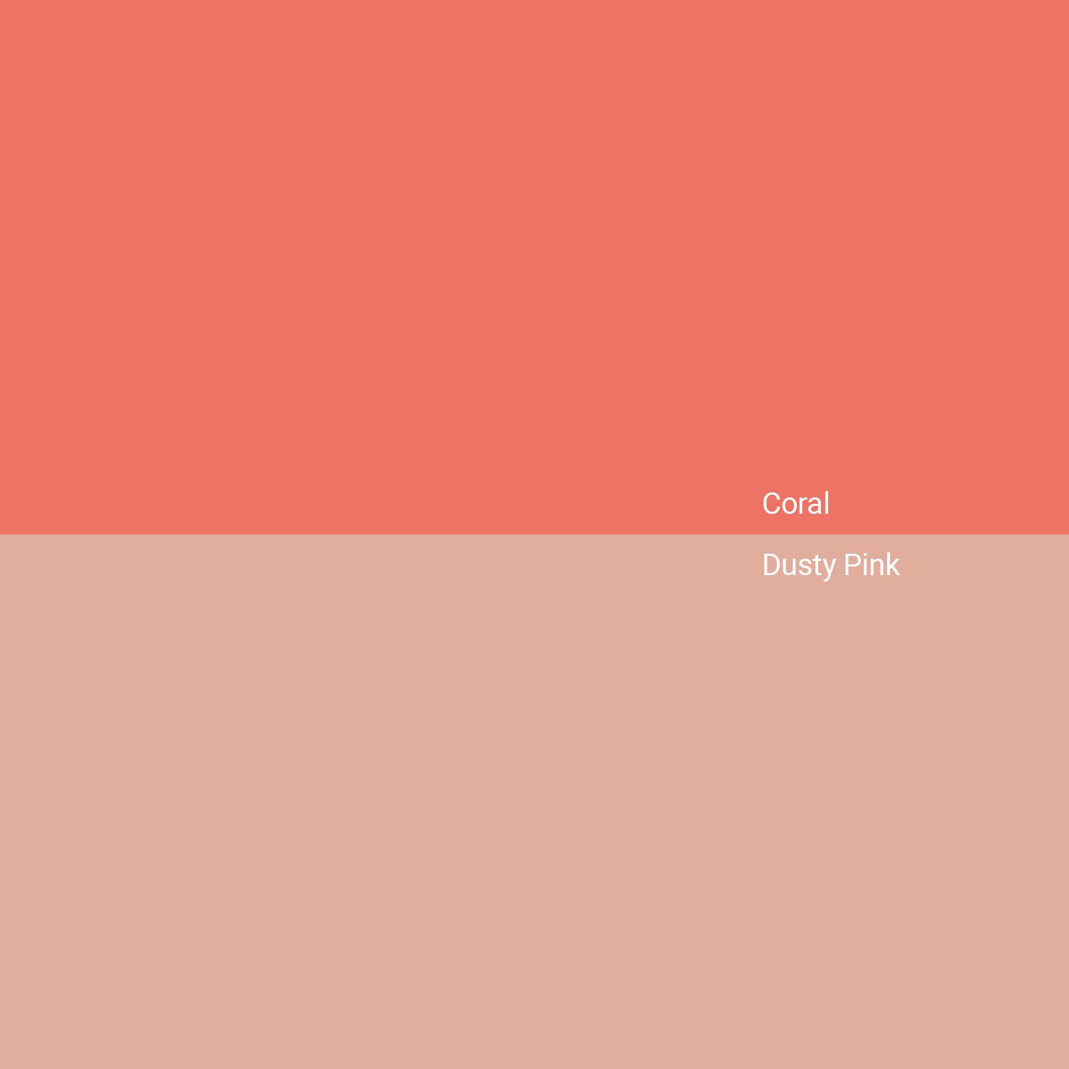
The specific “temperature” of the coral chosen dictates the emotional response of the consumer. A more vibrant, orange-leaning coral radiates a sense of adventure and playfulness. It suggests a brand that is forward-thinking and energetic. On the other end of the spectrum, a “dusty” or muted coral—leaning closer to terracotta or peach—communicates sophistication, heritage, and groundedness.
For brand strategists, understanding this spectrum is critical. A fintech startup might choose a sharp, neon-adjacent coral to signal disruption and “new-age” energy, whereas a high-end wellness brand might opt for a “living coral” that suggests natural health and biological vitality.
Cultural Resonances and Global Perception
When identifying “what color coral” a brand should adopt, global context cannot be ignored. In many Eastern cultures, variations of coral and orange represent spiritual transition and enlightenment. In Western markets, coral is frequently associated with the “tropical” or the “organic,” often linked to environmental consciousness and the beauty of the natural world. This duality allows brands to craft narratives that are both high-tech and high-touch, appealing to a consumer base that values both innovation and ecological responsibility.
Defining Your Shade: Finding the Right Coral for Your Corporate Identity
Not all corals are created equal. In the technical realm of brand design, the difference between a #FF7F50 (standard Coral) and a #FF6F61 (Pantone’s Living Coral) can fundamentally alter a brand’s perceived value and target demographic. To choose the right shade, designers and brand managers must look at the technical specifications and how they translate across different mediums.
The “Energetic” Coral: High Saturation and High Impact
For brands operating in the fast-paced world of e-commerce, food delivery, or social media, high-saturation corals are a powerful tool. These shades command attention. When used as a primary brand color, a bright coral acts as a natural call-to-action. It draws the eye more effectively than blue or green but feels more modern and “lifestyle-oriented” than a traditional primary red. This version of coral says, “We are here, we are exciting, and we are ready for what’s next.”
The “Sophisticated” Coral: Subtlety and Luxury
Luxury branding has historically shied away from bright, secondary colors, often sticking to black, white, gold, or deep navy. However, a muted, “nude” coral is increasingly being used to signal a new kind of luxury—one that is inclusive, warm, and experiential rather than cold and exclusive. This shade of coral works exceptionally well in high-end skincare, boutique hospitality, and bespoke interior design. It provides a “skin-tone” warmth that feels personal and intimate, fostering a sense of trust between the brand and the consumer.
The Technical Translation: RGB vs. CMYK
A common pitfall in brand strategy is selecting a coral that looks stunning on a high-resolution backlit screen (RGB) but loses its vibrancy when translated to physical packaging or printed stationery (CMYK). Coral is notoriously difficult to replicate in traditional four-color printing because its “glow” often comes from a balance of pigments that CMYK struggles to mimic without looking muddy. Brands committed to a coral identity must often invest in Pantone Matching System (PMS) spot colors to ensure that their “Living Coral” remains consistent from a mobile app icon to a physical storefront sign.
Cross-Industry Application: Where Coral Thrives
The versatility of coral allows it to transcend industry boundaries, but its application must be tailored to the specific industry’s “visual language.” By examining how different sectors utilize coral, we can better understand how to deploy it strategically.
Technology and SaaS: Breaking the “Blue” Barrier
The tech industry is famously dominated by “Tech Blue”—a color choice that signals reliability and security. However, as the market becomes crowded, many innovative SaaS companies are turning to coral to differentiate themselves. In this context, coral represents “Humanity in Tech.” It suggests that the software is user-friendly, empathetic, and designed for real people rather than just machines. It transforms a cold digital interface into a warm digital experience.
Wellness and Lifestyle: The Connection to Nature
In the wellness sector, coral is a direct nod to the organic. It evokes the beauty of coral reefs, sunrises, and natural flora. Brands that prioritize sustainability often use coral as an accent to earthy greens and browns. This combination moves the brand away from a “clinical” look toward a more holistic, life-affirming aesthetic. It speaks to the consumer’s desire for vitality and a connection to the natural world.
Food and Beverage: Stimulating the Appetite
Much like its cousins red and orange, coral is an appetite stimulant. It is vibrant and “juicy.” In the food and beverage industry, coral is often used to signal freshness and flavor. Whether it is used in the branding of a sparkling water company or a trendy fast-casual restaurant, coral suggests a product that is zestful and full of life. It avoids the heavy, “greasy” connotations sometimes associated with darker reds and yellows.
Building a Palette: Complementary Colors and Strategic Pairings
No brand color exists in a vacuum. The effectiveness of coral is heavily dependent on the colors that surround it. To answer “what color coral,” one must also ask “what color accompanies it?”
The Contrast Strategy: Coral and Teal/Navy
One of the most effective ways to make coral “pop” is to pair it with its opposite on the color wheel: teal or deep navy. This creates a high-contrast, professional look. The navy provides a foundation of stability and authority, while the coral adds a burst of innovation and energy. This pairing is particularly popular in corporate identities that want to appear established yet modern.
The Monochromatic Strategy: Tones and Tints
For a softer, more lifestyle-focused brand, using a monochromatic coral palette can be incredibly effective. By layering various tints (coral mixed with white) and shades (coral mixed with black), a brand can create a visual identity that is harmonious and calming. This approach is often seen in beauty and apparel branding, where the goal is to create an “aesthetic” that feels cohesive and curated.
The Neutral Balance: Coral, Gray, and Cream
To keep coral from becoming overwhelming, it is often paired with “warm neutrals” like cream, sand, or soft gray. This keeps the focus on the coral as the primary “hero” color while ensuring the overall brand identity remains sophisticated and easy on the eyes. This is a staple in modern interior design branding and high-end lifestyle magazines.
Future-Proofing the Brand: Coral as a Sustainable and Inclusive Choice
As we look toward the future of brand strategy, inclusivity and accessibility have become non-negotiable. “What color coral” a brand chooses must also account for digital accessibility standards, such as the Web Content Accessibility Guidelines (WCAG).
Digital Accessibility and Contrast Ratios
One of the challenges with lighter shades of coral is ensuring they provide enough contrast against white backgrounds for users with visual impairments. A strategic brand will select a coral that is deep enough to be legible in text or as a functional UI element, or they will reserve the lighter “peach” tones for decorative elements. This technical foresight ensures that the brand is inclusive and functional for all users, which in turn builds brand equity and trust.

Longevity vs. Trend
While Pantone’s designation of “Living Coral” as a Color of the Year brought the shade into the mainstream, a truly strategic brand uses coral not because it is “on-trend,” but because it aligns with their core values. The goal is to select a shade of coral that feels as relevant ten years from now as it does today. This is achieved by focusing on the brand’s “authentic” color—one that reflects its personality rather than the current fashion cycle.
In conclusion, the question of “what color coral” is a gateway into a sophisticated brand strategy. It requires a balance of psychological insight, technical precision, and creative vision. Whether used to disrupt the tech industry, soften a luxury brand, or energize a wellness startup, coral remains one of the most potent tools in a designer’s arsenal. It is a color that doesn’t just ask for attention—it invites connection. By carefully selecting the right hue, saturation, and complementary palette, a brand can harness the unique power of coral to create a lasting, meaningful impact in the minds of its consumers.
aViewFromTheCave is a participant in the Amazon Services LLC Associates Program, an affiliate advertising program designed to provide a means for sites to earn advertising fees by advertising and linking to Amazon.com. Amazon, the Amazon logo, AmazonSupply, and the AmazonSupply logo are trademarks of Amazon.com, Inc. or its affiliates. As an Amazon Associate we earn affiliate commissions from qualifying purchases.