
In the competitive landscape of modern commerce, a brand’s visual identity serves as its silent ambassador. While many entrepreneurs select colors based on personal preference or fleeting trends, the most enduring global brands utilize a more profound framework: the psychology of color. This discipline often mirrors the ancient system of energy centers known as chakras. By understanding what the chakra colors are and how they translate into consumer behavior, brand strategists can craft identities that resonate on a primal, emotional level.
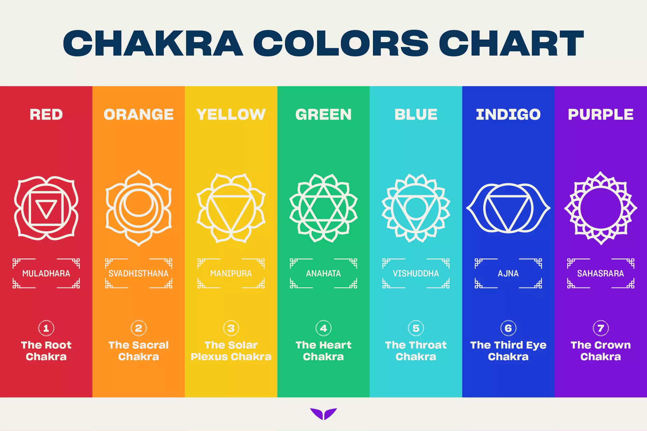
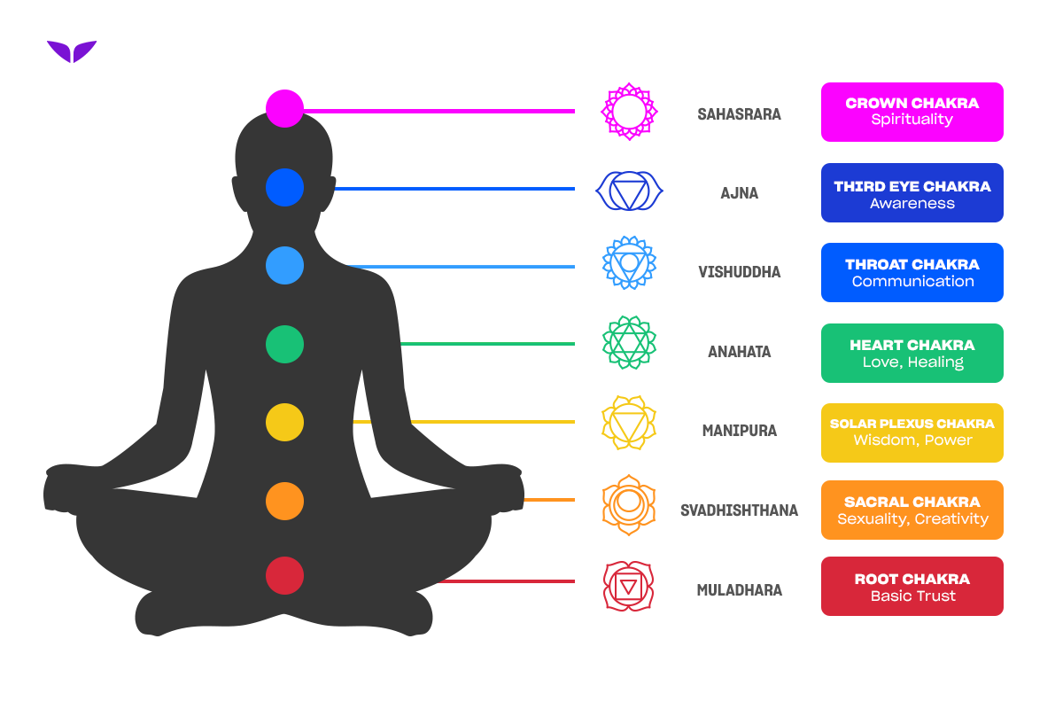
The chakra system identifies seven primary energy centers, each associated with a specific frequency and color. In a branding context, these colors are not merely decorative; they are communicative tools used to signal trust, innovation, power, or tranquility. This guide explores the strategic application of the seven chakra colors in brand development and corporate identity.
The Foundations of Color Strategy: Why the Spectrum Matters
Before diving into the specific colors, it is essential to understand the “why” behind the spectrum. Studies in color psychology suggest that up to 90% of snap judgments made about products can be based on color alone. Brands that align their visual identity with the psychological archetypes of the chakra colors create a “brand resonance” that feels intuitive to the consumer.
The Science of Visual Perception
In branding, color is the first thing a customer perceives, often before they read a single word of copy. The chakra colors follow the visible light spectrum—red, orange, yellow, green, blue, indigo, and violet. Each of these wavelengths triggers a different neurological response. For instance, longer wavelengths like red are stimulating and demand immediate attention, while shorter wavelengths like violet are calming and associated with introspection.
Creating an Emotional Architecture
A brand is more than a logo; it is an emotional architecture. By using the chakra colors as a reference point, designers can build a “personality” for a company. Are you a “Root” brand focused on security and foundation, or a “Crown” brand focused on luxury and transcendence? Identifying where your brand sits on this energetic spectrum is the first step toward a cohesive market positioning strategy.
Decoding the Seven Chakra Colors for Corporate Identity
To leverage these colors effectively, one must look at their traditional meanings and how they have been successfully repurposed in the world of high-level branding and marketing.
Red: The Root of Brand Identity
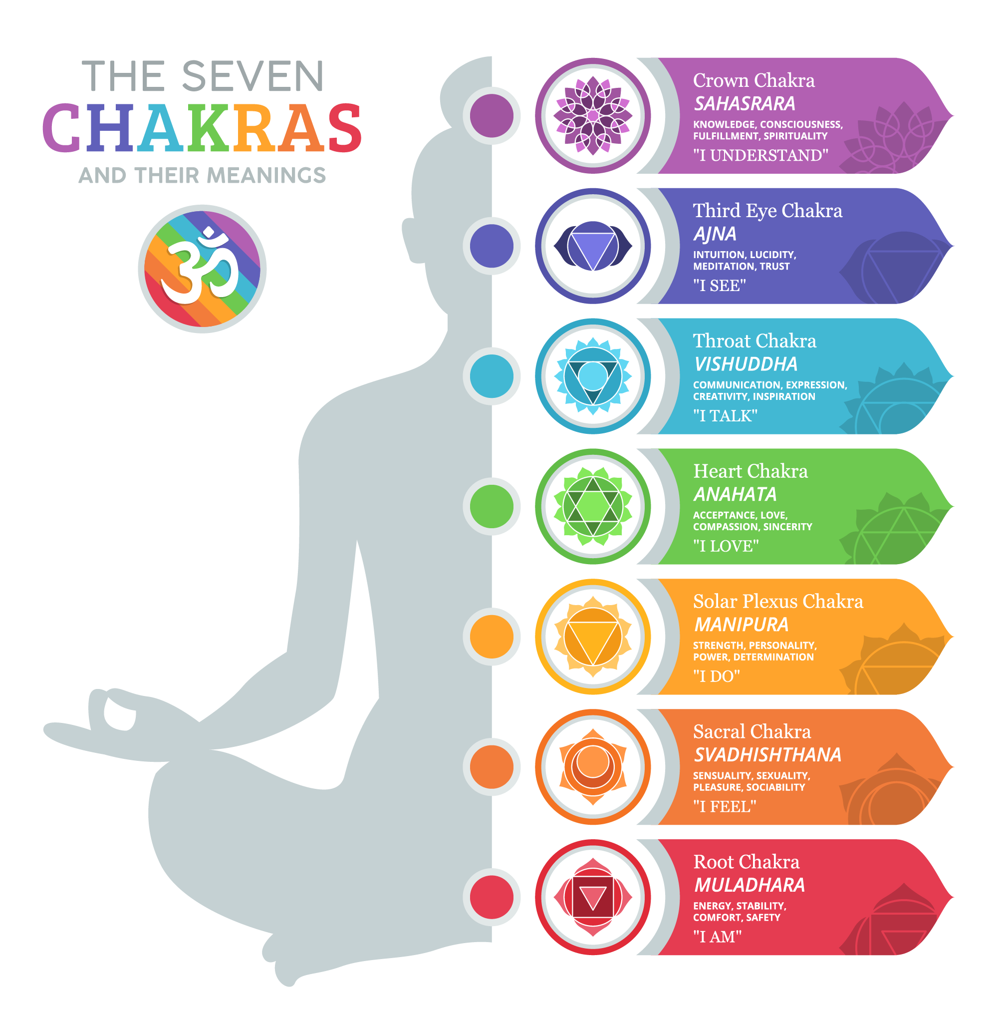
The Root Chakra (Muladhara) is represented by the color red. In branding, red is the ultimate “call to action.” It symbolizes survival, passion, energy, and foundation.
- Strategic Use: Red is used by brands that want to convey power, urgency, or physical excitement. It is a dominant color in the food and beverage industry (Coca-Cola, Red Bull) because it is known to stimulate appetite.
- Corporate Identity: In the tech space, red signals a “disruptor” status. It is bold and unapologetic. However, it must be used carefully, as over-saturation can lead to feelings of aggression or danger.
Orange: The Sacral Pulse of Creativity
The Sacral Chakra (Svadhisthana) is associated with orange. This color represents creativity, playfulness, and social connection.
- Strategic Use: Orange is the color of innovation and accessibility. It lacks the intense pressure of red but maintains a high level of energy. Brands like Nickelodeon or Fanta use orange to appeal to a youthful, fun-loving demographic.
- Corporate Identity: For service-based brands or startups, orange signals a friendly, approachable, and creative culture. It suggests that the brand is an “ally” rather than a cold corporate entity.
Yellow: Solar Plexus and the Power of Optimism
The Solar Plexus Chakra (Manipura) is represented by yellow. This is the center of personal power, confidence, and clarity.
- Strategic Use: Yellow is the most visible color in the spectrum. It is used to grab attention (think Post-it notes or DHL) and to project happiness and warmth (McDonald’s, IKEA).
- Corporate Identity: Yellow is often utilized by brands that want to project clarity of vision and mental agility. It is a color of logic and sunshine, making it ideal for brands that focus on speed, efficiency, and positive outcomes.
Green: The Heart of Sustainability and Growth
The Heart Chakra (Anahata) is green. It represents balance, healing, nature, and growth.
- Strategic Use: Green has become the universal shorthand for “eco-friendly” and “organic.” Brands like Whole Foods and Starbucks use green to foster a sense of relaxation and ethical responsibility.
- Corporate Identity: Beyond environmentalism, green is also the color of wealth and stability in financial sectors (particularly in the US). It suggests a brand that is balanced, enduring, and flourishing.
Blue: The Throat Chakra and Professional Trust
The Throat Chakra (Vishuddha) is blue. This is the center of communication and truth.
- Strategic Use: Blue is arguably the most popular color in corporate branding. It projects reliability, intelligence, and tranquility. Tech giants like IBM, Dell, and Intel, as well as social platforms like LinkedIn and Facebook, use blue to build a sense of community and dependable communication.
- Corporate Identity: If your brand strategy relies on trust—such as insurance, banking, or healthcare—blue is the primary choice. It creates a “calm” environment that encourages users to share information and rely on the brand’s expertise.
Indigo: The Third Eye of Intuition and Wisdom
The Third Eye Chakra (Ajna) is represented by indigo. This color signifies deep intuition, perception, and “big picture” thinking.
- Strategic Use: Indigo is a sophisticated color often used by brands that want to appear wise, visionary, or slightly mysterious. It is less common than standard blue, giving it a more “premium” and “niche” feel.
- Corporate Identity: Luxury brands or high-end consulting firms use indigo to signal that they possess deep insights that others might miss. It is a color for brands that are “ahead of the curve.”
Violet: The Crown of Luxury and Vision
The Crown Chakra (Sahasrara) is violet or purple. It represents spirituality, royalty, and the highest state of consciousness.
- Strategic Use: Historically, purple dye was the most expensive to produce, cementing its link to royalty. In modern branding, violet is used by luxury brands (Rolex, Hallmark) and those targeting a creative or spiritual audience.
- Corporate Identity: Violet suggests that a brand offers something “extraordinary.” It is used to market premium services that promise transformation, high-level craftsmanship, or an elite status.
Implementing Chakra-Inspired Palettes in Your Visual Identity
Choosing a single chakra color is rarely enough. Most successful brand identities utilize a primary color supported by a secondary palette to create a “harmonious” brand personality.
Balancing the “Energy” of a Brand
Just as a person seeks to balance their chakras, a brand must balance its visual energy. A tech company might use a “Blue” (Trust) base with “Orange” (Creativity) accents. This tells the consumer: “We are dependable, but we are also innovative.” This contrast prevents the brand from feeling either too stagnant or too chaotic.
Case Study: The Multi-Chakra Approach
Consider a brand like Google. Their logo utilizes red, yellow, green, and blue. By incorporating almost the entire spectrum, Google positions itself as a universal tool—a brand that touches every aspect of the human experience, from the “Root” (information/survival) to the “Throat” (communication). This multi-color strategy is risky because it can look cluttered, but when executed with clean design, it signals a brand of limitless scope.
The Role of White Space and Neutrality
While chakra colors provide the “vibration” of the brand, neutrals (white, black, and gray) provide the structure. In branding, white represents the “unmanifested” potential—cleanliness and simplicity. Black represents authority, elegance, and mystery. Using these in conjunction with chakra colors ensures that the brand remains professional and legible across different media.
The Future of Color Selection: AI, Personalization, and Emotional Intelligence
As we move into an era dominated by digital experiences, the application of chakra-based color theory is evolving. Brand strategy is no longer static; it is becoming dynamic and data-driven.
Algorithmic Color Tuning
Modern AI tools now allow brands to adjust their color palettes in real-time based on user demographics or even the time of day. A brand might lean into “Yellow” (Energy) in the morning and transition to “Indigo” (Calm/Insight) in the evening via its app interface. This “energetic alignment” mimics the natural circadian rhythms and the shifting needs of the consumer’s own internal “chakras.”
Cultural Nuance in Global Branding
While the chakra system is a universal framework, brand strategists must remain aware of cultural interpretations. In some cultures, white is the color of mourning, whereas, in the West, it is the color of purity. A truly sophisticated brand strategy takes the core “energy” of a chakra color and adapts its shade and saturation to fit the cultural context of the target market.
Conclusion: The Strategic Spectrum
Understanding what the chakra colors are provides a powerful lens through which to view brand development. By mapping the seven energy centers to corporate values, brands can move beyond mere aesthetics and begin to communicate with their audience on a subconscious level. Whether you are building a “Root” brand focused on the essentials of life or a “Crown” brand offering a vision of the future, the spectrum is your most potent tool for differentiation and connection. In the end, the most successful brands are those that are “aligned”—where their visual identity, their corporate mission, and their consumer’s emotional needs all vibrate at the same frequency.
aViewFromTheCave is a participant in the Amazon Services LLC Associates Program, an affiliate advertising program designed to provide a means for sites to earn advertising fees by advertising and linking to Amazon.com. Amazon, the Amazon logo, AmazonSupply, and the AmazonSupply logo are trademarks of Amazon.com, Inc. or its affiliates. As an Amazon Associate we earn affiliate commissions from qualifying purchases.